


The picture follows your choices: , .
Collectible Description
Experience Theo van Doesburg's 'Counter Composition XV,' a pivotal De Stijl masterpiece. Bold geometric forms, primary colors, and dynamic asymmetry create a harmonious abstraction – explore its revolutionary impact on art & design.
 Read More
Artist Biography
Explore the revolutionary art of Theo van Doesburg (1883-1931), founder of De Stijl & Neoplasticism. Discover his geometric abstractions, Bauhaus influence, and lasting impact on modern art, architecture & design.
Hand Made Oil Reproduction
Hand-painted oil on canvas in your size and frame, made to order by our artists. ( Switch to Print Switch to Digital Image)
More about this painting
 Preview
 Send
Send Share
Share
 Details
 Guide
Guide

 Download
 Similars
 X-Ray
X-Ray Diaporama
 Q&A
Q&A Stats
StatsOrder your painting in four simple steps
Take your time. You can change any answer; the price in your order card follows each choice.
1 Step one of four
Which size would you like?
These sizes keep the proportions of the original painting. The drawing shows your choice on a wall, above a two-metre sofa.
Or give your own measurements
Pick from our preset sizes that match the artwork's original proportions.

Type the width and the height you need, to fit your frame or your wall. This is hand-painted, so for a size with a different shape the artist can paint a bit more around the picture, or cut a bit — you choose. We send you a digital mockup to approve before the painting starts. The picture shown on this page does not show the real result — only the mockup does.
2 Step two of four
How should it be prepared: rolled, stretched or framed?
The prices below are for the size you chose in step one.
Choose the edges of the stretched canvas
Choose your frame
White $1
Blurside $1
Extended $1
P118B $10
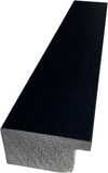
P118H $10
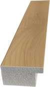
P118W $10
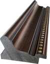
P438Z $10
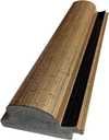
P508JH $12

P508YH $12
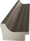
P805H $10
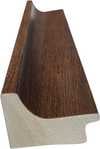
P805Z $10
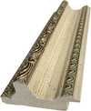
P919BZ $10
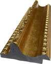
P919G $10
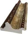
P919XJ $10
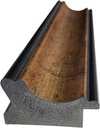
P959ZH $10
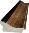
P968JZ $12
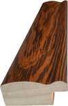
W106C $8
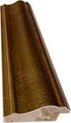
W218G $10
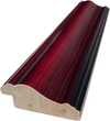
W218JH $8
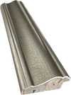
W218Y $10
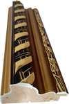
W307PJ $10
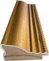
W316G $10
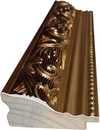
W316PJ $8
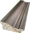
W316Y $10
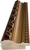
W398PJ $8
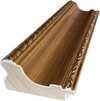
W4111J $10
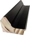
W500HY $15
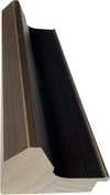
W500JH $15
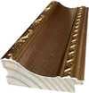
W692G $12
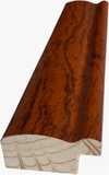
W849H $8
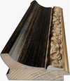
W940BG $15
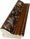
W953PJ $8
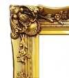
H24-GOLD $30

H24-SILVER $30
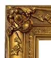
H36-GOLD $45
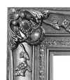
H36-SILVER $45
Framed
Moulding: . Overall size with the frame: .
3 Step three of four
Would you like anything changed in the painting?
Most people answer no. Because each painting is made by hand, our artist can also adapt it for you.
After order, ArtsDot.com team will email client for instructions and provide a mockup preview
4 Step four of four
A few finishing options
All of them are optional. The answers already selected cost nothing extra.
Who paints it?
Worldwide Delivery () in 3/4 weeks instead of standard 5 weeks. (10 November). No compromise on quality.
A nameplate, as in a museum?
Engraved Bronze Plaque Details
This elegant plaque features the artist's name and the title of the artwork, finely engraved for a timeless presentation.
It is made from bronze with a refined, elegant finish. The text is precisely laser-engraved for a sharp and permanent result. Measuring 9x2 cm, the plaque is compact yet easy to read. It's built to be durable and scratch-resistant, offering a professional, museum-quality look. Mounting is simple thanks to the included adhesive backing.
Transparent Acrylic Plaque Details
The plaque includes essential engraved details such as the artist's name, the title of the artwork, the date it was created, the type of media used-like oil on canvas or watercolor-a brief description of the piece, and a QR code that links to the complete artwork information.
It is crafted from clear acrylic, offering a sleek, modern appearance. The text is UV-engraved in black to ensure strong visual contrast. With a size of 10x15 cm, it ensures optimal readability. It comes equipped with two metal hooks for secure wall mounting. The plaque is designed to be weather-resistant, making it suitable for various environments, and it includes interactive features that work seamlessly with smartphone scanning.
Black Acrylic Plaque Details
This elegant plaque includes engraved information such as the artist's name, the title of the artwork, the date it was created, the type of media used (like oil on canvas or watercolor), a short description of the artwork, and a QR code for quick access to more information.
The plaque itself is made from refined black acrylic with a premium finish. The text is laser-engraved in white for high contrast and readability. Its size is 10x15 cm, designed to be easy to read. It comes with two metal hooks for professional mounting. The design is sleek and fits any interior style. It is also weather-resistant and durable, with built-in digital integration for mobile compatibility.
A protective varnish?
When do you need it?
✓ Check and order
Your painting, as you ordered it

Counter composition XV
Reproduction Medium
Reproduction Size
-

Elite Senior Artist
More detail, finesse, and extra production time
-

Reproduction Frame
-
-
For artworks or reproductions larger than 105 cm (approximately 41 inches) on any side, the frame will be shipped as a kit, disassembled. This method ensures safe delivery and prevents damage during transport.
Professional assembly required - this is not a DIY product.
The kit must be assembled and the canvas stretched by an experienced professional framer, using wood glue (not supplied), a canvas stretching plier and clamps to hold the bars square while the glue dries. Incorrect assembly or uneven canvas tension can permanently damage the artwork and is not covered by our warranty.
 For artworks or reproductions larger than 105 cm (approximately 41 inches) on any side, the frame will be shipped as a kit, disassembled. This method ensures safe delivery and prevents damage during transport.
All solid wood bars are included, precisely cut to size.
Assembled with the screws provided, plus wood glue for the corner joints, which is not supplied and must be sourced by your framer.
Professional tools are required and not included: a canvas stretching plier (tensioner) and clamps to hold the bars square while the glue dries.
Important:
The corner joints require wood glue, the bars must be held with clamps until the glue is fully dry, and tightening the canvas on the assembled frame requires a canvas stretching plier. None of these are included in the kit. Please arrange an experienced professional framer before ordering this size.

Nameplate
-
-

Protective Varnish
Glossy Varnish (enhances colors, protects against light/moisture)
-

Customize My Artwork
Examples of what can be changed: Replace face with customer photo; Add pet (e.g., replace cat with dog); Include hidden message in background; Change background landscape or elements.
-

Urgent
Worldwide Delivery () in 3/4 weeks instead of standard 5 weeks. (10 November). No compromise on quality.
-
Express Shipping
Worldwide Delivery () in 5 weeks. (17 November).
Included
Total Price
$ 263
Glass option is only available in size under 110 CM
Included with every order
- Free Worldwide Express Shipping
- High-Quality Linen Canvas
- Full Shipping Insurance
- Customs Tax Refund Guarantee
- True Color Matching Guarantee
- 100-Day Return Policy (Defects Only)
- 100% Money-Back Guarantee
- Bulk Discount Offer


The Geometry of Harmony: Unveiling Theo van Doesburg’s Counter Composition XV
Theo van Doesburg's "Counter Composition XV," painted in 1925, isn’t merely a painting; it’s a distilled essence of the De Stijl movement – a radical declaration of order and universal harmony. This deceptively simple work, executed against a stark white canvas, pulsates with an underlying tension born from the careful orchestration of geometric forms and primary colors. It represents a pivotal moment in 20th-century art, moving beyond representational imagery to explore the very foundations of visual language itself. The piece immediately commands attention not through elaborate detail or narrative, but through its profound sense of balance and its unwavering commitment to abstraction.
At first glance, the composition appears austere – a red rectangle dominating the upper left quadrant, juxtaposed with a blue counterpart in the lower right. However, this initial impression quickly gives way to an appreciation for the intricate grid that underpins the entire work. A network of black and white squares, meticulously arranged, creates a dynamic interplay of movement and stillness, suggesting both order and potential disruption. This isn’t haphazard placement; it's a deliberate choreography designed to evoke a feeling of controlled dynamism – a visual embodiment of De Stijl’s core philosophy.
Deconstructing the Language of Abstraction
The brilliance of "Counter Composition XV" lies in its reduction. Van Doesburg stripped away all extraneous elements, leaving only the fundamental building blocks of form and color: red, yellow, blue, black, and white. This limited palette wasn’t chosen arbitrarily; each hue was selected for its inherent purity and intensity, intended to be experienced without distraction. The application is equally crucial – flat, unmodulated areas devoid of shading or blending. This technique emphasizes the geometric shapes themselves, highlighting their sharp edges and creating a sense of crystalline clarity. It's a testament to the artist’s belief that beauty could be found in simplicity and precision.
The absence of perspective is equally significant. Van Doesburg deliberately rejects traditional spatial representation, opting instead for a two-dimensional plane where shapes are presented as independent entities. Overlapping elements and variations in size subtly suggest depth, but the overall effect is one of flattened planes interacting within a carefully constructed framework. This approach reflects De Stijl’s rejection of illusionism and its embrace of a purely conceptual understanding of space.
Symbolism and the Pursuit of Universal Harmony
Beyond its formal qualities, "Counter Composition XV" carries profound symbolic weight. The geometric forms – rectangles, squares, lines – are not merely decorative; they represent fundamental principles of order, balance, and harmony. The primary colors, stripped of their associations with natural phenomena, become pure expressions of energy and vibration. Van Doesburg believed that through the rigorous application of these abstract elements, artists could create a visual language capable of transcending individual expression and communicating universal truths. The piece is an attempt to build a new aesthetic based on mathematical ratios and geometric relationships – a blueprint for a harmonious world reflected in art.
Theo van Doesburg’s “Counter Composition XV” stands as a powerful testament to the transformative potential of abstraction. It's more than just a painting; it’s an invitation to contemplate the underlying order of the universe and the possibility of creating beauty through pure geometric form. Its stark simplicity, combined with its profound symbolic depth, continues to resonate with viewers today, cementing its place as a cornerstone of modern art.
Questions & Answers
What luminance does "Counter composition XV" by Theo van Doesburg have?
"Counter composition XV" by Theo van Doesburg has a soft shadow luminance. Luminance describes how much light the colors appear to reflect.
What is the color identity of "Counter composition XV" by Theo van Doesburg?
"Counter composition XV" by Theo van Doesburg uses an earthy palette, with phthalo green (#171b1d) as the dominant color.
Where does "Counter composition XV" stand among Theo van Doesburg's recurring subjects?
Among Theo van Doesburg's recorded themes - kandinsky’s abstraction, de stijl principles, universal harmony, geometric order, rejection traditional art forms, bauhaus influence, modern design, foundation movement - "Counter composition XV" brings its own focus on geometric abstraction, primary colors, de stijl, red rectangle, white background, composition, minimalism.
Related Artworks


Theo van Doesburg
1883 - 1931, Netherlands
Artist Biography
The Architect of Abstraction: A Life in Geometric Harmony
Theo van Doesburg, born Christian Emil Marie Küpper in 1883 in Utrecht, Netherlands, was more than a painter; he was a revolutionary force who reshaped the very foundations of modern art. His journey began amidst the lingering echoes of Impressionism and Post-Impressionism, initially mirroring styles reminiscent of Vincent van Gogh – both in subject matter and emotional intensity. However, this early phase served as a crucial prelude, a necessary stepping stone toward the radical transformation that would define his enduring legacy. A pivotal moment arrived in 1913 with his encounter with Wassily Kandinsky’s *Rückblicke*. This text sparked within van Doesburg a profound realization: true artistic expression lay not in replicating the external world but in channeling an inner, spiritual reality through pure abstraction. It was this conviction that birthed Neoplasticism, more commonly known as De Stijl – a movement he founded and fiercely championed, becoming its most ardent advocate.Forging a New Visual Language: The Principles of De Stijl
De Stijl wasn’t merely an artistic style; it was a comprehensive philosophical manifesto translated into visual form. Van Doesburg believed in stripping art down to its most essential elements – straight lines, right angles, and the primary colors of red, yellow, and blue, alongside black, white, and gray. This austere palette wasn't born from limitation but from a desire for universality—a belief that these fundamental forms resonated with an underlying cosmic order. He envisioned a *total* work of art, extending beyond the canvas to encompass architecture, design, and even everyday objects. Collaboration was key; van Doesburg worked closely with architects like J.J.P. Oud and Gerrit Rietveld, designing stained glass windows, furniture, and entire interiors that embodied the principles of De Stijl. His collaborations extended to fellow artists such as Piet Mondrian, with whom he co-founded the influential journal *De Stijl*, a platform for disseminating their ideas and attracting like-minded creatives. However, despite their shared origins, tensions arose between van Doesburg and Mondrian regarding the rigidity of Neoplasticism. Van Doesburg introduced “Elementarism” in 1926, advocating for diagonal lines and more dynamic compositions – a departure that ultimately led to a schism within the movement, revealing his restless spirit and constant pursuit of artistic evolution.Beyond Painting: A Multifaceted Artistic Vision
While celebrated as a painter, van Doesburg’s artistic pursuits were remarkably diverse. He was a prolific writer, poet, and critic, using his pen to articulate the theoretical underpinnings of De Stijl and challenge conventional notions of art. His engagement with Dadaism in the early 1920s further broadened his artistic horizons, leading to experimental works that incorporated collage and typography. This period also saw him teaching at the Bauhaus, where he shared his ideas with a new generation of artists and designers. He wasn’t content to remain within the confines of traditional art forms; van Doesburg actively sought to integrate art into everyday life, believing it had the power to transform society. His designs for interiors and furniture weren't merely aesthetic exercises but attempts to create harmonious living spaces that reflected the principles of De Stijl. A prime example is his collaboration with Sophie Taeuber-Arp and Georges Vantongerloo on designing artist residences, showcasing a holistic approach to artistic creation – an attempt to build a world *in* the image of his ideals.Legacy and Enduring Influence: A Pioneer of Modernism
Theo van Doesburg’s life was tragically cut short in 1931 at the age of 47, yet his impact on modern art remains profound. De Stijl, though relatively short-lived as a cohesive movement, exerted an enormous influence on subsequent artistic developments, including Bauhaus design, Minimalism, and Constructivism. His emphasis on geometric abstraction, pure color, and functionalism continues to resonate with artists and designers today. His work serves as a reminder that art is not merely about representation but about the exploration of fundamental forms and ideas. Van Doesburg’s legacy extends beyond his paintings and designs; it lies in his unwavering commitment to artistic innovation and his belief in the transformative power of abstraction. His vision of a unified, harmonious world – expressed through the language of De Stijl – continues to inspire those who seek to create a more beautiful and meaningful environment.Key Works & Lasting Impact
- Study for Simultaneous Compositions XXII (1922): A quintessential example of Neoplasticism, showcasing the movement’s signature geometric forms and limited color palette.
- Composition with half values (1928): Demonstrates van Doesburg's exploration of tonal variations within the De Stijl aesthetic.
- Dancers (1917-1918): Represents a transitional phase in his work, blending figurative elements with emerging abstract tendencies.
- Collaboration on *De Stijl* journal: A crucial platform for disseminating the movement’s ideas and fostering dialogue among artists and intellectuals.
- Elementarism (1926): Van Doesburg's attempt to inject dynamism into Neoplasticism, introducing diagonal lines and a more fluid approach to composition.


Related Articles

Neoplasticism: A Radical Geometry of Utopian Vision – Origins, Principles, and Enduring Influence
Explore the revolutionary Neoplasticism movement – De Stijl – with ArtsDot. Discover Mondrian & van Doesburg's principles, influence on modern art, and how to collect key works. Expert insights for discerning art enthusiasts.

Mastering Shadows: The 25 Most Powerful Artworks by Francisco Goya
Explore Goya's haunting masterpieces from courtly portraits to Black Paintings. Discover the full collection on ArtsDot.com.

Theo van Doesburg: Pioneering De Stijl & the Evolution of Neo-Plasticism
Explore the revolutionary De Stijl movement & Neo-Plasticism with our expert guide. Discover Piet Mondrian, Theo van Doesburg, and the lasting impact of this influential art style. Learn about collecting & investing in De Stijl masterpieces.