


The picture follows your choices: , .
Collectible Description
Experience Mark Rothko's 'Red and Orange': A vibrant color field masterpiece evoking passion & emotion through bold hues & textured canvas. Explore its legacy & artistic significance.
 Read More
Artist Biography
Mark Rothko mastered Color Field painting with the Seagram Murals. Discover the emotional power of his iconic abstract works today.
Hand Made Oil Reproduction
Hand-painted oil on canvas in your size and frame, made to order by our artists. ( Switch to Print Switch to Digital Image)
This Artwork Is Under Copyright Protection
The artwork displayed on this page is protected by copyright law, which means we cannot legally create or sell an identical reproduction. This protection is enforced under international agreements such as the Berne Convention and by national laws, including those outlined by the U.S. Copyright Law - Title 17.
As a respectful and legal alternative, we offer custom, hand-painted artworks inspired by the original. Our skilled and professional artists carefully study the original's style, mood, and artistic essence to create a new, unique piece that evokes the same feeling - while remaining an original creation in its own right.
This method fully complies with copyright regulations because it does not involve copying or duplicating the protected artwork. Instead, it is a creative reinterpretation - a new painting that is influenced by the original but not identical to it.
More about this painting
 Preview
 Send
Send Share
Share
 Details
 Guide
Guide

 Download
 Similars
 X-Ray
X-Ray Diaporama
 Q&A
Q&A Stats
StatsOrder your painting in four simple steps
Take your time. You can change any answer; the price in your order card follows each choice.
1 Step one of four
Which size would you like?
These sizes keep the proportions of the original painting. The drawing shows your choice on a wall, above a two-metre sofa.
Or give your own measurements
Pick from our preset sizes that match the artwork's original proportions.

Type the width and the height you need, to fit your frame or your wall. This is hand-painted, so for a size with a different shape the artist can paint a bit more around the picture, or cut a bit — you choose. We send you a digital mockup to approve before the painting starts. The picture shown on this page does not show the real result — only the mockup does.
2 Step two of four
How should it be prepared: rolled, stretched or framed?
The prices below are for the size you chose in step one.
Choose the edges of the stretched canvas
Choose your frame
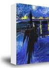
White $1
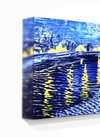
Blurside $1
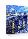
Extended $1
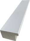
P118B $10
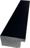
P118H $10
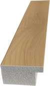
P118W $10
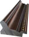
P438Z $10
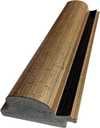
P508JH $12

P508YH $12
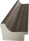
P805H $10
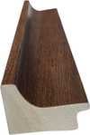
P805Z $10
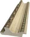
P919BZ $10

P919G $10
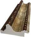
P919XJ $10
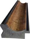
P959ZH $10
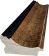
P968JZ $12

W106C $8

W218G $10
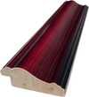
W218JH $8

W218Y $10
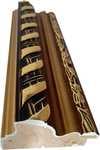
W307PJ $10

W316G $10
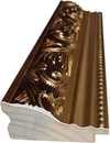
W316PJ $8
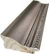
W316Y $10

W398PJ $8

W4111J $10
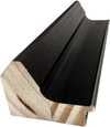
W500HY $15

W500JH $15

W692G $12

W849H $8
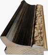
W940BG $15

W953PJ $8

H24-GOLD $30

H24-SILVER $30

H36-GOLD $45
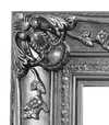
H36-SILVER $45
Framed
Moulding: . Overall size with the frame: .
3 Step three of four
Would you like anything changed in the painting?
Most people answer no. Because each painting is made by hand, our artist can also adapt it for you.
After order, ArtsDot.com team will email client for instructions and provide a mockup preview
4 Step four of four
A few finishing options
All of them are optional. The answers already selected cost nothing extra.
Who paints it?
Worldwide Delivery () in 3/4 weeks instead of standard 5 weeks. (8 November). No compromise on quality.
A nameplate, as in a museum?
Engraved Bronze Plaque Details
This elegant plaque features the artist's name and the title of the artwork, finely engraved for a timeless presentation.
It is made from bronze with a refined, elegant finish. The text is precisely laser-engraved for a sharp and permanent result. Measuring 9x2 cm, the plaque is compact yet easy to read. It's built to be durable and scratch-resistant, offering a professional, museum-quality look. Mounting is simple thanks to the included adhesive backing.
Transparent Acrylic Plaque Details
The plaque includes essential engraved details such as the artist's name, the title of the artwork, the date it was created, the type of media used-like oil on canvas or watercolor-a brief description of the piece, and a QR code that links to the complete artwork information.
It is crafted from clear acrylic, offering a sleek, modern appearance. The text is UV-engraved in black to ensure strong visual contrast. With a size of 10x15 cm, it ensures optimal readability. It comes equipped with two metal hooks for secure wall mounting. The plaque is designed to be weather-resistant, making it suitable for various environments, and it includes interactive features that work seamlessly with smartphone scanning.
Black Acrylic Plaque Details
This elegant plaque includes engraved information such as the artist's name, the title of the artwork, the date it was created, the type of media used (like oil on canvas or watercolor), a short description of the artwork, and a QR code for quick access to more information.
The plaque itself is made from refined black acrylic with a premium finish. The text is laser-engraved in white for high contrast and readability. Its size is 10x15 cm, designed to be easy to read. It comes with two metal hooks for professional mounting. The design is sleek and fits any interior style. It is also weather-resistant and durable, with built-in digital integration for mobile compatibility.
A protective varnish?
When do you need it?
✓ Check and order
Your painting, as you ordered it

Red and Orange
Reproduction Medium
Reproduction Size
-

Elite Senior Artist
More detail, finesse, and extra production time
-

Reproduction Frame
-
-
For artworks or reproductions larger than 105 cm (approximately 41 inches) on any side, the frame will be shipped as a kit, disassembled. This method ensures safe delivery and prevents damage during transport.
Professional assembly required - this is not a DIY product.
The kit must be assembled and the canvas stretched by an experienced professional framer, using wood glue (not supplied), a canvas stretching plier and clamps to hold the bars square while the glue dries. Incorrect assembly or uneven canvas tension can permanently damage the artwork and is not covered by our warranty.
 For artworks or reproductions larger than 105 cm (approximately 41 inches) on any side, the frame will be shipped as a kit, disassembled. This method ensures safe delivery and prevents damage during transport.
All solid wood bars are included, precisely cut to size.
Assembled with the screws provided, plus wood glue for the corner joints, which is not supplied and must be sourced by your framer.
Professional tools are required and not included: a canvas stretching plier (tensioner) and clamps to hold the bars square while the glue dries.
Important:
The corner joints require wood glue, the bars must be held with clamps until the glue is fully dry, and tightening the canvas on the assembled frame requires a canvas stretching plier. None of these are included in the kit. Please arrange an experienced professional framer before ordering this size.

Nameplate
-
-

Protective Varnish
Glossy Varnish (enhances colors, protects against light/moisture)
-

Customize My Artwork
Examples of what can be changed: Replace face with customer photo; Add pet (e.g., replace cat with dog); Include hidden message in background; Change background landscape or elements.
-

Urgent
Worldwide Delivery () in 3/4 weeks instead of standard 5 weeks. (8 November). No compromise on quality.
-
Express Shipping
Worldwide Delivery () in 5 weeks. (15 November).
Included
Total Price
$ 263
Glass option is only available in size under 110 CM
Included with every order
- Free Worldwide Express Shipping
- High-Quality Linen Canvas
- Full Shipping Insurance
- Customs Tax Refund Guarantee
- True Color Matching Guarantee
- 100-Day Return Policy (Defects Only)
- 100% Money-Back Guarantee
- Bulk Discount Offer


Red and Orange: A Journey Through Rothko’s Emotional Landscape
Mark Rothko, one of the towering figures of 20th-century art, didn't simply paint pictures; he crafted portals into the depths of human emotion. His work, particularly pieces like ‘Red and Orange,’ invites a profound engagement, demanding that we surrender to its quiet intensity rather than seeking immediate visual gratification. This painting, a cornerstone of his mature style, exemplifies Rothko’s revolutionary approach to color field abstraction – a deliberate move away from representational imagery towards pure feeling expressed through the luminous interaction of hues. It's a piece designed not to be ‘looked at,’ but *felt*. The genesis of ‘Red and Orange’ lies within the vibrant, yet turbulent, context of Abstract Expressionism, a movement that emerged in post-war America as artists sought new ways to grapple with the anxieties and uncertainties of the time. Rothko, however, forged his own distinct path within this broad movement. He wasn't interested in grand gestures or dramatic narratives; instead, he focused on distilling emotion into its most elemental form – color itself. His technique involved applying layers upon layers of oil paint, often mixed with turpentine to achieve a remarkable luminosity and subtle textural variations. The canvas isn’t merely a surface for pigment; it becomes an active participant in the creation of atmosphere, absorbing and reflecting light in ways that subtly shift the painting's mood throughout the day. Notice the delicate blending at the heart of the composition – a deliberate ambiguity that encourages contemplation rather than definitive interpretation. The painting’s structure is deceptively simple: two dominant rectangles of color—a rich, pulsating red on the left and an equally vibrant orange on the right—are juxtaposed within a larger field of muted tones. However, this apparent simplicity belies a complex interplay of visual and emotional forces. Rothko wasn't simply placing colors side-by-side; he was creating a dynamic tension between them, suggesting both harmony and discord. The red, often associated with passion, energy, and even danger, dominates the left portion of the canvas, while the orange—linked to warmth, optimism, and vitality—takes precedence on the right. This division isn’t rigid or absolute; rather, it creates a sense of movement and flow as the eye travels across the surface, drawn into the merging point where the two colors meet. The subtle gradations within each rectangle, achieved through meticulous layering and blending, add depth and complexity to the composition, preventing it from feeling flat or static. Rothko’s intention wasn't to depict a specific scene or object but to evoke universal human emotions – tragedy, ecstasy, doom—as he famously articulated in his writings. In ‘Red and Orange,’ the bold hues can be interpreted as symbols of these fundamental experiences. The intensity of the red might represent moments of profound sorrow or struggle, while the warmth of the orange suggests hope, joy, or a sense of transcendence. It’s important to recognize that Rothko deliberately avoided providing viewers with easy answers; he wanted them to project their own feelings and associations onto the canvas, creating a deeply personal experience. The painting becomes a mirror reflecting our own inner landscape. The legacy of ‘Red and Orange,’ and indeed of Mark Rothko's entire body of work, is undeniable. His color field paintings have profoundly influenced generations of artists, from abstract expressionists to contemporary painters exploring the expressive potential of color. Reproductions of this piece offer a remarkable opportunity to bring Rothko’s emotional intensity into any space, transforming interiors into contemplative sanctuaries. Consider how the rich hues interact with your existing décor – will they enhance the sense of warmth and tranquility, or add a touch of dramatic tension? The choice is yours, but one thing is certain: ‘Red and Orange’ remains a powerful testament to the transformative power of art.The Artistic Movement: Abstract Expressionism and Rothko's Place Within It
Rothko’s work stands as a pivotal contribution to Abstract Expressionism, a movement that fundamentally shifted the focus of American art away from representational imagery towards subjective experience and emotional expression. Emerging in the aftermath of World War II, Abstract Expressionism was characterized by its emphasis on spontaneity, gesture, and the artist's inner world. Artists like Jackson Pollock, Willem de Kooning, and Barnett Newman sought to capture the raw energy and anxieties of the post-war era through large-scale canvases and unconventional techniques. However, Rothko distinguished himself from his contemporaries with his deliberate restraint and focus on color as a primary means of communication. Unlike the gestural brushstrokes favored by Pollock or the fragmented figures of de Kooning, Rothko’s paintings are defined by their smooth, almost meditative surfaces. He rejected the notion of the artist's hand as a visible element in the work, striving instead to create an illusion of seamlessness and luminosity. This pursuit of pure color was deeply influenced by his interest in spirituality and Eastern philosophy, which he believed could provide access to profound emotional states. Rothko’s paintings aren’t about depicting something; they *are* the feeling itself – a distillation of experience rendered in pigment and light. The influence of earlier artistic traditions is also evident in Rothko's work. He drew inspiration from Byzantine icons, which are characterized by their flattened forms, luminous colors, and symbolic content. Similarly, he was fascinated by the color theories of Goethe, who proposed that colors could be understood as having specific psychological effects. Rothko’s use of complementary colors – red and orange in ‘Red and Orange,’ for example – is a deliberate attempt to create visual tension and evoke particular emotional responses. He wasn't simply arranging colors on a canvas; he was conducting an experiment in color psychology, seeking to harness the power of hue to communicate profound human experiences.The Painting: 'Red and Orange' - A Detailed Examination
‘Red and Orange’ is a prime example of Rothko’s distinctive technique and his unwavering commitment to expressing emotion through color. The painting measures approximately 39 ½ x 31 ¾ inches (100.5 x 80.6 cm), a size that allows the colors to dominate the viewer's field of vision, creating an immersive experience. As mentioned previously, the composition is built around two rectangular fields of color: a deep, saturated red on the left and a vibrant orange on the right. These rectangles are not sharply defined; rather, they bleed into one another at their edges, creating a sense of fluidity and ambiguity. The layering technique employed by Rothko is crucial to understanding the painting’s luminosity. He applied multiple thin layers of oil paint, often mixed with turpentine to achieve a translucent effect. This process allowed light to penetrate through the pigments, creating an almost ethereal glow. The texture of the canvas itself plays a significant role in this effect – it's subtly uneven and slightly rough, adding depth and complexity to the surface. Notice how the red seems to vibrate and pulsate within its rectangular frame, while the orange radiates warmth and vitality. The subtle variations in color intensity are also noteworthy. Rothko didn’t simply apply a uniform shade of red or orange; he carefully modulated the hues throughout each rectangle, creating areas of lighter and darker tones. This technique adds depth and dimension to the composition, preventing it from feeling flat or static. The blending at the point where the two colors meet is particularly intriguing – it creates a sense of ambiguity and suggests that the painting is in a state of constant flux. It’s as if the red and orange are merging and separating simultaneously, reflecting the complexities of human emotion.Emotional Resonance: Rothko's Pursuit of Universal Feeling
Rothko believed that color possessed the power to evoke profound emotional responses in viewers – tragedy, ecstasy, doom—as he himself articulated. He wasn’t interested in creating beautiful or aesthetically pleasing paintings; his primary goal was to communicate these fundamental human experiences directly and without mediation. This conviction stemmed from his belief that art could serve as a bridge between individuals, fostering empathy and understanding. The success of ‘Red and Orange,’ and indeed of Rothko's entire body of work, lies in its ability to tap into these universal emotions. The painting doesn’t require any specific interpretation or explanation; it simply *is* – a luminous field of color that invites the viewer to contemplate their own feelings and associations. It’s not uncommon for people to experience tears or a sense of profound emotion when viewing Rothko's paintings, suggesting that he has succeeded in creating works that resonate deeply with our shared human condition. Rothko’s approach was radical for its time, challenging traditional notions of art as representation and inviting viewers to engage with the work on an emotional level. His paintings are not meant to be ‘looked at’; they are meant to be *felt*. They are a testament to the transformative power of color and a profound exploration of the human psyche.Questions & Answers
Which artist is "Red and Orange" attributed to?
"Red and Orange" was created by Mark Rothko. The information on this page describes Mark Rothko's original work.
What size should I print "Red and Orange" for my room?
The recommended pairing for "Red and Orange" by Mark Rothko: a large print in a living room.
Does "Red and Orange" show strong light-dark contrasts?
"Red and Orange" by Mark Rothko shows a serene contrast between its light and dark areas.
Related Artworks


Mark Rothko
1903 - 1970, Latvia
Artist Biography
A Life Shaped by Displacement
Mark Rothko arrived in the United States as a young boy, part of a family moving from Dvinsk, Latvia, to Portland, Oregon, in 1913. His early years were marked by the heavy atmosphere of the Pale of Settlement, where his family lived amidst political unrest and the fear of pogroms. This sense of instability followed him across the ocean. The loss of his father, Jacob, shortly after their arrival in America added a layer of personal grief to the challenges of settling in a new culture. While he studied at Yale University, the pull of New York City eventually led him to leave formal academics behind for the Art Students League.
His upbringing was one of intellect and debate. His father, a pharmacist with socialist leanings, fostered a home where learning was central. This environment, combined with the hardships of the immigrant experience, created a deep sensitivity to human suffering. These early experiences of loss and the struggle to find a place in a chaotic world became the quiet foundation for everything he would later paint.
From Figures to Fields of Color
In his early years in New York, Rothko focused on realism, painting portraits and urban scenes with careful attention to detail. As the 1940s brought the horrors of World War II, his work began to shift. He moved away from recognizable objects, looking instead toward Surrealism and mythology to find a way to express universal human emotions. During this period, his canvases featured biomorphic shapes that seemed to float between being figures and being abstract forms.
By the late 1940s, he had developed the style that would define his career. He stripped away all imagery, leaving only large-scale canvases with rectangular blocks of color. These forms appeared to hover and resonate against one another. He used thin washes of paint to create subtle changes in tone and texture, making the edges of his shapes appear blurred. He often avoided titles, using simple numbers like No. 1 or No. 6 so that viewers could face the work without any preconceived ideas.
The Search for Emotional Truth
Rothko’s mature period is associated with Color Field painting. His goal was to use color to speak directly to the human soul, bypassing the intellect to reach deep emotions such as tragedy, ecstasy, and despair. He meticulously layered paint to create a sense of depth and light that seemed to come from within the canvas itself. These large works were intended to envelop the viewer in an immersive experience.
His commitment to this emotional honesty led to several significant projects:
- The Seagram Murals, which he originally intended for a New York restaurant but later donated to the Tate Gallery after feeling the setting would compromise the work.
- The Rothko Chapel in Houston, Texas, a non-denominational space containing fourteen of his paintings in varying shades of black, designed as a place for quiet reflection.
- The Harvard Mural series, which were donated to a dining room at the Holyoke Center.
Despite his immense influence on Abstract Expressionism and the later Minimalist movement, Rothko struggled with depression throughout his life. He died by suicide in 1970. His work remains a central part of modern art history, found in permanent collections such as the Museum of Modern Art in New York and the Tate Modern in London.


Related Articles

The Sublimity of Color: Exploring the Emotional Landscapes of Mark Rothko's Abstract Expressionism
Explore the profound emotional depth of Mark Rothko's abstract expressionism. Discover the history, techniques & lasting impact of this pivotal Color Field painter. Expert insights for collectors and art enthusiasts.

Mastering Emotion: The 25 Most Iconic Mark Rothko Artworks
Explore 25 iconic Mark Rothko masterpieces of Color Field painting. Discover museum-quality art on ArtsDot.com.

Beyond Representation: Exploring the Emotional Landscape of Abstract Expressionism
Explore the profound emotional world of Abstract Expressionism with ArtsDot. Discover key artists like Pollock & Rothko, learn about collecting, and find museum-quality reproductions to inspire your space.