

 Preview
 Send
Send Share
Share
 Details
 Guide
Guide

 Download
 Similars
 X-Ray
X-Ray Diaporama
 Q&A
Q&A Stats
StatsNo.1 (Untitled)


 Read More
The artwork displayed on this page is protected by copyright law, which means we cannot legally create or sell an identical reproduction. This protection is enforced under international agreements such as the Berne Convention and by national laws, including those outlined by the U.S. Copyright Law - Title 17.
This method fully complies with copyright regulations because it does not involve copying or duplicating the protected artwork. Instead, it is a creative reinterpretation - a new painting that is influenced by the original but not identical to it.
Giclée / Art Print
Museum-quality giclée or canvas print with fast production and flexible finish options. ( Buy Hand Made Painting Switch to Digital Image)

P118B $10
P118H $10
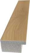
P118W $10
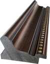
P438Z $10
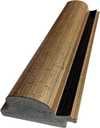
P508JH $12

P508YH $12
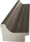
P805H $10
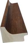
P805Z $10
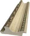
P919BZ $10
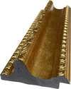
P919G $10
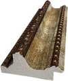
P919XJ $10
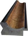
P959ZH $10
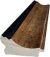
P968JZ $12

W106C $8

W218G $10

W218JH $8

W218Y $10
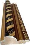
W307PJ $10

W316G $10
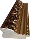
W316PJ $8
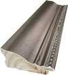
W316Y $10

W398PJ $8
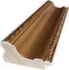
W4111J $10
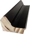
W500HY $15

W500JH $15
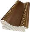
W692G $12

W849H $8
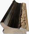
W940BG $15
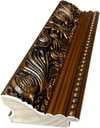
W953PJ $8


Pick from our preset sizes that match the artwork's original proportions.

Type the width and the height you need, to fit your frame or your wall. A print can only be cut, never made bigger than the picture, so a size with a different shape loses a part of the image. We send you a digital mockup to approve before we print anything. The picture shown on this page does not show the real cut — only the mockup does.
Worldwide Delivery () in 2 weeks instead of standard 4/5 weeks. (10 November)

Free Worldwide Express Shipping

High-Quality Linen Canvas

Full Shipping Insurance

Customs Tax Refund Guarantee

True Color Matching Guarantee

100-Day Return Policy (Defects Only)

100% Money-Back Guarantee

Bulk Discount Offer
 Glass option is only available in size under 110 CM

No.1 (Untitled)
Giclée / Art Print
Reproduction Size
-


Total Price
$ 63
Mark Rothko’s ‘No.1 (Untitled)’ – A Meditation on Color and Loss
Mark Rothko's 1948 canvas, ‘No.1 (Untitled)’, is more than just a painting; it’s an immersion into the profound emotional landscape of one of 20th-century art’s most influential figures. This color field masterpiece, dominated by a luminous yellow expanse punctuated with deliberate blue accents and scattered red dots, immediately draws the viewer into a space of quiet contemplation. The sheer scale of the work – unknown but undoubtedly commanding – amplifies this effect, enveloping the observer in its chromatic depths.
- The Rothko Aesthetic: ‘No.1 (Untitled)’ exemplifies Rothko’s signature style, developed during his exploration of color field painting. Rejecting traditional representational forms, he sought to evoke primal human emotions through the layering and blending of saturated hues.
- Technique – Layers of Resonance: The application of paint is crucial to understanding this piece. Rothko employed a technique of applying thin washes of color, building up layers upon layers until the surface achieved an almost translucent quality. This process created a sense of depth and vibration within the colors themselves, inviting the viewer to lose themselves in their shifting relationships.
Historical Context: The Shadow of Displacement
Created in 1948, ‘No.1 (Untitled)’ emerged from a period of immense upheaval – the aftermath of World War II and the burgeoning anxieties of the Cold War. However, to fully appreciate Rothko’s work, it's essential to consider his personal history. Born Markus Yakovlevich Rothkowitz in Daugavpils, Latvia, in 1903, he carried within him a deep-seated sense of displacement stemming from his family’s experiences during the turbulent early 20th century. The pogroms and political unrest that plagued Eastern Europe instilled in him a profound sensitivity to human suffering – a theme that would become a recurring motif in his art. His immigration to Portland, Oregon, in 1913, marked not just a geographical shift but a cultural collision, further fueling his exploration of existential themes related to loss, trauma, and the search for meaning.
Symbolism: Blue, Yellow, and the Scattered Remnants
The deliberate use of color is paramount. The dominant yellow represents warmth, hope, and perhaps even a fragile optimism – qualities that Rothko often sought to convey despite his own struggles with depression. The strategically placed blue accents introduce an element of melancholy and introspection, acting as counterpoints to the yellow’s vibrancy. The black spots, seemingly random, are not accidental; they represent fragments of memory, moments of darkness, or perhaps even the scars of trauma – a visual echo of Rothko's own life experiences. The scattered red dots add another layer of complexity, suggesting fleeting emotions, sparks of passion, or the enduring presence of human connection amidst despair.
Emotional Impact and Collecting
'No.1 (Untitled)' is not merely a decorative piece; it’s an invitation to engage in a deeply personal dialogue with art. Rothko's work possesses a remarkable ability to evoke powerful emotions – sorrow, hope, awe, and ultimately, a sense of shared humanity. A hand-painted reproduction of this artwork offers collectors the opportunity to bring this profound experience into their homes or offices, transforming spaces into contemplative sanctuaries. Its scale and color palette make it particularly well-suited for large rooms, acting as a focal point that commands attention and encourages quiet reflection. This piece is an investment not just in art, but in an enduring meditation on the human condition.
Questions & Answers
Where should a reproduction of "No.1 (Untitled)" by Mark Rothko be hung?
The square format of "No.1 (Untitled)" by Mark Rothko is recommended for a living room. Format and space together guide the placement of a reproduction.
Are the colors of "No.1 (Untitled)" by Mark Rothko vivid or muted?
The colors of "No.1 (Untitled)" by Mark Rothko show a balanced soft saturation with a vivid intensity.
What does "No.1 (Untitled)" share with the rest of Mark Rothko's output?
Within Mark Rothko's output, "No.1 (Untitled)" sits in the Color Field style, alongside the themes of existential themes, trauma, jewish diaspora, suffering, color field exploration, rothko’s core style, large-scale emotional impact.


Artist Biography
The Early Life of Mark Rothko
Mark Rothko was born Markus Yakovlevich Rothkowitz in 1903. He was born in Dvinsk, Russia, in a place now known as Daugavpils, Latvia. His family lived within the Pale of Settlement, a region marked by political unrest and the constant shadow of pogroms. This atmosphere of instability followed the family when they emigrated to the United States in 1913. After passing through Ellis Island, they settled in Portland, Oregon.
His father, Jacob, worked as a pharmacist. He was an intellectual man with socialist leanings who fostered a home centered on learning and debate. This environment of deep thought was interrupted by a sudden loss. Shortly after the family arrived in America, Jacob died from colon cancer. This early experience of grief and the struggle of the immigrant experience became a quiet foundation for the man he would become.
Artistic Training and Early Years in New York
The move to New York City in 1923 brought a shift in focus. After time spent at Yale University, the pull of the city led him away from formal academics. He sought out the Art Students League to refine his practice. During these early years, his brush was occupied with the tangible. He painted portraits and urban scenes, applying a careful attention to detail to the faces of people and the grit of city streets. The work was grounded in realism, capturing the physical world before the shift toward abstraction took hold.
By 1940, he made the decision to change his name to Mark Rothko. This was a period of transition, moving away from the structured representation of his youth. The focus began to drift from the recognizable objects of the city toward something less defined. He was searching for a way to express the weight of human experience without relying on the literal shapes of the world around him.
Evolution Toward Abstract Expressionism
As the 1940s progressed, the careful realism of his earlier years began to recede. The focus shifted away from the recognizable details of urban scenes and portraits. Instead, he turned toward the language of Surrealism and mythology. He used these themes to find a way to express the weight of human emotion. The paintings from this period often featured biomorphic shapes. These forms seemed to float, caught in a state of being neither fully figures nor entirely abstract.
This period marked his association with the American abstract expressionism movement. He moved away from the structured world of objects to explore something more internal. The canvases became less about what a thing looked like and more about the feeling it carried. He was searching for a way to communicate the complexities of the human condition through shape and myth.
- Mother and Child (1934)
- The Pugilist
- The High Priest (1945)
The Development of Color Field Painting
By the late 1940s, the work began to change. He moved away from the shapes of figures and the stories of mythology, stripping away recognizable imagery to find something more direct. The canvases grew in scale, occupied by large, rectangular blocks of color that seemed to hover. These forms did not sit on the surface but appeared to exist within a shallow, breathing space. This shift marked the beginning of his mature period, a time closely linked to the emergence of Color Field painting.
The application of paint was a slow, layered process. He used thin washes of pigment to build up the surface, creating subtle shifts in tone and texture. These layers allowed light to appear as if it were coming from within the canvas itself. The edges of the colored shapes were never sharp; instead, they were blurred and soft, making the boundaries between different hues feel permeable. This method turned the canvas into a place of quiet, heavy presence.
- No. 1
- Three
- No. 3/No. 13
- No. 10 (Brown Black Sienna on Dark Wine)
- Magenta, Black, Green on Orange
- White over Red
Technique and the Language of Color
The work relies on a specific, quiet method of layering. He applied thin washes of oil paint, building up the surface through meticulous, translucent layers. This process creates a velvety texture that seems to hold light within the pigment rather than just reflecting it from the surface. Instead of sharp lines, the edges of his rectangular forms are blurred, allowing colors to bleed and hover against one another. These large blocks of color are meant to create a sense of depth, making the canvas appear to breathe.
He stripped away titles that might suggest a specific subject or narrative. Many canvases carry only simple numbers, such as No. 1 or No. 6, leaving the viewer to face the color without any preconceived ideas. This choice forces a direct encounter with the paint. He used these luminous fields to reach for specific, heavy human emotions: tragedy, ecstasy, and despair. The scale of the works is intended to envelop the person standing before them, turning the act of looking into a silent, immersive experience.
- No. 10 (Brown Black Sienna on Dark Wine)
- No. 37 or No. 19
- White over Red
Major Commissions and Mural Projects
Rothko’s work often moved beyond the individual canvas to occupy entire rooms. He spent significant time on the Seagram murals, a series of paintings intended for a New York restaurant. He eventually decided the setting was not right for the work and donated them to the Tate Gallery in London. His interest in how color occupies a space also led to the Harvard Mural series, which was created for a dining room at the Holyoke Center.
In Houston, Texas, he left behind fourteen paintings for the Rothko Chapel. This non-denominational space contains works in varying shades of black. The paintings are arranged to sit within the architecture of the chapel, creating a specific environment for quiet reflection. The scale of these works is meant to meet the viewer where they stand, filling the peripheral vision with color.
Later Years and Tragic Death
The weight of his own work often seemed to press heavily upon him. Throughout his life, Rothko struggled with depression, a persistent shadow that accompanied his search for emotional truth. He lived a modest existence, often retreating into the quiet spaces required for his large-scale canvases. The intensity of his focus on the human condition—tragedy, ecstasy, and despair—was not merely a subject for the brush, but a reality he carried within himself.
By the end of his life, the struggle became too much to bear. On February 25, 1970, Rothko died by suicide in his studio. He was 66 years old. His death left behind a vast collection of works, including many that remained unfinished or were part of the large estate of paintings that his family and executors would later navigate through complex legal disputes.
The Lasting Legacy of His Art
The weight of his presence remains in the way his canvases occupy a room. He left behind an estate containing 798 paintings, a vast collection that continues to anchor modern art history. His shift toward large, luminous rectangles of color helped define the Abstract Expressionism movement and later influenced the Minimalist movement. These works do not rely on recognizable shapes to hold a viewer's attention; instead, they rely on the slow, rhythmic breathing of color to create a sense of depth.
His influence is felt in the way subsequent generations approached the canvas as a space for psychological and spiritual exploration. By stripping away narrative clutter, he changed how people interact with the physical reality of paint. His paintings are recognized as some of the most significant works of 20th-century art, often found in the permanent collections of major institutions like the Museum of Modern Art in New York and the Tate Modern in London. The scale of his work often swallows the peripheral vision, forcing a quiet, meditative stillness.
- No. 6 (Violet, Green and Red)
- Orange, Red, Yellow (1961)
- N.10 (1958)
Where to See His Works Today
To stand before his canvases is to experience the weight of color in a quiet room. In New York, the Museum of Modern Art holds several of his works. Across the Atlantic, the Tate Modern in London offers a similar space to sit with his large-scale forms. In Washington, D.C., the National Gallery of Art keeps a collection of his paintings, where the light hits the layered pigments in a way that reveals the depth he sought through thin washes of oil.
There is a specific stillness found in the Rothko Chapel in Houston, Texas. It is a non-denominational space containing fourteen of his paintings in varying shades of black. The architecture of the building, an octagon inscribed in a Greek cross, was influenced by the artist himself. It remains a place for quiet reflection, where the scale of the works is meant to envelop the person standing before them.
In Daugavpils, Latvia, the Rothko Museum is housed within the historic artillery arsenal building of the Daugavpils fortress. This institution is the only place in Europe that permanently displays original paintings on loan from his estate. Visitors can find his work in the Rothko Room, a space designed to hold these specific canvases in a setting that honors his origins.
- No. 1 (undated)
- Three (undated)
- No. 3/No. 13 (undated)
- No. 10 (undated)
- Magenta, Black, Green on Orange (undated)
- White over Red (undated)

Mark Rothko
1903 - 1970 , Latvia
Quick Facts
- Artistic Movement Or Style:
- Color Field painting
- Abstract Expressionism
- Artists Or Movements Influenced By This Artist: ['Minimalist movement']
- Full Name: Mark Rothko
- Nationality: American
- Notable Artworks:
- Violet, Black, Orange, Yellow on White and Red
- White Center
- Earth ^ Green
- Orange and yellow
- Green and Tangerine on Red
- Four Darks in Red
- Black on Maroon
- Untitled Mural for End Wall
- Ochre and Red on Red
- Blue and gray
- Place Of Birth: Daugavpils, Latvia
- Date Of Birth: 1903
- Date Of Death: 1970
Related Articles

Slate Blue Masterpieces: 10 Iconic Paintings & Timeless Home Decor Ideas
Immerse yourself in the captivating world of slate blue! Explore 10 iconic paintings by Monet, Van Gogh & Renoir. Discover their stories, techniques & find museum-quality art reproductions for your home at .

Mastering Abstraction: The 25 Most Iconic Works by Wassily Kandinsky
Explore 25 iconic Kandinsky masterpieces and the birth of abstraction. Discover the full collection online at ArtsDot.com.

Color & Emotion: The Top 25 Masterpieces by Mark Rothko
Explore 25 iconic Mark Rothko masterpieces and the soul of Color Field art. Discover the full collection online at ArtsDot.com.

The Sublimity of Color: Exploring the Emotional Landscapes of Mark Rothko's Abstract Expressionism
Explore the profound emotional depth of Mark Rothko's abstract expressionism. Discover the history, techniques & lasting impact of this pivotal Color Field painter. Expert insights for collectors and art enthusiasts.

Abstract Expressionism's 10 Defining Masterpieces |
Explore 10 defining Abstract Expressionism masterpieces by Pollock, Rothko & de Kooning. Discover the stories behind these iconic paintings and find museum-quality art reproductions to elevate your home decor on .


