

 Preview
 Send
Send Share
Share
 Details
 Guide
Guide

 Download
 Similars
 X-Ray
X-Ray Diaporama
 Q&A
Q&A Stats
StatsDisaster Retrospective Series


 Read More
The artwork displayed on this page is protected by copyright law, which means we cannot legally create or sell an identical reproduction. This protection is enforced under international agreements such as the Berne Convention and by national laws, including those outlined by the U.S. Copyright Law - Title 17.
This method fully complies with copyright regulations because it does not involve copying or duplicating the protected artwork. Instead, it is a creative reinterpretation - a new painting that is influenced by the original but not identical to it.
Giclée / Art Print
Museum-quality giclée or canvas print with fast production and flexible finish options. ( Buy Hand Made Painting Switch to Digital Image)
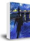
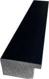
P118B $10
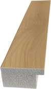
P118H $10
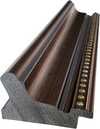
P118W $10
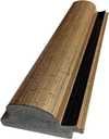
P438Z $10
P508JH $12
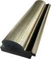
P508YH $12
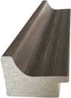
P805H $10
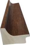
P805Z $10
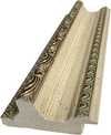
P919BZ $10
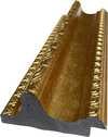
P919G $10
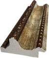
P919XJ $10
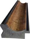
P959ZH $10
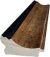
P968JZ $12

W106C $8
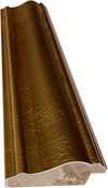
W218G $10
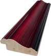
W218JH $8
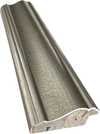
W218Y $10
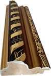
W307PJ $10
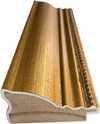
W316G $10
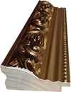
W316PJ $8
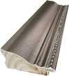
W316Y $10
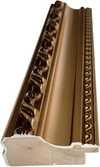
W398PJ $8
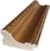
W4111J $10
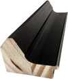
W500HY $15
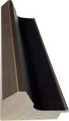
W500JH $15
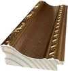
W692G $12

W849H $8
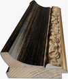
W940BG $15
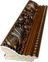
W953PJ $8
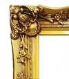
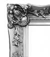
Pick from our preset sizes that match the artwork's original proportions.

Type the width and the height you need, to fit your frame or your wall. A print can only be cut, never made bigger than the picture, so a size with a different shape loses a part of the image. We send you a digital mockup to approve before we print anything. The picture shown on this page does not show the real cut — only the mockup does.
Worldwide Delivery () in 2 weeks instead of standard 4/5 weeks. (7 November)

Free Worldwide Express Shipping

High-Quality Linen Canvas

Full Shipping Insurance

Customs Tax Refund Guarantee

True Color Matching Guarantee

100-Day Return Policy (Defects Only)

100% Money-Back Guarantee

Bulk Discount Offer
 Glass option is only available in size under 110 CM

Disaster Retrospective Series
Giclée / Art Print
Reproduction Size
-


Total Price
$ 63
The Fragility of Modernity: A Study in Monochrome
In the mid-1960s, as the world stood on the precipice of unprecedented technological advancement and profound geopolitical tension, Andy Warhol captured a visceral fragment of the human condition. The Disaster Retrospective Series is not merely a collection of images; it is a haunting confrontation with the suddenness of catastrophe. Through his lens, the chaotic aftermath of car crashes becomes a meditative study on the precariousness of life. There is a striking, almost rhythmic quality to the destruction depicted—a stark realism that refuses to look away from the twisted metal and shattered glass. For the discerning collector or interior designer, this series offers a profound depth, providing a focal point that commands attention through its raw, unvarnified truth.
The visual language of the series is defined by Warhol’s masterful use of monochrome. By stripping away the distractions of color, he forces the viewer to engage directly with form, texture, and the stark interplay of light and shadow. The black and white palette amplifies the emotional gravity of the scene, transforming a news-worthy accident into an eternal, almost sculptural moment. This reductionist approach allows the heavy, dark tones of the damaged vehicles and the frantic movement of the onlookers to resonate with a quiet, somber intensity. It is a technique that elevates the mundane tragedy into something much more significant—a universal symbol of the sudden rupture in the continuity of daily life.
Technique and the Pulse of Pop Art
At the heart of this series lies Warhol’s revolutionary use of the silkscreen printing technique. This method, which he perfected through his background in commercial illustration, allows for a remarkable tonal consistency that is essential to the series' impact. By transferring images onto acetate sheets and applying ink through meticulous stencils, Warhol achieved a flattened, graphic quality that bridges the gap between fine art and mass media. This mechanical reproduction process serves a deeper symbolic purpose: it mirrors the way we consume tragedy in the modern age—through repetitive, detached, and often desensitized media imagery. The repetition inherent in his process echoes the relentless cycle of news and disaster that defines our collective consciousness.
To possess a high-quality reproduction of this series is to invite a piece of art history into one's space that speaks to both strength and vulnerability. For those curating sophisticated environments, these works provide an intellectual weight that complements modern, minimalist, or industrial aesthetics. The series does not merely decorate a wall; it provokes thought, acting as a window into the anxieties of the Cold War era while remaining strikingly relevant in our own age of instant information. It is an invitation to contemplate the beautiful, terrifying tension between human progress and the inevitable chaos that can dismantle it in a single, jarring moment.
Questions & Answers
What does "Disaster Retrospective Series" share with the rest of Andy Warhol's output?
Within Andy Warhol's output, "Disaster Retrospective Series" sits in the Pop Art style, alongside the themes of commercial illustration, pop culture imagery, repetition & warhol style, celebrity influence, american visual language.
How strong are the colors of "Disaster Retrospective Series"?
The color of "Disaster Retrospective Series" is muted in saturation and monochromatic in intensity.
What kind of piece is "Disaster Retrospective Series"?
"Disaster Retrospective Series" by Andy Warhol is classified as wall art. The category describes the kind of artwork the original is.


Artist Biography
The Industrial Roots of a Visual Language
Born Andrew Warhola Jr. in 1928 within the industrial landscape of Pittsburgh, Pennsylvania, the man who would become Andy Warhol spent much of his early years shaped by confinement and quiet observation. A childhood bout with Sydenham's chorea, or St. Vitus’ Dance, kept him indoors for long stretches. During these periods, he turned to the imagery provided by his mother: comic books and movie magazines. These were the first seeds of a visual vocabulary that would later embrace the mass-produced. He eventually moved toward formal training at the Carnegie Institute of Technology, earning a degree in Pictorial Design in 1949.
His arrival in New York City marked a transition from the private world of sketches to the public sphere of commercial illustration. Working for names such as Tiffany & Co., Vogue, and Harper's Bazaar, he mastered the precision required by advertising. This period of professional service instilled in him an understanding of how images are manufactured and distributed. He learned the mechanics of the brand before he ever attempted to deconstruct it.
The Factory and the Mechanics of Fame
By the 1960s, his focus shifted from illustrating products to treating the products themselves as subjects. Through the adoption of the silkscreen printing process, he introduced a method that mirrored the repetitive nature of consumer culture. This technique allowed for a detachment from the hand of the artist, favoring a flattened, mechanical aesthetic. His studio, known as The Factory, became a central point for a specific New York social circle. It was a space where musicians, poets, and film personalities gathered, often blurring the lines between their private lives and their public personas.
His work during these years explored several distinct themes:
- The commodification of everyday objects, such as his 1962 depictions of Campbell’s Soup Cans.
- The construction of celebrity through portraits of figures like Marilyn Monroe and Elizabeth Taylor.
- The darker side of the American experience, including his series on car crashes and electric chairs.
This era was not without physical consequence. In 1968, a radical feminist writer named Valerie Solanas entered his Manhattan studio and shot him, leaving him with lasting injuries. This event altered the trajectory of his studio life, moving it toward a more business-oriented enterprise.
Cinema and the Expanded Image
Beyond the canvas, Warhol was an active filmmaker who produced over 600 films between 1963 and 1968. Many of these were experimental or static in nature. He utilized long, unblinking takes in works like Sleep and Empire to challenge how an audience consumes moving images. His filmic output often featured his "superstars," a group of personalities from the Factory scene who became part of the cultural fabric of the time.
His influence reached into the music industry through his management of The Velvet Underground. He even designed the famous banana cover for their debut album, further merging the boundaries between fine art and popular media. By the time of his death in 1987, he had moved through various media—photography, publishing, and television—leaving behind a body of work that interrogated the very nature of what it means to be seen in a media-saturated age.

Andy Warhol
1928 - 1987 , United States of America
Quick Facts
- Artistic Movement Or Style: Pop Art
- Artists Or Movements Influenced By This Artist:
- Conceptualism
- Performance Art
- Full Name: Andrew Warhola Jr.
- Notable Artworks:
- Campbell's Soup Cans
- Marilyn Diptych
- Coca-Cola (3)
- Gold Marilyn
- Brillo Box sculptures
- Place Of Birth: Pittsburgh, United States of America
- Date Of Birth: 1928
- Date Of Death: 1987
Related Articles

Andy Warhol: Deconstructing Pop Culture & Redefining Artistic Expression
Explore the revolutionary art of Andy Warhol & the Pop Art movement. Discover his iconic techniques, cultural impact, and investment potential. A guide for discerning collectors.

Pop Art Icons: 10 Masterpieces That Revolutionized Modern Decor |
Explore 10 defining Pop Art masterpieces – from Warhol’s iconic Marilyn to Lichtenstein's bold dots. Discover the stories behind these revolutionary artworks & find museum-quality reproductions for your home at .

25 Iconic Andy Warhol Masterpieces That Defined Pop Art
Explore 25 iconic Andy Warhol masterpieces of Pop Art. Discover the stories behind these legends on ArtsDot.com.

Giclée Prints: Archival Quality & Aesthetic Nuances for the Discerning Collector
Explore the world of giclée prints with ArtsDot. Learn about archival quality, aesthetic nuances & investment potential. Expert guidance for discerning art collectors seeking museum-quality reproductions and lasting value.

The Enduring Legacy of Fine Art Prints: Technique, History & Aesthetic Impact
Explore the rich history & techniques of fine art prints. Discover investment potential, assess authenticity, and learn how to preserve your collection with expert guidance. Trusted insights for discerning collectors.


