Introduction To step into a gallery is to enter a conversation between light and pigment, where every stroke of the brush carries the weight of intention. Among the vast spectrum of human creativity, there exists a rare and captivating category of ma...
To enter a gallery is to step into a silent conversation between light and pigment, where every intentional stroke carries weight. We often seek art that commands attention, yet the most enduring works are frequently those that refuse to shout. There exists a rare category of creation defined not by overwhelming saturation, but by a rhythmic equilibrium—a state of balanced color intensity where vibrant hues and subtle tones coexist without exhausting the eye. This balance is a sanctuary of stability in an increasingly chaotic visual landscape, offering a sense of permanence that anchors a room and invites a long, contemplative gaze.
True harmony occurs when no single hue dominates to the point of fatigue, yet no shade feels lost to the shadows. It is a sophisticated feat of mastery where brilliance breathes rather than erupts. When we encounter such works, we are not merely looking at pigment on canvas; we are experiencing a carefully orchestrated tension between color and restraint. This equilibrium provides a grounding experience, allowing the viewer to find peace in the deliberate arrangement of light and shade.
The Language of the Wheel: Navigating Complementary and Analogous Harmonies
Complementary colors are pairs of colors which, when combined or mixed, cancel each other out (lose chroma) by producing a grayscale color like white or black. When two highly chromatic complementary colors are placed next to each other, they create ...
Understanding how colors interact requires a look at the fundamental relationships established by the color wheel. Artists have long utilized these geometric connections to evoke specific moods. A complementary scheme, utilizing opposites like red and green or blue and orange, creates a striking visual tension and a sense of energy through high contrast. When placed side-by-side, these opposing forces can create a subtle vibration that enhances the vitality of the composition.
Conversely, the analogous approach offers a more stable, peaceful experience. By selecting colors that sit adjacent to one another—such as azure, indigo, and violet—an artist achieves a sense of continuity and comfort. This method relies on a consistent temperature, often leaning into purely warm or cool palettes, to create a unified, almost monochromatic atmosphere. For those seeking variety without the pressure of intense conflict, the split-complementary technique provides a middle ground, maintaining visual interest through a more nuanced distribution of contrast.
The Anchor of Neutrals: How Value and Grayscale Provide Context
While hue captures our initial attention, it is value—the lightness or darkness of a color—that truly sculpturalizes a composition. The strategic use of grayscale, blacks, and whites provides the essential context that allows strong colors to emerge. A colorless area or a passage of gray can act as a visual palate cleanser, preventing the eye from becoming overwhelmed by saturation. In many ways, the presence of neutral tones is more vital to beauty than the presence of bright pigments; they provide the stage upon which the drama of color unfolds.
This principle extends to the concept of weight within a space. Darker tones can ground a composition, providing a sense of structural stability, while lighter shades evoke airiness and expansion. By manipulating these values, an artist can guide the eye through a painting, using light to sculpt form and shadow to create depth. This interplay of light and dark, often referred to as chiaroscuro, ensures that even the most colorful works possess a sense of three-dimensional reality and physical presence.
Structured Serenity: Finding Balance in Geometric Abstraction
A Vision of Geometric Equilibrium Chromatic Symmetry: A Singular Meditative Study in Geometric Harmony and Rhythmic Form is a breathtaking exploration of precision, color, and rhythm. This work presents a sophisticated 3x3 grid of nine distinct modul...
In the realm of modern abstraction, color harmony finds a new expression through precision and rhythm. Works such as Élise Muller’sChromatic Symmetry: A Singular Meditative Study in Geometric Harmony and Rhythmic Form demonstrate how a disciplined structure can facilitate deep calm. Through a sophisticated 3x3 grid, Muller utilizes high-saturation primaries alongside soft pastels to create a dance of controlled repetition. Here, the mechanical stability of the geometric form balances the playful energy of the colors, proving that precision does not preclude emotion.
This sense of equilibrium is echoed in the works of Laurent Fabre, whose Monolithic Earth Tones explores a different kind of stability. By utilizing an interlocking grid of rectangular planes and a palette of deep umber, burnt sienna, and warm ochre, Fabre achieves an asymmetrical balance that feels monumental. These geometric explorations remind us that harmony can be found in the tension between heavy, grounded blocks of color and delicate, fine-lined accents, offering a structured way to experience visual rest.
Luminous Transitions: The Mastery of Sfumato and Tonal Glazes
A Study in Quiet Elegance: Whistler’s Exploration of Color Harmony James Abbott McNeill Whistler's “Harmony in Flesh Colour and Red,” completed in 1869, stands as a cornerstone of Aestheticism—a movement dedicated to elevating art beyond mere narrati...
The most profound transitions in art often occur where the boundaries of color are intentionally blurred. Leonardo da Vinci’s Mona Lisa remains the definitive example of this mastery through the use of sfumato. By applying layers of translucent, smoky glazes, Da Vinci dissolved harsh outlines into a seamless atmospheric haze. There are no jarring pigments here; instead, the palette relies on muted, earthy tones that allow light to appear as if it is breathing through the very skin of the subject.
This pursuit of tonal harmony was also a cornerstone of the Aestheticism movement. James Abbott McNeill Whistler approached color with a similar devotion to subtlety. In Harmony in Flesh Colour and Red, he eschewed dramatic lighting in favor of a tonal palette that prioritizes color harmony above all else. Through meticulous layering of thin glazes, he captured the nuances of light and shadow with a precision that feels both intimate and sophisticated. Similarly, his Colour Scheme for the Dining-Room of Aubrey House utilizes gradations of yellow and orange to create a warm, inviting luminescence, proving that color can exist for its own sake, divorced from any didactic purpose.
Designing with Intention: Translating Artistry into Interior Harmony
The Foundations of Chromatic Equilibrium: Understanding Color Theory & Psychology Harmonizing Spaces: A Guide to Utilizing Color Palettes in Interior Design Elevate your interior design projects with our expert guide to color palettes! Learn the psyc...
For the modern collector, selecting art is an opportunity to curate the very atmosphere of a home. A balanced painting does more than occupy a wall; it anchors a room, providing a focal point that invites contemplation. When integrating works into a living space, one might look to the soft minimalism of Laurent Roche, whose practice combines warm tones with clean spatial balance to create a luminous depth. Such pieces bridge the gap between historical mastery and the complexities of modern life, offering a sense of tranquility in an era of digital saturation.
Whether you are drawn to the sculptural harmony of Estanislao Contreras Colima or the textured, non-representational explorations of Christian Noiret, the goal remains the same: to find pieces that resonate with your personal aesthetic and provide a sense of permanence. At ArtsDot.com, we specialize in bringing these moments of equilibrium to life through hand-painted oil reproductions and museum-quality prints. From custom commissions that transform personal memories into masterpieces to large-scale murals for architectural spaces, our mission is to help you discover art that brings a sense of soulful, lasting harmony to your world.
Elevate your collection with expert insights into color theory. Discover how the masterful interplay of warm and cool hues creates emotional resonance and spatial harmony, guiding discerning collectors in selecting museum-quality masterpieces for sophisticated interior curation.
Elevate hospitality interiors with expert guidance on using masterpiece art to achieve chromatic equilibrium. Discover how hand-painted reproductions can balance color, create focal points, and define luxury through the timeless principles of fine art history.



 Mastering Harmony: 10 Iconic Artworks with Perfect Color Balance
 Complementary colors
 Chromatic Symmetry: A Singular Meditative Study in Geometric Harmony and Rhythmic Form
 Harmony in Flesh Colour and Red
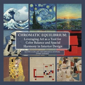 Chromatic Equilibrium: Leveraging Art as a Tool for Color Balance and Spatial Harmony in Interior Design


