- ホーム

- 油絵の複製画
- ヨーゼフ・アルベルス
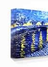
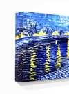
- Homage to the Square

 シェアする
シェアするHomage to the Square


P118B $10
P118H $10
P118W $10
P438Z $10
P508JH $12

P508YH $12
P805H $10
P805Z $10
P919BZ $10
P919G $10
P919XJ $10
P959ZH $10
P968JZ $12
W106C $8
W218G $10
W218JH $8
W218Y $10
W307PJ $10
W316G $10
W316PJ $8
W316Y $10
W398PJ $8
W4111J $10
W500HY $15
W500JH $15
W692G $12
W849H $8
W940BG $15
W953PJ $8
 続きを読む
続きを読む作品のオリジナル比率に合わせた、当店の規定サイズからお選びください。
特定のフレームやスペースに合わせて、ご希望のサイズをご入力いただけます。選択されたサイズが元の画像の比率と異なる場合、アートワークをトリミングするか、手描きで要素を追加して絵画を拡張いたします。デジタルモックアップ を制作し、制作開始前にご確認(承認)をいただきます。
画面上のプレビューは、実際のトリミングや拡張を正確に反映しているものではありません。最終的な構図は、モックアップによってのみ正確にご確認いただけます。
カスタムサイズもご利用いただけますが、元の比率を維持するためには、あらかじめ用意されたリストからサイズを選択することをお勧めいたします。
ご注文後、ArtsDot.com チームより詳細な指示をお送りするとともに、仕上がりイメージ(モックアップ)をご提供いたします。


 ガラスオプションは、110cm未満のサイズでのみご利用いただけます。

Homage to the Square
複製技法
複製画のサイズ
-


合計金額
-
作品解説
Homage to the Square: A Dialogue Between Color and Form
Josef Albers’s “Homage to the Square” isn't merely a painting; it’s an invitation—a carefully orchestrated conversation between two fundamental elements of visual art: color and geometric form. Created in 1967, this seminal work embodies the core tenets of Minimalism and Color Field painting, cementing Albers’s position as one of the most influential artists of the mid-20th century. The image itself presents a deceptively simple composition—a square dominated by a rich crimson hue, punctuated by a smaller yellow square positioned in its upper left corner. Yet, within this apparent austerity lies profound intellectual depth and aesthetic beauty.The Bauhaus Legacy and Material Exploration
Albers’s artistic genesis wasn't nurtured in the gilded halls of academic institutions but rather molded by the pragmatic realities of his father’s carpentry business in Bottrop, Germany. This formative experience instilled a meticulous appreciation for materials—understanding their inherent qualities and how they translate into visual expression. As evidenced by his early printmaking endeavors and stained glass commissions, Albers possessed an innate understanding of craftsmanship and technique. His time at the Bauhaus school solidified these principles, fostering a dedication to experimentation and pushing boundaries within artistic practice. This foundational knowledge informs every aspect of “Homage to the Square,” particularly its textured surface—a deliberate choice designed to heighten the viewer’s sensory experience.Color Theory in Practice: Albers' Method
Albers’s approach to color was revolutionary, rooted in his meticulous study of optical perception and championed by Color Field painting. He famously described his method as “seeing is believing,” emphasizing that our brains actively construct visual reality based on prior experiences. In "Homage to the Square," he meticulously layered thin coats of pigment onto a wooden panel, creating subtle variations in hue and saturation—a technique aimed at demonstrating how color interacts with color. The yellow square isn’t simply juxtaposed against the red; it subtly alters its appearance, prompting contemplation about the subjective nature of perception. This careful consideration of visual phenomena distinguishes Albers' work from more conventional representational art forms.Symbolism Beyond Geometry: A Meditation on Perception
While seemingly devoid of narrative content, “Homage to the Square” carries significant symbolic weight. The square itself represents stability and order—a deliberate antithesis to the chaotic world outside the canvas. However, its dominance is tempered by the yellow square’s presence, symbolizing warmth and luminosity. This pairing isn't accidental; Albers intended it as a visual metaphor for the complexities of human consciousness—the way in which our perceptions shape our understanding of reality. The painting encourages viewers to actively engage with the artwork, prompting them to consider how their own experiences influence their interpretation of color and form.Emotional Resonance: Quiet Contemplation
Ultimately, “Homage to the Square” transcends mere visual stimulation; it invites a state of quiet contemplation. Its understated elegance speaks volumes about Albers’s belief in art's capacity to evoke emotion without resorting to explicit imagery. The harmonious blend of red and yellow creates a sense of serenity—a meditative experience that aligns perfectly with the spirit of Minimalism. Reproductions of this iconic artwork offer collectors and interior designers alike an opportunity to bring a touch of intellectual sophistication and visual harmony into their spaces, honoring Albers’s enduring legacy as a pioneer of color theory and geometric abstraction.関連作品


アーティストの略歴
素材と共に築かれた生涯:初期の歩みとバウハウスの形成
ヨーゼフ・アルバースの芸術的な旅路は、名声あるアカデミーの洗練された空気の中ではなく、ドイツのボトロップにある父の請負業という、極めて実利的な世界から始まりました。1888年に生まれた若き日のアルバースは、大工仕事、配管、塗装といった素材に対する深い敬意をその身に吸収していきました。これらの技術は、後に彼の美意識を根本的に形作ることになります。それは単なる職業訓練ではありませんでした。形がいかにして具現化されるのか、そしてそれぞれの媒体が持つ固有の性質とは何かを理解するという、ものづくりの本質への没入だったのです。芸術に身を捧げる前、アルバースは5年間の教師生活を送り、忍耐強さと教育的スキルを磨きました。これらの資質は、後に彼が築き上げるほど影響力のある教育者としてのキャリアを決定づけることになります。1913年から1915年にかけてベルリンの王立美術学校で受けた正式な芸術教育において、彼は版画、絵画、そして極めて重要なステンドグラスの技法を探求しました。初期の依頼作品である「Rosa Mystica Ora Pro Nobis」(1918年)の美しいステンドグラスは、光と色の相互作用に対する彼の生涯にわたる情熱を予兆させ、後に続く抽象的な探求への手がかりとなりました。この初期の作品は単なる装飾品ではなく、光がいかにして素材を「変容」させるかという探求であり、そのテーマは彼のキャリアを通じて響き続けることになります。バウハウスという試練:主題としての色彩
転機が訪れたのは1922年、アルバースがすべての芸術分野の統合を目指した革命的な学校、バウハウスの教員に加わった時でした。当初は予備課程である「Werklehre(工房実習)」の指導を任された彼は、機能主義、幾何学的抽象、そして素材の探求という、バウハウスの核心的な原則に没頭しました。この時期は、彼にとって変革をもたらすものでした。アルバースは色彩知覚への体系的な調査を開始し、具象的な芸術から、より抽象的な語彙へと移行していったのです。彼は単に「どのような色が存在するか」に関心があったのではなく、「色がどのように相互作用し、互いにどのような影響を与え、私たちの目がそれをどのように捉えるか」を追求しました。初期の作品にはパウル・クレーやヴァシリ・カンディンスキーといったバウエアの巨匠たちの影響が見て取れますが、アルバースは形而上学的な解釈よりも経験的な観察を優先するという、独自の道を切り拓きました。彼は色彩を通じて精神的な真理を追い求めたのではなく、その物理的な効果を緻密に記録しようとしたのです。この科学的な厳格さは、彼の芸術的手法の代名詞となりました。「何が見えているか」ではなく「いかに見るか」という知覚への集中が、彼を際立たせ、未来の探求への礎を築いたのです。正方形へのオマージュ:知覚の実験室
ロバート・ラウシェンバーグやサイ・トゥオンブリーといったアメリカの芸術家世代を育成したブラック・マウンテン・カレッジでの指導期間を経て、アルバースは1949年、彼の最も象徴的なシリーズとなる「正方形へのオマージュ」に着手しました。この継続的なプロジェクトは、入れ子状になった正方形を描いた一連の絵画で構成され、各反復において色彩の関係性の微妙な変化を探求するものでした。その前提は一見すると非常に単純ですが、そこには驚くほど複雑で厳格な調査が隠されています。このシリーズは幾何学を称えるためのものではなく、むしろ色彩知覚を研究するための実験室でした。アルバースは自身の実験を細かく記録し、色は静止した存在ではなく、互いに内的な論理によって支配し合う動的な力であり、しばしば目に錯覚を引き起こすものであることを明らかにしました。一見明るい正方形が後退して見え、逆に暗い正方形が前進して見えるといった現象は、直感的な理解を裏切るものです。この研究は、1963年の記念碑的な著書『色彩の相互作用』へと結実し、今日でもアーティストやデザイナーに学ばれる基礎的なテキストとなりました。この本は色彩理論の論文ではなく、私たちの色彩知覚がいかに相対的で文脈に依存するかを示すための一連の演習です。それは、「見る」という行為は受動的なものではなく、能動的な解釈のプロセスであるというアルバースの信念の証なのです。遺産と永続する影響力
ヨーゼフ・アルバースの影響は、彼の絵画を遥かに超えて広がっています。1950年から1958年の退職まで、イェール大学のデザイン学部長を務めたことは、深く影響力のある教育者としての彼の名声を確固たるものにしました。彼は実践的な実験、批判的な観察、そして既成概念に対する絶え間ない疑い、これらを強調しました。学生たちは単に「何を描くか」を教わったのではなく、「いかに見るか」――分析し、解体し、視覚体験を支配する根本的な原理を理解する方法――を教え込まれたのです。彼の教育的アプローチは独立した思考を育み、学生たちが独自の芸術的な声を確立することを促しました。色彩の相互作用は今なお美術教育の礎であり続け、世代を超えて色彩の関係性の理解に影響を与えています。アルバースは現在、抽象芸術、特に幾何学的抽象とミニマリズム美学の発展における重要人物として認められています。「正方形へのオマージュ」シリーズは、知覚現象の探求において象徴的な存在であり続けており、一見単純な形態の中にも、発見を待つ無限の複雑さが存在することを示しています。彼は1976年3月25日、コネチカット州ニューヘイブンでその生涯を閉じましたが、観察、実験、そして色彩が持つ永遠の神秘の力を示す遺産は、今もなおアーティスト、デザイナー、教育者たちにインスピレーションを与え、挑戦を続けています。主な作品
- Gray Instrumentation I Prospectus (1975): 幾何学的な均衡と微妙な色調の変化を体現した、ミニマリズム的なモノクローム絵画。
- Study for Homage to the Square – Beaming (制作年不明): 入れ子状の正方形における色彩の相互作用を探求した古典的な例であり、静寂と空間的な奥行きを感じさせる作品。
- Rosa Mystica Ora Pro Nobis (1918): 初期のステンドグラス依頼作品。光と色彩に対する彼の生涯にわたる情熱を予兆させている。

ヨーゼフ・アルベルス
1888 - 1976 , ドイツ
基本情報
- Artistic Movement Or Style: 幾何学的抽象
- Artists Or Movements Influenced By This Artist:
- ミニマリズム
- カラーフィールド・ペインティング
- Artists Who Influenced This Artist:
- パウル・クレー
- ヴァシリー・カンディンスキー
- Date Of Birth: 1888年3月19日
- Date Of Death: 1976年3月25日
- Full Name: ヨーゼフ・アルベルス
- Nationality: ドイツ系アメリカ人
- Notable Artworks:
- 正方形へのオマージュ
- Gray Instrumentation I Prospectus
- Rosa Mystica Ora Pro Nobis
- Place Of Birth: ドイツ、ボトロップ
関連記事

Morris Louis: Pioneering Color Field Painting & Abstract Expressionism's Legacy
Explore the groundbreaking abstract expressionism of Morris Louis, a pioneer of Color Field painting. Discover his innovative techniques, influential series & lasting legacy in post-war American art. Learn more at ArtsDot.

Carl Newman: Exploring Abstraction's Spiritual Resonance Through Color Field Painting
Explore the profound spiritual resonance of Color Field Painting with insights into Rothko, Newman & Still. Discover the techniques & legacy of this influential abstract art movement.

Beyond Form & Color: Geometric Abstraction's Enduring Legacy in Art History
Explore the captivating world of geometric abstraction! Discover its origins, key artists like Malevich & Mondrian, and why this movement remains highly valued by art collectors today. Expert insights at ArtsDot.

Jacob Kainen: A Pioneer of American Color Field Painting & Abstract Expressionism
Explore the life & work of Jacob Kainen, a pivotal figure in American Abstract Expressionism and Color Field painting. Discover his journey from Social Realism to vibrant abstraction and lasting influence on 20th-century art.

Josef Albers: A Homage to Color Interaction & the Foundations of Visual Perception
Explore Josef Albers's groundbreaking color theory & the 'Homage to the Square' series. Discover how his work revolutionized visual perception and influenced modern art movements like Minimalism & Op Art. Learn about his Bauhaus roots & lasting legacy.