

- 118.0 x 140.0 cm


图片将根据您的选择进行更新: , .
藏品详情
Admire Joris van Son's 'Still-Life,' a meticulously rendered 1650 masterpiece showcasing vibrant fruits, elegant composition & rich detail from The Hermitage Museum.
 展开全文
展开全文
艺术家简介
Discover joris van son, a Dutch Golden Age painter from Antwerp (1542-1601). Explore his portraits & historical scenes, influenced by Delft's school & teacher to Rembrandt.
手工油画复制品
由我们的艺术家按需定制,为您提供您所选尺寸及画框的布面手工油画。 ( 切换至版画销售渠道 切换至数字图像销售渠道)
更多关于此画作的信息
 实景预览
实景预览
 分享
分享 分享
分享
 详情
详情 指南
指南

 下载作品
下载作品
 相似作品
相似作品 X射线
X射线 幻灯片播放
幻灯片播放 问答
问答 统计数据
统计数据只需简单四步,即可订购您的画作
请慢慢挑选。您可以随时更改任何选项;订单详情卡中的价格将随您的选择实时更新。
1 四步中的第一步
您想要哪种尺寸?
这些尺寸均保持了原画的比例。示意图展示了您所选尺寸在墙面上的效果,其位置位于一张两米宽的沙发上方。
或输入您自定义的尺寸
您可以从与原作比例一致的预设尺寸中进行选择。

请输入您需要的宽度和高度,以适配您的画框或墙面。由于作品为手工绘制,若选择不同比例的尺寸,艺术家可能会在画面边缘多画一些或稍作裁剪 —— 由您决定。在开始绘画之前,我们会为您发送一份数字效果图供您确认。本页面上展示的图片并非最终实物 —— 只有效果图才能反映真实结果。
2 四步中的第二步
您希望如何装裱:卷轴装、绷框装还是带框装?
以下价格对应您在第一步中所选的尺寸。
选择绷边画布的边缘样式
选择您的画框
白色边缘 ¥1
边缘晕染效果 ¥1
延展式 ¥1
P118B ¥10
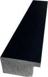
P118H ¥10
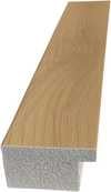
P118W ¥10
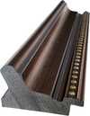
P438Z ¥10
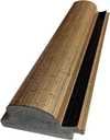
P508JH ¥12
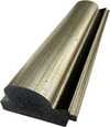
P508YH ¥12
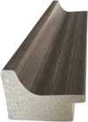
P805H ¥10
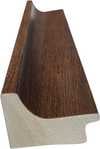
P805Z ¥10
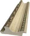
P919BZ ¥10
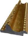
P919G ¥10
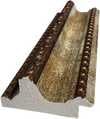
P919XJ ¥10
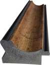
P959ZH ¥10
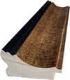
P968JZ ¥12
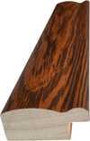
W106C ¥8
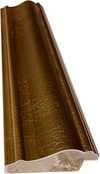
W218G ¥10
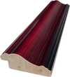
W218JH ¥8
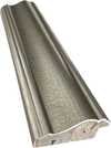
W218Y ¥10
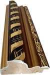
W307PJ ¥10
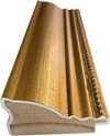
W316G ¥10
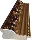
W316PJ ¥8
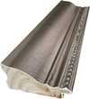
W316Y ¥10
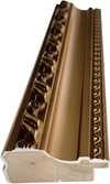
W398PJ ¥8
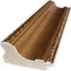
W4111J ¥10
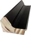
W500HY ¥15
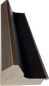
W500JH ¥15
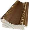
W692G ¥12
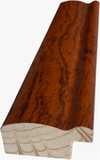
W849H ¥8
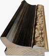
W940BG ¥15
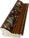
W953PJ ¥8
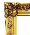
H24-GOLD ¥30
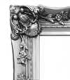
H24-SILVER ¥30
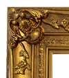
H36-GOLD ¥45
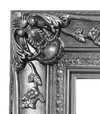
H36-SILVER ¥45
带框
边框材质: . 含框总尺寸: .
3 四步中的第三步
您想对画作进行任何修改吗?
大多数人的回答是否定的。由于每一幅画作都是手工绘制,我们的艺术家也可以为您进行定制。
下单后,ArtsDot.com 团队将通过电子邮件联系客户获取具体指令,并提供效果预览图
4 第四步(共四步)
几种饰面选项
所有选项均为可选。已选择的答案不会产生额外费用。
出自哪位艺术家之手?
像博物馆里的那样,配上一块铭牌?
青铜铭牌雕刻详情
This elegant plaque features the artist's name and the title of the artwork, finely engraved for a timeless presentation.
It is made from bronze with a refined, elegant finish. The text is precisely laser-engraved for a sharp and permanent result. Measuring 9x2 cm, the plaque is compact yet easy to read. It's built to be durable and scratch-resistant, offering a professional, museum-quality look. Mounting is simple thanks to the included adhesive backing.
透明亚克力铭牌详情
The plaque includes essential engraved details such as the artist's name, the title of the artwork, the date it was created, the type of media used-like oil on canvas or watercolor-a brief description of the piece, and a QR code that links to the complete artwork information.
It is crafted from clear acrylic, offering a sleek, modern appearance. The text is UV-engraved in black to ensure strong visual contrast. With a size of 10x15 cm, it ensures optimal readability. It comes equipped with two metal hooks for secure wall mounting. The plaque is designed to be weather-resistant, making it suitable for various environments, and it includes interactive features that work seamlessly with smartphone scanning.
黑色亚克力铭牌详情
This elegant plaque includes engraved information such as the artist's name, the title of the artwork, the date it was created, the type of media used (like oil on canvas or watercolor), a short description of the artwork, and a QR code for quick access to more information.
The plaque itself is made from refined black acrylic with a premium finish. The text is laser-engraved in white for high contrast and readability. Its size is 10x15 cm, designed to be easy to read. It comes with two metal hooks for professional mounting. The design is sleek and fits any interior style. It is also weather-resistant and durable, with built-in digital integration for mobile compatibility.
需要保护性光油吗?
您预计何时收到?
✓ 确认并下单
您的画作,正如您所订购的那样

Still-Life
复制品材质
复刻品尺寸
-

精选资深艺术家
更丰富的细节、更精湛的工艺以及更充裕的制作时间
-

复制画装裱选项
-
-
对于任何边长超过 105 厘米(约 41 英寸)的艺术品或复制品,画框将以拆解后的组件形式发货。此方法可确保安全送达并防止运输过程中的损坏。
需由专业人员组装 —— 本产品不适用于 DIY 操作。
该组件必须由经验丰富的专业装裱师进行组装及画布绷装,过程中需使用木工胶(不随附)、画布绷边钳以及夹具,以确保在胶水干燥期间保持内框方正。组装不当或画布张力不均可能会对艺术品造成永久性损坏,且此类情况不在我们的保修范围之内。
 对于任何边长超过 105 厘米(约 41 英寸)的艺术品或复制品,画框将以拆解后的组件形式发货。此方法可确保安全送达并防止运输过程中的损坏。
包含所有实木条,尺寸精确,便于组装。
使用随附的螺丝进行组装,另需准备用于角部连接的木工胶(本品不含木工胶),请由您的装裱师自行准备。
需另备专业工具(本套件不含):画布绷紧钳以及用于在胶水干燥过程中保持木条方正的夹具。
重要提示:
角部连接处需要使用木工胶,边框条必须使用夹具固定直至胶水完全干透,且在组装好的框架上绷紧画布需要用到画布拉伸钳。以上工具均不包含在套装内。请在订购此尺寸前,预先联系经验丰富的专业装裱师。

展品铭牌
-
-

保护性清漆
光泽清漆(提亮色彩,防光防潮)
-

定制我的艺术品
定制化示例:替换面部为客户照片;添加宠物(例如,将猫替换为狗);在背景中加入隐藏信息;更改背景风景或元素。
-

加急
全球配送()仅需 3-4 周即可送达,无需等待标准时效的 5 周。(4 November)。品质始终如一,绝不妥协。
-
极速达
全球配送(),预计 5 周送达。(11 November)。
已包含
最终结算价
¥ 1766
玻璃选项仅适用于110厘米以下的尺寸。
每份订单均包含
- 全球免运费特快专递服务
- 优质亚麻画布
- 全程运输保险
- 关税退款保证
- 色彩精准还原保证
- 100天退货保障(仅限制造缺陷)
- 100% 退款保证
- 多件购买优惠


The Still Life’s Silent Symphony: Joris Van Son's 1650 Masterpiece
Joris Van Son’s “Still-Life,” painted in 1650, isn’t merely a depiction of fruit and objects; it’s a carefully orchestrated tableau brimming with the quiet elegance and meticulous observation characteristic of Flemish Baroque art. Housed within the venerable halls of The Hermitage Museum in St. Petersburg, this oil on canvas offers a captivating glimpse into a world where beauty was painstakingly rendered, and symbolism whispered beneath the surface of everyday abundance. Measuring 118 x 140 cm, the painting invites prolonged contemplation, revealing layers of artistic skill and historical context with each studied glance.
- A Table Laden with Treasures: The composition centers around a richly draped table, its surface a stage for an array of carefully chosen items. A prominent orange, bursting with vibrant color, immediately draws the eye – a symbol of wealth, vitality, and even mortality in 17th-century still life traditions. Adjacent to it lie two apples, one ruby red and the other a crisp green, representing temptation, knowledge, and the duality of nature’s gifts.
- The Lobster's Bold Presence: Dominating the center is a magnificent lobster, its claws dramatically open as if caught mid-movement. This creature, often associated with luxury and indulgence, speaks to the opulence of the era and hints at the fleeting pleasures of life. The inclusion of such an exotic item underscores Van Son’s access to – or awareness of – goods from distant lands.
- A Symphony of Textures and Light: Notice the masterful rendering of textures—the velvety smoothness of the peaches, the glistening sheen of the grapes, the rough surface of the pewter plate. Van Son expertly manipulated light and shadow, creating a sense of depth and volume that brings the objects to life. The subtle gradations of color contribute to this effect, enhancing the realism and tactile quality of the scene.
The Hand of the Master: Technique and Style
Van Son’s style is deeply rooted in the traditions of Flemish painting, yet he possesses a distinctive voice. He clearly learned from Jan Davidsz de Heem, evident in his penchant for lavish arrangements and vibrant color palettes. However, Van Son departs from his mentor with a greater emphasis on atmospheric perspective and a more restrained use of impasto—the visible application of paint—allowing the details to shine through with remarkable clarity. The painting’s surface is remarkably smooth, achieved through meticulous layering and blending techniques. The artist's attention to detail is breathtaking; one can almost feel the weight of the fruit and the coolness of the pewter.
Technically, Van Son employed a thin, white chalk ground before applying his paint, creating a luminous base that enhanced the colors’ brilliance. He utilized translucent glazes—thin layers of diluted color—to build up depth and create subtle variations in tone, particularly noticeable in the shadows and highlights. The use of pentimenti – small changes made during the painting process – further reveals the artist's creative journey and his willingness to refine his work.A Window into 17th-Century Symbolism
Beyond its aesthetic beauty, “Still-Life” is rich in symbolic meaning. The abundance of fruit represents prosperity and fertility, but also serves as a poignant reminder of the transience of earthly pleasures – a concept central to Vanitas paintings, which often included skulls or decaying objects alongside beautiful items. The lobster, with its association with luxury and indulgence, can be interpreted as a symbol of mortality, reminding viewers of the fleeting nature of life’s joys. The inclusion of elements like the pewter plate and the draped cloth speaks to the material world and the importance of earthly possessions.
Bringing Van Son's Vision Home: Reproductions Available
A reproduction of “Still-Life” by Joris Van Son offers a remarkable opportunity to bring this masterpiece into your home or office. Handmade oil painting reproductions, meticulously crafted by skilled artisans, capture the essence of the original while providing an affordable and accessible way to appreciate its beauty. These reproductions are available in various sizes and framing options, allowing you to select a piece that perfectly complements your décor. Explore the collection at https://ArtsDot.com and discover the timeless allure of Joris Van Son’s “Still-Life.”
常见问题与解答
为什么“Still-Life”目前的版权状态是这样的?
Joris Van Son 的《Still-Life》 已进入 属于公有领域 —— 其版权已过期。版权保护期自艺术家逝世之日起计算,该艺术家于 1601 年逝世。
如何发现与 Joris Van Son 的《Still-Life》 风格相近的艺术品?
Joris Van Son 的《Still-Life》 的 相似作品 页面展示了相关艺术作品。
"Still-Life" 的色彩呈现出浓郁还是柔和的视觉感?
“Still-Life”的色彩强度为Monochromatic。强度描述了色彩呈现的浓郁程度。
相似作品


Joris Van Son
1542 - 1601, Belgium
艺术家简介
Joris Hoefnagel: A Pioneer of Naturalism and Manuscript Illumination
Joris Hoefnagel, born in Antwerp around 1542 and tragically dying in Vienna in 1601, stands as a pivotal figure bridging the late Renaissance and the burgeoning Baroque periods. More than simply a painter or illustrator, he was a meticulous observer of nature, a skilled miniaturist, and a crucial contributor to the development of topographical drawing – a field that would profoundly influence generations of artists. His legacy lies not just in his individual works but also in the techniques and approaches he pioneered, shaping the visual language of his time.
Hoefnagel’s early life was steeped in mercantile activity. The son of Jacob Hoefnagel, a diamond dealer and tapestry merchant, he received an unusually comprehensive education, encompassing humanist studies alongside artistic training. While speculation persists regarding his apprenticeship under Hans Bol – a prominent Antwerp painter – the precise details remain elusive. Regardless, this formative period undoubtedly instilled within him a rigorous approach to observation and representation, qualities that would become hallmarks of his later work. His travels through France and Spain exposed him to diverse artistic influences, particularly in the realm of decorative arts and manuscript illumination, experiences which significantly broadened his creative horizons.
The World Within Manuscript Pages
Hoefnagel’s most celebrated contributions reside within the intricate world of illuminated manuscripts. He served as a highly sought-after illuminator for wealthy patrons across Europe, producing breathtakingly detailed illustrations for religious texts and scholarly works. His style was characterized by an almost scientific precision – he meticulously documented flora, fauna, and architectural details with remarkable accuracy. This wasn’t merely decorative; it reflected a genuine fascination with the natural world, anticipating the rise of botanical illustration and proto-scientific inquiry.
His work for the *Speculum Humanae Salvationis*, an enormous theological manuscript commissioned by Emperor Charles V, is particularly noteworthy. Within its pages, Hoefnagel rendered hundreds of illustrations – from exotic animals and plants to intricate architectural designs and detailed depictions of courtly life. These images weren’t simply embellishments; they were integral components of the text, providing visual commentary and enriching the reader's understanding. He developed innovative techniques for rendering textures, light, and shadow, pushing the boundaries of manuscript illumination and establishing a new standard for detail and realism.
A Master of Detail: Drawing and Topographical Observation
Beyond his work in illuminated manuscripts, Hoefnagel was a remarkably skilled draftsman. His drawings are characterized by an astonishing level of precision and observation – he captured the nuances of light, texture, and form with unparalleled accuracy. He moved beyond traditional portraiture, developing a unique approach to topographical drawing, meticulously documenting landscapes and architectural structures. This focus on detailed representation foreshadowed the rise of landscape painting as a distinct genre in the Netherlands.
His drawings of Antwerp, for example, are considered groundbreaking. They weren’t merely scenic views; they were carefully constructed representations that captured the city's layout, buildings, and atmosphere with remarkable detail. Hoefnagel’s meticulous approach to observation influenced a generation of artists, including his nephew, Jacob Hoefnagel, who continued to develop and refine these techniques.
Influence and Legacy
Joris Hoefnagel's impact on the course of art history is profound. He bridged the gap between late Gothic artistic traditions and the emerging Renaissance style, incorporating Italian influences while retaining a distinctly Northern European sensibility. His meticulous attention to detail, his pioneering work in topographical drawing, and his contributions to manuscript illumination established new standards for realism, accuracy, and visual storytelling.
Furthermore, Hoefnagel’s detailed botanical illustrations played a crucial role in the development of natural history as a scientific discipline. His images served as models for later generations of artists and scientists, contributing to the burgeoning field of botany and influencing the way nature was depicted and understood. Though his life was tragically cut short, Joris Hoefnagel’s legacy endures as a testament to the power of observation, meticulous craftsmanship, and artistic innovation.
相关文章
Jan van Kessel the Elder: A Baroque Master of Floral Still Life & Miniature Portraiture
Discover the exquisite detail of Jan van Kessel the Elder's Baroque floral still lifes & captivating miniatures. Explore his artistic legacy, scientific precision, and lasting influence on 17th-century Flemish painting.

Abraham Hendricksz van Beyeren: Pioneering Dutch Still Life & the Banquet Tradition
Explore the captivating world of Dutch Golden Age still life with Abraham van Beyeren. Discover his innovative techniques, symbolic banquet scenes & lasting influence on art history. Learn about collecting these masterpieces.

伦勃朗25幅杰作:光影大师的艺术传奇与家居臻选
探索伦勃朗25幅杰作,领略荷兰黄金时代光影大师的艺术传奇!从《夜巡》到自画像,深入了解巴洛克艺术、历史绘画与人物肖像背后的故事。ArtsDot.com提供高清艺术复制品及家居装饰灵感。立即探索完整系列!