


Картина відповідає вашим виборам: , .
Опис експоната
Explore 'No. 21' by Mark Rothko, a pivotal work from 1949 showcasing his transition to Color Field painting. Discover the emotional depth and abstract beauty of this masterpiece.
 Розгорнути текст
Біографія митця
Пориньте у світ емоційного кольору! Картина Марка Рота з 1952 року – шедевр абстрактного експресіонізму, що запрошує до роздумів та спокусив світ мистецтва.
Олійная репродукція ручної роботи
Написана вручну олією на полотні у вашому розмірі та рамі, виготовлена на замовлення нашими художниками. ( Перейти до друку Перейти до цифрових зображень)
Цей твір захищено авторським правом
Мистецький твір, представлений на цій сторінці, захищений законом про авторське право, що унеможливлює легальне створення або продаж його ідентичної репродукції. Цей захист забезпечується відповідно до міжнародних угод, таких як Бернська конвенція та національним законодавством, зокрема положеннями, що викладені в Законодавство США про авторське право — Розділ 17. Всі права захищені. Будь-яке використання без дозволу заборонено.
Як шанобливу та законну альтернативу, ми пропонуємо унікальні картини ручної роботи, створені натхненням від оригіналу. Наші досвідчені професійні художники ретельно вивчають стиль, настрій та художню сутність оригіналу, щоб створити новий, неповторний твір, який викликає ті ж почуття, — залишаючись при цьому самобутнім творінням.
Цей метод повністю відповідає нормам авторського права, оскільки він не передбачає копіювання чи дублювання захищеного твору мистецтва. Натомість це творче переосмислення — створення нового малюнка під впливом оригіналу, який не є його точним відтворенням.
Більше про цю картину
 Переглянути в інтер'єрі
 Надіслати як листівку
 Поділитися
 Деталі витвору
 Посібник

 Завантажити
 Схожі екземпляри
 Рентгенівське дослідження
 Слайд-шоу
 Питання та відповіді
 Статистика
Замовте свою картину у чотири прості кроки
Не поспішайте. Ви можете змінити будь-яку відповідь; ціна у вашій кошику буде оновлюватися відповідно до кожного вибору.
1 Перший крок із чотирьох
Який розмір ви бажаєте обрати?
Ці розміри зберігають пропорції оригінальної картини. На малюнку показано ваш вибір на стіні над двометровим диваном.
Або вкажіть власні розміри
Обирайте з наших стандартних розмірів, що відповідають оригінальним пропорціям твору мистецтва.

Введіть необхідну ширину та висоту, щоб картина підійшла до вашої рами або стіни. Оскільки це ручний розпис, для зміни пропорцій художник може дописати трохи більше по краях або дещо обрізати композицію — вибір за вами. Перед початком роботи ми надішлемо вам цифровий макет для затвердження. Зображення, показане на цій сторінці, не є реальним результатом — лише макет відображає майбутній вигляд.
2 Другий крок із чотирьох
Як його підготувати: у рулоні, на підрамнику чи в рамі?
Наведені нижче ціни вказані для розміру, обраного вами на першому кроці.
Оберіть тип країв натяжного полотна
Оберіть свою раму
Білий край ₴1
Розмитий край ₴1
З розширенням ₴1
P118B ₴10
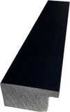
P118H ₴10
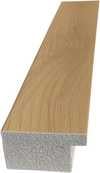
P118W ₴10
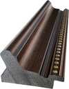
P438Z ₴10
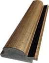
P508JH ₴12

P508YH ₴12
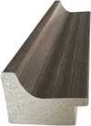
P805H ₴10
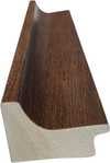
P805Z ₴10
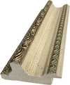
P919BZ ₴10
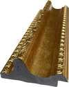
P919G ₴10
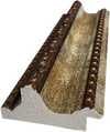
P919XJ ₴10
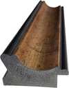
P959ZH ₴10
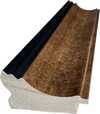
P968JZ ₴12
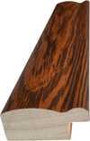
W106C ₴8

W218G ₴10

W218JH ₴8

W218Y ₴10
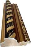
W307PJ ₴10

W316G ₴10
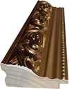
W316PJ ₴8
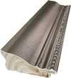
W316Y ₴10
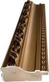
W398PJ ₴8
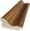
W4111J ₴10
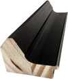
W500HY ₴15
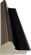
W500JH ₴15
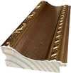
W692G ₴12

W849H ₴8
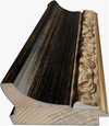
W940BG ₴15
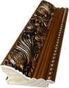
W953PJ ₴8
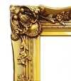
H24-GOLD ₴30

H24-SILVER ₴30
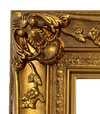
H36-GOLD ₴45
H36-SILVER ₴45
У рамі
Багет: . Загальний розмір із рамою: .
3 Третій крок із чотирьох
Бажаєте внести якісь зміни в картину?
Більшість людей відповідають «ні». Оскільки кожна картина створена вручну, наш художник також може адаптувати її для вас.
Після оформлення замовлення команда ArtsDot.com надішле клієнту електронний лист із запитом інструкцій та надасть попередній макет для перегляду
4 Четвертий крок із чотирьох
Кілька варіантів фінішного покриття
Усі вони є необов'язковими. Вибір уже вибраних варіантів не потребує додаткової оплати.
Хто автор?
Доставка по всьому світу () за 3–4 тижні замість стандартних 5 тижнів. (7 Листопад). Без жодних компромісів у якості.
Табличка, як у музеї?
Деталі гравірування на бронзовій табличці
This elegant plaque features the artist's name and the title of the artwork, finely engraved for a timeless presentation.
It is made from bronze with a refined, elegant finish. The text is precisely laser-engraved for a sharp and permanent result. Measuring 9x2 cm, the plaque is compact yet easy to read. It's built to be durable and scratch-resistant, offering a professional, museum-quality look. Mounting is simple thanks to the included adhesive backing.
Деталі прозорої акрилової таблички
The plaque includes essential engraved details such as the artist's name, the title of the artwork, the date it was created, the type of media used-like oil on canvas or watercolor-a brief description of the piece, and a QR code that links to the complete artwork information.
It is crafted from clear acrylic, offering a sleek, modern appearance. The text is UV-engraved in black to ensure strong visual contrast. With a size of 10x15 cm, it ensures optimal readability. It comes equipped with two metal hooks for secure wall mounting. The plaque is designed to be weather-resistant, making it suitable for various environments, and it includes interactive features that work seamlessly with smartphone scanning.
Деталі чорної акрилової таблички
This elegant plaque includes engraved information such as the artist's name, the title of the artwork, the date it was created, the type of media used (like oil on canvas or watercolor), a short description of the artwork, and a QR code for quick access to more information.
The plaque itself is made from refined black acrylic with a premium finish. The text is laser-engraved in white for high contrast and readability. Its size is 10x15 cm, designed to be easy to read. It comes with two metal hooks for professional mounting. The design is sleek and fits any interior style. It is also weather-resistant and durable, with built-in digital integration for mobile compatibility.
Захисний лак?
Коли вам це потрібно?
✓ Перевірити та замовити
Ваша картина, згідно із вашим замовленням

No. 21
Матеріал репродукції
Розмір репродукції
-

Видатний майстер-художник
Більше деталізації, витонченості та додаткового часу на створення твору
-

Рама для репродукції
-
-
Для творів мистецтва або репродукцій, розмір яких перевищує 105 см (приблизно 41 дюйм) з будь-якого боку, рама доставляється у вигляді розібраного комплекту. Такий метод гарантує безпечну доставку та запобігає пошкодженням під час транспортування.
Потребує професійного збирання — це не продукт для самостійного виготовлення (DIY).
Комплект має бути зібраний, а полотно натягнуте досвідченим майстром багетних робіт із використанням клейового дерева (не входить у комплект), щипців для натягування полотна та затискачів, щоб підрамник залишався рівним під час висихання клею. Неправильне збирання або нерівномірне натягування полотна може призвести до незворотного пошкодження твору мистецтва, що не підпадає під дію нашої гарантії.
 Для творів мистецтва або репродукцій, розмір яких перевищує 105 см (приблизно 41 дюйм) з будь-якого боку, рама доставляється у вигляді розібраного комплекту. Такий метод гарантує безпечну доставку та запобігає пошкодженням під час транспортування.
У комплект входять усі бруски з цільного дерева, точно вирізані за розміром.
Збирається за допомогою гвинтів, що входять до комплекту, а також клейового розчину для кутових з'єднань, який не входить до комплекту і має бути підготовлений вашим майстром.
Потрібні професійні інструменти, які не входять до комплекту: щипці для натягування полотна (натягувач) та затискачі, щоб утримувати рейки рівно під час висихання клею.
Важливо:
Для з'єднання кутів потрібен клей для дерева, перекладини необхідно затиснути струбцинами до повного висихання клею, а для натягування полотна на зібрану раму знадобляться щипці для натягування полотна. Жоден із цих інструментів не входить до комплекту. Будь ласка, проконсультуйтеся з досвідченим майстром багетного оформлення перед замовленням рами такого розміру.

Етикетка експоната
-
-

Захисний лак
Глянцевий лак (підсилює яскравість кольорів, захищає від світла та вологи)
-

Персоналізувати мій витвір
Приклади можливих змін: заміна обличчя на фото клієнта; додавання домашньої тварини (наприклад, заміна кота на собаку); додавання прихованого повідомлення на фоні; зміна пейзажу або елементів фону.
-

Прискорено
Доставка по всьому світу () за 3–4 тижні замість стандартних 5 тижнів. (7 Листопад). Без компромісів у якості.
-
Експрес-доставка
Доставка по всьому світу () протягом 5 тижнів. (14 Листопад).
Включено в ціну
Підсумкова вартість
₴ 11808
Скляний варіант доступний лише для розмірів до 110 см
До кожного замовлення додається
- Безкоштовна експрес-доставка по всьому світу
- Високоякісне лляне полотно
- Повне страхове покриття доставки
- Гарантія повернення митних зборів
- Гарантія точного відтворення кольорів
- Політика повернення протягом 100 днів (лише у разі виявлення дефектів)
- Гарантія повернення 100% коштів
- Пропозиція на оптові замовлення


A Chromatic Labyrinth: Decoding Mark Rothko’s No. 21
Mark Rothko's *No. 21*, painted in 1949, stands as a pivotal work within the artist’s transition towards his signature Color Field style—a moment where figuration dissolves and pure emotional resonance takes hold. The painting isn’t simply an arrangement of colors; it is an immersive experience, a visual poem built from layers of pigment and subtle variations in tone. Rather than depicting objects or scenes, Rothko sought to evoke fundamental human emotions through the direct application of color. *No. 21* exemplifies this pursuit, presenting blocks of red, blue, orange, and hints of green that seem to float and interact on the canvas surface. The composition isn’t rigidly defined; edges are soft, blurred, allowing colors to bleed into one another, creating a sense of atmospheric depth and an almost meditative quality. It's a painting that demands contemplation, inviting viewers to lose themselves within its chromatic depths.The Birth of a Style: Rothko’s Artistic Journey
To understand *No. 21*, it is essential to consider Mark Rothko’s artistic evolution. Born Marcus Yakovlevich Rothkowitz in Latvia in 1903, he immigrated to the United States with his family as a child. His early work, dating from the 1920s and 30s, was largely figurative, depicting urban scenes and portraits. However, influenced by the anxieties of World War II and a growing interest in mythology and Surrealism, Rothko began experimenting with more symbolic imagery during the 1940s. This period served as a crucial bridge towards his eventual abstraction. The year 1949, when *No. 21* was created, marks a turning point. It’s a moment where he consciously distances himself from recognizable forms and embraces the power of color to convey meaning directly. The influence of Matisse's *The Red Studio*, with its enveloping field of red, is particularly notable; Rothko himself acknowledged the painting’s profound impact on his own work, describing how it allowed him to “become” the color itself.Technique and Emotional Resonance
Rothko’s technique in *No. 21* is deceptively simple yet profoundly effective. He employed thin washes of oil paint, often diluted with turpentine or other mediums, applied in multiple layers. This layering creates a luminosity and depth that draws the viewer in. The edges aren't sharply defined but rather feathered and blurred, contributing to the painting’s ethereal quality. He wasn’t interested in brushstrokes as expressive marks; instead, he sought to eliminate any trace of his hand, creating surfaces that appear almost seamless. This deliberate removal of painterly gesture is key to Rothko’s intention: he wanted the color itself to be the subject, unmediated by technique. The emotional impact of *No. 21* is deeply personal and subjective. The interplay of warm reds and cooler blues can evoke feelings of passion, tranquility, or even melancholy. It's a painting that doesn’t dictate emotion but rather provides a space for viewers to experience their own inner landscape.A Legacy of Color and Contemplation
Mark Rothko’s work continues to resonate with audiences today, not only for its aesthetic beauty but also for its profound emotional depth. His paintings are held in major museums worldwide, including the Metropolitan Museum of Art and the Menil Collection, and his most ambitious project, the Rothko Chapel in Houston, remains a powerful site of contemplation and spiritual experience. *No. 21* embodies the core principles that define Rothko’s artistic vision: the power of color to evoke emotion, the importance of creating immersive experiences, and the belief that art can offer solace and meaning in a chaotic world. A reproduction of this work offers not just a visual statement but an invitation to quiet reflection—a chance to bring a piece of profound emotional resonance into any space.Питання та відповіді
Які емоції викликає "No. 21"?
«No. 21» роботи Марк Ротко передає Задумливий емоційний настрій.
Яка палітра та домінуючий колір визначають "No. 21"?
У творі «No. 21» роботи Марк Ротко використана палітра Теплі тони, де домінуючим кольором є Бронзово-золотистий (#e48741).
Яка частина дому найкраще підійде для репродукції «No. 21»?
«No. 21» роботи Марк Ротко рекомендується для Вітальня. Ця пропозиція ґрунтується на сюжеті, кольоровій гамі та настрої твору.


Марк Ротко
1903 - 1970, Латвія
Біографія митця
Early Life and the Seeds of Artistic Vision
Mark Rothko, born Markus Yakovlevich Rothkowitz in Dvinsk, Latvia, in 1903, carried within him from the outset a sense of displacement that would profoundly shape his artistic journey. His early years were marked by the anxieties of a Jewish family living within the Pale of Settlement, shadowed by pogroms and political unrest. This atmosphere instilled a deep sensitivity to human suffering, a theme that would resonate throughout his oeuvre. The 1913 immigration to Portland, Oregon, represented not just a geographical shift but a cultural upheaval for the young Rothko. While his father, a pharmacist and intellectual with socialist leanings, fostered a home filled with debate and learning, the loss of Jacob Rothkowitz shortly after their arrival cast a long shadow. This early experience of loss, coupled with the challenges of assimilation, fueled a lifelong exploration of existential themes – mortality, trauma, and the search for meaning in a chaotic world. Though he excelled academically at Yale University, Rothko found himself drawn more to the vibrant energy of New York City, abandoning formal studies to pursue his passion for art at the Art Students League. These formative years laid the groundwork for an artistic vision that would ultimately challenge conventional notions of painting and redefine the emotional power of color.From Figurative Beginnings to Abstract Expressionism
Rothko’s initial artistic explorations were firmly rooted in realism, depicting urban scenes and portraits with a keen eye for detail. However, these early works already hinted at the psychological depth that would become his hallmark. As the 1940s unfolded, and the world grappled with the horrors of World War II, Rothko’s art underwent a dramatic transformation. Influenced by Surrealism and mythology, he began to move away from representational imagery, seeking instead to express universal human emotions through symbolic forms. This period saw the emergence of multi-form paintings – canvases populated by ambiguous, biomorphic shapes that seemed to hover between figuration and abstraction. These works were not merely experiments in form; they were deeply felt responses to the anxieties and uncertainties of a world at war. By the late 1940s, Rothko had arrived at his signature style: large-scale canvases featuring rectangular blocks of color that appeared to float and resonate with one another. He stripped away all vestiges of recognizable imagery, focusing instead on the pure emotional impact of color and form. This marked a pivotal moment in the development of Abstract Expressionism, and established Rothko as a leading figure in this groundbreaking movement.The Color Field and the Pursuit of Transcendence
Rothko’s mature work is defined by what came to be known as “Color Field” painting – vast expanses of luminous color that envelop the viewer in an immersive experience. These paintings are not about *what* they depict, but rather *how* they make you feel. Rothko believed that art should engage the viewer viscerally, bypassing intellectual analysis and speaking directly to the emotions. He meticulously layered thin washes of paint, creating subtle variations in tone and texture that seemed to emanate from within the canvas. The edges of his rectangular forms are often blurred, allowing them to blend and interact with one another, creating a sense of depth and movement. Rothko deliberately avoided titles beyond numbers – “No. 1,” “No. 6” – encouraging viewers to confront the paintings without preconceived notions and allow their own emotional responses to guide their experience. He sought to create a space for contemplation, a sanctuary where viewers could connect with something larger than themselves. His ambition was nothing less than to evoke profound spiritual experiences through the language of color.Major Achievements and Lasting Legacy
Among Rothko’s most significant achievements are “No. 10 (1950),” a pivotal work that exemplifies his evolving style, and the Seagram Murals (1958). Commissioned for the Four Seasons Restaurant in New York City, these murals were ultimately rejected by Rothko, who felt they would be compromised by their intended environment. He instead donated them to the Tate Gallery in London, where they continue to inspire awe and contemplation. Perhaps his most ambitious project was the Rothko Chapel (1971) in Houston, Texas – a non-denominational sanctuary housing fourteen of his paintings. Designed as a space for quiet reflection, the chapel is considered a sacred place by many, embodying Rothko’s belief in the spiritual power of art. Rothko's influence on subsequent generations of artists has been immense. He paved the way for Minimalist art and continues to inspire contemporary painters who explore the emotional possibilities of abstraction. Despite struggling with depression throughout his life, culminating in his tragic suicide in 1970, Mark Rothko remains one of the most important and influential artists of the 20th century – a master of color whose work continues to resonate with audiences around the world.- Rothko’s paintings are celebrated for their ability to convey universal human emotions—tragedy, ecstasy, despair, and hope.
- His exploration of color as a vehicle for emotional expression revolutionized abstract painting.
- The Rothko Chapel stands as a testament to his belief in the spiritual power of art.
- He remains a pivotal figure in Abstract Expressionism and a major influence on contemporary artists.


Пов'язані статті

The Sublimity of Color: Exploring the Emotional Landscapes of Mark Rothko's Abstract Expressionism
Explore the profound emotional depth of Mark Rothko's abstract expressionism. Discover the history, techniques & lasting impact of this pivotal Color Field painter. Expert insights for collectors and art enthusiasts.

25 шедеврів Марка Ротко: глибокі емоції та колірні симфонії для вашого дому | ArtsDot
Відкрийте 25 найвідоміших шедеврів Марка Ротко! Пориньте у світ емоційного абстрактного експресіонізму, колірних симфоній та глибокого психологічного живопису. Купуйте репродукції картин Ротко преміум-якості для вашого дому на ArtsDot.com.

Топ-10 шедеврів абстрактного експресіонізму: мистецтво, яке змінила епоху | ArtsDot.com
Відкрийте для себе 10 шедеврів абстрактного експресіонізму! Дізнайтесь історію Поллока, Ротко та інших геніїв. Репродукції картин преміум-якості для вашого дому від ArtsDot.com. Дослідіть колекцію онлайн!