


Картина відповідає вашим виборам: , .
Опис експоната
A vibrant oil painting by Korean contemporary artist Kho Nak Beom captures a woman's poignant sorrow through a striking palette of pink and orange, inviting you to explore this emotive masterpiece for your collection.
 Розгорнути текст
Біографія митця
Korean colorist kho, nak beom (1960-present) creates striking monochromatic portraits & diagonal skin studies. Explore his 'Color Analysis' and exhibitions.
Олійная репродукція ручної роботи
Написана вручну олією на полотні у вашому розмірі та рамі, виготовлена на замовлення нашими художниками. ( Перейти до друку Перейти до цифрових зображень)
Цей твір захищено авторським правом
Мистецький твір, представлений на цій сторінці, захищений законом про авторське право, що унеможливлює легальне створення або продаж його ідентичної репродукції. Цей захист забезпечується відповідно до міжнародних угод, таких як Бернська конвенція та національним законодавством, зокрема положеннями, що викладені в Законодавство США про авторське право — Розділ 17. Всі права захищені. Будь-яке використання без дозволу заборонено.
Як шанобливу та законну альтернативу, ми пропонуємо унікальні картини ручної роботи, створені натхненням від оригіналу. Наші досвідчені професійні художники ретельно вивчають стиль, настрій та художню сутність оригіналу, щоб створити новий, неповторний твір, який викликає ті ж почуття, — залишаючись при цьому самобутнім творінням.
Цей метод повністю відповідає нормам авторського права, оскільки він не передбачає копіювання чи дублювання захищеного твору мистецтва. Натомість це творче переосмислення — створення нового малюнка під впливом оригіналу, який не є його точним відтворенням.
Більше про цю картину
 Переглянути в інтер'єрі
 Надіслати як листівку
 Поділитися
 Деталі витвору
 Посібник

 Завантажити
 Схожі екземпляри
 Рентгенівське дослідження
 Слайд-шоу
 Питання та відповіді
 Статистика
Замовте свою картину у чотири прості кроки
Не поспішайте. Ви можете змінити будь-яку відповідь; ціна у вашій кошику буде оновлюватися відповідно до кожного вибору.
1 Перший крок із чотирьох
Який розмір ви бажаєте обрати?
Ці розміри зберігають пропорції оригінальної картини. На малюнку показано ваш вибір на стіні над двометровим диваном.
Або вкажіть власні розміри
Обирайте з наших стандартних розмірів, що відповідають оригінальним пропорціям твору мистецтва.

Введіть необхідну ширину та висоту, щоб картина підійшла до вашої рами або стіни. Оскільки це ручний розпис, для зміни пропорцій художник може дописати трохи більше по краях або дещо обрізати композицію — вибір за вами. Перед початком роботи ми надішлемо вам цифровий макет для затвердження. Зображення, показане на цій сторінці, не є реальним результатом — лише макет відображає майбутній вигляд.
2 Другий крок із чотирьох
Як його підготувати: у рулоні, на підрамнику чи в рамі?
Наведені нижче ціни вказані для розміру, обраного вами на першому кроці.
Оберіть тип країв натяжного полотна
Оберіть свою раму
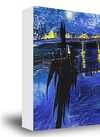
Білий край ₴1
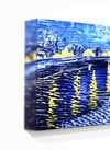
Розмитий край ₴1
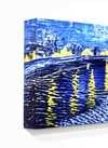
З розширенням ₴1
P118B ₴10
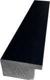
P118H ₴10
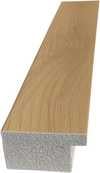
P118W ₴10
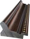
P438Z ₴10
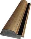
P508JH ₴12

P508YH ₴12
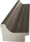
P805H ₴10
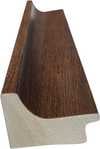
P805Z ₴10
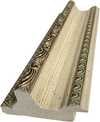
P919BZ ₴10

P919G ₴10
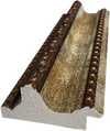
P919XJ ₴10
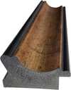
P959ZH ₴10
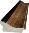
P968JZ ₴12

W106C ₴8

W218G ₴10

W218JH ₴8
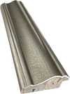
W218Y ₴10

W307PJ ₴10

W316G ₴10
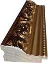
W316PJ ₴8
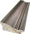
W316Y ₴10
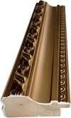
W398PJ ₴8

W4111J ₴10
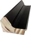
W500HY ₴15

W500JH ₴15
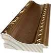
W692G ₴12

W849H ₴8
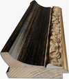
W940BG ₴15

W953PJ ₴8

H24-GOLD ₴30

H24-SILVER ₴30

H36-GOLD ₴45
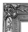
H36-SILVER ₴45
У рамі
Багет: . Загальний розмір із рамою: .
3 Третій крок із чотирьох
Бажаєте внести якісь зміни в картину?
Більшість людей відповідають «ні». Оскільки кожна картина створена вручну, наш художник також може адаптувати її для вас.
Після оформлення замовлення команда ArtsDot.com надішле клієнту електронний лист із запитом інструкцій та надасть попередній макет для перегляду
4 Четвертий крок із чотирьох
Кілька варіантів фінішного покриття
Усі вони є необов'язковими. Вибір уже вибраних варіантів не потребує додаткової оплати.
Хто автор?
Доставка по всьому світу () за 3–4 тижні замість стандартних 5 тижнів. (4 Листопад). Без жодних компромісів у якості.
Табличка, як у музеї?
Деталі гравірування на бронзовій табличці
This elegant plaque features the artist's name and the title of the artwork, finely engraved for a timeless presentation.
It is made from bronze with a refined, elegant finish. The text is precisely laser-engraved for a sharp and permanent result. Measuring 9x2 cm, the plaque is compact yet easy to read. It's built to be durable and scratch-resistant, offering a professional, museum-quality look. Mounting is simple thanks to the included adhesive backing.
Деталі прозорої акрилової таблички
The plaque includes essential engraved details such as the artist's name, the title of the artwork, the date it was created, the type of media used-like oil on canvas or watercolor-a brief description of the piece, and a QR code that links to the complete artwork information.
It is crafted from clear acrylic, offering a sleek, modern appearance. The text is UV-engraved in black to ensure strong visual contrast. With a size of 10x15 cm, it ensures optimal readability. It comes equipped with two metal hooks for secure wall mounting. The plaque is designed to be weather-resistant, making it suitable for various environments, and it includes interactive features that work seamlessly with smartphone scanning.
Деталі чорної акрилової таблички
This elegant plaque includes engraved information such as the artist's name, the title of the artwork, the date it was created, the type of media used (like oil on canvas or watercolor), a short description of the artwork, and a QR code for quick access to more information.
The plaque itself is made from refined black acrylic with a premium finish. The text is laser-engraved in white for high contrast and readability. Its size is 10x15 cm, designed to be easy to read. It comes with two metal hooks for professional mounting. The design is sleek and fits any interior style. It is also weather-resistant and durable, with built-in digital integration for mobile compatibility.
Захисний лак?
Коли вам це потрібно?
✓ Перевірити та замовити
Ваша картина, згідно із вашим замовленням

Color Analysis
Матеріал репродукції
Розмір репродукції
-

Видатний майстер-художник
Більше деталізації, витонченості та додаткового часу на створення твору
-

Рама для репродукції
-
-
Для творів мистецтва або репродукцій, розмір яких перевищує 105 см (приблизно 41 дюйм) з будь-якого боку, рама доставляється у вигляді розібраного комплекту. Такий метод гарантує безпечну доставку та запобігає пошкодженням під час транспортування.
Потребує професійного збирання — це не продукт для самостійного виготовлення (DIY).
Комплект має бути зібраний, а полотно натягнуте досвідченим майстром багетних робіт із використанням клейового дерева (не входить у комплект), щипців для натягування полотна та затискачів, щоб підрамник залишався рівним під час висихання клею. Неправильне збирання або нерівномірне натягування полотна може призвести до незворотного пошкодження твору мистецтва, що не підпадає під дію нашої гарантії.
 Для творів мистецтва або репродукцій, розмір яких перевищує 105 см (приблизно 41 дюйм) з будь-якого боку, рама доставляється у вигляді розібраного комплекту. Такий метод гарантує безпечну доставку та запобігає пошкодженням під час транспортування.
У комплект входять усі бруски з цільного дерева, точно вирізані за розміром.
Збирається за допомогою гвинтів, що входять до комплекту, а також клейового розчину для кутових з'єднань, який не входить до комплекту і має бути підготовлений вашим майстром.
Потрібні професійні інструменти, які не входять до комплекту: щипці для натягування полотна (натягувач) та затискачі, щоб утримувати рейки рівно під час висихання клею.
Важливо:
Для з'єднання кутів потрібен клей для дерева, перекладини необхідно затиснути струбцинами до повного висихання клею, а для натягування полотна на зібрану раму знадобляться щипці для натягування полотна. Жоден із цих інструментів не входить до комплекту. Будь ласка, проконсультуйтеся з досвідченим майстром багетного оформлення перед замовленням рами такого розміру.

Етикетка експоната
-
-

Захисний лак
Глянцевий лак (підсилює яскравість кольорів, захищає від світла та вологи)
-

Персоналізувати мій витвір
Приклади можливих змін: заміна обличчя на фото клієнта; додавання домашньої тварини (наприклад, заміна кота на собаку); додавання прихованого повідомлення на фоні; зміна пейзажу або елементів фону.
-

Прискорено
Доставка по всьому світу () за 3–4 тижні замість стандартних 5 тижнів. (4 Листопад). Без компромісів у якості.
-
Експрес-доставка
Доставка по всьому світу () протягом 5 тижнів. (11 Листопад).
Включено в ціну
Підсумкова вартість
₴ 11832
Скляний варіант доступний лише для розмірів до 110 см
До кожного замовлення додається
- Безкоштовна експрес-доставка по всьому світу
- Високоякісне лляне полотно
- Повне страхове покриття доставки
- Гарантія повернення митних зборів
- Гарантія точного відтворення кольорів
- Політика повернення протягом 100 днів (лише у разі виявлення дефектів)
- Гарантія повернення 100% коштів
- Пропозиція на оптові замовлення


A Symphony of Sorrow and Hue
In the evocative masterpiece Color Analysis, the contemporary Korean master Kho, Nak Beom invites viewers into a deeply intimate psychological landscape. Painted in 1999, this oil on canvas work serves as a profound meditation on the intersection of human emotion and chromatic intensity. At first glance, the eye is drawn to the central figure—a woman with luminous blonde hair, her face cradled by her hands in a gesture of profound vulnerability. There is an undeniable weight to her expression, a sense of mourning or quiet despair that anchors the composition. Yet, rather than retreating into the shadows of grief, Kho utilizes a vibrant, almost electric palette of pinks, yellows, and oranges to frame this moment of sorrow. This juxtaposition creates a striking tension; the warmth of the colors clashes with the coolness of the subject's melancholy, suggesting that even within our most painful moments, life continues to pulse with an unyielding, radiant energy.
The technique employed by Kho is nothing short of transformative. As a painter known for his meticulous exploration of form and color, he utilizes the rich, tactile nature of oil paint to build layers of light and depth. The brushwork, while controlled, allows for a certain fluidity that mimics the ebb and flow of emotion. The way the light catches the golden strands of her hair and the crimson of her dress creates a sense of three-dimensionality that pulls the viewer into her personal orbit. This mastery of color is not merely decorative; it is structural. By manipulating high-saturation tones, Kho directs the viewer's gaze through the canvas, ensuring that the eye lingers on the subtle shifts in skin tone and the heavy, expressive contours of the subject's features.
Temporal Echoes and Symbolic Depth
Beyond the immediate emotional impact of the portrait, Color Analysis contains subtle, surrealist elements that deepen its narrative complexity. Tucked within the background, two clocks emerge—one positioned near the top left and another toward the center-left. These are not merely incidental details but potent symbols of the inexorable passage of time. In the context of the woman's visible distress, the clocks serve as a memento mori, reminding us that grief is a temporal experience, yet one that is inextricably linked to the ticking rhythm of existence. They suggest a frozen moment in time, an eternalized snapshot of a fleeting heartache, where the movement of the hands on the clock face contrasts with the stillness of the subject's contemplative pose.
For collectors and interior designers alike, this piece offers a rare opportunity to possess a work that functions as both a visual centerpiece and a conversational catalyst. The painting’s ability to command attention through its bold color scheme makes it an ideal acquisition for sophisticated spaces—be it a modern gallery-style living room or a curated study. It provides a sense of dramatic flair without sacrificing intellectual depth. To hang a reproduction of Color Analysis is to invite a dialogue about the human condition into one's home, offering a piece that is as much an exploration of the soul as it is a triumph of contemporary Korean colorism.
Питання та відповіді
Наскільки виражений контраст у «Color Analysis» роботи Kho, Nak Beom?
Рівень контрасту твору «Color Analysis» роботи Kho, Nak Beom становить Statement.
З якої країни походить твір у стилі Contemporary Realism під назвою "Color Analysis"?
«Color Analysis» пов’язує мистецтво Contemporary Realism із South Korea через місце народження його творця.
У якому музеї зберігається оригінал «Color Analysis»?
Оригінал «Color Analysis» роботи Kho, Nak Beom зберігається в Korean Art Museum Association, Сеул, Південна Корея. Репродукція дозволяє прикрасити цим твором ваш дім.
Схожі твори мистецтва


Kho, Nak Beom
1960 - , South Korea
Біографія митця
A Chromatic Exploration of the Human Condition: The Art of Kho, Nak Beom
Born in Seoul, South Korea, in 1960, kho, nak beom – often referred to as Nakbeom Kho – has emerged as a compelling figure in contemporary Korean art. His work is immediately recognizable for its striking use of color, or rather, the deliberate *absence* of it in many instances, and his profound exploration of form through solid lines, monochromatic portraiture, and uniquely angled depictions of skin. Kho isn’t simply painting faces; he's dissecting perception itself, examining how we construct identity and experience emotion through visual cues.
Early Life and Artistic Foundations
Kho’s artistic journey began with formal training at Hong-ik University in Seoul, where he earned both a Bachelor of Fine Arts (B.F.A.) in 1987 and a Master of Fine Arts (M.F.A.) in 1989. This period was crucial in establishing his technical foundation and fostering an intellectual curiosity that would define his later work. While the specifics of early influences remain somewhat elusive, it’s clear that Kho developed a keen interest in the power of simplification – stripping away extraneous detail to reveal the essential structure beneath. His academic background provided him with the tools to not only execute complex compositions but also to critically analyze the history of portraiture and representation.
The Development of a Unique Visual Language
Kho’s artistic practice is characterized by a fascinating duality. He often works in series, exploring variations on a theme – most notably his ‘Color Analysis’ paintings. These aren't traditional color studies in the conventional sense; rather, they are bold statements where blocks of solid color define planes and contours, creating an almost architectural rendering of the human face. The effect is both arresting and unsettling. The absence of subtle shading or realistic detail forces the viewer to confront the underlying structure of the portrait, prompting a deeper consideration of form and perception. Alongside these vibrant explorations, Kho also creates intensely focused monochromatic portraits and studies of skin rendered with diagonal lines – a technique that imbues his subjects with a sense of movement and vulnerability. This interplay between color and monochrome, abstraction and figuration, is central to understanding his artistic vision.
Key Achievements and Exhibitions
Kho’s work has garnered recognition both within Korea and internationally. He is an active member of the Korean Artist Project, a collective that promotes contemporary art from South Korea. His participation in the artist-in-residence program in Sapporo, Japan, broadened his exposure to diverse artistic perspectives, while exhibitions at spaces like the Free Space in the Czech Republic further cemented his presence on the global stage. Significant solo shows include ‘Pentangular: Nak Beom Kho’ at the Asia Art Archive and ‘Kho Nak Beom: Melencolia’ at the Leeahn Gallery in Daegu. The 'Melencolia' exhibition, in particular, highlighted his exploration of psychological states through portraiture, showcasing a nuanced understanding of human emotion. His 1999 work, ‘Color Analysis’, executed in oil on canvas, stands as a pivotal piece, exemplifying the core tenets of his artistic style and serving as a touchstone for much of his subsequent output.
Historical Significance and Lasting Impact
Kho Nak Beom's contribution to contemporary art lies in his ability to challenge conventional notions of portraiture. He doesn’t seek to merely *reproduce* likeness; he aims to deconstruct it, revealing the underlying structures that shape our perception of identity. His work resonates with a broader trend in contemporary art towards abstraction and conceptualism, yet remains distinctly rooted in his Korean heritage. By simplifying form and manipulating color, Kho invites viewers to engage with his subjects on a deeper, more intellectual level. He forces us to question how we see, how we interpret, and ultimately, how we understand the human condition. His continued artistic exploration promises further insights into the complexities of perception and the enduring power of visual representation.
Пов'язані статті

Топ-25 шедеврів Анрі Матісса: Кольори та форми, що змінили мистецтво | ArtsDot
Відкрийте для себе 25 найвідоміших шедеврів Анрі Матісса! Дізнайтесь історію фавізму, колірних рішень та унікального стилю художника. Репродукції картин Матісса для вашого дому – на ArtsDot.com. Дослідіть колекцію онлайн!

Crimson Threads of Narrative: Exploring Symbolism & Representation in Artworks Featuring the Red Dress
Explore the rich symbolism of the red dress in art history! From ancient power displays to iconic portraits like Cézanne’s 'Madame Cezanne', discover the cultural and artistic significance behind this captivating color. Expert analysis & insights.

Топ-10 шедеврів живопису в ніжно-рожевих тонах: мистецтво світла та кольору від ArtsDot
Пориньте у світ ніжності! Топ-10 знаменитих картин в рожевих тонах від Моне, Ренуара та інших майстрів. Історія мистецтва, декор стін та ексклюзивні репродукції на ArtsDot.com. Відкрийте всю колекцію онлайн!