- Додому

- Друк на полотні
- Йозеф Альберс
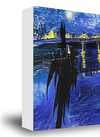
- Pillars

 Надіслати
Pillars


Гікле / Художній принт
Музейна якість друку جيкле або на полотні з оперативним виготовленням та різноманітними варіантами фінішної обробки.

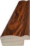
P118B $10
P118H $10
P118W $10
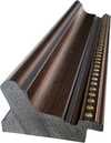
P438Z $10
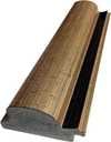
P508JH $12

P508YH $12
P805H $10
P805Z $10
P919BZ $10
P919G $10
P919XJ $10
P959ZH $10
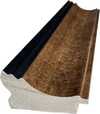
P968JZ $12
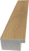
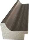
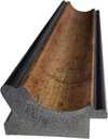
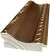
W106C $8
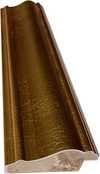
W218G $10

W218JH $8
W218Y $10
W307PJ $10

W316G $10
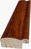
W316PJ $8
W316Y $10
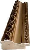
W398PJ $8
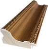
W4111J $10
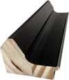
W500HY $15
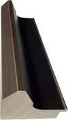
W500JH $15
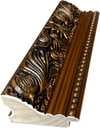
W692G $12
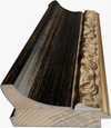
W849H $8
W940BG $15
W953PJ $8
Обирайте з наших стандартних розмірів, що відповідають оригінальним пропорціям твору мистецтва.
Ви можете вказати власні розміри, щоб репродукція ідеально підійшла до конкретної рами або інтер'єру. Якщо обраний вами розмір не відповідає пропорціям оригіналу, ми або обріжемо полотно, або розширимо зображення за допомогою дзеркального відображення чи суцільної заливки країв. Перед початком виробництва вам буде надіслано цифровий макет для затвердження.
Будь ласка, зверніть увагу, що попередній перегляд на екрані не відображає фактичне обрізання або розширення. Тільки макет точно покаже фінальну композицію.
Хоча можливість замовлення індивідуальних розмірів доступна, ми рекомендуємо обирати формат із попередньо визначеного списку, щоб зберегти оригінальні пропорції.
Доставка по всьому світу () за 2 тижні замість стандартних 4/5 тижнів. (16 Липень)

Безкоштовна експрес-доставка по всьому світу

Високоякісне лляне полотно

Повне страхове покриття доставки

Гарантія відшкодування митних зборів

Гарантія точного відтворення кольорів

Політика повернення протягом 60 днів (лише у разі виявлення дефектів)

Гарантія повернення 100% коштів

Знижка на багатоелементні замовлення
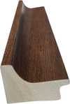
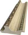
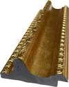
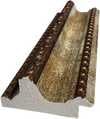
 Скляний варіант доступний лише для розмірів до 110 см

Pillars
Гікле / Художній принт
Розмір репродукції
-


Підсумкова ціна
-
Опис експоната
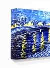
Josef Albers' Pillars: A Study in Order and Abstraction
Josef Albers’ "Pillars," created in 1928, is a striking example of early geometric abstraction that foreshadows the artist's later explorations of color theory. This artwork, measuring 61 x 61 cm, offers a compelling glimpse into Albers' artistic development during his time at the Bauhaus, a period marked by experimentation and a shift towards non-objective art.
Historical Context: The Bauhaus Influence
Albers’ journey as an artist was significantly shaped by his enrollment in the Bauhaus school in 1920. This progressive institution championed innovative educational ideas and fostered a climate of creative exploration. Initially studying painting at a traditional art school, Albers quickly gravitated towards the glass workshop within the Bauhaus, disregarding the prescribed wall painting class. It was here that he began creating "wall glass paintings"—assemblages of opaque glass—which served as precursors to his later color studies. “Pillars” reflects this early experimentation with form and material, demonstrating a move away from representational art towards pure abstraction.
Visual Analysis: Geometry, Color, and Composition
The artwork presents a meticulously structured composition characterized by vertical and horizontal lines arranged in a grid-like pattern. The color palette is restrained yet impactful, primarily featuring red, white, black, and grey tones with subtle variations. This deliberate choice of colors contributes to the overall sense of order and precision. The symmetrical arrangement emphasizes balance, while crisp, defined lines form rectangles and blocks that intersect, creating a complex visual texture. Notably, "Pillars" lacks traditional perspective or depth; it exists entirely on a flat, two-dimensional plane. The absence of recognizable objects or scenes reinforces the artwork’s purely abstract nature.
Style and Technique: Minimalism and Constructivism
“Pillars” aligns with both Minimalist and Constructivist aesthetics. Its emphasis on geometric forms, clean lines, and a limited color palette are hallmarks of Minimalism. Simultaneously, the structured grid and focus on construction evoke influences from Constructivism, an art movement that prioritized industrial materials and rational design principles. The technique employed appears to be precise painting, likely achieved through careful brushwork or potentially masking techniques to ensure sharp lines. The artwork is executed on canvas, as evidenced by the texture of the wooden backing.
Emotional Impact and Symbolism
While devoid of overt symbolism or emotional narrative, "Pillars" evokes a sense of order, precision, and intellectual rigor. Some viewers may perceive a slightly sterile or clinical aesthetic due to its geometric nature. However, the interplay of colors and forms creates a subtle visual rhythm that engages the viewer's perception. Ultimately, “Pillars” invites contemplation on the fundamental elements of art—line, shape, color—and their capacity to create compelling abstract compositions.
Схожі витвори мистецтва


Біографія митця
A Life Forged in Material: The Early Years and Bauhaus Formation
Josef Albers’s artistic journey began not amidst the rarefied air of established academies, but within the pragmatic world of his father’s contracting business in Bottrop, Germany. Born in 1888, young Josef absorbed a deep respect for materials – carpentry, plumbing, house-painting – skills that would fundamentally shape his aesthetic sensibility. This wasn't merely vocational training; it was an immersion into the very essence of making, understanding how forms materialized and the inherent qualities within each medium. He learned to appreciate the subtle textures of wood, the precise angles of metal, the transformative power of color applied to surfaces. Before dedicating himself fully to art, Albers spent five years as a schoolteacher, honing patience and pedagogical skill—attributes that would later define his influential teaching career. Formal artistic training commenced at the Königliche Kunstschule in Berlin between 1913 and 1915, where he explored printmaking, painting, and, crucially, stained glass. His early commission, “Rosa Mystica Ora Pro Nobis” (1918), a stunning stained-glass window for a church in Germany, foreshadowed his lifelong fascination with the interplay of light and color, hinting at the abstract explorations to come. This initial work wasn’t simply decorative; it was an investigation into how light *transformed* material, a theme that would resonate throughout his career. The meticulous craftsmanship required for stained glass instilled in him a deep appreciation for detail and precision – qualities he would later apply to his paintings.The Bauhaus Crucible: Color as Subject
A pivotal moment arrived in 1922 when Albers joined the faculty of the Bauhaus, a revolutionary school seeking to unify all artistic disciplines under Walter Gropius’s visionary leadership. Initially tasked with teaching the preliminary course – *Werklehre* (workshop practice) – he immersed himself in its core principles: functionalism, geometric abstraction, and material exploration. This period proved transformative. Albers began a systematic investigation into color perception, moving away from representational art towards an increasingly abstract vocabulary. He wasn’t interested merely in *what* colors were, but *how* they interacted, how they influenced each other, and how our eyes perceived them. The influence of fellow Bauhaus masters like Paul Klee and Wassily Kandinsky is discernible in his early work, yet Albers charted a unique course, prioritizing empirical observation over metaphysical interpretation. He wasn’t seeking spiritual truths through color; he was meticulously documenting its physical effects – a scientific rigor that became the hallmark of his artistic method. This focus on perception, on how we *see*, rather than what is *seen*, set him apart and laid the groundwork for his future explorations. The Bauhaus environment fostered experimentation with new materials and techniques, pushing Albers to explore unconventional methods of applying color and creating visual effects.Homage to the Square: A Laboratory of Perception
Following a period teaching at Black Mountain College – where he fostered a generation of American artists including Robert Rauschenberg and Cy Twombly – Albers embarked on what would become his most iconic series in 1949: “Homage to the Square.” This ongoing project consisted of paintings featuring nested squares within squares, each iteration exploring subtle variations in color relationships. It’s a deceptively simple premise, but one that belies an incredibly complex and rigorous investigation. Albers meticulously documented his experiments, revealing how colors aren't static entities but dynamic forces governing each other through internal logic – often misleading to the eye. A seemingly brighter square might appear to recede while a darker one advances, defying intuitive understanding. The series wasn’t intended as a celebration of geometry; rather, it was a laboratory for studying color perception. Albers’s goal was not to create beautiful pictures but to reveal the underlying principles governing how we *see* color. This research culminated in his seminal book, “Interaction of Color” (1963), a foundational text still studied by artists and designers today. The book isn't a treatise on color theory; it’s a series of exercises designed to demonstrate how our perception of color is relative and contextual – a testament to Albers’ belief that seeing is not passive, but an active process of interpretation.Chromatic Interactions and Legacy
Albers continued to refine his artistic practice throughout the 1950s and 60s, exploring variations on “Homage to the Square” and creating other works based on geometric abstraction and color interaction. He developed a unique system for documenting his experiments, meticulously recording the colors used, their spatial relationships, and the resulting visual effects. This systematic approach became central to his teaching methodology, emphasizing observation, analysis, and critical thinking. Albers’s influence extended far beyond his own artistic output. As head of the design department at Yale University from 1950 until 1968, he shaped the education of countless designers and artists, instilling in them a commitment to rigorous experimentation and a deep understanding of visual perception. His legacy is one of intellectual rigor combined with profound aesthetic sensitivity – a testament to his belief that art can be both beautiful and intellectually stimulating. Josef Albers died on March 25, 1976, in New Haven, Connecticut, leaving behind a body of work that continues to challenge and inspire artists and designers around the world.Notable Works
- Gray Instrumentation I Prospectus (1975): A minimalist monochrome painting exemplifying geometric balance and subtle tonal variations.
- Study for Homage to the Square – Beaming (Date Unknown): A classic example of Albers’s exploration of color interaction within nested squares, evoking a sense of calm and spatial depth.
- Rosa Mystica Ora Pro Nobis (1918): His early stained-glass commission, foreshadowing his lifelong fascination with light and color.

Йозеф Альберс
1888 - 1976 , Німеччина
Короткі факти
- Artistic Movement Or Style: Геометрична абстракція
- Artists Or Movements Influenced By This Artist:
- Minimalism
- Color Field Painting
- Artists Who Influenced This Artist:
- Paul Klee
- Wassily Kandinsky
- Date Of Birth: 19 березня 1888
- Date Of Death: 25 березня 1976
- Full Name: Josef Albers
- Nationality: Німецько-американський
- Notable Artworks:
- Homage to the Square
- Gray Instrumentation I Prospectus
- Rosa Mystica Ora Pro Nobis
- Place Of Birth: Боттром, Німеччина
Пов'язані статті

Топ-10 шедеврів геометричної абстракції: мистецтво для вашого інтер'єру від ArtsDot.com
Відкрийте для себе 10 шедеврів геометричної абстракції від Кандинського, Малевича та Мондріана! Історія мистецтва, кольори та форми. Репродукції картин преміум-класу на ArtsDot.com – ідеальний декор для вашого дому.

The Subtleties of Shade: Exploring Black, White & Gray Abstraction in Modern Interior Design
Explore the power of black, white & gray abstraction in modern interior design. Discover how minimalist art impacts spatial perception & creates sophisticated hotel spaces. Expert insights for designers.

Топ-10 шедеврів у білих тонах: мистецтво світла та простору від ArtsDot
Відкрийте для себе 10 легендарних картин, де білий колір стає головним героєм! Історія Моне, Ван Гога та інших майстрів. Купіть репродукції шедеврів імпресіонізму на ArtsDot.com – мистецтво для вашого дому.

Josef Albers: A Homage to Color Interaction & the Foundations of Visual Perception
Explore Josef Albers's groundbreaking color theory & the 'Homage to the Square' series. Discover how his work revolutionized visual perception and influenced modern art movements like Minimalism & Op Art. Learn about his Bauhaus roots & lasting legacy.

Тиха Резонанс Стриманості: Мінімалістична Абстракція як Каталізатор Безтурботного Інтер'єру
Відкрийте секрети створення безтурботного інтер'єру з мінімалістичною абстракцією! Експертні поради, натхнення та практичні рішення для дому. Зробіть простір гармонійним та функціональним.