- Додому

- Друк на полотні
- Йозеф Альберс
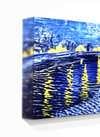
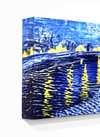
- Homage to the Square Glow

 Надіслати
Homage to the Square Glow
 Painting
- Other
- Abstract Art
 1966
1966- Modern
 122.0 x 122.0 cm
Гікле / Художній принт
Музейна якість друку جيкле або на полотні з оперативним виготовленням та різноманітними варіантами фінішної обробки.
 Читати далі

Обирайте з наших стандартних розмірів, що відповідають оригінальним пропорціям твору мистецтва.
Ви можете вказати власні розміри, щоб репродукція ідеально підійшла до конкретної рами або інтер'єру. Якщо обраний вами розмір не відповідає пропорціям оригіналу, ми або обріжемо полотно, або розширимо зображення за допомогою дзеркального відображення чи суцільної заливки країв. Перед початком виробництва вам буде надіслано цифровий макет для затвердження.
Будь ласка, зверніть увагу, що попередній перегляд на екрані не відображає фактичне обрізання або розширення. Тільки макет точно покаже фінальну композицію.
Хоча можливість замовлення індивідуальних розмірів доступна, ми рекомендуємо обирати формат із попередньо визначеного списку, щоб зберегти оригінальні пропорції.
Доставка по всьому світу () за 2 тижні замість стандартних 4/5 тижнів. (1 Липень)

Безкоштовна експрес-доставка по всьому світу

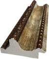
Високоякісне лляне полотно

Повне страхове покриття доставки

Гарантія відшкодування митних зборів

Гарантія точного відтворення кольорів

Політика повернення протягом 60 днів (лише у разі виявлення дефектів)

Гарантія повернення 100% коштів

Знижка на багатоелементні замовлення
 Скляний варіант доступний лише для розмірів до 110 см

Homage to the Square Glow
Гікле / Художній принт
Розмір репродукції
-


Підсумкова ціна
-
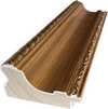
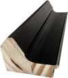
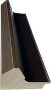
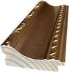
Опис експоната
The Geometry of Perception: Exploring Josef Albers' Homage to the Square Glow
To stand before Homage to the Square Glow is not merely to observe paint on canvas; it is to enter a meticulously constructed optical experience. This striking abstract composition, executed by the master color theorist Josef Albers in 1966, invites the viewer into a profound meditation on how color interacts with its neighbor. The piece commands attention with its vibrant field of red, serving as a rich, enveloping backdrop against which nine distinct yellow squares are strategically placed. These squares, varying dramatically in size—from the substantial anchor at the bottom left to the delicate whisper near the top right—do not exist in isolation. Instead, they engage in a silent, dynamic conversation across the square format, creating an undeniable visual rhythm that speaks volumes about perception itself.
A Masterclass in Color Theory and Materiality
Albers’s genius was never just in painting; it was in understanding the very physics of color. His background, steeped in the tangible realities of craftsmanship—the materials of his father's contracting business—infused his abstract work with an almost architectural solidity. Here, the technique is deceptively simple: flat planes of saturated pigment. Yet, the effect achieved is anything but flat. The juxtaposition of red and yellow forces the eye to constantly recalibrate its understanding of hue. It is a testament to Albers’s lifelong study that he could manipulate such basic elements—color and shape—to evoke such complex emotional resonance. For those drawn to modern design or collecting art that speaks to intellectual depth, this piece offers an unparalleled lesson in visual harmony.
Historical Context: Bauhaus Echoes into Abstraction
Emerging from the fertile ground of mid-century Modernism, Homage to the Square Glow carries the torch of early 20th-century design principles while speaking with a distinctly mature voice. While rooted in the rigorous explorations of form championed by movements like the Bauhaus, Albers always maintained a deeply personal, almost spiritual connection to his subject matter. The work represents a pinnacle moment where pure abstraction achieved profound emotional accessibility. It is art that rewards contemplation, suggesting that even the most rigid geometric structure can house boundless feeling.
Emotional Resonance and Interior Application
For the collector or designer seeking a focal point imbued with thoughtful history, this reproduction offers immediate impact. The intense warmth emanating from the red field, punctuated by the bright, energetic pops of yellow, injects vitality into any space. It is a piece that feels both scholarly in its execution and wildly optimistic in its spirit. Whether placed above a console table or serving as a singular statement piece in a gallery setting, Homage to the Square Glow does more than decorate; it activates the room, encouraging viewers to pause, look closer, and reconsider the simple relationship between two colors.
Схожі витвори мистецтва


Біографія митця
A Life Forged in Material: The Early Years and Bauhaus Formation
Josef Albers’s artistic journey began not amidst the rarefied air of established academies, but within the pragmatic world of his father’s contracting business in Bottrop, Germany. Born in 1888, young Josef absorbed a deep respect for materials – carpentry, plumbing, house-painting – skills that would fundamentally shape his aesthetic sensibility. This wasn't merely vocational training; it was an immersion into the very essence of making, understanding how forms materialized and the inherent qualities within each medium. He learned to appreciate the subtle textures of wood, the precise angles of metal, the transformative power of color applied to surfaces. Before dedicating himself fully to art, Albers spent five years as a schoolteacher, honing patience and pedagogical skill—attributes that would later define his influential teaching career. Formal artistic training commenced at the Königliche Kunstschule in Berlin between 1913 and 1915, where he explored printmaking, painting, and, crucially, stained glass. His early commission, “Rosa Mystica Ora Pro Nobis” (1918), a stunning stained-glass window for a church in Germany, foreshadowed his lifelong fascination with the interplay of light and color, hinting at the abstract explorations to come. This initial work wasn’t simply decorative; it was an investigation into how light *transformed* material, a theme that would resonate throughout his career. The meticulous craftsmanship required for stained glass instilled in him a deep appreciation for detail and precision – qualities he would later apply to his paintings.The Bauhaus Crucible: Color as Subject
A pivotal moment arrived in 1922 when Albers joined the faculty of the Bauhaus, a revolutionary school seeking to unify all artistic disciplines under Walter Gropius’s visionary leadership. Initially tasked with teaching the preliminary course – *Werklehre* (workshop practice) – he immersed himself in its core principles: functionalism, geometric abstraction, and material exploration. This period proved transformative. Albers began a systematic investigation into color perception, moving away from representational art towards an increasingly abstract vocabulary. He wasn’t interested merely in *what* colors were, but *how* they interacted, how they influenced each other, and how our eyes perceived them. The influence of fellow Bauhaus masters like Paul Klee and Wassily Kandinsky is discernible in his early work, yet Albers charted a unique course, prioritizing empirical observation over metaphysical interpretation. He wasn’t seeking spiritual truths through color; he was meticulously documenting its physical effects – a scientific rigor that became the hallmark of his artistic method. This focus on perception, on how we *see*, rather than what is *seen*, set him apart and laid the groundwork for his future explorations. The Bauhaus environment fostered experimentation with new materials and techniques, pushing Albers to explore unconventional methods of applying color and creating visual effects.Homage to the Square: A Laboratory of Perception
Following a period teaching at Black Mountain College – where he fostered a generation of American artists including Robert Rauschenberg and Cy Twombly – Albers embarked on what would become his most iconic series in 1949: “Homage to the Square.” This ongoing project consisted of paintings featuring nested squares within squares, each iteration exploring subtle variations in color relationships. It’s a deceptively simple premise, but one that belies an incredibly complex and rigorous investigation. Albers meticulously documented his experiments, revealing how colors aren't static entities but dynamic forces governing each other through internal logic – often misleading to the eye. A seemingly brighter square might appear to recede while a darker one advances, defying intuitive understanding. The series wasn’t intended as a celebration of geometry; rather, it was a laboratory for studying color perception. Albers’s goal was not to create beautiful pictures but to reveal the underlying principles governing how we *see* color. This research culminated in his seminal book, “Interaction of Color” (1963), a foundational text still studied by artists and designers today. The book isn't a treatise on color theory; it’s a series of exercises designed to demonstrate how our perception of color is relative and contextual – a testament to Albers’ belief that seeing is not passive, but an active process of interpretation.Chromatic Interactions and Legacy
Albers continued to refine his artistic practice throughout the 1950s and 60s, exploring variations on “Homage to the Square” and creating other works based on geometric abstraction and color interaction. He developed a unique system for documenting his experiments, meticulously recording the colors used, their spatial relationships, and the resulting visual effects. This systematic approach became central to his teaching methodology, emphasizing observation, analysis, and critical thinking. Albers’s influence extended far beyond his own artistic output. As head of the design department at Yale University from 1950 until 1968, he shaped the education of countless designers and artists, instilling in them a commitment to rigorous experimentation and a deep understanding of visual perception. His legacy is one of intellectual rigor combined with profound aesthetic sensitivity – a testament to his belief that art can be both beautiful and intellectually stimulating. Josef Albers died on March 25, 1976, in New Haven, Connecticut, leaving behind a body of work that continues to challenge and inspire artists and designers around the world.Notable Works
- Gray Instrumentation I Prospectus (1975): A minimalist monochrome painting exemplifying geometric balance and subtle tonal variations.
- Study for Homage to the Square – Beaming (Date Unknown): A classic example of Albers’s exploration of color interaction within nested squares, evoking a sense of calm and spatial depth.
- Rosa Mystica Ora Pro Nobis (1918): His early stained-glass commission, foreshadowing his lifelong fascination with light and color.

Йозеф Альберс
1888 - 1976 , Німеччина
Короткі факти
- Artistic Movement Or Style: Геометрична абстракція
- Artists Or Movements Influenced By This Artist:
- Minimalism
- Color Field Painting
- Artists Who Influenced This Artist:
- Paul Klee
- Wassily Kandinsky
- Date Of Birth: 19 березня 1888
- Date Of Death: 25 березня 1976
- Full Name: Josef Albers
- Nationality: Німецько-американський
- Notable Artworks:
- Homage to the Square
- Gray Instrumentation I Prospectus
- Rosa Mystica Ora Pro Nobis
- Place Of Birth: Боттром, Німеччина
Пов'язані статті

Топ-25 шедеврів Василя Кандинського: подорож у світ абстрактного мистецтва | ArtsDot.com
Відкрийте для себе 25 найвідоміших шедеврів Василя Кандинського! Пориньте у світ абстрактного мистецтва, експресіонізму та кольорових композицій. Репродукції картин Кандинського преміум-якості на ArtsDot.com – для вашого інтер'єру з душею. Дослідіть повну колекцію онлайн!

Топ-10 шедеврів геометричної абстракції: мистецтво для вашого інтер'єру від ArtsDot.com
Відкрийте для себе 10 шедеврів геометричної абстракції від Кандинського, Малевича та Мондріана! Історія мистецтва, кольори та форми. Репродукції картин преміум-класу на ArtsDot.com – ідеальний декор для вашого дому.
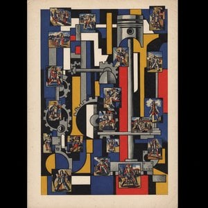
Топ-25 шедеврів Фернана Леже: мистецтво машинного віку для вашого дому | ArtsDot
Відкрийте для себе 25 шедеврів Фернана Леже – піонера кубізму та тубізму! Історія мистецтва, кольори та форми машинного віку. Репродукції картин високої якості від ArtsDot.com. Дослідіть повну колекцію онлайн!

Казимир Малевич: Топ-25 шедеврів абстрактного мистецтва для вашого дому | ArtsDot
Відкрийте світ Казимира Малевича! Топ-25 шедеврів супрематизму, включаючи легендарний Чорний квадрат. Історія мистецтва, репродукції картин та ідеї декору для вашого дому на ArtsDot.com. Дослідіть повну колекцію онлайн!

Beyond Form & Color: Geometric Abstraction's Enduring Legacy in Art History
Explore the captivating world of geometric abstraction! Discover its origins, key artists like Malevich & Mondrian, and why this movement remains highly valued by art collectors today. Expert insights at ArtsDot.