

 Förhandsvisa

 Skicka
 Dela
 Visa detaljer
 Guide


 Ladda ner
 Liknande objekt
 Röntgen
 Bildspel
 Frågor och svar
 Statistik
Light Grey Wall

- 60.0 x 87.0 cm


 Visa mer
Konstverket som visas på denna sida skyddas av upphovsrättslagen, vilket innebär att vi inte lagligt kan skapa eller sälja en identisk reproduktion. Detta skydd upprätthålls genom internationella avtal såsom den Bernkonventionen och genom nationella lagar, inklusive de som fastställs av Amerikansk upphovsrättslag – Titel 17. Alla rättigheter förbehållna. Återgivning av konstverk är förbjuden utan skriftligt tillstånd från WahooArt.
Denna metod följer fullt ut upphovsrättsliga regler eftersom den inte innebär kopiering eller duplicering av det skyddade konstverket. Istället är det en kreativ nytolkning – en ny målning som är influerad av originalet men inte identisk med det.
Giclée / Konsttryck
Giclée- eller canvasprint av museumskvalitet med snabb produktion och flexibla ytbehandlingsalternativ. ( Beställ handmålad reproduktion Byt till digital bild)
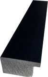
P118B Skr10
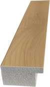
P118H Skr10
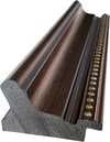
P118W Skr10
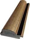
P438Z Skr10
P508JH Skr12
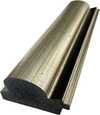
P508YH Skr12
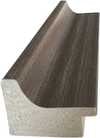
P805H Skr10
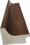
P805Z Skr10
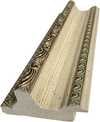
P919BZ Skr10
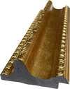
P919G Skr10
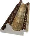
P919XJ Skr10
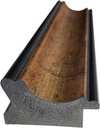
P959ZH Skr10
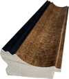
P968JZ Skr12
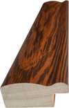
W106C Skr8
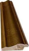
W218G Skr10
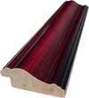
W218JH Skr8
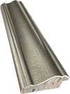
W218Y Skr10
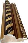
W307PJ Skr10
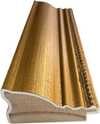
W316G Skr10
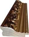
W316PJ Skr8
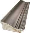
W316Y Skr10
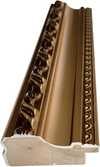
W398PJ Skr8
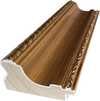
W4111J Skr10
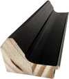
W500HY Skr15
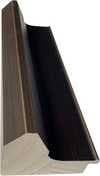
W500JH Skr15
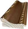
W692G Skr12
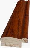
W849H Skr8
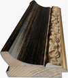
W940BG Skr15
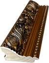
W953PJ Skr8
Välj bland våra förinställda storlekar som motsvarar konstverkets ursprungliga proportioner.

Ange den bredd och höjd du behöver för att passa din ram eller vägg. Ett tryck kan endast beskäras, aldrig göras större än originalbilden, vilket innebär att ett format med en annan proportion leder till att en del av bilden går förlorad. Vi skickar en digital mockup för godkännande innan vi påbörjar tryckningen. Bilden som visas på denna sida visar inte den faktiska beskärningen — det är endast mockuppen som gör det.
Leverans över hela världen () på 2 veckor istället för standard 4/5 veckor. (16 november)

Fri expressfrakt över hela världen

Högkvalitativ linnecanvas

Fullständig fraktförsäkring

Garantier för återbetalning av tullavgifter

Garantier för exakt färgåtergivning

100 dagars returrätt (endast vid fel)

100% pengarna tillbaka-garanti

Mängdrabatt erbjuds
 Glasalternativet är endast tillgängligt i storlekar under 110 cm.

Light Grey Wall
Giclée / Konsttryck
Storlek på reproduktion
-


Slutgiltigt pris
Skr 625
Josef Albers’ Light Grey Wall: A Meditation on Color Interaction
Josef Albers is one of the most important proponents of geometric abstraction, and his activity as an artist is inseparable from his influential work as a teacher. In the 1920s he taught in the Bauhaus, and after it was closed in prestigious American universities such as Black Mountain College, Harvard and Yale. He summarized his courses in colour theory in 1963 in his book The Interaction of Color.The Light Grey Wall is closely related to Albers’s theoretical research—a sequel to the Adobe series, the idea for which came to him in Mexico in 1947—representing a profound exploration into how colours perceive each other and how this perception shapes our visual experience. It's more than just an aesthetically pleasing composition; it embodies Albers’s core belief that art should stimulate contemplation and challenge conventional ways of seeing.- Subject Matter: The artwork presents a deceptively simple subject – the arrangement of geometric forms. Specifically, two vertical bars are positioned symmetrically within a rectangular frame, creating a balanced visual equilibrium.
- Style & Movement: Light Grey Wall firmly establishes itself within Constructivism and Minimalism, prioritizing form and structure over representational content. This stylistic choice reflects Albers’s desire to strip away extraneous details, focusing solely on the fundamental elements of visual perception.
- Technique: Executed in oil on fiberboard, the painting demonstrates meticulous attention to detail—primarily achieved through printmaking techniques like lithography or etching. The smooth surface and subtle tonal variations convey a sense of precision and control, mirroring Albers’s methodical approach to artistic creation. Noticeably absent are brushstrokes or impasto, emphasizing flatness and contributing to the overall feeling of serenity.
Compositional Harmony & Spatial Illusion
The rectangular frame serves as an anchor for the artwork's visual narrative, dividing the canvas into horizontal bands of grey. Two vertical bars dominate the central rectangle, adding dynamism and balance without disrupting the overarching stillness. The upper band is slightly lighter than the lower one—a subtle gesture that introduces tonal contrast and subtly guides the viewer’s gaze. Despite its apparent simplicity, Light Grey Wall achieves a remarkable feat: it generates depth through layering of shapes and varying shades of grey, creating an illusion of recession that invites contemplation. This technique skillfully mimics the way light interacts with surfaces in real life—a deliberate nod to Albers's fascination with optics and perception.Historical Context & Theoretical Significance
Created in 1958, Light Grey Wall emerged during a period marked by significant advancements in color theory and artistic experimentation. It builds upon Albers’s earlier work exploring the concept of “interaction,” where colours influence each other's appearance—a cornerstone of his influential teachings at Black Mountain College and Yale University. The piece exemplifies Albers’s belief that art should provoke thought and stimulate sensory awareness, aligning perfectly with the broader ethos of Minimalism and its rejection of decorative elements. It stands as a testament to Albers’s unwavering commitment to investigating the fundamental principles governing visual experience.Symbolism & Emotional Resonance
Beyond its formal qualities, Light Grey Wall possesses a quiet emotional resonance—a feeling of order, control, and perhaps contemplative stillness. The monochromatic palette reinforces this mood, stripping away distractions and inviting viewers to focus on the interplay between form and colour. As Albers famously stated, “Art is not to be looked at; Art is looking at us,” encapsulating his artistic philosophy and highlighting the artwork’s capacity to engage the viewer intellectually and emotionally. Light Grey Wall remains a powerful reminder of the transformative potential inherent in minimalist art—a celebration of simplicity and an invitation to embrace mindful observation.Frågor och svar
Vilken är den emotionella tonen i "Light Grey Wall" av Josef Albers?
Den emotionella tonen som har registrerats för "Light Grey Wall" av Josef Albers är Reflective. Den sammanfattar den känsla som verket uttrycker.
Vilken storlek bör jag välja för tryck av "Light Grey Wall" till mitt rum?
Rekommenderad kombination för "Light Grey Wall" av Josef Albers: ett tryck i storlek Large för ett Living Room.
Vilken känsla tillför "Light Grey Wall" av Josef Albers ett rum?
Den Calm atmosfären i "Light Grey Wall" av Josef Albers passar perfekt för det rekommenderade rummet: ett Living Room.
Liknande konstverk


Konstnärsbiografi
A Life Forged in Material: The Early Years and Bauhaus Formation
Josef Albers’s artistic journey began not amidst the rarefied air of established academies, but within the pragmatic world of his father’s contracting business in Bottrop, Germany. Born in 1888, young Josef absorbed a deep respect for materials – carpentry, plumbing, house-painting – skills that would fundamentally shape his aesthetic sensibility. This wasn't merely vocational training; it was an immersion into the very essence of making, understanding how forms materialized and the inherent qualities within each medium. He learned to appreciate the subtle textures of wood grain, the precise angles of metalwork, and the transformative power of color in a painter’s palette. Before dedicating himself fully to art, Albers spent five years as a schoolteacher, honing patience and pedagogical skill—attributes that would later define his influential teaching career. Formal artistic training commenced at the Königliche Kunstschule in Berlin between 1913 and 1915, where he explored printmaking, painting, and, crucially, stained glass. His early commission, “Rosa Mystica Ora Pro Nobis” (1918), a stunning stained-glass window for a church in Germany, foreshadowed his lifelong fascination with the interplay of light and color, hinting at the abstract explorations to come. This initial work wasn’t simply decorative; it was an investigation into how light *transformed* material, a theme that would resonate throughout his career – a delicate dance between pigment and illumination.The Bauhaus Crucible: Color as Subject
A pivotal moment arrived in 1922 when Albers joined the faculty of the Bauhaus, a revolutionary school seeking to unify all artistic disciplines under Walter Gropius’s visionary leadership. Initially tasked with teaching the preliminary course – *Werklehre* (workshop practice) – he immersed himself in its core principles: functionalism, geometric abstraction, and material exploration. This period proved transformative. Albers began a systematic investigation into color perception, moving away from representational art towards an increasingly abstract vocabulary. He wasn’t interested merely in *what* colors were, but *how* they interacted, how they influenced each other, and how our eyes perceived them. The influence of fellow Bauhaus masters like Paul Klee and Wassily Kandinsky is discernible in his early work, yet Albers charted a unique course, prioritizing empirical observation over metaphysical interpretation. He wasn’t seeking spiritual truths through color; he was meticulously documenting its physical effects – a scientific rigor that became the hallmark of his artistic method. This focus on perception, on how we *see*, rather than what is *seen*, set him apart and laid the groundwork for his future explorations. The Bauhaus environment fostered experimentation with unconventional materials—glass, metal, wood—and encouraged students to challenge traditional notions of art and design.Homage to the Square: A Laboratory of Perception
Following a period teaching at Black Mountain College – where he fostered a generation of American artists including Robert Rauschenberg and Cy Twombly – Albers embarked on what would become his most iconic series in 1949: “Homage to the Square.” This ongoing project consisted of paintings featuring nested squares within squares, each iteration exploring subtle variations in color relationships. It’s a deceptively simple premise, but one that belies an incredibly complex and rigorous investigation. Albers meticulously documented his experiments, revealing how colors aren't static entities but dynamic forces governing each other through internal logic – often misleading to the eye. A seemingly brighter square might appear to recede while a darker one advances, defying intuitive understanding. The series wasn’t intended as a celebration of geometry; rather, it was a laboratory for studying color perception. Albers’s goal was not to create beautiful pictures but to reveal the underlying rules governing how we perceive color – a profound exploration of visual psychology. This work culminated in his seminal book, “Interaction of Color” (1963), a foundational text still studied by artists and designers today. The book isn't a treatise on color theory; it’s a series of exercises designed to demonstrate how our perception of color is relative and contextual – a testament to Albers’ belief that seeing is not passive, but an active process of interpretation.Legacy and Enduring Influence
Josef Albers’s impact extends far beyond his paintings. His tenure as head of the design department at Yale University, from 1950 until his retirement in 1958, cemented his reputation as a profoundly influential teacher. He emphasized hands-on experimentation, critical observation, and relentless questioning of assumptions. Students weren't simply taught *what* to paint; they were taught *how* to see – to analyze, to deconstruct, and to understand the underlying principles governing visual experience. Albers’s approach fostered independent thinking and encouraged students to develop their own unique artistic voices. “Interaction of Color” continues to be a cornerstone of art education, shaping how generations understand color relationships. Albers is now recognized as a key figure in the development of abstract art, particularly geometric abstraction and minimalist aesthetics. His “Homage to the Square” series remains iconic for its exploration of perceptual phenomena, demonstrating that even within seemingly simple forms, there exists an infinite complexity waiting to be discovered. He died on March 25, 1976, in New Haven, Connecticut, leaving behind a legacy that continues to inspire and challenge artists, designers, and educators alike – a testament to the power of observation, experimentation, and the enduring mystery of color.Notable Works
- Gray Instrumentation I Prospectus (1975): A minimalist monochrome painting exemplifying geometric balance and subtle tonal variations.
- Study for Homage to the Square – Beaming (Date Unknown): A classic example of Albers’s exploration of color interaction within nested squares, evoking a sense of calm and spatial depth.
- Rosa Mystica Ora Pro Nobis (1918): His early stained-glass commission, foreshadowing his lifelong fascination with light and color.

Josef Albers
1888 - 1976 , Tyskland
Kortfakta
- Artistic Movement Or Style: Geometrisk abstraktion
- Artists Or Movements Influenced By This Artist:
- Minimalism
- Färdplanering
- Artists Who Influenced This Artist:
- Paul Klee
- Kandinsky
- Date Of Birth: 19 mars 1888
- Date Of Death: 25 mars 1976
- Full Name: Josef Albers
- Nationality: Tysk-amerikansk
- Notable Artworks:
- Homage till kvadraten
- Rosa Mystica
- Gray Instrumentation
- Place Of Birth: Bottrop, Tyskland
Relaterade artiklar

Josef Albers: A Homage to Color Interaction & the Foundations of Visual Perception
Explore Josef Albers's groundbreaking color theory & the 'Homage to the Square' series. Discover how his work revolutionized visual perception and influenced modern art movements like Minimalism & Op Art. Learn about his Bauhaus roots & lasting legacy.

Geometrisk Abstraktion: Topp 10 Mästverk som Formade Konsten | ArtsDot.com
Utforska de 10 mästerverk som definierade geometrisk abstraktion! Lär känna Mondrian, Kandinsky & Malevich. Hitta inspiration och museumskvalitativa konsttryck för ditt hem på ArtsDot.com. Upptäck hela samlingen online!

Masterpieces of Light: The Top 25 Artworks by James McNeill Whistler
Explore the iconic masterpieces of James McNeill Whistler. Discover the essence of Tonalism and fine art on ArtsDot.com.
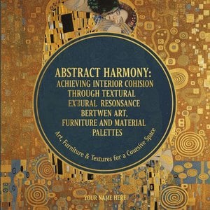
Abstrakt harmoni: Att skapa sammanhang i interiören genom texturresonans mellan konst, möbler och materialpaletter
Skapa harmoniska hem med abstrakt konst! Expertguider om färg, textur & belysning. Hitta inspiration och investera i tidlösa verk som speglar din personlighet – hos ArtsDot.

Tre dukars berättelse: Valets emotionella landskap i konstnärlig reproduktion och personligt uttryck
Utforska konstnärlig reproduktionens värld! Lär dig skilja äkta konst från kopior, förstå tekniker och undvika förfalskningar. Skapa personliga mästerverk med ArtsDot.com – din expertpartner inom kvalitetskonst.