

 Náhľad v interiéri
 Odoslať ako digitálnu kartu
 Zdieľať
 Podrobnosti o dielo
 Príručka

 Stiahnuť obraz
 Podobné položky
 RTG skúška
 Prehliadanie diapozoje
 Otázky a odpovede
 Štatistiky
Orange and Tan

- 206.0 x 161.0 cm


 Zobraziť viac
Umelecké dielo zobrazené na tejto stránke je chránené autorským zákonom, čo znamená, že nemôžeme legálne vytvárať ani predávať jeho identickú reprodukciu. Táto ochrana je vymáhaná na základe medzinárodných dohôd, ako napríklad Bernská konvencia a národnými zákonmi, vrátane tých, ktoré sú stanovené v Autorské právo USA – Title 17. Všetky práva vyhradené.
Táto metóda plne dodržiava autorské práva, pretože nezahŕňa kopírovanie ani duplikovanie chráneného diela. Ide skôr o kreatívnu reinterpretáciu – nový obraz, ktorý je ovplybnený originálom, no nie je s ním identický.
Giclée / Umenotlač
Giclée tlač alebo plátno múzeálnej kvality s rýchlou výrobou a rôznymi možnosťami povrchovej úpravy. ( Kúpiť ručne maľovaný obraz Prepnúť na digitálny obraz)
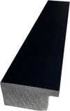
P118B €10
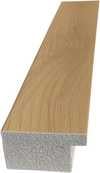
P118H €10
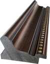
P118W €10
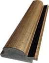
P438Z €10
P508JH €12
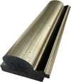
P508YH €12
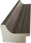
P805H €10
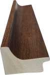
P805Z €10
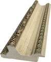
P919BZ €10
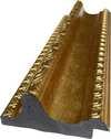
P919G €10
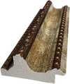
P919XJ €10
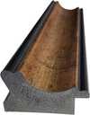
P959ZH €10
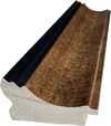
P968JZ €12
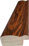
W106C €8

W218G €10
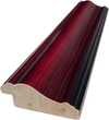
W218JH €8
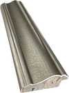
W218Y €10
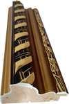
W307PJ €10

W316G €10
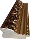
W316PJ €8
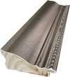
W316Y €10
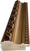
W398PJ €8
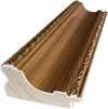
W4111J €10
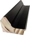
W500HY €15
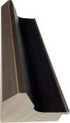
W500JH €15
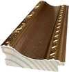
W692G €12
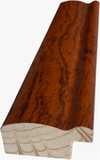
W849H €8
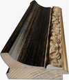
W940BG €15
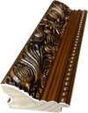
W953PJ €8


Vyberte si z našich preddefinovaných rozmerov, ktoré zodpovedajú pôvodným pomeroḿ diela.

Zadajte šírku a výšku, ktoré potrebujete, aby sa reprodukcia hodila k vášmu rámu alebo stene. Print možno len orezávať, nikdy však nemennú veľkosť zvětšiť oproti pôvodnému obrázku, preto pri inom formáte stráca časť obrazu. Pred samotným vytlačiacím procesom vám pošleme digitálny náhľad na schválenie. Obrázok zobrazený na tejto stránke nezobrazuje reálny rez — len digitálny náhľad ukazuje presný výsledok.
Celosvetová doprava () do 2 týždňov namiesto štandardných 4 až 5 týždňov. (11 november)

Bezplatná expresná doprava po celom svete

Vysokokvalitné lnianske plátno

Kompletné poistenie prepravy

Záruka vrátenia colného poplatku

Záruka presného farebného zhodnutia

100-dená politika vrátenia tovaru (iba pri vadách)

100% záruka vrátenia peňazí

Zľava pri väčšom množstve
 Možnosť skla je dostupná len pri rozmeroch pod 110 cm

Orange and Tan
Giclée / Umenotlač
Veľkosť reprodukcie
-


Celková cena
€ 56
Identification of Orange and Tan
Orange and Tan is an abstract work by the artist Mark Rothko. Created in 1954, the painting exists as a quiet intersection of color and space. It belongs to the movements of Abstract Expressionism and Color Field painting, while also being categorized within the Abstract (Modern) tradition.
The canvas holds a specific weight. It is a study of hue and texture that avoids the depiction of recognizable objects or scenes. Instead, the work relies on the presence of pigment to communicate. The composition is defined by its relationship to the viewer, offering a direct encounter with the medium itself.
The painting remains a significant part of the artist's mid-century output. It occupies a space where the boundaries of form begin to dissolve into the background. A soft light seems to reside within the layers of the pigment.
Composition and Visual Elements
Two rectangular blocks of color define the space. A red-orange shape hovers above a warm yellow-gold field. These geometric forms occupy the canvas without the need for recognizable objects or scenes. The arrangement relies on the weight of these blocks to create a sense of balance. It is a study in color field and abstract structure.
The palette remains warm, built from orange and yellow tones. A thick impasto texture marks the surface, giving the pigment a physical presence. Light seems to catch on the ridges of the paint. The edges of the shapes are soft, blurring the boundary where one hue meets the next. A subtle blue-green stroke rests beneath the ochre background, providing a cool counterpoint to the dominant warmth.
The scale of the work is large, measuring 206 x 161 cm. This size allows the color to fill the viewer's peripheral vision. The composition avoids narrative, focusing instead on the interaction of light and pigment. The surface holds a quiet, heavy presence.
Technique and Material Composition
The canvas holds a weight of pigmented hide glue and oil. Rothko achieved a luminous depth through a technique of condensation, layering thin washes of pigment to build the surface. These translucent veils of color allow light to settle within the paint itself. The resulting texture is tactile, a physical presence that invites a close, quiet observation of the material grain.
To achieve these subtle gradations, the artist mixed oil paints with mineral spirits and varnishes. This combination allows the hues to bleed into one another. The edges of the rectangular blocks are soft and blurred, lacking any sharp or definitive boundary. Instead, the colors hover in a hazy state, meeting where the pigment thins into the background. A single, delicate stroke of blue-green rests beneath the ochre, a cool interruption in the warmth of the oil.
Provenance and Collection History
The canvas resides within the National Gallery of Art in Washington DC. It carries the accession number 1977.47.13. This placement marks its permanent home among the public collections, a quiet station for its layered pigments.
The work entered the institution through a gift from Enid A. Haupt. Such transitions move the object from private hands into the stewardship of the gallery. The legal rights and copyright for the image are held by Kate Rothko Prizel and Christopher Rothko.
The history of the piece is a record of movement and preservation. It remains a fixed point in the gallery's holdings.
Related Works by Mark Rothko
The resonance of color shifts through his evolving palette. In 1953, No.61 (Rust and Blue) explored a different temperature, pairing deep oxidation with the coolness of sky. A few years later, around 1956, Orange and yellow revisited the warmth of the sun, though the arrangement of light changed. These canvases exist as quiet neighbors to the heavy presence of Orange and Tan.
Other compositions rely on the weight of darker tones to anchor the eye. No. 10 (Brown Black Sienna on Dark Wine) uses deep, bruised hues to create a sense of gravity. In contrast, Magenta, Black, Green on Orange brings a sharp, chromatic tension to the surface. Each work seeks a specific frequency of human feeling through the layering of pigment.
- No.61 (Rust and Blue), 1953
- Orange and yellow, about 1956
- No. 10 (Brown Black Sienna on Dark Wine)
- Magenta, Black, Green on Orange
The paint settles into the grain. Light remains trapped beneath the surface.
Otázky a odpovede
Aká farebná paleta je použitá v díle „Orange and Tan“ od Mark Rothko?
Paleta diela „Orange and Tan“ od Mark Rothko je opísaná ako Earthy. Ide o stručný popis farebnej skladby tohto diela.
Aký emocionálny tón má dielo „Orange and Tan“ od Mark Rothko?
Emocionálny tón zaznamenaný pre „Orange and Tan“ od Mark Rothko je Reflective. Tento opis vystihuje pocit, ktorý toto dielo vyjadruje.
Kde sa odporúča vystaviť dielo „Orange and Tan“ vo formáte Portrait?
Formát Portrait diela „Orange and Tan“ od Mark Rothko je ideálny pre Living Room. Formát a priestor spoločne určujú najvhodnejšie umiestnenie reprodukcie.
Podobné diela


Súvisiace články

Chromatic Atmospheres: Exploring the Subtleties of Color Field Painting's Emotional Resonance
Explore the profound world of Color Field painting with ArtsDot. Discover key artists like Rothko & Newman, its philosophical roots, and lasting impact on modern art. Expert insights for collectors.

Mark Rothko: Top 25 dielo pre milovníkov umenia a luxusného interiéru
Ponorte sa do sveta Marka Rothka s ArtsDot.com! Objavte top 25 diel abstraktného expresionizmu, farebných plôch a hlbokých emócií. Kúpiť reprodukcie obrazov online a inšpirujte sa pre luxusný interiérový dizajn. Preskúmajte celú kolekciu na ArtsDot.com

Top 25 diel Národnej galérie umenia vo Washingtone: Majstri a ikony pre váš domov
Objavte top 25 diel Národnej galérie umenia vo Washingtone! Prežite príbehy Cézanna, Matissea a Picassa. Reprodukcie obrazov pre luxusný interiér na ArtsDot.com – múzejná kvalita a inšpirácia pre váš domov.

Chromatic Atmospheres: The Psychological Impact of Minimalist Color Field Reproductions in Luxury Villa Interiors
Discover the profound psychological impact of minimalist Color Field paintings for luxury villas. Explore Rothko & curated art reproductions with ArtsDot.com – expert guidance, museum-quality prints, and investment advice.

The Sublimity of Color: Exploring the Emotional Landscapes of Mark Rothko's Abstract Expressionism
Explore the profound emotional depth of Mark Rothko's abstract expressionism. Discover the history, techniques & lasting impact of this pivotal Color Field painter. Expert insights for collectors and art enthusiasts.


