


Imaginea respectă alegerile tale: , .
Descriere obiect de colecție
Experience Theo van Doesburg's 'Counter Composition XV,' a pivotal De Stijl masterpiece. Bold geometric forms, primary colors, and dynamic asymmetry create a harmonious abstraction – explore its revolutionary impact on art & design.
 Vezi mai mult
Biografie artist
Theo van Doesburg (1883-1931): revoluționarul De Stijl, fondator al abstracționismului geometric și pionier al artei moderne. Geometrie, culoare pură și o viziune unică!
Reproducere pictată manual în ulei
Pictură în ulei pe pânză, pictată manual de artiștii noștri la dimensiunea și ramele dorite de dumneavoastră, pe comandă. ( Comută pe versiunea Print Comută pe Imagine Digitală)
Mai multe detalii despre această pictură
 Previzualizare
 Trimite prin felicitare
 Distribuie
 Detalii despre lucrare
 Ghid
Ghid

 Descarcă imaginea
 Produse similare
 Radiografie
 Galerie foto
 Întrebări și răspunsuri
 Statistici
Comandați tabloul dumneavoastră în patru pași simpli
Nu vă grăbiți. Puteți modifica orice răspuns; prețul din coșul de comandă se actualizează în funcție de fiecare alegere.
1 Pasul unu din patru
Ce dimensiune doriți?
Aceste dimensiuni păstrează proporțiile tabloului original. Ilustrația prezintă alegerea dumneavoastră pe un perete, deasupra unei canapele de doi metri.
Sau introduceți propriile dimensiuni
Alegeți dintre dimensiunile noastre prestabilite, care respectă proporțiile originale ale operei de artă.

Introduceți lățimea și înălțimea necesare pentru a se potrivi ramei sau peretelui dumneavoastră. Această lucrare este pictată manual, așa că, pentru o dimensiune cu o formă diferită, artistul poate picta puțin mai mult în jurul imaginii sau poate tăia puțin din margini — dumneavoastră decideți. Vă vom trimite o simulare digitală pentru aprobare înainte de a începe pictarea. Imaginea afișată pe această pagină nu reprezintă rezultatul real — doar simularea este reprezentativă.
2 Pasul doi din patru
Cum ar trebui pregătită: rulată, întinsă pe pânză sau înramată?
Prețurile de mai jos sunt pentru dimensiunea aleasă la primul pas.
Alege marginile tabloului pe pânză întinsă
Alege cadrul tău
Alb lei1
Margini difuze lei1
Extins lei1
P118B lei10
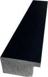
P118H lei10
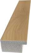
P118W lei10
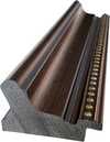
P438Z lei10
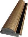
P508JH lei12

P508YH lei12
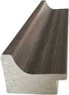
P805H lei10
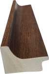
P805Z lei10
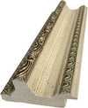
P919BZ lei10
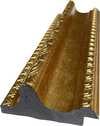
P919G lei10
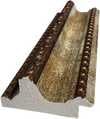
P919XJ lei10
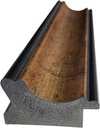
P959ZH lei10
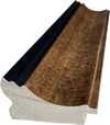
P968JZ lei12
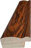
W106C lei8
W218G lei10
W218JH lei8
W218Y lei10
W307PJ lei10
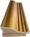
W316G lei10
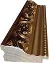
W316PJ lei8
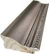
W316Y lei10
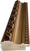
W398PJ lei8
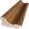
W4111J lei10
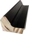
W500HY lei15
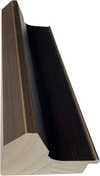
W500JH lei15
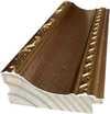
W692G lei12
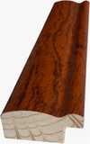
W849H lei8
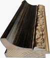
W940BG lei15
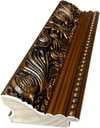
W953PJ lei8
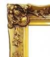
H24-GOLD lei30

H24-SILVER lei30
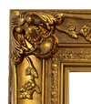
H36-GOLD lei45
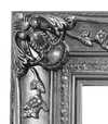
H36-SILVER lei45
Înramat
Ramă: . Dimensiuni cu ramă: .
3 Pasul trei din patru
Doriți să modificați ceva în tabloul respectiv?
Majoritatea oamenilor răspund negativ. Deoarece fiecare pictură este realizată manual, artistul nostru poate adapta lucrarea și pentru dumneavoastră.
După plasarea comenzii, echipa ArtsDot.com va contacta clientul prin e-mail pentru instrucțiuni și va furniza o previzualizare (mockup)
4 Pasul patru din patru
Câteva opțiuni de finisare
Toate sunt opționale. Răspunsurile deja selectate nu implică costuri suplimentare.
Cine este autorul?
Livrare în întreaga lume () în 3-4 săptămâni, în loc de cele 5 săptămâni standard. (7 Noiembrie). Fără compromisuri în ceea ce privește calitatea.
O plăcuță de identificare, ca la muzeu?
Detalii plăcuță din bronz gravat
This elegant plaque features the artist's name and the title of the artwork, finely engraved for a timeless presentation.
It is made from bronze with a refined, elegant finish. The text is precisely laser-engraved for a sharp and permanent result. Measuring 9x2 cm, the plaque is compact yet easy to read. It's built to be durable and scratch-resistant, offering a professional, museum-quality look. Mounting is simple thanks to the included adhesive backing.
Detalii plăcuță din acril transparent
The plaque includes essential engraved details such as the artist's name, the title of the artwork, the date it was created, the type of media used-like oil on canvas or watercolor-a brief description of the piece, and a QR code that links to the complete artwork information.
It is crafted from clear acrylic, offering a sleek, modern appearance. The text is UV-engraved in black to ensure strong visual contrast. With a size of 10x15 cm, it ensures optimal readability. It comes equipped with two metal hooks for secure wall mounting. The plaque is designed to be weather-resistant, making it suitable for various environments, and it includes interactive features that work seamlessly with smartphone scanning.
Detalii placă din acril negru
This elegant plaque includes engraved information such as the artist's name, the title of the artwork, the date it was created, the type of media used (like oil on canvas or watercolor), a short description of the artwork, and a QR code for quick access to more information.
The plaque itself is made from refined black acrylic with a premium finish. The text is laser-engraved in white for high contrast and readability. Its size is 10x15 cm, designed to be easy to read. It comes with two metal hooks for professional mounting. The design is sleek and fits any interior style. It is also weather-resistant and durable, with built-in digital integration for mobile compatibility.
Un lac protector?
Când aveți nevoie de el?
✓ Verifică și comandă
Tabloul tău, exact așa cum l-ai comandat

Counter composition XV
Tehnică de reproducere
Dimensiune reproducere
-

Selecție de artiști de elită
Mai multe detalii, rafinament și timp suplimentar de execuție
-

Ramă pentru reproducere artistică
-
-
Pentru opere de artă sau reproduceri care depășesc 105 cm (aproximativ 41 de inch) pe oricare dintre laturi, cadrul va fi livrat demontat, sub formă de kit. Această metodă asigură o livrare sigură și previne deteriorarea în timpul transportului.
Este necesară asamblarea profesională – acest produs nu este de tip DIY (de făcut singur).
Kitul trebuie asamblat, iar pânza întinsă, de către un legător de cadre experimentat, utilizând adeziv pentru lemn (neinclus în colet), o cheie pentru întinderea pânzei și cleme pentru a menține barele la unghi drept în timp ce adezivul se usucă. Asamblarea incorectă sau tensiunea neuniformă a pânzei pot deteriora permanent opera de artă și nu sunt acoperite de garanția noastră.
 Pentru opere de artă sau reproduceri care depășesc 105 cm (aproximativ 41 de inch) pe oricare dintre laturi, cadrul va fi livrat demontat, sub formă de kit. Această metodă asigură o livrare sigură și previne deteriorarea în timpul transportului.
Toate barele din lemn masiv sunt incluse, tăiate cu precizie la dimensiunea necesară.
Asamblat cu șuruburile incluse, plus adeziv pentru lemn pentru îmbinările de colț, care nu este furnizat și trebuie achiziționat de către tâmplarul dumneavoastră.
Sunt necesare unelte profesionale care nu sunt incluse: o șipte de întindere a pânzei (tensionator) și cleme pentru a menține barele la unghi drept în timp ce adezivul se usucă.
Important:
Îmbinările de colț necesită adeziv pentru lemn, barele trebuie fixate cu clești de strângere până când adezivul este complet uscat, iar întinderea pânzei pe cadrul asamblat necesită un clește pentru întins pânza. Niciunul dintre aceste elemente nu este inclus în kit. Vă rugăm să consultați un încadrator profesionist cu experiență înainte de a comanda această dimensiune.

Etichetă de prezentare
-
-

Lac de protecție
Lac lucios (intensifică nuanțele și oferă protecție împotriva luminii și a umidității)
-

Personalizează opera mea de artă
Exemple de elemente ce pot fi personalizate: Înlocuirea feței cu fotografia clientului; Adăugarea unui animal de companie (de exemplu, înlocuirea unei pisici cu un câine); Includerea unui mesaj ascuns în fundal; Modificarea peisajului sau a elementelor din fundal.
-

Livrare rapidă
Livrare la nivel mondial () în 3-4 săptămâni, în loc de cele 5 săptămâni standard. (7 Noiembrie). Fără compromisuri când vine vorba de calitate.
-
Livrare rapidă
Livrare la nivel mondial () în 5 săptămâni. (14 Noiembrie).
Inclus
Preț total calculat
lei 1254
Opțiunea cu sticlă este disponibilă doar pentru dimensiuni de sub 110 cm
Inclus în fiecare comandă
- Livrare expres gratuită la nivel mondial
- Pânză de in de înaltă calitate
- Asigurare completă pentru transport
- Garanție de rambursare a taxelor vamale
- Garanția fidelității culorilor
- Politica de retur în 100 de zile (doar pentru defecte de fabricație)
- Garanție de rambursare 100%
- Ofertă pentru comenzi multiple


The Geometry of Harmony: Unveiling Theo van Doesburg’s Counter Composition XV
Theo van Doesburg's "Counter Composition XV," painted in 1925, isn’t merely a painting; it’s a distilled essence of the De Stijl movement – a radical declaration of order and universal harmony. This deceptively simple work, executed against a stark white canvas, pulsates with an underlying tension born from the careful orchestration of geometric forms and primary colors. It represents a pivotal moment in 20th-century art, moving beyond representational imagery to explore the very foundations of visual language itself. The piece immediately commands attention not through elaborate detail or narrative, but through its profound sense of balance and its unwavering commitment to abstraction.
At first glance, the composition appears austere – a red rectangle dominating the upper left quadrant, juxtaposed with a blue counterpart in the lower right. However, this initial impression quickly gives way to an appreciation for the intricate grid that underpins the entire work. A network of black and white squares, meticulously arranged, creates a dynamic interplay of movement and stillness, suggesting both order and potential disruption. This isn’t haphazard placement; it's a deliberate choreography designed to evoke a feeling of controlled dynamism – a visual embodiment of De Stijl’s core philosophy.
Deconstructing the Language of Abstraction
The brilliance of "Counter Composition XV" lies in its reduction. Van Doesburg stripped away all extraneous elements, leaving only the fundamental building blocks of form and color: red, yellow, blue, black, and white. This limited palette wasn’t chosen arbitrarily; each hue was selected for its inherent purity and intensity, intended to be experienced without distraction. The application is equally crucial – flat, unmodulated areas devoid of shading or blending. This technique emphasizes the geometric shapes themselves, highlighting their sharp edges and creating a sense of crystalline clarity. It's a testament to the artist’s belief that beauty could be found in simplicity and precision.
The absence of perspective is equally significant. Van Doesburg deliberately rejects traditional spatial representation, opting instead for a two-dimensional plane where shapes are presented as independent entities. Overlapping elements and variations in size subtly suggest depth, but the overall effect is one of flattened planes interacting within a carefully constructed framework. This approach reflects De Stijl’s rejection of illusionism and its embrace of a purely conceptual understanding of space.
Symbolism and the Pursuit of Universal Harmony
Beyond its formal qualities, "Counter Composition XV" carries profound symbolic weight. The geometric forms – rectangles, squares, lines – are not merely decorative; they represent fundamental principles of order, balance, and harmony. The primary colors, stripped of their associations with natural phenomena, become pure expressions of energy and vibration. Van Doesburg believed that through the rigorous application of these abstract elements, artists could create a visual language capable of transcending individual expression and communicating universal truths. The piece is an attempt to build a new aesthetic based on mathematical ratios and geometric relationships – a blueprint for a harmonious world reflected in art.
Theo van Doesburg’s “Counter Composition XV” stands as a powerful testament to the transformative potential of abstraction. It's more than just a painting; it’s an invitation to contemplate the underlying order of the universe and the possibility of creating beauty through pure geometric form. Its stark simplicity, combined with its profound symbolic depth, continues to resonate with viewers today, cementing its place as a cornerstone of modern art.
Întrebări și răspunsuri
Ce nivel de luminozitate are "Counter composition XV" de Theo van Doesburg?
"Counter composition XV" de Theo van Doesburg are o luminanță de Soft Shadow. Luminația descrie câtă lumină par să reflecte culorile.
Care sunt culorile dominante în "Counter composition XV" de Theo van Doesburg?
"Counter composition XV" de Theo van Doesburg utilizează o paletă de culori Earthy, având culoarea Phthalo Green (#171b1d) ca nuanță dominantă.
Cum se încadrează "Counter composition XV" în rândul temelor recurente ale lui Theo van Doesburg?
Printre temele consacrate ale lui Theo van Doesburg, kandinsky’s abstraction, de stijl principles, universal harmony, geometric order, rejection traditional art forms, bauhaus influence, modern design, foundation movement – „Counter composition XV” oferă o perspectivă proprie asupra geometric abstraction, primary colors, de stijl, red rectangle, white background, composition, minimalism.
Opere similare


Theo van Doesburg
1883 - 1931, Olanda
Biografie artist
The Architect of Abstraction: A Life in Geometric Harmony
Theo van Doesburg, born Christian Emil Marie Küpper in 1883 in Utrecht, Netherlands, wasn’t merely a painter; he was a revolutionary force who fundamentally reshaped the very foundations of modern art. His journey began amidst the lingering echoes of Impressionism and Post-Impressionism, initially mirroring styles reminiscent of Vincent van Gogh – both in subject matter and emotional intensity. However, this early phase served as a crucial prelude, a necessary stepping stone toward the radical transformation that would define his enduring legacy. A pivotal moment arrived in 1913 with his encounter with Wassily Kandinsky’s *Rückblicke*. This text sparked within van Doesburg a profound realization: true artistic expression lay not in replicating the external world but in channeling an inner, spiritual reality through pure abstraction. It was this conviction that birthed Neoplasticism, more commonly known as De Stijl – a movement he founded and fiercely championed, becoming its most ardent advocate.Forging a New Visual Language: The Principles of De Stijl
De Stijl wasn’t merely an artistic style; it was a comprehensive philosophical manifesto translated into visual form. Van Doesburg believed in stripping art down to its most essential elements – straight lines, right angles, and the primary colors of red, yellow, and blue, alongside black, white, and gray. This austere palette wasn't born from limitation but from a desire for universality—a belief that these fundamental forms resonated with an underlying cosmic order. He envisioned a *total* work of art, extending beyond the canvas to encompass architecture, design, and even everyday objects. Collaboration was key; van Doesburg worked closely with architects like J.J.P. Oud and Gerrit Rietveld, designing stained glass windows, furniture, and entire interiors that embodied the principles of De Stijl. His collaborations extended to fellow artists such as Piet Mondrian, with whom he co-founded the influential journal *De Stijl*, a platform for disseminating their ideas and attracting like-minded creatives. However, despite their shared origins, tensions arose between van Doesburg and Mondrian regarding the rigidity of Neoplasticism. Van Doesburg introduced “Elementarism” in 1926, advocating for diagonal lines and more dynamic compositions – a departure that ultimately led to a schism within the movement, revealing his restless spirit and constant pursuit of artistic evolution.The Early Years & The Seeds of Abstraction
Theo van Doesburg’s early life was marked by a surprising lack of formal artistic training. Born into a family of artists—his father, Wilhelm Küpper, was a photographer—he initially pursued acting and singing before finding his calling as a shop assistant. This seemingly mundane occupation provided him with a keen eye for detail and an appreciation for the beauty of everyday objects – qualities that would later inform his artistic vision. It wasn’t until 1908, when he exhibited his paintings in the Hague, that he began to establish himself as a serious artist. His early works were characterized by a sensitivity reminiscent of Vincent van Gogh—both in subject matter and emotional intensity. However, this initial phase served as a crucial prelude, a necessary stepping stone toward the radical transformation that would define his enduring legacy. The turning point arrived in 1913 with his encounter with Wassily Kandinsky’s *Rückblicke*. This text sparked within van Doesburg a profound realization: true artistic expression lay not in replicating the external world but in channeling an inner, spiritual reality through pure abstraction.The Birth of De Stijl & The Pursuit of Totality
In 1917, amidst the turmoil of World War I, Theo van Doesburg, along with Piet Mondrian, Bart van der Leck, and others, founded *De Stijl* (The Style), a journal dedicated to exploring the principles of pure abstraction. They sought to create a “total work of art” – an encompassing aesthetic that extended beyond painting to encompass architecture, design, and all aspects of human experience. This ambition led them to develop a rigorous set of rules: only primary colors, straight lines, right angles, and black and white were permitted. The goal was to achieve a sense of harmony and universality through the reduction of form to its most essential elements. *De Stijl* quickly became a focal point for avant-garde artists and designers, shaping the visual language of the interwar period.Beyond Painting: A Multifaceted Artistic Vision
While celebrated as a painter, van Doesburg’s artistic pursuits were remarkably diverse. He was a prolific writer, poet, critic, and designer, using his pen to articulate the theoretical underpinnings of De Stijl and challenge conventional notions of art. His engagement with Dadaism in the early 1920s further broadened his artistic horizons, leading to experimental works that incorporated collage and typography. This period also saw him teaching at the Bauhaus, where he shared his ideas with a new generation of artists and designers. He wasn’t content to remain within the confines of traditional art forms; van Doesburg actively sought to integrate art into everyday life, believing it had the power to transform society. His designs for interiors and furniture weren't merely aesthetic exercises but attempts to create harmonious living spaces that reflected the principles of De Stijl.Legacy & Lasting Influence
Theo van Doesburg’s life was tragically cut short in 1931 at the age of 47, yet his impact on modern art remains profound. De Stijl, though relatively short-lived as a cohesive movement, exerted an enormous influence on subsequent artistic developments, including Bauhaus design, Minimalism, and Constructivism. His emphasis on geometric abstraction, pure color, and functionalism continues to resonate with artists and designers today. His work serves as a reminder that art is not merely about representation but about the exploration of fundamental forms and ideas. Van Doesburg’s legacy extends beyond his paintings and designs; it lies in his unwavering commitment to artistic innovation and his belief in the transformative power of abstraction. His vision of a unified, harmonious world – expressed through the language of De Stijl – continues to inspire those who seek to create a more beautiful and meaningful environment.
Articole similare

Neoplasticism: A Radical Geometry of Utopian Vision – Origins, Principles, and Enduring Influence
Explore the revolutionary Neoplasticism movement – De Stijl – with ArtsDot. Discover Mondrian & van Doesburg's principles, influence on modern art, and how to collect key works. Expert insights for discerning art enthusiasts.

Goya: Cele Mai Iconice Capodopere – Artă Spaniolă pentru Decor Rafinat | ArtsDot.ro
Descoperă cele mai frumoase 25 de picturi ale lui Francisco Goya! Explorează capodoperele romantice, portretele impresionante și gravurile puternice. Reproduceri artă spaniolă de calitate muzeală pentru un decor rafinat. Explorează colecția completă online pe ArtsDot.com

Theo van Doesburg: Pioneering De Stijl & the Evolution of Neo-Plasticism
Explore the revolutionary De Stijl movement & Neo-Plasticism with our expert guide. Discover Piet Mondrian, Theo van Doesburg, and the lasting impact of this influential art style. Learn about collecting & investing in De Stijl masterpieces.