
 Acrylic On Canvas
- WallArt
- De Stijl
 7.0 x 6.0 cm
 Króller-Müller Museum

The picture follows your choices: , .
Opis obiektu
Study for Simultaneous compositions XXII by Theo van Doesburg: A rare geometric abstraction showcasing early De Stijl principles. Explore this 7cm sketch's layered lines & aged paper texture.
 Rozwiń treść
Biografia artysty
Theo van Doesburg – rewolucjonista sztuki! Założyciel De Stijl, pionier abstrakcji geometrycznej i architekt wizji harmonijnego świata. Jego dzieła inspirują do dziś!
Ręcznie malowana reprodukcja olejowa
Ręcznie malowany obraz olejny na płótnie, wykonany na zamówienie przez naszych artystów w wybranym przez Ciebie wymiarze i oprawie. ( Przełącz na wydania drukowane Przejdź do wersji cyfrowej)
More about this painting
 Podgląd w skali 1:1
 Wyślij jako kartkę
 Udostępnij
 Szczegóły dzieła
 Przewodnik

 Pobierz obraz
 Podobne obiekty
 RTG
RTG Pokaz slajdów
 Q&A
Q&A Statystyki
Order your painting in four simple steps
Take your time. You can change any answer; the price in your order card follows each choice.
1 Step one of four
Which size would you like?
These sizes keep the proportions of the original painting. The drawing shows your choice on a wall, above a two-metre sofa.
Or give your own measurements
Wybierz spośród naszych standardowych rozmiarów, które zachowują oryginalne proporcje dzieła sztuki.

Wpisz wymaganą szerokość i wysokość, aby obraz pasował do Twojej ramy lub ściany. Ponieważ jest to dzieło malowane ręcznie, w przypadku rozmiaru o innych proporcjach artysta może domalować nieco więcej wokół obrazu lub przyciąć jego fragmenty — wybór należy do Ciebie. Przed rozpoczęciem pracy prześlemy Ci cyfrową wizualizację do zatwierdzenia. Obraz widoczny na tej stronie nie przedstawia rzeczywistego efektu — jedynie wizualizacja oddaje realny rezultat.
2 Step two of four
How should it be prepared: rolled, stretched or framed?
The prices below are for the size you chose in step one.
Choose the edges of the stretched canvas
Choose your frame
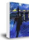
White zł1
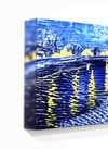
Blurside zł1
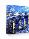
Extended zł1
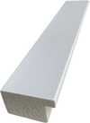
P118B zł10
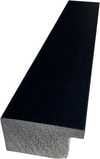
P118H zł10
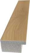
P118W zł10
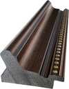
P438Z zł10
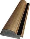
P508JH zł12
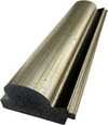
P508YH zł12
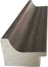
P805H zł10
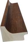
P805Z zł10
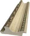
P919BZ zł10
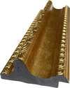
P919G zł10
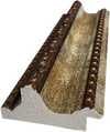
P919XJ zł10
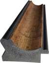
P959ZH zł10
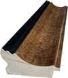
P968JZ zł12
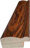
W106C zł8
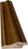
W218G zł10
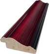
W218JH zł8
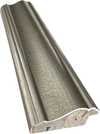
W218Y zł10
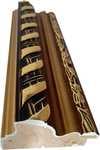
W307PJ zł10
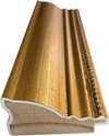
W316G zł10
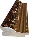
W316PJ zł8
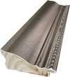
W316Y zł10
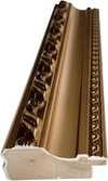
W398PJ zł8
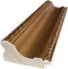
W4111J zł10
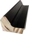
W500HY zł15
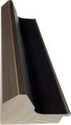
W500JH zł15
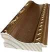
W692G zł12
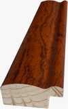
W849H zł8
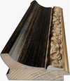
W940BG zł15
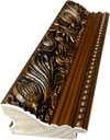
W953PJ zł8
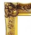
H24-GOLD zł30

H24-SILVER zł30
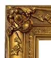
H36-GOLD zł45
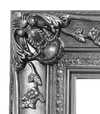
H36-SILVER zł45
W oprawie
Moulding: . Overall size with the frame: .
3 Step three of four
Would you like anything changed in the painting?
Most people answer no. Because each painting is made by hand, our artist can also adapt it for you.
After order, ArtsDot.com team will email client for instructions and provide a mockup preview
4 Step four of four
A few finishing options
All of them are optional. The answers already selected cost nothing extra.
Who paints it?
Dostawa na całym świecie () w ciągu 3–4 tygodni zamiast standardowych 5 tygodni. (29 Październik). Bez kompromisów w kwestii jakości.
A nameplate, as in a museum?
Szczegóły grawerowanej brązowej tabliczki
This elegant plaque features the artist's name and the title of the artwork, finely engraved for a timeless presentation.
It is made from bronze with a refined, elegant finish. The text is precisely laser-engraved for a sharp and permanent result. Measuring 9x2 cm, the plaque is compact yet easy to read. It's built to be durable and scratch-resistant, offering a professional, museum-quality look. Mounting is simple thanks to the included adhesive backing.
Szczegóły przezroczystej tabliczki akrylowej
The plaque includes essential engraved details such as the artist's name, the title of the artwork, the date it was created, the type of media used-like oil on canvas or watercolor-a brief description of the piece, and a QR code that links to the complete artwork information.
It is crafted from clear acrylic, offering a sleek, modern appearance. The text is UV-engraved in black to ensure strong visual contrast. With a size of 10x15 cm, it ensures optimal readability. It comes equipped with two metal hooks for secure wall mounting. The plaque is designed to be weather-resistant, making it suitable for various environments, and it includes interactive features that work seamlessly with smartphone scanning.
Szczegóły czarnej tabliczki akrylowej
This elegant plaque includes engraved information such as the artist's name, the title of the artwork, the date it was created, the type of media used (like oil on canvas or watercolor), a short description of the artwork, and a QR code for quick access to more information.
The plaque itself is made from refined black acrylic with a premium finish. The text is laser-engraved in white for high contrast and readability. Its size is 10x15 cm, designed to be easy to read. It comes with two metal hooks for professional mounting. The design is sleek and fits any interior style. It is also weather-resistant and durable, with built-in digital integration for mobile compatibility.
A protective varnish?
When do you need it?
✓ Check and order
Your painting, as you ordered it

Study for Simultaneous compositions XXII
Technika reprodukcji
Wymiary reprodukcji
-

Wybitny mistrz artystyczny
Większa szczegółowość, finezja i dodatkowy czas na realizację
-

Opcje oprawy reprodukcji
-
-
W przypadku dzieł sztuki lub reprodukcji, których którykolwiek z boków przekracza 105 cm (około 41 cali), rama zostanie wysłana w formie zestawu do samodzielnego montażu. Metoda ta zapewnia bezpieczną dostawę i zapobiega uszkodzeniom podczas transportu.
Wymagany profesjonalny montaż – nie jest to produkt typu DIY.
Zestaw musi zostać złożony, a płótno naciągnięte przez doświadczonego profesjonalnego ramiarza, przy użyciu kleju do drewna (brak w zestawie), kleszczy do naciągania płótna oraz ścisków, które utrzymają krosna w równej pozycji podczas schnięcia kleju. Nieprawidłowy montaż lub nierównomierne napięcie płótna może trwale uszkodzić dzieło sztuki i nie podlega naszej gwarancji.
 W przypadku dzieł sztuki lub reprodukcji, których którykolwiek z boków przekracza 105 cm (około 41 cali), rama zostanie wysłana w formie zestawu do samodzielnego montażu. Metoda ta zapewnia bezpieczną dostawę i zapobiega uszkodzeniom podczas transportu.
W zestawie znajdują się wszystkie listwy z litego drewna, precyzyjnie docięte do wymiarów.
Montaż odbywa się przy użyciu dołączonych wkrętów oraz kleju do drewna do łączenia narożników, którego zestaw nie zawiera i który musi zostać dostarczony przez ramiarza.
Wymagane są profesjonalne narzędzia, których nie ma w zestawie: kleszcze do naciągania płótna (napinacz) oraz zaciski, które pozwolą utrzymać listwy w równej pozycji podczas schnięcia kleju.
Ważne:
Do połączenia narożników niezbędny jest klej do drewna, listwy należy unieruchomić za pomocą ścisków do momentu całkowitego wyschnięcia kleju, a naciągnięcie płótna na złożoną ramę wymaga użycia kleszczy do naciągania płótna. Żaden z tych elementów nie jest dołączony do zestawu. Przed zamówieniem tego rozmiaru zalecamy konsultację z doświadczonym ramiarzem.

Etykieta obiektu
-
-

Lakier ochronny
Lakier z połyskiem (pogłębia kolory, chroni przed światłem i wilgocią)
-

Personalizacja dzieła
Przykłady możliwości personalizacji: zastąp twarz zdjęciem klienta; dodaj zwierzę domowe (np. zamień kota na psa); umieść ukrytą wiadomość w tle; zmień krajobraz lub elementy tła.
-

Ekspresowa
Dostawa na cały świat () w ciągu 3–4 tygodni zamiast standardowych 5 tygodni. (29 Październik). Bez kompromisów w kwestii jakości.
-
Przesyłka ekspresowa
Dostawa na cały świat () w ciągu 5 tygodni. (5 Listopad).
W cenie
Cena całkowita
zł 1013
Opcja ze szkłem jest dostępna wyłącznie w rozmiarach poniżej 110 cm
Included with every order
- Bezpłatna ekspresowa wysyłka na cały świat
- Wysokiej jakości płótno lniane
- Pełne ubezpieczenie przesyłki
- Gwarancja zwrotu należności celnych i podatków importowych
- Gwarancja wiernego odwzorowania kolorów
- 100-dniowa polityka zwrotów (tylko w przypadku wad)
- Gwarancja 100% zwrotu pieniędzy
- Zniżka przy zakupie wielu sztuk


Study for Simultaneous compositions XXII
Theo van Doesburg’s “Study for Simultaneous compositions XXII” stands as a testament to the radical aesthetic principles of De Stijl – a movement that irrevocably altered the trajectory of 20th-century art. Executed in graphite on graph paper mounted on cardboard, this deceptively simple sketch encapsulates the core tenets of Neo-Plasticism: pure abstraction and geometric harmony achieved through orthogonal lines and fundamental shapes. Created around 1929, it represents a pivotal moment in Van Doesburg’s artistic evolution, marking his unwavering commitment to distilling visual experience into its purest form.- Subject Matter & Composition: The artwork presents a meticulously constructed grid overlaid with intersecting diagonal lines and a central square – elements characteristic of De Stijl's exploration of spatial relationships. A smaller circle is positioned strategically within the upper-left quadrant, subtly disrupting the geometric order while maintaining visual balance.
- Style & Technique: Van Doesburg’s technique—dry media applied directly to paper—emphasizes precision and control. The graphite lines are drawn with deliberate accuracy, creating a stark contrast against the pale graph paper background. This method reflects De Stijl's rejection of illusionistic representation in favor of an intellectual engagement with form and structure.
- Historical Context: Born Christian Emil Marie Küpper in Utrecht in 1883, Theo van Doesburg emerged from the Impressionist and Post-Impressionist traditions but swiftly rejected their subjective biases. Inspired by Kandinsky’s pioneering explorations into abstract expressionism, he founded De Stijl alongside Piet Mondrian in 1917, establishing a visual language rooted in geometric abstraction and chromatic neutrality.
- Symbolism & Meaning: The arrangement of shapes—the square, diagonal lines, and circle—is laden with symbolic significance. These forms represent not merely visual elements but also conceptual ideas related to balance, harmony, and universality – core concepts underpinning De Stijl’s philosophical stance. It embodies the movement's aspiration to transcend earthly concerns and access a realm of pure spiritual contemplation.
- Emotional Impact: Viewing “Study for Simultaneous compositions XXII” evokes a sense of intellectual curiosity and methodical construction. Rather than eliciting emotional response, it invites contemplation on the fundamental principles governing visual perception and artistic creation. Its austere beauty speaks to an enduring fascination with geometric abstraction as a vehicle for conveying profound ideas.
Pytania i odpowiedzi
W jaki sposób kolory dzieła „Study for Simultaneous compositions XXII” – Teo van Doesburg korespondują z jego ładunkiem emocjonalnym?
„Study for Simultaneous compositions XXII” – Teo van Doesburg łączy w sobie Neutrals paletę barw z Reflective tonem.
Czy mogę użyć rozszerzonej rzeczywistości, aby zobaczyć „Study for Simultaneous compositions XXII” – Teo van Doesburg w swoim pokoju?
„Study for Simultaneous compositions XXII” posiada podgląd w rozszerzonej rzeczywistości: strona Podgląd w AR pozwala zobaczyć dzieło w Twojej własnej przestrzeni na kompatybilnym urządzeniu.
Czy dzieło "Study for Simultaneous compositions XXII" jest dostępne jako wysokiej jakości wydruk artystyczny?
Aby zamówić wydruk dzieła „Study for Simultaneous compositions XXII” – Teo van Doesburg, wystarczy przejść na jego stronę Wydruk artystyczny premium: szlachetna odbitka na płótnie bawełnianym lub archiwalnym papierze o strukturze płótna.
Podobne dzieła


Teo van Doesburg
1883 - 1931, Holandia
Biografia artysty
The Architect of Abstraction: A Life in Geometric Harmony
Theo van Doesburg, born Christian Emil Marie Küpper in 1883 in Utrecht, Netherlands, wasn’t merely a painter; he was a revolutionary force who fundamentally reshaped the landscape of modern art. His journey began amidst the lingering echoes of Impressionism and Post-Impressionism – initially mirroring styles reminiscent of Vincent van Gogh – both in subject matter and emotional intensity. However, this early phase served as a crucial prelude, a necessary stepping stone toward the radical transformation that would define his enduring legacy. A pivotal moment arrived in 1913 with his encounter with Wassily Kandinsky’s *Rückblicke*. This text ignited within van Doesburg a profound realization: true artistic expression lay not in replicating the external world but in channeling an inner, spiritual reality through pure abstraction. It was this conviction that birthed Neoplasticism – more commonly known as De Stijl – a movement he founded and fiercely championed, becoming its most ardent advocate.Forging a New Visual Language: The Principles of De Stijl
De Stijl wasn’t simply an artistic style; it was a comprehensive philosophical manifesto translated into visual form. Van Doesburg believed in stripping art down to its most essential elements – straight lines, right angles, and the primary colors of red, yellow, and blue, alongside black, white, and gray. This austere palette wasn't born from limitation but from a desire for universality—a belief that these fundamental forms resonated with an underlying cosmic order. He envisioned a *total* work of art, extending beyond the canvas to encompass architecture, design, and even everyday objects. Collaboration was key; van Doesburg worked closely with architects like J.J.P. Oud and Gerrit Rietveld, designing stained glass windows, furniture, and entire interiors that embodied the principles of De Stijl. His collaborations extended to fellow artists such as Piet Mondrian, with whom he co-founded the influential journal *De Stijl*, a platform for disseminating their ideas and attracting like-minded creatives. However, despite their shared origins, tensions arose between van Doesburg and Mondrian regarding the rigidity of Neoplasticism. Van Doesburg introduced “Elementarism” in 1926, advocating for diagonal lines and more dynamic compositions – a departure that ultimately led to a schism within the movement, revealing his restless spirit and constant pursuit of artistic evolution.A Multifaceted Artistic Vision: Beyond Painting
While celebrated as a painter, van Doesburg’s artistic pursuits were remarkably diverse. He was a prolific writer, poet, and critic, using his pen to articulate the theoretical underpinnings of De Stijl and challenge conventional notions of art. His engagement with Dadaism in the early 1920s further broadened his artistic horizons, leading to experimental works that incorporated collage and typography. This period also saw him teaching at the Bauhaus, where he shared his ideas with a new generation of artists and designers. He wasn’t content to remain within the confines of traditional art forms; van Doesburg actively sought to integrate art into everyday life, believing it had the power to transform society. His designs for interiors and furniture weren't merely aesthetic exercises but attempts to create harmonious living spaces that reflected the principles of De Stijl. A prime example is his collaboration with Sophie Taeuber-Arp and Georges Vantongerloo on designing artist residences, showcasing a holistic approach to artistic creation – an attempt to build a world *in* the image of his ideals.Key Works & Lasting Influence
- Study for Simultaneous Compositions XXII (1922): A quintessential example of Neoplasticism, showcasing the movement’s signature geometric forms and limited color palette.
- Composition with half values (1928): Demonstrates van Doesburg's exploration of tonal variations within the De Stijl aesthetic.
- Dancers (1917-1918): Represents a transitional phase in his work, blending figurative elements with emerging abstract tendencies.
- Collaboration on *De Stijl* journal: A crucial platform for disseminating the movement’s ideas and fostering dialogue among artists and intellectuals.
- Elementarism (1926): Van Doesburg's attempt to inject dynamism into Neoplasticism, introducing diagonal lines and a more fluid approach to composition.
The Architect of Abstraction: A Life in Geometric Harmony
Theo van Doesburg, born Christian Emil Marie Küpper in 1883 in Utrecht, Netherlands, was more than a painter; he was a revolutionary force who reshaped the very foundations of modern art. His journey began amidst the lingering echoes of Impressionism and Post-Impressionism, initially mirroring styles reminiscent of Vincent van Gogh – both in subject matter and emotional intensity. However, this early phase served as a crucial prelude, a necessary stepping stone toward the radical transformation that would define his enduring legacy. A pivotal moment arrived in 1913 with his encounter with Wassily Kandinsky’s *Rückblicke*. This text sparked within van Doesburg a profound realization: true artistic expression lay not in replicating the external world but in channeling an inner, spiritual reality through pure abstraction. It was this conviction that birthed Neoplasticism – more commonly known as De Stijl – a movement he founded and fiercely championed, becoming its most ardent advocate.Forging a New Visual Language: The Principles of De Stijl
De Stijl wasn’t simply an artistic style; it was a comprehensive philosophical manifesto translated into visual form. Van Doesburg believed in stripping art down to its most essential elements – straight lines, right angles, and the primary colors of red, yellow, and blue, alongside black, white, and gray. This austere palette wasn't born from limitation but from a desire for universality—a belief that these fundamental forms resonated with an underlying cosmic order. He envisioned a *total* work of art, extending beyond the canvas to encompass architecture, design, and even everyday objects. Collaboration was key; van Doesburg worked closely with architects like J.J.P. Oud and Gerrit Rietveld, designing stained glass windows, furniture, and entire interiors that embodied the principles of De Stijl. His collaborations extended to fellow artists such as Piet Mondrian, with whom he co-founded the influential journal *De Stijl*, a platform for disseminating their ideas and attracting like-minded creatives. However, despite their shared origins, tensions arose between van Doesburg and Mondrian regarding the rigidity of Neoplasticism. Van Doesburg introduced “Elementarism” in 1926, advocating for diagonal lines and more dynamic compositions – a departure that ultimately led to a schism within the movement, revealing his restless spirit and constant pursuit of artistic evolution.A Multifaceted Artistic Vision: Beyond Painting
While celebrated as a painter, van Doesburg’s artistic pursuits were remarkably diverse. He was a prolific writer, poet, and critic, using his pen to articulate the theoretical underpinnings of De Stijl and challenge conventional notions of art. His engagement with Dadaism in the early 1920s further broadened his artistic horizons, leading to experimental works that incorporated collage and typography. This period also saw him teaching at the Bauhaus, where he shared his ideas with a new generation of artists and designers. He wasn’t content to remain within the confines of traditional art forms; van Doesburg actively sought to integrate art into everyday life, believing it had the power to transform society. His designs for interiors and furniture weren't merely aesthetic exercises but attempts to create harmonious living spaces that reflected the principles of De Stijl. A prime example is his collaboration with Sophie Taeuber-Arp and Georges Vantongerloo on designing artist residences, showcasing a holistic approach to artistic creation – an attempt to build a world *in* the image of his ideals.Key Works & Lasting Influence
- Study for Simultaneous Compositions XXII (1922): A quintessential example of Neoplasticism, showcasing the movement’s signature geometric forms and limited color palette.
- Composition with half values (1928): Demonstrates van Doesburg's exploration of tonal variations within the De Stijl aesthetic.
- Dancers (1917-1918): Represents a transitional phase in his work, blending figurative elements with emerging abstract tendencies.
- Collaboration on *De Stijl* journal: A crucial platform for disseminating the movement’s ideas and fostering dialogue among artists and intellectuals.
- Elementarism (1926): Van Doesburg's attempt to inject dynamism into Neoplasticism, introducing diagonal lines and a more fluid approach to composition.
Powiązane artykuły

Theo van Doesburg: Pioneering De Stijl & the Evolution of Neo-Plasticism
Explore the revolutionary De Stijl movement & Neo-Plasticism with our expert guide. Discover Piet Mondrian, Theo van Doesburg, and the lasting impact of this influential art style. Learn about collecting & investing in De Stijl masterpieces.

Francisco Goya: 25 Arcydzieł Genialnego Malarza Hiszpańskiego | ArtsDot.pl
Odkryj 25 arcydzieł Francisco Goyi – od portretów królewskich po dramatyczne 'Czarne Malowidła'. Poznaj historię, technikę i emocje hiszpańskiego mistrza. Reprodukcje obrazów najwyższej jakości na ArtsDot.com! Eksploruj kolekcję online.
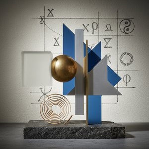
Poza Formą: Filozoficzne Fundamenty Abstrakcji Geometrycznej i Suprematyzmu
Odkryj filozoficzne korzenie abstrakcji geometrycznej i suprematyzmu Kazimira Malewicza. Analiza dzieł, inspiracji i wpływu awangardy na sztukę XX wieku. Reprodukcje najwyższej jakości na ArtsDot.