


 Zobacz w skali 1:1
 Wyślij
 Udostępnij
 Szczegóły
 Przewodnik

 Pobierz plik obrazu
 Podobne obiekty
 RTG
RTG Pokaz slajdów
 Statystyki
Counter composition V


 Czytaj więcej
Giclée / Wydruk artystyczny
Wydruki giclée lub płótna o jakości muzealnej, szybka realizacja i szeroki wybór opcji wykończenia. ( Kup ręcznie malowany obraz Przełącz na wersję cyfrową)
P118B zł10
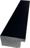
P118H zł10
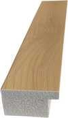
P118W zł10
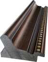
P438Z zł10
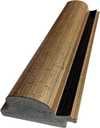
P508JH zł12
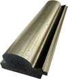
P508YH zł12
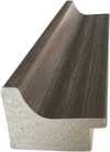
P805H zł10
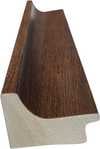
P805Z zł10
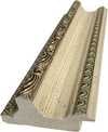
P919BZ zł10
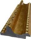
P919G zł10
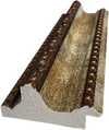
P919XJ zł10
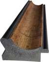
P959ZH zł10
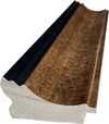
P968JZ zł12
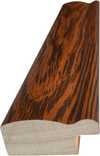
W106C zł8
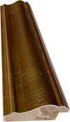
W218G zł10
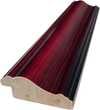
W218JH zł8
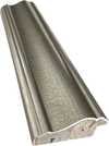
W218Y zł10
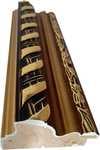
W307PJ zł10
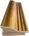
W316G zł10
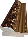
W316PJ zł8
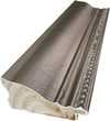
W316Y zł10
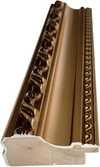
W398PJ zł8
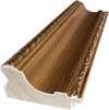
W4111J zł10
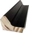
W500HY zł15
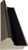
W500JH zł15
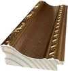
W692G zł12
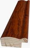
W849H zł8
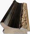
W940BG zł15
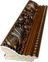
W953PJ zł8

Wybierz spośród naszych standardowych rozmiarów, które zachowują oryginalne proporcje dzieła sztuki.

Wpisz wymaganą szerokość i wysokość, aby dopasować grafikę do ramy lub ściany. Wydruk można jedynie przyciąć, nigdy nie powiększając go poza oryginalny obraz, dlatego format o innym proporcji spowoduje utratę części kompozycji. Przed rozpoczęciem druku prześlemy Ci cyfrowy podgląd do zatwierdzenia. Obraz wyświetlany na tej stronie nie pokazuje rzeczywistego przycięcia — jedynie podgląd oddaje ten efekt.
Dostawa na cały świat () w ciągu 2 tygodni zamiast standardowych 4/5 tygodni. (23 Październik)

Bezpłatna ekspresowa wysyłka na cały świat

Wysokiej jakości płótno lniane

Pełne ubezpieczenie transportowe

Gwarancja zwrotu należności celnych i podatków importowych

Gwarancja idealnego odwzorowania barw

100-dniowy okres na zwrot dzieła w przypadku wykrycia wad produkcyjnych

Gwarancja 100% zwrotu pieniędzy

Oferta przy zakupie wielu sztuk
 Opcja ze szkłem jest dostępna wyłącznie w rozmiarach poniżej 110 cm

Counter composition V
Giclée / Wydruk artystyczny
Rozmiar reprodukcji
-


Suma do zapłaty
zł 239
The Geometry of Tension
Step closer and observe how the canvas breathes through its very lack of traditional form. In Counter composition V, created in 1924, there is no attempt to mimic the physical world or provide a window into a landscape. Instead, we find ourselves facing a deliberate arrangement of nine colored shapes. A large red rectangle dominates the center, anchoring the composition with its weight. To its left, a smaller yellow rectangle sits in quiet proximity, while to the right, a blue square is framed by a thin white border. Below these primary elements, two black rectangles—one larger than the other—are also bordered in white, resting against a light gray background. The lines are clean, and the colors remain flat, stripped of any shading or perspective.
The arrangement feels balanced yet restless. There is a subtle energy here that comes from the way these shapes interact without the use of traditional intersecting lines. It is an exercise in equilibrium, where each block of color holds its ground against the others. The eye moves across the gray expanse, caught by the sudden shifts between the primary hues and the dark, heavy presence of the black forms.
A Departure from the Vertical
To understand this work, one must consider the friction that birthed it. This piece belongs to a period of profound change within the De Stijl movement. While much of the era's art relied on the rigid stability of horizontal and vertical lines, this specific composition introduces a sense of rotation. The rectangles and squares appear tilted at exactly forty-five degrees, a technique that defines the artist's move toward Elementarism. This shift was more than a stylistic choice; it was a reaction to the perceived limitations of Neoplasticism. By rotating the elements, the artist sought to inject a dynamic movement into the work, breaking away from the static nature of purely orthogonal compositions.
< p>This method creates a subtle illusion of depth and motion that contradicts the flatness of the paint itself. The inclusion of a single small grey shape at the bottom right edge further disrupts the expected primary palette, adding a quiet note of complexity to the arrangement. It is a study in how much change can be introduced before the fundamental harmony of the composition is lost. Through these tilted planes, the artist explores a new visual language, one that favors energy and rotation over the strict, unmoving grids of his contemporaries.Pytania i odpowiedzi
Jaką tematykę i atmosferę łączy „Counter composition V” autorstwa Teo van Doesburg?
„Counter composition V” autorstwa Teo van Doesburg łączy w sobie red rectangle, yellow rectangle, blue square, black rectangles, white borders, gray background z Minimalist atmosferą.
Jaki rozmiasto wydruku "Counter composition V" będzie odpowiedni do mojego pokoju?
Zalecane zestawienie dla „Counter composition V” autorstwa Teo van Doesburg: wydruk w formacie Medium do Coworking.
Kiedy i z jakich materiałów wykonano "Counter composition V"?
Technika wykonania dzieła „Counter composition V” autorstwa Teo van Doesburg to Oil On Canvas, a datowanie pracy pochodzi z 1924.
Podobne dzieła


Biografia artysty
The Architect of Abstraction: A Life in Geometric Harmony
Theo van Doesburg, born Christian Emil Marie Küpper in 1883 in Utrecht, Netherlands, wasn’t merely a painter; he was a revolutionary force who fundamentally reshaped the landscape of modern art. His journey began amidst the lingering echoes of Impressionism and Post-Impressionism – initially mirroring styles reminiscent of Vincent van Gogh – both in subject matter and emotional intensity. However, this early phase served as a crucial prelude, a necessary stepping stone toward the radical transformation that would define his enduring legacy. A pivotal moment arrived in 1913 with his encounter with Wassily Kandinsky’s *Rückblicke*. This text ignited within van Doesburg a profound realization: true artistic expression lay not in replicating the external world but in channeling an inner, spiritual reality through pure abstraction. It was this conviction that birthed Neoplasticism – more commonly known as De Stijl – a movement he founded and fiercely championed, becoming its most ardent advocate.Forging a New Visual Language: The Principles of De Stijl
De Stijl wasn’t simply an artistic style; it was a comprehensive philosophical manifesto translated into visual form. Van Doesburg believed in stripping art down to its most essential elements – straight lines, right angles, and the primary colors of red, yellow, and blue, alongside black, white, and gray. This austere palette wasn't born from limitation but from a desire for universality—a belief that these fundamental forms resonated with an underlying cosmic order. He envisioned a *total* work of art, extending beyond the canvas to encompass architecture, design, and even everyday objects. Collaboration was key; van Doesburg worked closely with architects like J.J.P. Oud and Gerrit Rietveld, designing stained glass windows, furniture, and entire interiors that embodied the principles of De Stijl. His collaborations extended to fellow artists such as Piet Mondrian, with whom he co-founded the influential journal *De Stijl*, a platform for disseminating their ideas and attracting like-minded creatives. However, despite their shared origins, tensions arose between van Doesburg and Mondrian regarding the rigidity of Neoplasticism. Van Doesburg introduced “Elementarism” in 1926, advocating for diagonal lines and more dynamic compositions – a departure that ultimately led to a schism within the movement, revealing his restless spirit and constant pursuit of artistic evolution.A Multifaceted Artistic Vision: Beyond Painting
While celebrated as a painter, van Doesburg’s artistic pursuits were remarkably diverse. He was a prolific writer, poet, and critic, using his pen to articulate the theoretical underpinnings of De Stijl and challenge conventional notions of art. His engagement with Dadaism in the early 1920s further broadened his artistic horizons, leading to experimental works that incorporated collage and typography. This period also saw him teaching at the Bauhaus, where he shared his ideas with a new generation of artists and designers. He wasn’t content to remain within the confines of traditional art forms; van Doesburg actively sought to integrate art into everyday life, believing it had the power to transform society. His designs for interiors and furniture weren't merely aesthetic exercises but attempts to create harmonious living spaces that reflected the principles of De Stijl. A prime example is his collaboration with Sophie Taeuber-Arp and Georges Vantongerloo on designing artist residences, showcasing a holistic approach to artistic creation – an attempt to build a world *in* the image of his ideals.Key Works & Lasting Influence
- Study for Simultaneous Compositions XXII (1922): A quintessential example of Neoplasticism, showcasing the movement’s signature geometric forms and limited color palette.
- Composition with half values (1928): Demonstrates van Doesburg's exploration of tonal variations within the De Stijl aesthetic.
- Dancers (1917-1918): Represents a transitional phase in his work, blending figurative elements with emerging abstract tendencies.
- Collaboration on *De Stijl* journal: A crucial platform for disseminating the movement’s ideas and fostering dialogue among artists and intellectuals.
- Elementarism (1926): Van Doesburg's attempt to inject dynamism into Neoplasticism, introducing diagonal lines and a more fluid approach to composition.
The Architect of Abstraction: A Life in Geometric Harmony
Theo van Doesburg, born Christian Emil Marie Küpper in 1883 in Utrecht, Netherlands, was more than a painter; he was a revolutionary force who reshaped the very foundations of modern art. His journey began amidst the lingering echoes of Impressionism and Post-Impressionism, initially mirroring styles reminiscent of Vincent van Gogh – both in subject matter and emotional intensity. However, this early phase served as a crucial prelude, a necessary stepping stone toward the radical transformation that would define his enduring legacy. A pivotal moment arrived in 1913 with his encounter with Wassily Kandinsky’s *Rückblicke*. This text sparked within van Doesburg a profound realization: true artistic expression lay not in replicating the external world but in channeling an inner, spiritual reality through pure abstraction. It was this conviction that birthed Neoplasticism – more commonly known as De Stijl – a movement he founded and fiercely championed, becoming its most ardent advocate.Forging a New Visual Language: The Principles of De Stijl
De Stijl wasn’t simply an artistic style; it was a comprehensive philosophical manifesto translated into visual form. Van Doesburg believed in stripping art down to its most essential elements – straight lines, right angles, and the primary colors of red, yellow, and blue, alongside black, white, and gray. This austere palette wasn't born from limitation but from a desire for universality—a belief that these fundamental forms resonated with an underlying cosmic order. He envisioned a *total* work of art, extending beyond the canvas to encompass architecture, design, and even everyday objects. Collaboration was key; van Doesburg worked closely with architects like J.J.P. Oud and Gerrit Rietveld, designing stained glass windows, furniture, and entire interiors that embodied the principles of De Stijl. His collaborations extended to fellow artists such as Piet Mondrian, with whom he co-founded the influential journal *De Stijl*, a platform for disseminating their ideas and attracting like-minded creatives. However, despite their shared origins, tensions arose between van Doesburg and Mondrian regarding the rigidity of Neoplasticism. Van Doesburg introduced “Elementarism” in 1926, advocating for diagonal lines and more dynamic compositions – a departure that ultimately led to a schism within the movement, revealing his restless spirit and constant pursuit of artistic evolution.A Multifaceted Artistic Vision: Beyond Painting
While celebrated as a painter, van Doesburg’s artistic pursuits were remarkably diverse. He was a prolific writer, poet, and critic, using his pen to articulate the theoretical underpinnings of De Stijl and challenge conventional notions of art. His engagement with Dadaism in the early 1920s further broadened his artistic horizons, leading to experimental works that incorporated collage and typography. This period also saw him teaching at the Bauhaus, where he shared his ideas with a new generation of artists and designers. He wasn’t content to remain within the confines of traditional art forms; van Doesburg actively sought to integrate art into everyday life, believing it had the power to transform society. His designs for interiors and furniture weren't merely aesthetic exercises but attempts to create harmonious living spaces that reflected the principles of De Stijl. A prime example is his collaboration with Sophie Taeuber-Arp and Georges Vantongerloo on designing artist residences, showcasing a holistic approach to artistic creation – an attempt to build a world *in* the image of his ideals.Key Works & Lasting Influence
- Study for Simultaneous Compositions XXII (1922): A quintessential example of Neoplasticism, showcasing the movement’s signature geometric forms and limited color palette.
- Composition with half values (1928): Demonstrates van Doesburg's exploration of tonal variations within the De Stijl aesthetic.
- Dancers (1917-1918): Represents a transitional phase in his work, blending figurative elements with emerging abstract tendencies.
- Collaboration on *De Stijl* journal: A crucial platform for disseminating the movement’s ideas and fostering dialogue among artists and intellectuals.
- Elementarism (1926): Van Doesburg's attempt to inject dynamism into Neoplasticism, introducing diagonal lines and a more fluid approach to composition.

Teo van Doesburg
1883 - 1931 , Holandia
Najważniejsze informacje
- Artistic Movement Or Style: De Stijl, Neoplastyzm
- Artists Or Movements Influenced By This Artist:
- Bauhaus
- Minimalizm
- Artists Who Influenced This Artist:
- Wassili Kandinsky
- Vincent van Gogh
- Date Of Birth: 30 sierpnia 1883
- Date Of Death: 7 marca 1931
- Full Name: Christian Emil Marie Küpper
- Nationality: Holender
- Notable Artworks:
- Badanie dla kompozycji z półwartościami
- Kompozycja z półwartościami
- Tancerze
- Place Of Birth: Utrecht, Holandia
Zobacz także powiązane artykuły
Poza Formą: Filozoficzne Fundamenty Abstrakcji Geometrycznej i Suprematyzmu
Odkryj filozoficzne korzenie abstrakcji geometrycznej i suprematyzmu Kazimira Malewicza. Analiza dzieł, inspiracji i wpływu awangardy na sztukę XX wieku. Reprodukcje najwyższej jakości na ArtsDot.

Poza Formą i Kolorem: Ewolucja Abstrakcji Geometrycznej w Sztuce XX i XXI Wieku
Odkryj fascynującą historię abstrakcji geometrycznej w sztuce XX i XXI wieku! Analiza kluczowych nurtów, artystów i technik. Ekspercka wiedza dla kolekcjonerów na ArtsDot.com.

Theo van Doesburg: Pioneering De Stijl & the Evolution of Neo-Plasticism
Explore the revolutionary De Stijl movement & Neo-Plasticism with our expert guide. Discover Piet Mondrian, Theo van Doesburg, and the lasting impact of this influential art style. Learn about collecting & investing in De Stijl masterpieces.

25 Arcydzieł Kandinskiego: Kolor, Duchowość i Abstrakcja w Twoim Domu | ArtsDot.com
Odkryj 25 arcydzieł Wassily Kandinskiego – pioniera abstrakcji i ekspresjonizmu! Poznaj historie, techniki i emocje kryjące się za jego kolorowymi kompozycjami. Reprodukcje obrazów najwyższej jakości na ArtsDot.com. Eksploruj pełną kolekcję online!

Geometria Sztuki: 10 Arcydzieł Abstrakcji Geometrycznej | ArtsDot.com
Odkryj 10 arcydzieł abstrakcji geometrycznej! Poznaj historię Mondriana, Kandinskiego i Maleвича. Inspiracje wnętrzarskie z malarstwem abstrakcyjnym – reprodukcje najwyższej jakości na ArtsDot.com. Eksploruj kolekcję online!
