

- 12.0 x 16.0 cm


Obraz dostosowuje się do Twoich wyborów: , .
Opis obiektu
Discover "Composition (The Cow)" by Theo van Doesburg (1917). A striking early work by the De Stijl pioneer, this 12x16cm painting offers a glimpse into his innovative style. Acquire a piece of art history.
 Rozwiń treść
Biografia artysty
Theo van Doesburg – rewolucjonista sztuki! Założyciel De Stijl, pionier abstrakcji geometrycznej i architekt wizji harmonijnego świata. Jego dzieła inspirują do dziś!
Ręcznie malowana reprodukcja olejowa
Ręcznie malowany obraz olejny na płótnie, wykonany na zamówienie przez naszych artystów w wybranym przez Ciebie wymiarze i oprawie. ( Przełącz na wydania drukowane Przejdź do wersji cyfrowej)
Więcej o tym obrazie
 Podgląd w skali 1:1
 Wyślij jako kartkę
 Udostępnij
 Szczegóły dzieła
 Przewodnik

 Pobierz obraz
 Podobne obiekty
 RTG
RTG Pokaz slajdów
 Pytania i odpowiedzi
 Statystyki
Zamów swój obraz w czterech prostych krokach
Nie spiesz się. Możesz zmienić każdą odpowiedź; cena w Twoim koszyku będzie aktualizowana po każdym wyborze.
1 Pierwszy z czterech kroków
Który rozmiar wybierasz?
Te rozmiary zachowują proporcje oryginalnego obrazu. Rysunek przedstawia wybrany przez Ciebie format na ścianie, nad dwumetrową sofą.
lub podaj własne wymiary
Wybierz spośród naszych standardowych rozmiarów, które zachowują oryginalne proporcje dzieła sztuki.

Wpisz wymaganą szerokość i wysokość, aby obraz pasował do Twojej ramy lub ściany. Ponieważ jest to dzieło malowane ręcznie, w przypadku rozmiaru o innych proporcjach artysta może domalować nieco więcej wokół obrazu lub przyciąć jego fragmenty — wybór należy do Ciebie. Przed rozpoczęciem pracy prześlemy Ci cyfrową wizualizację do zatwierdzenia. Obraz widoczny na tej stronie nie przedstawia rzeczywistego efektu — jedynie wizualizacja oddaje realny rezultat.
2 Drugi z czterech kroków
W jaki sposób przygotować dzieło: w formie tuby, na krosnach czy w ramie?
Poniższe ceny dotyczą rozmiaru wybranego w pierwszym kroku.
Wybierz krawędzie płótna naciągniętego na ramę
Wybierz ramę
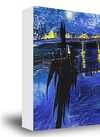
Białe krawędzie zł1
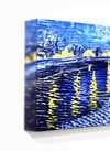
rozmyte krawędzie zł1
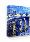
Przedłużony zł1
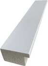
P118B zł10
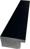
P118H zł10
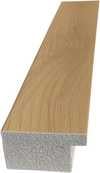
P118W zł10
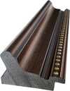
P438Z zł10
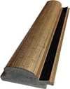
P508JH zł12
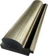
P508YH zł12
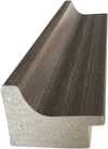
P805H zł10
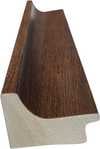
P805Z zł10
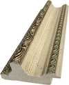
P919BZ zł10
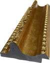
P919G zł10
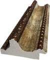
P919XJ zł10
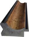
P959ZH zł10
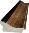
P968JZ zł12
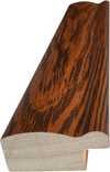
W106C zł8
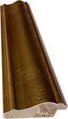
W218G zł10
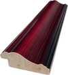
W218JH zł8
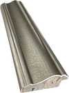
W218Y zł10
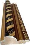
W307PJ zł10
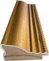
W316G zł10
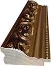
W316PJ zł8
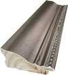
W316Y zł10
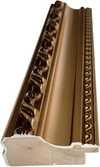
W398PJ zł8
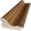
W4111J zł10
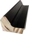
W500HY zł15
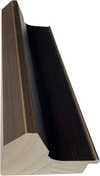
W500JH zł15
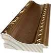
W692G zł12
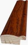
W849H zł8
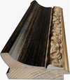
W940BG zł15
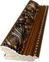
W953PJ zł8
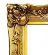
H24-GOLD zł30
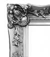
H24-SILVER zł30
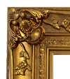
H36-GOLD zł45
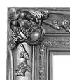
H36-SILVER zł45
W oprawie
Profil: . Wymiar całkowity w ramie: .
3 Trzeci z czterech kroków
Czy chcieliby Państwo wprowadzić jakieś zmiany w obrazie?
Większość osób odpowiada przecząco. Ponieważ każdy obraz jest tworzony ręcznie, nasz artysta może również dostosować go do Twoich potrzeb.
Po złożeniu zamówienia zespół ArtsDot.com skontaktuje się z klientem drogą mailową w celu uzyskania instrukcji i prześle podgląd projektu
4 Krok czwarty z czterech
Kilka opcji wykończenia
Wszystkie są opcjonalne. Wybrane już odpowiedzi nie wiążą się z żadnymi dodatkowymi kosztami.
Kto jest autorem?
Dostawa na całym świecie () w ciągu 3–4 tygodni zamiast standardowych 5 tygodni. (5 Listopad). Bez kompromisów w kwestii jakości.
Tabliczka informacyjna, jak w muzeum?
Szczegóły grawerowanej brązowej tabliczki
This elegant plaque features the artist's name and the title of the artwork, finely engraved for a timeless presentation.
It is made from bronze with a refined, elegant finish. The text is precisely laser-engraved for a sharp and permanent result. Measuring 9x2 cm, the plaque is compact yet easy to read. It's built to be durable and scratch-resistant, offering a professional, museum-quality look. Mounting is simple thanks to the included adhesive backing.
Szczegóły przezroczystej tabliczki akrylowej
The plaque includes essential engraved details such as the artist's name, the title of the artwork, the date it was created, the type of media used-like oil on canvas or watercolor-a brief description of the piece, and a QR code that links to the complete artwork information.
It is crafted from clear acrylic, offering a sleek, modern appearance. The text is UV-engraved in black to ensure strong visual contrast. With a size of 10x15 cm, it ensures optimal readability. It comes equipped with two metal hooks for secure wall mounting. The plaque is designed to be weather-resistant, making it suitable for various environments, and it includes interactive features that work seamlessly with smartphone scanning.
Szczegóły czarnej tabliczki akrylowej
This elegant plaque includes engraved information such as the artist's name, the title of the artwork, the date it was created, the type of media used (like oil on canvas or watercolor), a short description of the artwork, and a QR code for quick access to more information.
The plaque itself is made from refined black acrylic with a premium finish. The text is laser-engraved in white for high contrast and readability. Its size is 10x15 cm, designed to be easy to read. It comes with two metal hooks for professional mounting. The design is sleek and fits any interior style. It is also weather-resistant and durable, with built-in digital integration for mobile compatibility.
Werniks ochronny?
Kiedy potrzebujesz dostawy?
✓ Sprawdź i zamów
Twoje dzieło, dokładnie tak, jak zamówiłeś

Composition (The Cow)
Technika reprodukcji
Wymiary reprodukcji
-

Wybitny mistrz artystyczny
Większa szczegółowość, finezja i dodatkowy czas na realizację
-

Opcje oprawy reprodukcji
-
-
W przypadku dzieł sztuki lub reprodukcji, których którykolwiek z boków przekracza 105 cm (około 41 cali), rama zostanie wysłana w formie zestawu do samodzielnego montażu. Metoda ta zapewnia bezpieczną dostawę i zapobiega uszkodzeniom podczas transportu.
Wymagany profesjonalny montaż – nie jest to produkt typu DIY.
Zestaw musi zostać złożony, a płótno naciągnięte przez doświadczonego profesjonalnego ramiarza, przy użyciu kleju do drewna (brak w zestawie), kleszczy do naciągania płótna oraz ścisków, które utrzymają krosna w równej pozycji podczas schnięcia kleju. Nieprawidłowy montaż lub nierównomierne napięcie płótna może trwale uszkodzić dzieło sztuki i nie podlega naszej gwarancji.
 W przypadku dzieł sztuki lub reprodukcji, których którykolwiek z boków przekracza 105 cm (około 41 cali), rama zostanie wysłana w formie zestawu do samodzielnego montażu. Metoda ta zapewnia bezpieczną dostawę i zapobiega uszkodzeniom podczas transportu.
W zestawie znajdują się wszystkie listwy z litego drewna, precyzyjnie docięte do wymiarów.
Montaż odbywa się przy użyciu dołączonych wkrętów oraz kleju do drewna do łączenia narożników, którego zestaw nie zawiera i który musi zostać dostarczony przez ramiarza.
Wymagane są profesjonalne narzędzia, których nie ma w zestawie: kleszcze do naciągania płótna (napinacz) oraz zaciski, które pozwolą utrzymać listwy w równej pozycji podczas schnięcia kleju.
Ważne:
Do połączenia narożników niezbędny jest klej do drewna, listwy należy unieruchomić za pomocą ścisków do momentu całkowitego wyschnięcia kleju, a naciągnięcie płótna na złożoną ramę wymaga użycia kleszczy do naciągania płótna. Żaden z tych elementów nie jest dołączony do zestawu. Przed zamówieniem tego rozmiaru zalecamy konsultację z doświadczonym ramiarzem.

Etykieta obiektu
-
-

Lakier ochronny
Lakier z połyskiem (pogłębia kolory, chroni przed światłem i wilgocią)
-

Personalizacja dzieła
Przykłady możliwości personalizacji: zastąp twarz zdjęciem klienta; dodaj zwierzę domowe (np. zamień kota na psa); umieść ukrytą wiadomość w tle; zmień krajobraz lub elementy tła.
-

Ekspresowa
Dostawa na cały świat () w ciągu 3–4 tygodni zamiast standardowych 5 tygodni. (5 Listopad). Bez kompromisów w kwestii jakości.
-
Przesyłka ekspresowa
Dostawa na cały świat () w ciągu 5 tygodni. (12 Listopad).
W cenie
Cena całkowita
zł 1029
Opcja ze szkłem jest dostępna wyłącznie w rozmiarach poniżej 110 cm
W każdym zamówieniu
- Bezpłatna ekspresowa wysyłka na cały świat
- Wysokiej jakości płótno lniane
- Pełne ubezpieczenie przesyłki
- Gwarancja zwrotu należności celnych i podatków importowych
- Gwarancja wiernego odwzorowania kolorów
- 100-dniowa polityka zwrotów (tylko w przypadku wad)
- Gwarancja 100% zwrotu pieniędzy
- Zniżka przy zakupie wielu sztuk


A Fragmented Vision: Exploring “Composition (The Cow)”
Theo van Doesburg’s “Composition (The Cow),” painted in 1917, isn't a straightforward depiction of bovine form; it’s an invitation into the nascent world of abstraction, a pivotal moment in the evolution of modern art. Far from a pastoral scene, this work embodies the spirit of early Cubism and Vorticism – movements grappling with how to represent reality not through imitation, but through the very structure of perception itself. The painting immediately commands attention, not for its recognizable subject matter, but for its dynamic energy, a restless arrangement of geometric planes that seem poised on the brink of collapse or explosion.
- The Deconstructed Form: Van Doesburg strips away all conventional notions of representation. The cow isn’t rendered with soft curves and subtle shading; instead, it's broken down into a series of sharp, angular rectangles – triangles, squares, and elongated parallelograms – that suggest the underlying structure of its body without ever fully resolving into a cohesive image.
- Monochromatic Intensity: The stark palette of grays and blacks against a white background amplifies the painting’s impact. The absence of color directs the viewer's attention to the interplay of lines, shapes, and their spatial relationships. It creates an atmosphere of intense concentration and intellectual engagement.
- A Dialogue with Movement: The intersecting diagonals and fragmented forms generate a powerful sense of movement – not a static stillness, but a dynamic tension that vibrates across the canvas. This feeling is reminiscent of the Vorticist fascination with speed and dynamism, mirroring the energy of early 20th-century industrialization.
The Roots of Abstraction: Van Doesburg’s Intellectual Journey
To understand “Composition (The Cow),” one must consider Theo van Doesburg's broader artistic trajectory. Initially influenced by the expressive brushwork and emotional intensity of Vincent van Gogh, he underwent a profound shift in perspective following his encounter with Wassily Kandinsky’s 1913 treatise, *Concerning the Spiritual in Art*. Kandinsky argued that art should transcend mere representation and tap into a realm of pure feeling and spiritual truth. This realization led Van Doesburg to abandon naturalistic depiction altogether, embracing abstraction as a means of accessing this inner world.
His early experiments with geometric abstraction, documented in preparatory sketches like the graphite studies of the cow, demonstrate a deliberate process of deconstruction. He began by simplifying recognizable forms – the contours of the animal’s body, its limbs and head – before systematically reducing them to their essential geometric components. This methodical approach reflects his belief that art should be built upon a rigorous intellectual framework, rather than intuitive impulse.
Symbolism Beyond the Obvious: A Modernist Manifesto
While “Composition (The Cow)” resists straightforward interpretation, it’s not devoid of symbolic meaning. The fragmented form can be seen as an allegory for the breakdown of traditional values and the fragmentation of modern experience. Van Doesburg was deeply critical of bourgeois society and its emphasis on materialism and superficiality. The painting's stark geometry and dynamic energy can be interpreted as a rejection of these values, advocating instead for a new aesthetic based on clarity, order, and intellectual rigor.
Furthermore, the cow itself – a symbol of rural simplicity and abundance – is transformed into an abstract entity, suggesting a critique of the relationship between nature and civilization. The animal’s essence is stripped away, leaving only its underlying structure, prompting viewers to reconsider their own perceptions of reality.
A Legacy in Lines: Reproduction and Artistic Resonance
“Composition (The Cow)” remains a powerfully evocative work, demonstrating Van Doesburg's pioneering role in the development of abstract art. Reproductions capture the painting’s dynamic energy and intellectual depth, offering a window into this pivotal moment in artistic history. When considering a high-quality reproduction, pay attention to the subtle tonal variations and the precise alignment of the geometric forms – these details are crucial to appreciating the painting's complexity and nuance. This piece is not merely an image; it’s a testament to Van Doesburg’s radical vision and his enduring influence on the course of modern art.
Pytania i odpowiedzi
Czy kolory w „Composition (The Cow)” – Teo van Doesburg są nasycone czy stonowane?
Paleta dzieła "Composition (The Cow)" charakteryzuje się Muted nasyceniem kolorów.
Gdzie mogę pobrać „Composition (The Cow)” – Teo van Doesburg?
Możliwość pobrania dzieła „Composition (The Cow)”: strona Pobierz plik cyfrowy oferuje wysokiej rozdzielczości cyfrowe zdjęcie do pobrania.
Jak nasycone są kolory w „Composition (The Cow)” – Teo van Doesburg?
Intensywność barw w dziele „Composition (The Cow)” wynosi Monochromatic. Intensywność określa, jak nasycone wydają się kolory.
Podobne dzieła


Teo van Doesburg
1883 - 1931, Holandia
Biografia artysty
The Architect of Abstraction: A Life in Geometric Harmony
Theo van Doesburg, born Christian Emil Marie Küpper in 1883 in Utrecht, Netherlands, wasn’t merely a painter; he was a revolutionary force who fundamentally reshaped the landscape of modern art. His journey began amidst the lingering echoes of Impressionism and Post-Impressionism – initially mirroring styles reminiscent of Vincent van Gogh – both in subject matter and emotional intensity. However, this early phase served as a crucial prelude, a necessary stepping stone toward the radical transformation that would define his enduring legacy. A pivotal moment arrived in 1913 with his encounter with Wassily Kandinsky’s *Rückblicke*. This text ignited within van Doesburg a profound realization: true artistic expression lay not in replicating the external world but in channeling an inner, spiritual reality through pure abstraction. It was this conviction that birthed Neoplasticism – more commonly known as De Stijl – a movement he founded and fiercely championed, becoming its most ardent advocate.Forging a New Visual Language: The Principles of De Stijl
De Stijl wasn’t simply an artistic style; it was a comprehensive philosophical manifesto translated into visual form. Van Doesburg believed in stripping art down to its most essential elements – straight lines, right angles, and the primary colors of red, yellow, and blue, alongside black, white, and gray. This austere palette wasn't born from limitation but from a desire for universality—a belief that these fundamental forms resonated with an underlying cosmic order. He envisioned a *total* work of art, extending beyond the canvas to encompass architecture, design, and even everyday objects. Collaboration was key; van Doesburg worked closely with architects like J.J.P. Oud and Gerrit Rietveld, designing stained glass windows, furniture, and entire interiors that embodied the principles of De Stijl. His collaborations extended to fellow artists such as Piet Mondrian, with whom he co-founded the influential journal *De Stijl*, a platform for disseminating their ideas and attracting like-minded creatives. However, despite their shared origins, tensions arose between van Doesburg and Mondrian regarding the rigidity of Neoplasticism. Van Doesburg introduced “Elementarism” in 1926, advocating for diagonal lines and more dynamic compositions – a departure that ultimately led to a schism within the movement, revealing his restless spirit and constant pursuit of artistic evolution.A Multifaceted Artistic Vision: Beyond Painting
While celebrated as a painter, van Doesburg’s artistic pursuits were remarkably diverse. He was a prolific writer, poet, and critic, using his pen to articulate the theoretical underpinnings of De Stijl and challenge conventional notions of art. His engagement with Dadaism in the early 1920s further broadened his artistic horizons, leading to experimental works that incorporated collage and typography. This period also saw him teaching at the Bauhaus, where he shared his ideas with a new generation of artists and designers. He wasn’t content to remain within the confines of traditional art forms; van Doesburg actively sought to integrate art into everyday life, believing it had the power to transform society. His designs for interiors and furniture weren't merely aesthetic exercises but attempts to create harmonious living spaces that reflected the principles of De Stijl. A prime example is his collaboration with Sophie Taeuber-Arp and Georges Vantongerloo on designing artist residences, showcasing a holistic approach to artistic creation – an attempt to build a world *in* the image of his ideals.Key Works & Lasting Influence
- Study for Simultaneous Compositions XXII (1922): A quintessential example of Neoplasticism, showcasing the movement’s signature geometric forms and limited color palette.
- Composition with half values (1928): Demonstrates van Doesburg's exploration of tonal variations within the De Stijl aesthetic.
- Dancers (1917-1918): Represents a transitional phase in his work, blending figurative elements with emerging abstract tendencies.
- Collaboration on *De Stijl* journal: A crucial platform for disseminating the movement’s ideas and fostering dialogue among artists and intellectuals.
- Elementarism (1926): Van Doesburg's attempt to inject dynamism into Neoplasticism, introducing diagonal lines and a more fluid approach to composition.
The Architect of Abstraction: A Life in Geometric Harmony
Theo van Doesburg, born Christian Emil Marie Küpper in 1883 in Utrecht, Netherlands, was more than a painter; he was a revolutionary force who reshaped the very foundations of modern art. His journey began amidst the lingering echoes of Impressionism and Post-Impressionism, initially mirroring styles reminiscent of Vincent van Gogh – both in subject matter and emotional intensity. However, this early phase served as a crucial prelude, a necessary stepping stone toward the radical transformation that would define his enduring legacy. A pivotal moment arrived in 1913 with his encounter with Wassily Kandinsky’s *Rückblicke*. This text sparked within van Doesburg a profound realization: true artistic expression lay not in replicating the external world but in channeling an inner, spiritual reality through pure abstraction. It was this conviction that birthed Neoplasticism – more commonly known as De Stijl – a movement he founded and fiercely championed, becoming its most ardent advocate.Forging a New Visual Language: The Principles of De Stijl
De Stijl wasn’t simply an artistic style; it was a comprehensive philosophical manifesto translated into visual form. Van Doesburg believed in stripping art down to its most essential elements – straight lines, right angles, and the primary colors of red, yellow, and blue, alongside black, white, and gray. This austere palette wasn't born from limitation but from a desire for universality—a belief that these fundamental forms resonated with an underlying cosmic order. He envisioned a *total* work of art, extending beyond the canvas to encompass architecture, design, and even everyday objects. Collaboration was key; van Doesburg worked closely with architects like J.J.P. Oud and Gerrit Rietveld, designing stained glass windows, furniture, and entire interiors that embodied the principles of De Stijl. His collaborations extended to fellow artists such as Piet Mondrian, with whom he co-founded the influential journal *De Stijl*, a platform for disseminating their ideas and attracting like-minded creatives. However, despite their shared origins, tensions arose between van Doesburg and Mondrian regarding the rigidity of Neoplasticism. Van Doesburg introduced “Elementarism” in 1926, advocating for diagonal lines and more dynamic compositions – a departure that ultimately led to a schism within the movement, revealing his restless spirit and constant pursuit of artistic evolution.A Multifaceted Artistic Vision: Beyond Painting
While celebrated as a painter, van Doesburg’s artistic pursuits were remarkably diverse. He was a prolific writer, poet, and critic, using his pen to articulate the theoretical underpinnings of De Stijl and challenge conventional notions of art. His engagement with Dadaism in the early 1920s further broadened his artistic horizons, leading to experimental works that incorporated collage and typography. This period also saw him teaching at the Bauhaus, where he shared his ideas with a new generation of artists and designers. He wasn’t content to remain within the confines of traditional art forms; van Doesburg actively sought to integrate art into everyday life, believing it had the power to transform society. His designs for interiors and furniture weren't merely aesthetic exercises but attempts to create harmonious living spaces that reflected the principles of De Stijl. A prime example is his collaboration with Sophie Taeuber-Arp and Georges Vantongerloo on designing artist residences, showcasing a holistic approach to artistic creation – an attempt to build a world *in* the image of his ideals.Key Works & Lasting Influence
- Study for Simultaneous Compositions XXII (1922): A quintessential example of Neoplasticism, showcasing the movement’s signature geometric forms and limited color palette.
- Composition with half values (1928): Demonstrates van Doesburg's exploration of tonal variations within the De Stijl aesthetic.
- Dancers (1917-1918): Represents a transitional phase in his work, blending figurative elements with emerging abstract tendencies.
- Collaboration on *De Stijl* journal: A crucial platform for disseminating the movement’s ideas and fostering dialogue among artists and intellectuals.
- Elementarism (1926): Van Doesburg's attempt to inject dynamism into Neoplasticism, introducing diagonal lines and a more fluid approach to composition.
Powiązane artykuły

Francisco Goya: 25 Arcydzieł Genialnego Malarza Hiszpańskiego | ArtsDot.pl
Odkryj 25 arcydzieł Francisco Goyi – od portretów królewskich po dramatyczne 'Czarne Malowidła'. Poznaj historię, technikę i emocje hiszpańskiego mistrza. Reprodukcje obrazów najwyższej jakości na ArtsDot.com! Eksploruj kolekcję online.

O nas
Odkryj naszą historię! Wprowadzamy światowej klasy sztukę do Twojego życia dzięki starannie dobranym dziełom, personalizowanym kreacjom i bezpłatnym podglądom. Cenione przez osoby prywatne i firmy od 2000 roku.

Rembrandt van Rijn: 25 Najwybitniejszych Dzieł Sztuki – Reprodukcje i Inspiracje do Wnętrz
Poznaj 25 arcydzieł Rembrandta van Rijn! Odkryj fascynujące historie, techniki i wpływ holenderskiego mistrza baroku na świat sztuki. Reprodukcje obrazów najwyższej jakości – inspiracje do wnętrz na ArtsDot.com