- Home

- Op canvas afdrukken
- Josef Albers
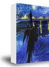
- Pillars

 Verstuur
Pillars
 Oil On Canvas
- WallArt
- Constructivism
 1928
1928- Modern
 61.0 x 61.0 cm
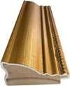
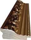
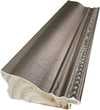
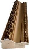
Giclée / Kunstafdruk
Giclée- of canvasafdruk van museumkwaliteit met snelle productie en flexibele afwerkingsopties.
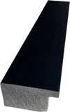
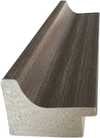
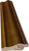
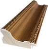
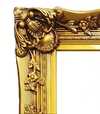
P118B $10
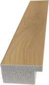
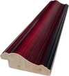
P118H $10
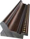
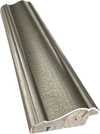
P118W $10
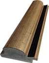
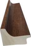
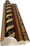
P438Z $10
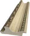
P508JH $12

P508YH $12
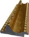
P805H $10
P805Z $10
P919BZ $10
P919G $10
P919XJ $10
P959ZH $10
P968JZ $12
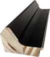
W106C $8
W218G $10
W218JH $8
W218Y $10
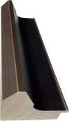
W307PJ $10
W316G $10
W316PJ $8
W316Y $10
W398PJ $8
W4111J $10
W500HY $15
W500JH $15
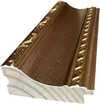
W692G $12
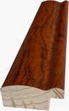
W849H $8
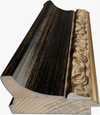
W940BG $15
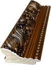
W953PJ $8
Kies uit onze vooraf ingestelde maten die overeenkomen met de originele verhoudingen van het kunstwerk.
U kunt uw eigen afmetingen opgeven om in een specifieke lijst of ruimte te passen. Als de door u gekozen maat niet overeenkomt met de proporties van het originele kunstwerk, zullen wij de afbeelding bijsnijden of uitbreiden met een gespiegelde of effen rand. Een digitaal mockup wordt ter goedkeuring naar u verzonden voordat de productie begint.
Houd er rekening mee dat de preview op het scherm de werkelijke bijsneding of uitbreiding niet weergeeft. Alleen de mockup toont de uiteindelijke compositie nauwkeurig.
Hoewel aangepaste maten beschikbaar zijn, raden wij aan een afmeting uit de vooraf bepaalde lijst te kiezen om de originele proporties te behouden.
Wereldwijde levering () binnen 2 weken in plaats van de standaard 4/5 weken. (17 juli)

Gratis wereldwijde expressverzending

Hoogwaardig linnen canvas

Volledige verzendverzekering

Garantie op terugbetaling van invoerrechten

Garantie op exacte kleurweergave

60 dagen retourbeleid (alleen bij defecten)

100% Geld-terug-garantie

Korting bij meerdere afnames
 De optie voor glas is alleen beschikbaar bij een formaat kleiner dan 110 cm.

Pillars
Giclée / Kunstafdruk
Afmetingen reproductie
-


Eindtotaal
-
Beschrijving verzamelobject
Josef Albers' Pillars: A Study in Order and Abstraction
Josef Albers’ "Pillars," created in 1928, is a striking example of early geometric abstraction that foreshadows the artist's later explorations of color theory. This artwork, measuring 61 x 61 cm, offers a compelling glimpse into Albers' artistic development during his time at the Bauhaus, a period marked by experimentation and a shift towards non-objective art.
Historical Context: The Bauhaus Influence
Albers’ journey as an artist was significantly shaped by his enrollment in the Bauhaus school in 1920. This progressive institution championed innovative educational ideas and fostered a climate of creative exploration. Initially studying painting at a traditional art school, Albers quickly gravitated towards the glass workshop within the Bauhaus, disregarding the prescribed wall painting class. It was here that he began creating "wall glass paintings"—assemblages of opaque glass—which served as precursors to his later color studies. “Pillars” reflects this early experimentation with form and material, demonstrating a move away from representational art towards pure abstraction.
Visual Analysis: Geometry, Color, and Composition
The artwork presents a meticulously structured composition characterized by vertical and horizontal lines arranged in a grid-like pattern. The color palette is restrained yet impactful, primarily featuring red, white, black, and grey tones with subtle variations. This deliberate choice of colors contributes to the overall sense of order and precision. The symmetrical arrangement emphasizes balance, while crisp, defined lines form rectangles and blocks that intersect, creating a complex visual texture. Notably, "Pillars" lacks traditional perspective or depth; it exists entirely on a flat, two-dimensional plane. The absence of recognizable objects or scenes reinforces the artwork’s purely abstract nature.
Style and Technique: Minimalism and Constructivism
“Pillars” aligns with both Minimalist and Constructivist aesthetics. Its emphasis on geometric forms, clean lines, and a limited color palette are hallmarks of Minimalism. Simultaneously, the structured grid and focus on construction evoke influences from Constructivism, an art movement that prioritized industrial materials and rational design principles. The technique employed appears to be precise painting, likely achieved through careful brushwork or potentially masking techniques to ensure sharp lines. The artwork is executed on canvas, as evidenced by the texture of the wooden backing.
Emotional Impact and Symbolism
While devoid of overt symbolism or emotional narrative, "Pillars" evokes a sense of order, precision, and intellectual rigor. Some viewers may perceive a slightly sterile or clinical aesthetic due to its geometric nature. However, the interplay of colors and forms creates a subtle visual rhythm that engages the viewer's perception. Ultimately, “Pillars” invites contemplation on the fundamental elements of art—line, shape, color—and their capacity to create compelling abstract compositions.
Vergelijkbare kunstwerken


Biografie van de kunstenaar
A Life Forged in Material: The Early Years and Bauhaus Formation
Josef Albers’s artistic journey began not amidst the rarefied air of established academies, but within the pragmatic world of his father's contracting business in Bottrop, Germany. Born in 1888, young Josef absorbed a deep respect for materials – carpentry, plumbing, house-painting – skills that would fundamentally shape his aesthetic sensibility. This wasn’t merely vocational training; it was an immersion into the very essence of making, understanding how forms materialized and the inherent qualities within each medium. He learned to appreciate the subtle textures of wood, the precise angles of metal, the transformative power of color applied to surfaces – a foundation that would underpin his later explorations in abstraction. Before dedicating himself fully to art, Albers spent five years as a schoolteacher, honing patience and pedagogical skill—attributes that would later define his influential teaching career. Formal artistic training commenced at the Königliche Kunstschule in Berlin between 1913 and 1915, where he explored printmaking, painting, and, crucially, stained glass. His early commission, “Rosa Mystica Ora Pro Nobis” (1918), a stunning stained-glass window for a church in Germany, foreshadowed his lifelong fascination with the interplay of light and color, hinting at the abstract explorations to come. This initial work wasn’t simply decorative; it was an investigation into how light *transformed* material, a theme that would resonate throughout his career – a delicate balance between form and illumination.The Bauhaus Crucible: Color as Subject
A pivotal moment arrived in 1922 when Albers joined the faculty of the Bauhaus, a revolutionary school seeking to unify all artistic disciplines under Walter Gropius’s visionary leadership. Initially tasked with teaching the preliminary course – *Werklehre* (workshop practice) – he immersed himself in its core principles: functionalism, geometric abstraction, and material exploration. This period proved transformative. Albers quickly recognized that art wasn't merely about representation; it was about understanding the fundamental properties of materials and how they interacted with each other and with light. He began a systematic investigation into color perception, moving away from representational art towards an increasingly abstract vocabulary. He wasn’t interested merely in *what* colors were, but *how* they interacted, how they influenced each other, and how our eyes perceived them. The influence of fellow Bauhaus masters like Paul Klee and Wassily Kandinsky is discernible in his early work – a synthesis of formal structure and expressive color. Albers wasn’t seeking spiritual truths through color; he was meticulously documenting its physical effects – a scientific rigor that became the hallmark of his artistic method. He experimented with pigments, varnishes, and glazing techniques, striving to capture the subtle nuances of light and shadow. This focus on perception, on how we *see*, rather than what is *seen*, set him apart and laid the groundwork for his future explorations.Homage to the Square: A Laboratory of Perception
Following a period teaching at Black Mountain College – where he fostered a generation of American artists including Robert Rauschenberg and Cy Twombly – Albers embarked on what would become his most iconic series in 1949: “Homage to the Square.” This ongoing project consisted of paintings featuring nested squares within squares, each iteration exploring subtle variations in color relationships. The series wasn’t intended as a celebration of geometry; rather, it was a laboratory for studying color perception. Albers meticulously documented his experiments, revealing how colors aren't static entities but dynamic forces governing each other through internal logic – often misleading to the eye. A seemingly brighter square might appear to recede while a darker one advances, defying intuitive understanding. He used a rigorous system of notation to record the precise hues and values he employed, creating a detailed visual diary of his investigations. The paintings themselves are deceptively simple in their composition, yet they represent an incredibly complex and nuanced exploration of color theory. The series culminated in his seminal book, “Interaction of Color” (1963), a foundational text still studied by artists and designers today – a testament to Albers’ belief that seeing is not passive, but an active process of interpretation.Chromatic Interactions and Legacy
“Interaction of Color” isn't simply a treatise on color theory; it’s a series of exercises designed to demonstrate how our perception of color is relative and contextual. The book encourages readers to experiment with different color combinations and observe the resulting effects, fostering a deeper understanding of how colors influence each other. Albers’s work extended beyond painting, encompassing graphic design, furniture design, and teaching. He instilled in his students a profound respect for materials, an emphasis on observation, and a willingness to question conventional assumptions. His legacy is one of intellectual rigor combined with artistic sensitivity – a rare combination that has profoundly influenced generations of artists. Josef Albers died on March 25, 1976, in New Haven, Connecticut, leaving behind a body of work that continues to challenge and inspire viewers to see the world anew. His paintings remain powerful reminders of the beauty and complexity hidden within the simplest of forms – a testament to his lifelong dedication to exploring the mysteries of color and perception.Notable Works
- Gray Instrumentation I Prospectus (1975): A minimalist monochrome painting exemplifying geometric balance and subtle tonal variations.
- Study for Homage to the Square – Beaming (Date Unknown): A classic example of Albers’s exploration of color interaction within nested squares, evoking a sense of calm and spatial depth.
- Rosa Mystica Ora Pro Nobis (1918): His early stained-glass commission, foreshadowing his lifelong fascination with light and color.

Josef Albers
1888 - 1976 , Duitsland
Belangrijkste feiten
- Artistic Movement Or Style: Abstractie geometrisch
- Artists Or Movements Influenced By This Artist:
- Minimalisme
- Veldkleur
- Artists Who Influenced This Artist:
- Klee
- Kandinsky
- Date Of Birth: 19 maart 1888
- Date Of Death: 25 maart 1976
- Full Name: Josef Albers
- Nationality: Duits-Amerikaans
- Notable Artworks:
- Hommage aan de Vierkant
- Grijze Instrumentatie I Prospectus
- Place Of Birth: Bottrop, Duitsland
Gerelateerde artikelen

Top 10 Meesterwerken van de Geometrische Abstractie | ArtsDot.nl
Ontdek de 10 meest invloedrijke meesterwerken van de geometrische abstractie! Van Mondriaan tot Malevich, leer over kunstenaars, technieken & kleuren. Museumkwaliteit reproducties op ArtsDot.com – voor een unieke interieurstijl.

De Subtiele Kracht van Neutraal: Zwart, Wit en Grijs als Katalysatoren voor Licht, Textuur en Moderne Architectuur
Ontdek de subtiele kracht van zwart, wit en grijs in hoteldesign. Expert tips voor licht, textuur & moderne architectuur. Creëer rustgevende, luxe ruimtes met ArtsDot.

Top 10 Witte Meesterwerken: Kunstgeschiedenis & Interieurinspiratie
Ontdek de top 10 witte meesterwerken uit de kunstgeschiedenis! Van Monet tot Mondriaan, bewonder abstracte vormen & serene kleuren. Vind museumkwaliteit reproducties en interieurinspiratie op ArtsDot.com.

Josef Albers: A Homage to Color Interaction & the Foundations of Visual Perception
Explore Josef Albers's groundbreaking color theory & the 'Homage to the Square' series. Discover how his work revolutionized visual perception and influenced modern art movements like Minimalism & Op Art. Learn about his Bauhaus roots & lasting legacy.

De Stille Resonantie van Terughoudendheid: Minimalistische Abstracte Kunst als Katalysator voor Serene Interieurs
Ontdek de kracht van minimalistische abstracte kunst voor een serene woning. ArtsDot biedt museumkwaliteit reproducties & gepersonaliseerd advies. Creëer uw droominterieur vandaag nog!