

- 30.0 x 20.0 cm


Het werk volgt uw keuzes: , .
Beschrijving verzamelobject
Explore Josef Albers' 'Multiplex A,' a captivating woodcut masterpiece showcasing intricate geometric patterns and vibrant color interactions—a cornerstone of modern art education.
 Lees meer
Biografie kunstenaar
Josef Albers was een baanbrekende Duitse-Amerikaanse kunstenaar en onderwijzer, bekend om zijn kleurtheorie, geometrische abstractie en invloedrijke lesmethoden op de Bauhaus en Black Mountain College. Zijn "Homage to the Square" serie is iconisch.
Handgemaakte olieverfreproductie
Met de hand geschilderd in olieverf op canvas in uw gewenste maat en lijst, op bestelling gemaakt door onze kunstenaars. ( Schakel over naar print Schakel over naar digitale afbeeldingen)
Dit kunstwerk is auteursrechtelijk beschermd
De kunstwerken die op deze pagina worden weergegeven, zijn beschermd door de auteursrechtwetgeving, wat betekent dat het ons wettelijk niet is toegestaan om identieke reproducties te maken of te verkopen. Deze bescherming wordt gehandhaafd onder internationale overeenkomsten zoals de Conventie van Bern en door nationale wetgeving, waaronder de bepalingen van de Amerikaanse auteurswet - Titel 17. Alle rechten voorbehouden. Reproduceren of distribueren van afbeeldingen is niet toegestaan zonder uitdrukkelijke schriftelijke toestemming van WahooArt.com en de rechthebbenden.
Als een respectvol en legaal alternatief bieden wij op maat gemaakte, handgeschilderde kunstwerken aan die geïnspireerd zijn op het origineel. Onze bekwame en professionele kunstenaars bestuderen zorgvuldig de stijl, sfeer en artistieke essentie van het origineel om een nieuw, uniek werk te creëren dat dezelfde emotie oproept – terwijl het een op zichzelf staande, originele creatie blijft.
Deze methode voldoet volledig aan de auteursrechtwetgeving, omdat het niet gaat om het kopiëren of dupliceren van het beschermde kunstwerk. In plaats daarvan is er sprake van een creatieve herinterpretatie — een nieuw schilderij dat door het origineel wordt geïnspireerd, maar er niet identiek aan is.
Meer over dit schilderij
 Voorvertoning
 Verstuur
 Delen
Delen
 Details bekijken
 Gids
Gids

 Download
 Vergelijkbare items
 Röntgenonderzoek
 Diavoorstelling
 Vraag & antwoord
 Statistieken
Bestel uw schilderij in vier eenvoudige stappen
Neem de tijd. U kunt elk antwoord nog wijzigen; de prijs in uw besteloverzicht wordt direct aangepast aan elke keuze.
1 Stap één van de vier
Welke maat wilt u kiezen?
Deze formaten behouden de proporties van het originele schilderij. De tekening laat uw keuze zien op een muur, boven een bank van twee meter.
Of geef uw eigen afmetingen op
Kies uit onze vooraf ingestelde maten die overeenkomen met de originele verhoudingen van het kunstwerk.

Voer de breedte en hoogte in die u nodig heeft, passend bij uw lijst of uw muur. Omdat dit handgeschilderd is, kan de kunstenaar bij een afmeting met een andere beeldverhouding iets meer rondom het schilderij schilderen of juist iets meer weglaten — u kiest zelf. Wij sturen u een digitaal mockup ter goedkeuring voordat het schilderwerk begint. De afbeelding die op deze pagina wordt getoond, is niet het uiteindelijke resultaat — alleen de mockup geeft dit weer.
2 Stap twee van vier
Hoe moet het worden geleverd: gerold, opgespannen of ingelijst?
De onderstaande prijzen zijn voor de maat die u in stap één heeft gekozen.
Kies de randen van het canvas
Kies uw lijst
Wit €1
Vervagende randen €1
Doorlopende rand €1
P118B €10
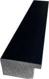
P118H €10
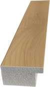
P118W €10
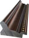
P438Z €10
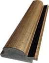
P508JH €12

P508YH €12
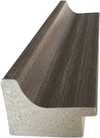
P805H €10
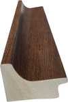
P805Z €10
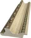
P919BZ €10
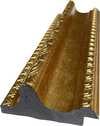
P919G €10
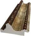
P919XJ €10
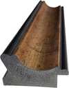
P959ZH €10
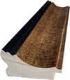
P968JZ €12
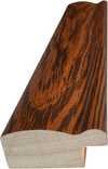
W106C €8
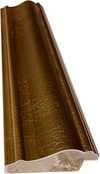
W218G €10
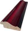
W218JH €8
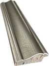
W218Y €10
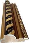
W307PJ €10
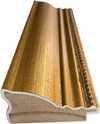
W316G €10
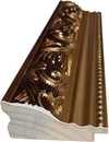
W316PJ €8
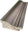
W316Y €10
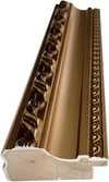
W398PJ €8
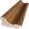
W4111J €10
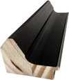
W500HY €15
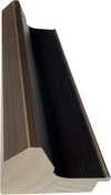
W500JH €15
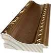
W692G €12
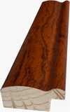
W849H €8
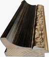
W940BG €15
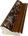
W953PJ €8
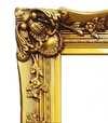
H24-GOLD €30

H24-SILVER €30
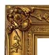
H36-GOLD €45
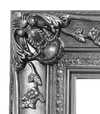
H36-SILVER €45
Ingelijst
Lijstrand: . Totale afmetingen inclusief lijst: .
3 Stap drie van vier
Wilt u dat er iets aan het schilderij wordt aangepast?
De meeste mensen antwoorden nee. Omdat elk schilderij met de hand wordt gemaakt, kan onze kunstenaar het ook voor u aanpassen.
Na de bestelling zal het team van ArtsDot.com per e-mail contact opnemen met de klant voor instructies en een mockup-voorbeeld verstrekken
4 Stap vier van vier
Enkele afwerkingsopties
Ze zijn allemaal optioneel. De reeds geselecteerde antwoorden brengen geen extra kosten met zich mee.
Wie is de kunstenaar?
Wereldwijde levering () binnen 3 tot 4 weken in plaats van de standaard 5 weken. (8 november). Zonder concessies aan de kwaliteit.
Een naambordje, zoals in een museum?
Details van de gegraveerde bronzen plaat
This elegant plaque features the artist's name and the title of the artwork, finely engraved for a timeless presentation.
It is made from bronze with a refined, elegant finish. The text is precisely laser-engraved for a sharp and permanent result. Measuring 9x2 cm, the plaque is compact yet easy to read. It's built to be durable and scratch-resistant, offering a professional, museum-quality look. Mounting is simple thanks to the included adhesive backing.
Details transparante acrylplaat
The plaque includes essential engraved details such as the artist's name, the title of the artwork, the date it was created, the type of media used-like oil on canvas or watercolor-a brief description of the piece, and a QR code that links to the complete artwork information.
It is crafted from clear acrylic, offering a sleek, modern appearance. The text is UV-engraved in black to ensure strong visual contrast. With a size of 10x15 cm, it ensures optimal readability. It comes equipped with two metal hooks for secure wall mounting. The plaque is designed to be weather-resistant, making it suitable for various environments, and it includes interactive features that work seamlessly with smartphone scanning.
Details zwarte acrylplaat
This elegant plaque includes engraved information such as the artist's name, the title of the artwork, the date it was created, the type of media used (like oil on canvas or watercolor), a short description of the artwork, and a QR code for quick access to more information.
The plaque itself is made from refined black acrylic with a premium finish. The text is laser-engraved in white for high contrast and readability. Its size is 10x15 cm, designed to be easy to read. It comes with two metal hooks for professional mounting. The design is sleek and fits any interior style. It is also weather-resistant and durable, with built-in digital integration for mobile compatibility.
Een beschermende vernis?
Wanneer heeft u het nodig?
✓ Controleren en bestellen
Uw schilderij, zoals u het heeft besteld

Multiplex A
Druktechniek
Afmetingen reproductie
-

Geselecteerde topkunstenaars
Meer detail, verfijning en extra productietijd
-

Lijst voor reproductie
-
-
Voor kunstwerken of reproducties die aan één zijde groter zijn dan 105 cm (ongeveer 41 inch), wordt de lijst als een losse set verzonden. Deze methode garandeert een veilige levering en voorkomt schade tijdens het transport.
Professionele montage vereist - dit is geen doe-het-zelfproduct.
De set moet worden gemonteerd en het canvas moet worden gespannen door een ervaren professionele lijstenmaker, met gebruik van houtlijm (niet inbegrepen), een doekspanter en klemmen om de sponningen recht te houden terwijl de lijm droogt. Onjuiste montage of een ongelijkmatige spanning op het canvas kan het kunstwerk permanent beschadigen en wordt niet gedekt door onze garantie.
 Voor kunstwerken of reproducties die aan één zijde groter zijn dan 105 cm (ongeveer 41 inch), wordt de lijst als een losse set verzonden. Deze methode garandeert een veilige levering en voorkomt schade tijdens het transport.
Alle massief houten onderdelen zijn inbegrepen, nauwkeurig op maat gesneden voor montage.
Te monteren met de meegeleverde schroeven, plus houtlijm voor de hoekverbindingen, die niet wordt meegeleverd en door uw lijstenmaker moet worden aangeschaft.
Professioneel gereedschap is vereist en niet inbegrepen: een spanner voor canvas en klemmen om de latten recht te houden terwijl de lijm droogt.
Belangrijk:
De hoekverbindingen vereisen houtlijm, de latten moeten met lijmklemmen worden vastgehouden tot de lijm volledig is opgedroogd, en het spannen van het canvas op het samengestelde frame vereist een doekspanter. Geen van deze artikelen is inbegrepen in de set. Wij adviseren u om een ervaren professionele lijstenmaker te raadplegen voordat u deze maat bestelt.

Naamplaatje
-
-

Beschermende vernislaag
Glanzende vernis (versterkt de kleuren en biedt bescherming tegen licht en vocht)
-

Mijn kunstwerk aanpassen
Voorbeelden van aanpassingen: vervang het gezicht door een eigen foto; voeg een huisdier toe (bijv. vervang de kat door een hond); verwerk een verborgen boodschap in de achtergrond; wijzig het landschap of andere elementen op de achtergrond.
-

Spoedlevering
Wereldwijde levering () binnen 3 tot 4 weken in plaats van de standaard 5 weken. (8 november). Geen concessies aan de kwaliteit.
-
Spoedlevering
Wereldwijde levering naar binnen 5 weken. (15 november).
Inbegrepen
Eindtotaal
€ 235
De optie voor glas is alleen beschikbaar bij een formaat kleiner dan 110 cm.
Inbegrepen bij elke bestelling
- Gratis wereldwijde expressverzending
- Hoogwaardig linnen canvas
- Volledige verzendverzekering
- Garantie op terugbetaling van invoerrechten
- Garantie op exacte kleurweergave
- Retourbeleid van 100 dagen (alleen bij defecten)
- 100% Geld-terug-garantie
- Korting bij meerdere afnames


Josef Albers’s “Multiplex A”: A Geometric Meditation on Perception
“Multiplex A,” created in 1947 by the visionary artist Josef Albers, is more than just a woodcut; it's an invitation to contemplate the very nature of visual perception. Born in Bottrop, Germany, and deeply influenced by his early experiences with craftsmanship – from carpentry to glass engraving – Albers’s artistic journey was fundamentally shaped by a profound understanding of materials and their inherent qualities. His time at the Bauhaus, a crucible of modern art and design, further solidified this approach, pushing him to explore abstraction and challenge conventional notions of representation. “Multiplex A” stands as a culmination of these influences, a meticulously constructed exploration of color interaction and spatial relationships that continues to resonate with viewers today.
The artwork’s visual language is deceptively simple yet profoundly complex. Albers employs a restricted palette – primarily black and white – to create a dynamic interplay of geometric forms: triangles, squares, and rectangles are arranged in a seemingly random order, yet within this apparent chaos lies a carefully orchestrated balance. The precision of the woodcut technique—a method demanding meticulous detail and control—is crucial to conveying the artwork’s intellectual rigor. Each line is deliberate, each shape precisely rendered, contributing to an overall sense of ordered complexity. Albers wasn't simply creating a decorative pattern; he was designing a visual experiment, a tangible manifestation of his theories on color perception.
The Foundations of Color Theory
Albers’s work is inextricably linked to his groundbreaking book, “Interaction of Colors,” published in 1963. This seminal text explored the ways in which colors influence and modify each other when placed adjacent to one another. "Multiplex A" serves as a visual demonstration of these principles. The overlapping shapes create areas of simultaneous contrast, where colors appear to shift and change depending on their surrounding hues. Albers’s meticulous documentation of these color interactions—the precise shades he used and the resulting effects—became a cornerstone of modern color theory, influencing generations of artists and designers.
The artwork's design is rooted in Albers’s concept of “homage,” a deliberate tribute to the fundamental elements of art. He sought not to create something entirely new but rather to explore and illuminate existing artistic conventions. "Multiplex A" can be seen as an homage to the principles of geometry, color theory, and the very act of seeing. It’s a quiet assertion that beauty and meaning can be found in the simplest of forms and relationships.
Symbolism and Emotional Resonance
While Albers deliberately avoided overt symbolism in his work, “Multiplex A” possesses a subtle emotional depth. The geometric precision evokes a sense of order and control, while the overlapping shapes suggest ambiguity and uncertainty. The stark contrast between black and white creates a visual tension that mirrors the complexities of human perception. Some viewers interpret the artwork as a meditation on duality—the interplay of light and dark, order and chaos, certainty and doubt.
Beyond its intellectual rigor, “Multiplex A” also possesses an undeniable aesthetic appeal. The carefully balanced composition, combined with the rich texture of the woodcut print, creates a visually engaging experience. It’s a work that rewards repeated viewing, revealing new nuances and subtleties with each encounter. The artwork invites contemplation, prompting viewers to question their own assumptions about color, space, and perception.
A Legacy in Art and Design
Josef Albers' influence extends far beyond the art world. His teaching methods at Black Mountain College profoundly shaped the development of American art education, emphasizing hands-on experimentation and critical thinking. “Multiplex A” stands as a testament to his enduring legacy—a work that continues to inspire artists, designers, and anyone interested in exploring the mysteries of visual perception. Reproductions of this iconic piece offer a unique opportunity to bring Albers’s groundbreaking ideas into your home or studio, serving as a constant reminder of the power of art to illuminate our understanding of the world around us.
Veelgestelde vragen
Welke afmeting en oriëntatie worden aanbevolen voor een print van "Multiplex A" door Josef Albers?
Voor een afdruk van "Multiplex A" door Josef Albers wordt een formaat van Medium aanbevolen in Portrait oriëntatie.
Is Josef Albers, maker van "Multiplex A", bekend onder andere namen?
Josef Albers staat ook bekend als Joseph Albers, AL-bərz, AHL-.
Waar wordt het Portrait-formaat van "Multiplex A" aanbevolen te tonen?
Met zijn Portrait-formaat is een reproductie van "Multiplex A" een prachtige aanvulling op een Living Room.
Vergelijkbare kunstwerken


Josef Albers
1888 - 1976, Duitsland
Biografie kunstenaar
A Life Forged in Material: The Early Years and Bauhaus Formation
Josef Albers’s artistic journey began not amidst the rarefied air of established academies, but within the pragmatic world of his father's contracting business in Bottrop, Germany. Born in 1888, young Josef absorbed a deep respect for materials – carpentry, plumbing, house-painting – skills that would fundamentally shape his aesthetic sensibility. This wasn’t merely vocational training; it was an immersion into the very essence of making, understanding how forms materialized and the inherent qualities within each medium. He learned to appreciate the subtle textures of wood, the precise angles of metal, the transformative power of color applied to surfaces – a foundation that would underpin his later explorations in abstraction. Before dedicating himself fully to art, Albers spent five years as a schoolteacher, honing patience and pedagogical skill—attributes that would later define his influential teaching career. Formal artistic training commenced at the Königliche Kunstschule in Berlin between 1913 and 1915, where he explored printmaking, painting, and, crucially, stained glass. His early commission, “Rosa Mystica Ora Pro Nobis” (1918), a stunning stained-glass window for a church in Germany, foreshadowed his lifelong fascination with the interplay of light and color, hinting at the abstract explorations to come. This initial work wasn’t simply decorative; it was an investigation into how light *transformed* material, a theme that would resonate throughout his career – a delicate balance between form and illumination.The Bauhaus Crucible: Color as Subject
A pivotal moment arrived in 1922 when Albers joined the faculty of the Bauhaus, a revolutionary school seeking to unify all artistic disciplines under Walter Gropius’s visionary leadership. Initially tasked with teaching the preliminary course – *Werklehre* (workshop practice) – he immersed himself in its core principles: functionalism, geometric abstraction, and material exploration. This period proved transformative. Albers quickly recognized that art wasn't merely about representation; it was about understanding the fundamental properties of materials and how they interacted with each other and with light. He began a systematic investigation into color perception, moving away from representational art towards an increasingly abstract vocabulary. He wasn’t interested merely in *what* colors were, but *how* they interacted, how they influenced each other, and how our eyes perceived them. The influence of fellow Bauhaus masters like Paul Klee and Wassily Kandinsky is discernible in his early work – a synthesis of formal structure and expressive color. Albers wasn’t seeking spiritual truths through color; he was meticulously documenting its physical effects – a scientific rigor that became the hallmark of his artistic method. He experimented with pigments, varnishes, and glazing techniques, striving to capture the subtle nuances of light and shadow. This focus on perception, on how we *see*, rather than what is *seen*, set him apart and laid the groundwork for his future explorations.Homage to the Square: A Laboratory of Perception
Following a period teaching at Black Mountain College – where he fostered a generation of American artists including Robert Rauschenberg and Cy Twombly – Albers embarked on what would become his most iconic series in 1949: “Homage to the Square.” This ongoing project consisted of paintings featuring nested squares within squares, each iteration exploring subtle variations in color relationships. The series wasn’t intended as a celebration of geometry; rather, it was a laboratory for studying color perception. Albers meticulously documented his experiments, revealing how colors aren't static entities but dynamic forces governing each other through internal logic – often misleading to the eye. A seemingly brighter square might appear to recede while a darker one advances, defying intuitive understanding. He used a rigorous system of notation to record the precise hues and values he employed, creating a detailed visual diary of his investigations. The paintings themselves are deceptively simple in their composition, yet they represent an incredibly complex and nuanced exploration of color theory. The series culminated in his seminal book, “Interaction of Color” (1963), a foundational text still studied by artists and designers today – a testament to Albers’ belief that seeing is not passive, but an active process of interpretation.Chromatic Interactions and Legacy
“Interaction of Color” isn't simply a treatise on color theory; it’s a series of exercises designed to demonstrate how our perception of color is relative and contextual. The book encourages readers to experiment with different color combinations and observe the resulting effects, fostering a deeper understanding of how colors influence each other. Albers’s work extended beyond painting, encompassing graphic design, furniture design, and teaching. He instilled in his students a profound respect for materials, an emphasis on observation, and a willingness to question conventional assumptions. His legacy is one of intellectual rigor combined with artistic sensitivity – a rare combination that has profoundly influenced generations of artists. Josef Albers died on March 25, 1976, in New Haven, Connecticut, leaving behind a body of work that continues to challenge and inspire viewers to see the world anew. His paintings remain powerful reminders of the beauty and complexity hidden within the simplest of forms – a testament to his lifelong dedication to exploring the mysteries of color and perception.Notable Works
- Gray Instrumentation I Prospectus (1975): A minimalist monochrome painting exemplifying geometric balance and subtle tonal variations.
- Study for Homage to the Square – Beaming (Date Unknown): A classic example of Albers’s exploration of color interaction within nested squares, evoking a sense of calm and spatial depth.
- Rosa Mystica Ora Pro Nobis (1918): His early stained-glass commission, foreshadowing his lifelong fascination with light and color.
Gerelateerde artikelen

Kandinsky's Meesterwerken: 25 Abstracte Kunstparels voor uw Interieur | ArtsDot
Ontdek de 25 meest iconische werken van Wassily Kandinsky! Duik in zijn abstracte wereld vol kleur, expressionisme & spirituele diepgang. Vind museumkwaliteit reproducties en interieurinspiratie op ArtsDot.com.
Beyond Form: Exploring the Philosophical Foundations of Geometric Abstraction
Explore the philosophical roots & artistic evolution of geometric abstraction with ArtsDot. Discover Mondrian, Malevich, De Stijl & more. Expert insights for collectors and art enthusiasts.

The Enduring Appeal of Geometric Patterns in Art: A Historical & Contemporary Exploration
Explore the captivating history of geometric abstraction in art, from ancient roots to contemporary masters. Expert insights for collectors & enthusiasts. Discover key artists, movements & investment potential.