공유하기
공유하기Counter composition X


지클레 / 아트 프린트
빠른 제작과 다양한 마감 옵션을 제공하는 박물관 품질의 지클레이 또는 캔버스 프린트. (![]() 손으로 그린 그림 구매
손으로 그린 그림 구매![]() 이미지 구매)
이미지 구매)
P118B $10
P118H $10
P118W $10
P438Z $10
P508JH $12

P508YH $12
P805H $10
P805Z $10
P919BZ $10
P919G $10
P919XJ $10
P959ZH $10
P968JZ $12
W106C $8
W218G $10
W218JH $8
W218Y $10
W307PJ $10
W316G $10
W316PJ $8
W316Y $10
W398PJ $8
W4111J $10
W500HY $15
W500JH $15
W692G $12
W849H $8
W940BG $15
W953PJ $8

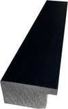
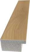
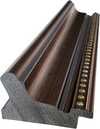
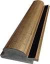
작품의 원본 비율을 유지하는 미리 설정된 크기 중에서 선택하세요.
특정 프레임이나 공간에 맞춰 직접 치수를 입력하실 수 있습니다. 선택하신 사이즈가 원본 이미지의 비율과 일치하지 않을 경우, 작품을 크롭(자르기)하거나 이미지를 대칭 또는 단색 채우기로 확장하여 제작합니다. 제작 시작 전, 최종 확인을 위해 디지털 목업이 전송됩니다.
화면상의 미리보기는 실제 크롭이나 확장 상태를 반영하지 않으므로, 최종 구도는 오직 목업을 통해서만 정확하게 확인하실 수 있습니다.
맞춤 사이즈 제작도 가능하지만, 원본 비율을 유지하기 위해서는 사전 정의된 목록에서 치수를 선택하시는 것을 권장합니다.


 유리 옵션은 110cm 미만 크기에서만 선택 가능합니다.

Counter composition X
지클레 / 아트 프린트
복제본 크기
-


최종 결제 금액
$ 62
작품 상세 설명
The Geometry of Pure Being: Exploring Counter composition X
To stand before Theo van Doesburg's Counter composition X is not merely to observe paint on canvas; it is to encounter a moment of profound intellectual clarity, a visual manifesto rendered in primary colors and absolute structure. This piece, dating from 1924, pulses with the revolutionary spirit of early modernism. It presents itself as a seemingly simple square, yet within its rigid confines—the bold placement of red in the upper left, yellow centrally positioned, blue anchoring the lower left, and black completing the composition in the lower right—lies an entire philosophy. Van Doesburg strips away the illusion of depth and narrative chaos, leaving behind only the essential dialogue between form and color.
A Testament to De Stijl's Vision
This work is deeply embedded within the ethos of Neoplasticism, the movement that gave rise to De Stijl. For Van Doesburg, art could no longer afford the sentimental trappings of representation. The world, he argued, was best understood not through mimicry, but through its underlying structural harmonies. Counter composition X embodies this quest for universal order. The technique is characterized by an almost ascetic purity; clean lines meet flat planes of saturated color. It speaks to a desire to distill existence down to its most fundamental components—the vertical and the horizontal, the primary hues. Owning a reproduction of this piece allows one to bring that same sense of disciplined harmony into a contemporary living space.
Symbolism in Primary Dialogue
The selection of colors is never arbitrary; it is a carefully orchestrated symbolic language. The primaries—red, yellow, and blue—are the foundational notes of visual experience, while black provides the necessary grounding counterpoint. These elements interact not as separate entities, but as interdependent forces balancing within the square matrix. Consider the tension between the vibrant red corner and the deep, stabilizing black quadrant. This interplay suggests a dynamic equilibrium—a perfect balance achieved through opposing yet complementary forces. It is an abstract meditation on structure itself, suggesting that true beauty resides in the relationship between parts.
Emotional Resonance for the Modern Collector
For the collector or designer, Counter composition X offers more than mere decoration; it offers a focal point of contemplation. Its bold graphic nature acts as an immediate visual anchor, capable of elevating any room from mundane to monumental. The emotional impact is one of invigorating calm—the kind that comes from understanding underlying principles. It demands that the viewer slow down, look closer, and engage their intellect alongside their eye. Whether displayed in a minimalist gallery setting or integrated into a richly decorated interior, this painting asserts an undeniable modern sophistication, celebrating geometry as the ultimate form of expressive power.
유사한 작품들


작가 약력
추상의 설계자: 기하학적 조화 속에 피어난 삶
1883년 네덜란드 위트레흐트에서 크리스티안 에밀 마리 퀴퍼라는 이름으로 태어난 테오 반 뒤스부르흐는 단순한 화가 그 이상이었습니다. 그는 현대 미술의 근간을 재편한 혁명적인 동력이었습니다. 그의 예술적 여정은 인상주의와 후기 인상주의의 잔향 속에서 시작되었으며, 초기에는 빈센트 반 고흐를 연상시키는 주제와 정서적 강렬함을 투영하기도 했습니다. 그러나 이 초기 단계는 그가 남긴 영원한 유산을 정의할 급진적인 변화를 향한 필수적인 디딤돌이자 중요한 서곡이었습니다. 결정적인 순간은 1히13년, 바실리 칸딘스키의 Rückblicke(회고)를 접하면서 찾아왔습니다. 이 텍스트는 반 뒤스부르흐의 내면에 깊은 깨달음을 불러일으켰습니다. 진정한 예술적 표현이란 외부 세계를 복제하는 것이 아니라, 순수 추상을 통해 내면의 영적인 실재를 전달하는 데 있다는 사실을 말입니다. 이러한 확신은 신조형주의, 즉 우리에게 더 잘 알려진 '데 스틸(De Stijl)' 운동을 탄생시켰으며, 그는 이 운동의 창시자이자 가장 열렬한 옹호자로 활동했습니다.새로운 시각 언어의 구축: 데 스틸의 원칙
데 스틸은 단순한 예술 양식이 아니었습니다. 그것은 시각적 형태로 번역된 포괄적인 철학적 선언문이었습니다. 반 뒤스로르흐는 예술을 가장 본질적인 요소들, 즉 직선과 직각, 그리고 빨강, 노랑, 파랑의 삼원색과 함께 검정, 하양, 회색으로 정제해야 한다고 믿었습니다. 이 절제된 팔레트는 결코 제약에서 비롯된 것이 아니라, 보편성을 향한 갈망, 즉 이러한 근본적인 형태들이 우주의 질서와 공명한다는 믿음에서 탄생했습니다. 그는 캔버스를 넘어 건축, 디자인, 심지어 일상의 사물에까지 확장되는 '총체적 예술(total work of art)'을 꿈꿨습니다. 협업은 그의 작업에서 핵심이었습니다. 반 뒤스부르흐는 J.J.P. 아우드나 게리트 리트벨트와 같은 건축가들과 긴밀히 협력하며, 데 스틸의 원칙을 구현한 스테인드글라스 창문, 가구, 그리고 공간 전체를 디자인했습니다. 그의 협업은 피에트 몬드리안과 같은 동료 예술가들에게도 이어졌으며, 이들은 영향력 있는 잡지 De Stijl를 공동 창간하여 자신들의 아이디어를 전파하고 뜻을 같이하는 창작자들을 모으는 플랫폼으로 삼았습니다. 그러나 공유된 뿌리에도 불구하고, 신조형주의의 경직성을 둘러싸고 반 뒤스로르흐와 몬드리안 사이에 긴장이 발생하기도 했습니다. 1926년, 반 뒤스부르흐는 대각선과 더욱 역동적인 구도를 옹호하는 '엘레멘타리즘(Elementarism)'을 도입했습니다. 이러한 변화는 결국 운동 내의 분열로 이어졌으나, 이는 예술적 진화를 끊임없이 추구했던 그의 역동적인 정신을 여실히 보여주었습니다.회화를 넘어: 다각적인 예술적 비전
화가로서 찬사를 받는 한편, 반 뒤스부르흐의 예술적 탐구는 놀라울 정도로 다양했습니다. 그는 다작을 하는 작가이자 시인, 그리고 비평가였으며, 펜을 통해 데 스틸의 이론적 토대를 명확히 하고 기존의 관습적인 예술 개념에 도전했습니다. 1920년대 초 다다이즘과의 교류는 그의 예술적 지평을 더욱 넓혔고, 콜라주와 타이포그래피를 결합한 실험적인 작품들로 이어졌습니다. 이 시기에 그는 바우하우스에서 강의하며 새로운 세대의 예술가와 디자이너들에게 자신의 아이디어를 공유하기도 했습니다. 그는 전통적인 예술 형식의 틀 안에 머무는 것에 만족하지 않았습니다. 반 뒤스부르흐는 예술이 사회를 변화시킬 힘을 가지고 있다고 믿었으며, 예술을 일상생활 속에 통합시키고자 적극적으로 노력했습니다. 그가 디자인한 인테리어와 가구들은 단순한 미적 실험이 아니라, 데 스틸의 원칙을 반영하여 조화로운 생활 공간을 창조하려는 시도였습니다. 소피 타우버-아르프, 조르주 반토네를 비롯한 예술가들과 함께 예술가 주거지를 디자인했던 사례는 그의 총체적인 예술적 접근법을 잘 보여줍니다. 이는 자신의 이상을 투영한 세상을 구축하려 했던 숭고한 시도였습니다.유산과 영원한 영향력: 모더니즘의 선구자
테오 반 뒤스부르흐의 삶은 1931년, 47세라는 젊은 나이에 비극적으로 중단되었지만, 현대 미술에 남긴 그의 충격은 여전히 깊고 강렬합니다. 데 스틸 운동은 하나의 응집된 운동으로서 지속된 기간은 비교적 짧았으나, 바우하우스 디자인, 미니멀리즘, 구성주의를 포함한 후대의 예술적 발전 과정에 엄청난 영향을 미쳤습니다. 기하학적 추상, 순수 색채, 그리고 기능주의에 대한 그의 강조는 오늘날의 예술가와 디자이너들에게도 끊임없이 공명을 일으키고 있습니다. 그의 작업은 예술이 단순히 대상을 재현하는 것이 아니라, 근본적인 형태와 아이디어를 탐구하는 과정임을 상기시켜 줍니다. 반 뒤스부르흐의 유산은 그의 회화와 디자인을 넘어, 예술적 혁신에 대한 흔들림 없는 헌신과 추상의 변혁적 힘에 대한 믿음에 맞닿아 있습니다. 데 스틸의 언어로 표현된 통합되고 조화로운 세계에 대한 그의 비전은, 더욱 아름답고 의미 있는 환경을 만들고자 하는 이들에게 영원한 영감을 주고 있습니다.주요 작품 및 지속적인 영향
- 동시적 구성을 위한 연구 XXII (1922): 신조형주의의 전형적인 예로, 운동의 상징적인 기하학적 형태와 제한된 색채 팔레트를 보여줍니다.
- 반값의 구도 (1928): 데 스틸 미학 안에서 톤의 변화를 탐구한 반 뒤스부르흐의 노력을 잘 나타냅니다.
- 무용수들 (1917-1918): 구상적 요소와 떠오르는 추상적 경향이 혼합된 그의 과도기적 단계를 보여줍니다.
- 잡지 De Stijl 공동 창간: 운동의 아이디어를 전파하고 예술가와 지식인들 사이의 대화를 촉진한 결정적인 플랫폼입니다.
- 엘레멘타리즘 (1926): 신조형주의에 역동성을 불어넣기 위해 대각선과 더욱 유연한 구도를 도입하려 했던 반 뒤스부르흐의 시도입니다.

테오 반 뒤스부르흐
1883 - 1931 , 네덜란드
주요 정보
- Artistic Movement Or Style: 데 스틸, 신조형주의
- Artists Or Movements Influenced By This Artist:
- 바우하우스
- 미니멀리즘
- 구성주의
- Artists Who Influenced This Artist:
- 바실리 칸딘스키
- 빈센트 반 고흐
- Date Of Birth: 1883년 8월 30일
- Date Of Death: 1931년 3월 7일
- Full Name: 테오 반 뒤스부르흐
- Nationality: 네덜란드
- Notable Artworks:
- 동시적 구성을 위한 연구...
- 반값의 구성
- 무용수들
- Place Of Birth: 네덜란드 위트레흐트
관련 기사 더 보기

기하학적 추상 미술을 정의한 명작 10가지 | ArtsDot.com
몬드리안, 말레비치 등 거장들의 기하학적 추상 미술 명작 10선을 만나보세요. 각 작품의 예술사적 의미와 색채, 구성을 탐구하고 ArtsDot.com에서 고품질 아트 프린트를 소장하세요. 지금 바로 온라인 컬렉션을 확인하세요!

Demandes Commerciales
APS ofrece reproducciones de bellas artes y encargos personalizados desde 2004. Confían en nosotros corporaciones, hoteles y coleccionistas selectos para obras de arte de calidad museística, servicio discreto y soluciones artísticas completas. ¡Póngase en contacto con nosotros para obtener un presupuesto personalizado!

Theo van Doesburg: Pioneering De Stijl & the Evolution of Neo-Plasticism
Explore the revolutionary De Stijl movement & Neo-Plasticism with our expert guide. Discover Piet Mondrian, Theo van Doesburg, and the lasting impact of this influential art style. Learn about collecting & investing in De Stijl masterpieces.

Beyond Form & Color: Geometric Abstraction's Evolution in 20th/21st Century Art
Explore the evolution of geometric abstraction from Cubism to contemporary art. Discover key artists like Malevich & Mondrian, investment insights, and expert collecting advice at ArtsDot.
Beyond Form: Exploring the Philosophical Foundations of Geometric Abstraction
Explore the philosophical roots & artistic evolution of geometric abstraction with ArtsDot. Discover Mondrian, Malevich, De Stijl & more. Expert insights for collectors and art enthusiasts.