


선택하신 옵션에 따른 작품 정보입니다: , .
수집품 상세 설명
A vibrant oil painting by Korean contemporary artist Kho Nak Beom captures a woman's poignant sorrow through a striking palette of pink and orange, inviting you to explore this emotive masterpiece for your collection.
 더 보기
더 보기
작가 프로필
Korean colorist kho, nak beom (1960-present) creates striking monochromatic portraits & diagonal skin studies. Explore his 'Color Analysis' and exhibitions.
핸드메이드 유화 복제화
작가가 직접 캔버스에 손으로 그린 유화 작품으로, 원하는 크기와 액자로 맞춤 제작해 드립니다. ( 프린트 판매로 전환 디지털 이미지로 전환)
본 작품은 저작권법의 보호를 받습니다.
이 페이지에 표시된 작품은 저작권법의 보호를 받으며, 이에 따라 동일한 복제품을 제작하거나 판매하는 것은 법으로 금지되어 있습니다. 이러한 권리 보호는 다음과 같은 국제 협약에 따라 시행됩니다. 베른 협약 또한 다음에서 명시하는 법률을 포함한 국내법에 의해 보호됩니다. 미국 저작권법 제17조.
저희는 존중을 담은 합법적인 대안으로서, 원작에서 영감을 받은 맞춤형 수제 유화 작품을 제공합니다. 저희의 숙련된 전문 화가들은 원작의 스타일, 분위기, 예술적 정수를 면밀히 연구하여, 그 자체로 독창적인 창작물이면서도 원작과 동일한 감동을 불러일으키는 새로운 작품을 만들어냅니다.
이 방식은 저작권 보호를 받는 예술 작품을 복제하거나 그대로 재현하는 것이 아니기에 저작권 규정을 완벽히 준수합니다. 대신, 이는 창의적인 재해석의 과정을 거칩니다. 즉, 원작에서 영감을 받되 원작과 동일하지 않은 새로운 회화 작품을 의미합니다.
이 작품에 대해 더 알아보기
 미리보기
미리보기
 공유하기
공유하기 공유하기
공유하기
 상세 정보
상세 정보 가이드 보기

 다운로드
다운로드
 유사 작품 더 보기
 X-레이
X-레이 슬라이드 쇼 보기
 질의응답
질의응답 통계 정보
통계 정보단 네 단계로 완성되는 간편한 작품 주문 방법
천천히 진행하셔도 좋습니다. 답변은 언제든 변경할 수 있으며, 선택 사항에 따라 주문 카드 내의 가격이 실시간으로 반영됩니다.
1 4단계 중 1단계
원하시는 사이즈를 선택해 주세요.
이 사이즈들은 원작의 비율을 그대로 유지합니다. 그림 속 예시는 2미터 길이의 소파 위 벽면에 선택하신 작품을 배치했을 때의 모습입니다.
또는 직접 치수 입력하기
작품의 원본 비율을 그대로 유지하는 프리셋 사이즈 중에서 선택해 보세요.

액자나 벽면 크기에 맞춰 필요한 가로와 세로 길이를 입력해 주세요. 본 작품은 수작업으로 제작되므로, 요청하신 비율에 따라 작가가 그림의 가장자리를 조금 더 넓게 그리거나 일부를 조정하여 작업할 수 있습니다. 작업 시작 전, 최종 확인을 위해 디지털 목업 이미지를 보내드립니다. 이 페이지에 표시된 이미지는 실제 결과물과 다를 수 있으며, 오직 목업 이미지만이 정확한 결과물을 보여줍니다.
2 4단계 중 2단계
어떤 방식으로 준비해 드릴까요: 롤 형태로, 캔버스에 씌워서, 또는 액자에 넣어?
아래 가격은 첫 번째 단계에서 선택하신 크기를 기준으로 합니다.
캔버스 옆면 스타일 선택
프레임을 선택하세요
화이트 테두리 ₩1

블러사이드 ₩1
옆면 확장형 ₩1
P118B ₩10
P118H ₩10
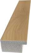
P118W ₩10
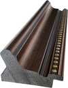
P438Z ₩10
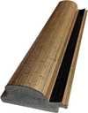
P508JH ₩12

P508YH ₩12
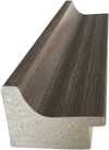
P805H ₩10
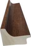
P805Z ₩10
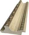
P919BZ ₩10

P919G ₩10
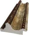
P919XJ ₩10
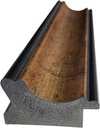
P959ZH ₩10
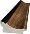
P968JZ ₩12
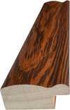
W106C ₩8

W218G ₩10

W218JH ₩8
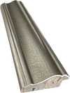
W218Y ₩10

W307PJ ₩10

W316G ₩10
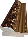
W316PJ ₩8
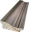
W316Y ₩10
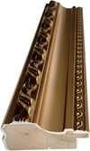
W398PJ ₩8
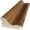
W4111J ₩10
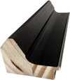
W500HY ₩15
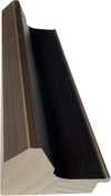
W500JH ₩15

W692G ₩12

W849H ₩8
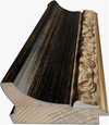
W940BG ₩15
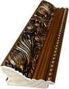
W953PJ ₩8

H24-GOLD ₩30

H24-SILVER ₩30
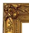
H36-GOLD ₩45
H36-SILVER ₩45
액자형
몰딩: . 액자 포함 전체 크기: .
3 4단계 중 3단계
그림에서 변경하고 싶은 부분이 있으신가요?
대부분의 사람들은 아니라고 답합니다. 모든 작품은 수작업으로 제작되기에, 저희 작가는 고객님의 요청에 맞춰 작품을 변경해 드릴 수도 있습니다.
주문 완료 후, ArtsDot.com 팀에서 상세 안내를 위해 고객님께 이메일을 보내드리며, 시안 미리보기를 제공해 드립니다.
4 4단계 중 4단계
몇 가지 마감 옵션
모두 선택 사항입니다. 이미 선택된 답변에 대해서는 추가 비용이 발생하지 않습니다.
작가는 누구인가요?
박물관에 있는 것과 같은 명판을 원하시나요?
동판 각인 상세 정보
This elegant plaque features the artist's name and the title of the artwork, finely engraved for a timeless presentation.
It is made from bronze with a refined, elegant finish. The text is precisely laser-engraved for a sharp and permanent result. Measuring 9x2 cm, the plaque is compact yet easy to read. It's built to be durable and scratch-resistant, offering a professional, museum-quality look. Mounting is simple thanks to the included adhesive backing.
투명 아크릴 명판 상세 정보
The plaque includes essential engraved details such as the artist's name, the title of the artwork, the date it was created, the type of media used-like oil on canvas or watercolor-a brief description of the piece, and a QR code that links to the complete artwork information.
It is crafted from clear acrylic, offering a sleek, modern appearance. The text is UV-engraved in black to ensure strong visual contrast. With a size of 10x15 cm, it ensures optimal readability. It comes equipped with two metal hooks for secure wall mounting. The plaque is designed to be weather-resistant, making it suitable for various environments, and it includes interactive features that work seamlessly with smartphone scanning.
블랙 아크릴 명판 상세 정보
This elegant plaque includes engraved information such as the artist's name, the title of the artwork, the date it was created, the type of media used (like oil on canvas or watercolor), a short description of the artwork, and a QR code for quick access to more information.
The plaque itself is made from refined black acrylic with a premium finish. The text is laser-engraved in white for high contrast and readability. Its size is 10x15 cm, designed to be easy to read. It comes with two metal hooks for professional mounting. The design is sleek and fits any interior style. It is also weather-resistant and durable, with built-in digital integration for mobile compatibility.
보호용 바니시를 선택하시겠습니까?
언제 받기를 원하시나요?
✓ 확인 및 주문하기
주문하신 그대로의 작품

Color Analysis
재현 기법
복제본 크기
-

엄선된 시니어 아티스트
더욱 세밀한 묘사와 정교함, 그리고 충분한 제작 시간
-

복제화 액자 구성
-
-
가로 또는 세로 중 어느 한 면이라도 105cm(약 41인치)를 초과하는 작품이나 복제화의 경우, 프레임은 분해된 키트 형태로 배송됩니다. 이는 안전한 배송을 보장하고 운송 중 발생할 수 있는 손상을 방지하기 위함입니다.
전문가 조립 권장 - 본 제품은 DIY용이 아닙니다.
해당 키트는 숙련된 전문 프레임 제작자가 목공용 풀(별도 구매), 캔버스 스트레칭 플라이어 및 풀이 마르는 동안 나무 틀의 수평을 유지할 클램프를 사용하여 캔버스를 팽팽하게 고정하고 조립해야 합니다. 잘못된 조립이나 불균형한 캔버스 장력은 작품에 영구적인 손상을 입힐 수 있으며, 이로 인한 손상은 보증 범위에 포함되지 않습니다.
 가로 또는 세로 중 어느 한 면이라도 105cm(약 41인치)를 초과하는 작품이나 복제화의 경우, 프레임은 분해된 키트 형태로 배송됩니다. 이는 안전한 배송을 보장하고 운송 중 발생할 수 있는 손상을 방지하기 위함입니다.
모든 원목 부재가 포함되어 있으며, 조립에 딱 맞게 정밀하게 재단되었습니다.
제공된 나사와 함께, 별도로 준비해야 하는 모서리 접합부용 목공용 풀을 사용하여 조립합니다. (목공용 풀은 포함되어 있지 않으므로 제작자께서 직접 준비해 주셔야 합니다.)
전문가용 도구가 필요하며 키트에 포함되어 있지 않습니다: 캔버스 스트레칭 플라이어(텐셔너)와 접착제가 마르는 동안 나무 틀의 수평을 유지하기 위한 클램프가 필요합니다.
주의사항:
모서리 접합부에는 목공용 풀이 필요하며, 풀이 완전히 마를 때까지 클램프로 바(bar)를 고정해야 합니다. 또한 조립된 프레임에 캔버스를 팽팽하게 당기려면 캔버스 스트레칭 플라이어가 필요합니다. 이 제품들 중 어느 것도 키트에 포함되어 있지 않습니다. 이 사이즈를 주문하시기 전에 숙련된 전문 액자 제작업체를 미리 섭외하시기 바랍니다.

작품 설명문
-
-

보호용 바니시
유광 바니시(색감을 선명하게 하며 빛과 습기로부터 보호함)
-

내 작품 맞춤 설정
변경 가능한 예시: 얼굴을 고객의 사진으로 교체, 반려동물 추가(예: 고양이를 강아지로 변경), 배경에 숨겨진 메시지 삽입, 배경 풍경 또는 요소 변경.
-

빠른 배송
전 세계 배송()은 기존 5주의 표준 기간 대신 3~4주 내에 완료됩니다. (4 11월). 품질에는 어떠한 타협도 하지 않습니다.
-
특급 배송
전 세계 배송(): 약 5주 소요 (11 11월).
포함됨
최종 결제 금액
₩ 352089
유리 옵션은 110cm 미만 크기에서만 선택 가능합니다.
모든 주문에 포함되는 혜택
- 전 세계 무료 특급 배송
- 프리미엄 린넨 캔버스
- 배송 전 과정 보험 적용
- 관세 및 수입세 환급 보장 서비스
- 원본과 동일한 색상 구현 보장
- 100일 이내 반품 정책 (결함 발생 시)
- 100% 환불 보장
- 다량 구매 할인 혜택


A Symphony of Sorrow and Hue
In the evocative masterpiece Color Analysis, the contemporary Korean master Kho, Nak Beom invites viewers into a deeply intimate psychological landscape. Painted in 1999, this oil on canvas work serves as a profound meditation on the intersection of human emotion and chromatic intensity. At first glance, the eye is drawn to the central figure—a woman with luminous blonde hair, her face cradled by her hands in a gesture of profound vulnerability. There is an undeniable weight to her expression, a sense of mourning or quiet despair that anchors the composition. Yet, rather than retreating into the shadows of grief, Kho utilizes a vibrant, almost electric palette of pinks, yellows, and oranges to frame this moment of sorrow. This juxtaposition creates a striking tension; the warmth of the colors clashes with the coolness of the subject's melancholy, suggesting that even within our most painful moments, life continues to pulse with an unyielding, radiant energy.
The technique employed by Kho is nothing short of transformative. As a painter known for his meticulous exploration of form and color, he utilizes the rich, tactile nature of oil paint to build layers of light and depth. The brushwork, while controlled, allows for a certain fluidity that mimics the ebb and flow of emotion. The way the light catches the golden strands of her hair and the crimson of her dress creates a sense of three-dimensionality that pulls the viewer into her personal orbit. This mastery of color is not merely decorative; it is structural. By manipulating high-saturation tones, Kho directs the viewer's gaze through the canvas, ensuring that the eye lingers on the subtle shifts in skin tone and the heavy, expressive contours of the subject's features.
Temporal Echoes and Symbolic Depth
Beyond the immediate emotional impact of the portrait, Color Analysis contains subtle, surrealist elements that deepen its narrative complexity. Tucked within the background, two clocks emerge—one positioned near the top left and another toward the center-left. These are not merely incidental details but potent symbols of the inexorable passage of time. In the context of the woman's visible distress, the clocks serve as a memento mori, reminding us that grief is a temporal experience, yet one that is inextricably linked to the ticking rhythm of existence. They suggest a frozen moment in time, an eternalized snapshot of a fleeting heartache, where the movement of the hands on the clock face contrasts with the stillness of the subject's contemplative pose.
For collectors and interior designers alike, this piece offers a rare opportunity to possess a work that functions as both a visual centerpiece and a conversational catalyst. The painting’s ability to command attention through its bold color scheme makes it an ideal acquisition for sophisticated spaces—be it a modern gallery-style living room or a curated study. It provides a sense of dramatic flair without sacrificing intellectual depth. To hang a reproduction of Color Analysis is to invite a dialogue about the human condition into one's home, offering a piece that is as much an exploration of the soul as it is a triumph of contemporary Korean colorism.
질의응답
Kho, Nak Beom의 "Color Analysis"의 대비는 어느 정도로 강한가요?
Kho, Nak Beom의 "Color Analysis"의 대비 수준은 Statement입니다.
Contemporary Realism 양식의 작품 "Color Analysis"은 어느 나라에서 유래되었나요?
"Color Analysis"은 작가의 탄생지를 통해 Contemporary Realism 사조와 South Korea를 연결합니다.
"Color Analysis"의 원작은 어느 박물관에 소장되어 있나요?
Kho, Nak Beom의 "Color Analysis"의 원작은 한국미술협회, 서울, 대한민국에 소장되어 있습니다. 복제화를 통해 이 작품을 집에서도 감상하실 수 있습니다.


Kho, Nak Beom
1960 - , South Korea
작가 정보
A Chromatic Exploration of the Human Condition: The Art of Kho, Nak Beom
Born in Seoul, South Korea, in 1960, kho, nak beom – often referred to as Nakbeom Kho – has emerged as a compelling figure in contemporary Korean art. His work is immediately recognizable for its striking use of color, or rather, the deliberate *absence* of it in many instances, and his profound exploration of form through solid lines, monochromatic portraiture, and uniquely angled depictions of skin. Kho isn’t simply painting faces; he's dissecting perception itself, examining how we construct identity and experience emotion through visual cues.
Early Life and Artistic Foundations
Kho’s artistic journey began with formal training at Hong-ik University in Seoul, where he earned both a Bachelor of Fine Arts (B.F.A.) in 1987 and a Master of Fine Arts (M.F.A.) in 1989. This period was crucial in establishing his technical foundation and fostering an intellectual curiosity that would define his later work. While the specifics of early influences remain somewhat elusive, it’s clear that Kho developed a keen interest in the power of simplification – stripping away extraneous detail to reveal the essential structure beneath. His academic background provided him with the tools to not only execute complex compositions but also to critically analyze the history of portraiture and representation.
The Development of a Unique Visual Language
Kho’s artistic practice is characterized by a fascinating duality. He often works in series, exploring variations on a theme – most notably his ‘Color Analysis’ paintings. These aren't traditional color studies in the conventional sense; rather, they are bold statements where blocks of solid color define planes and contours, creating an almost architectural rendering of the human face. The effect is both arresting and unsettling. The absence of subtle shading or realistic detail forces the viewer to confront the underlying structure of the portrait, prompting a deeper consideration of form and perception. Alongside these vibrant explorations, Kho also creates intensely focused monochromatic portraits and studies of skin rendered with diagonal lines – a technique that imbues his subjects with a sense of movement and vulnerability. This interplay between color and monochrome, abstraction and figuration, is central to understanding his artistic vision.
Key Achievements and Exhibitions
Kho’s work has garnered recognition both within Korea and internationally. He is an active member of the Korean Artist Project, a collective that promotes contemporary art from South Korea. His participation in the artist-in-residence program in Sapporo, Japan, broadened his exposure to diverse artistic perspectives, while exhibitions at spaces like the Free Space in the Czech Republic further cemented his presence on the global stage. Significant solo shows include ‘Pentangular: Nak Beom Kho’ at the Asia Art Archive and ‘Kho Nak Beom: Melencolia’ at the Leeahn Gallery in Daegu. The 'Melencolia' exhibition, in particular, highlighted his exploration of psychological states through portraiture, showcasing a nuanced understanding of human emotion. His 1999 work, ‘Color Analysis’, executed in oil on canvas, stands as a pivotal piece, exemplifying the core tenets of his artistic style and serving as a touchstone for much of his subsequent output.
Historical Significance and Lasting Impact
Kho Nak Beom's contribution to contemporary art lies in his ability to challenge conventional notions of portraiture. He doesn’t seek to merely *reproduce* likeness; he aims to deconstruct it, revealing the underlying structures that shape our perception of identity. His work resonates with a broader trend in contemporary art towards abstraction and conceptualism, yet remains distinctly rooted in his Korean heritage. By simplifying form and manipulating color, Kho invites viewers to engage with his subjects on a deeper, more intellectual level. He forces us to question how we see, how we interpret, and ultimately, how we understand the human condition. His continued artistic exploration promises further insights into the complexities of perception and the enduring power of visual representation.
관련 콘텐츠

앙리 마티스의 걸작 25선: 색채와 감각의 혁신을 만나다 | ArtsDot
앙리 마티스의 시대를 초월하는 걸작 25선을 만나보세요. 색채주의, 야수파를 대표하는 그의 삶과 예술 세계를 탐험하고, ArtsDot에서 명화 복제본으로 거실 인테리어에 감동을 더하세요. 지금 바로 컬렉션을 확인하세요!

Crimson Threads of Narrative: Exploring Symbolism & Representation in Artworks Featuring the Red Dress
Explore the rich symbolism of the red dress in art history! From ancient power displays to iconic portraits like Cézanne’s 'Madame Cezanne', discover the cultural and artistic significance behind this captivating color. Expert analysis & insights.

Blush & Brilliance: 10 Iconic Paintings Dominated by Light Pink Tones |
Explore 10 iconic paintings bathed in captivating light pink tones! From Monet's Impressionism to Renoir’s romance, discover the stories behind these blush-hued masterpieces. Find museum-quality art reproductions & decor inspiration at .