

- 100.0 x 120.0 cm


선택하신 옵션에 따른 작품 정보입니다: , .
수집품 상세 설명
Explore João Vieira’s "Untitled" (1969) – an abstract expressionist masterpiece featuring bold letters & dynamic forms. A captivating exploration of inversion, eroticism, and visual poetry.
 더 보기
더 보기
작가 프로필
Discover João Donato: Brazilian jazz & bossa nova pioneer! Known for 'Amazonas' & innovative compositions, his music blends Cuban influences & explores diverse themes.
핸드메이드 유화 복제화
작가가 직접 캔버스에 손으로 그린 유화 작품으로, 원하는 크기와 액자로 맞춤 제작해 드립니다. ( 프린트 판매로 전환 디지털 이미지로 전환)
본 작품은 저작권법의 보호를 받습니다.
이 페이지에 표시된 작품은 저작권법의 보호를 받으며, 이에 따라 동일한 복제품을 제작하거나 판매하는 것은 법으로 금지되어 있습니다. 이러한 권리 보호는 다음과 같은 국제 협약에 따라 시행됩니다. 베른 협약 또한 다음에서 명시하는 법률을 포함한 국내법에 의해 보호됩니다. 미국 저작권법 제17조.
저희는 존중을 담은 합법적인 대안으로서, 원작에서 영감을 받은 맞춤형 수제 유화 작품을 제공합니다. 저희의 숙련된 전문 화가들은 원작의 스타일, 분위기, 예술적 정수를 면밀히 연구하여, 그 자체로 독창적인 창작물이면서도 원작과 동일한 감동을 불러일으키는 새로운 작품을 만들어냅니다.
이 방식은 저작권 보호를 받는 예술 작품을 복제하거나 그대로 재현하는 것이 아니기에 저작권 규정을 완벽히 준수합니다. 대신, 이는 창의적인 재해석의 과정을 거칩니다. 즉, 원작에서 영감을 받되 원작과 동일하지 않은 새로운 회화 작품을 의미합니다.
이 작품에 대해 더 알아보기
 미리보기
미리보기
 공유하기
공유하기 공유하기
공유하기
 상세 정보
상세 정보 가이드 보기

 다운로드
다운로드
 유사 작품 더 보기
 X-레이
X-레이 슬라이드 쇼 보기
 질의응답
질의응답 통계 정보
통계 정보단 네 단계로 완성되는 간편한 작품 주문 방법
천천히 진행하셔도 좋습니다. 답변은 언제든 변경할 수 있으며, 선택 사항에 따라 주문 카드 내의 가격이 실시간으로 반영됩니다.
1 4단계 중 1단계
원하시는 사이즈를 선택해 주세요.
이 사이즈들은 원작의 비율을 그대로 유지합니다. 그림 속 예시는 2미터 길이의 소파 위 벽면에 선택하신 작품을 배치했을 때의 모습입니다.
또는 직접 치수 입력하기
작품의 원본 비율을 그대로 유지하는 프리셋 사이즈 중에서 선택해 보세요.

액자나 벽면 크기에 맞춰 필요한 가로와 세로 길이를 입력해 주세요. 본 작품은 수작업으로 제작되므로, 요청하신 비율에 따라 작가가 그림의 가장자리를 조금 더 넓게 그리거나 일부를 조정하여 작업할 수 있습니다. 작업 시작 전, 최종 확인을 위해 디지털 목업 이미지를 보내드립니다. 이 페이지에 표시된 이미지는 실제 결과물과 다를 수 있으며, 오직 목업 이미지만이 정확한 결과물을 보여줍니다.
2 4단계 중 2단계
어떤 방식으로 준비해 드릴까요: 롤 형태로, 캔버스에 씌워서, 또는 액자에 넣어?
아래 가격은 첫 번째 단계에서 선택하신 크기를 기준으로 합니다.
캔버스 옆면 스타일 선택
프레임을 선택하세요
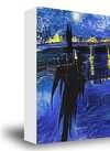
화이트 테두리 ₩1
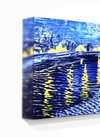
블러사이드 ₩1
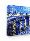
옆면 확장형 ₩1
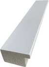
P118B ₩10
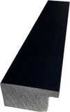
P118H ₩10
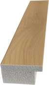
P118W ₩10
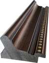
P438Z ₩10
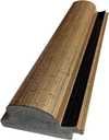
P508JH ₩12
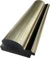
P508YH ₩12
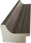
P805H ₩10
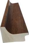
P805Z ₩10
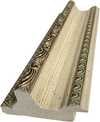
P919BZ ₩10
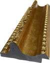
P919G ₩10
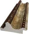
P919XJ ₩10
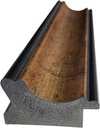
P959ZH ₩10
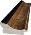
P968JZ ₩12
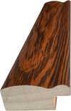
W106C ₩8
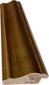
W218G ₩10
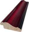
W218JH ₩8
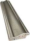
W218Y ₩10
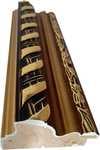
W307PJ ₩10
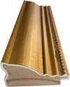
W316G ₩10
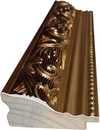
W316PJ ₩8
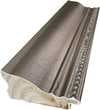
W316Y ₩10
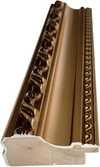
W398PJ ₩8
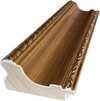
W4111J ₩10
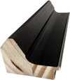
W500HY ₩15
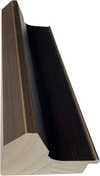
W500JH ₩15
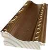
W692G ₩12
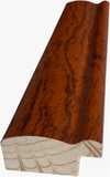
W849H ₩8
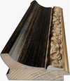
W940BG ₩15
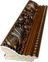
W953PJ ₩8
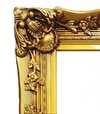
H24-GOLD ₩30
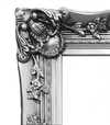
H24-SILVER ₩30
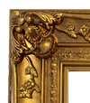
H36-GOLD ₩45
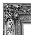
H36-SILVER ₩45
액자형
몰딩: . 액자 포함 전체 크기: .
3 4단계 중 3단계
그림에서 변경하고 싶은 부분이 있으신가요?
대부분의 사람들은 아니라고 답합니다. 모든 작품은 수작업으로 제작되기에, 저희 작가는 고객님의 요청에 맞춰 작품을 변경해 드릴 수도 있습니다.
주문 완료 후, ArtsDot.com 팀에서 상세 안내를 위해 고객님께 이메일을 보내드리며, 시안 미리보기를 제공해 드립니다.
4 4단계 중 4단계
몇 가지 마감 옵션
모두 선택 사항입니다. 이미 선택된 답변에 대해서는 추가 비용이 발생하지 않습니다.
작가는 누구인가요?
박물관에 있는 것과 같은 명판을 원하시나요?
동판 각인 상세 정보
This elegant plaque features the artist's name and the title of the artwork, finely engraved for a timeless presentation.
It is made from bronze with a refined, elegant finish. The text is precisely laser-engraved for a sharp and permanent result. Measuring 9x2 cm, the plaque is compact yet easy to read. It's built to be durable and scratch-resistant, offering a professional, museum-quality look. Mounting is simple thanks to the included adhesive backing.
투명 아크릴 명판 상세 정보
The plaque includes essential engraved details such as the artist's name, the title of the artwork, the date it was created, the type of media used-like oil on canvas or watercolor-a brief description of the piece, and a QR code that links to the complete artwork information.
It is crafted from clear acrylic, offering a sleek, modern appearance. The text is UV-engraved in black to ensure strong visual contrast. With a size of 10x15 cm, it ensures optimal readability. It comes equipped with two metal hooks for secure wall mounting. The plaque is designed to be weather-resistant, making it suitable for various environments, and it includes interactive features that work seamlessly with smartphone scanning.
블랙 아크릴 명판 상세 정보
This elegant plaque includes engraved information such as the artist's name, the title of the artwork, the date it was created, the type of media used (like oil on canvas or watercolor), a short description of the artwork, and a QR code for quick access to more information.
The plaque itself is made from refined black acrylic with a premium finish. The text is laser-engraved in white for high contrast and readability. Its size is 10x15 cm, designed to be easy to read. It comes with two metal hooks for professional mounting. The design is sleek and fits any interior style. It is also weather-resistant and durable, with built-in digital integration for mobile compatibility.
보호용 바니시를 선택하시겠습니까?
언제 받기를 원하시나요?
✓ 확인 및 주문하기
주문하신 그대로의 작품

Untitled
재현 기법
복제본 크기
-

엄선된 시니어 아티스트
더욱 세밀한 묘사와 정교함, 그리고 충분한 제작 시간
-

복제화 액자 구성
-
-
가로 또는 세로 중 어느 한 면이라도 105cm(약 41인치)를 초과하는 작품이나 복제화의 경우, 프레임은 분해된 키트 형태로 배송됩니다. 이는 안전한 배송을 보장하고 운송 중 발생할 수 있는 손상을 방지하기 위함입니다.
전문가 조립 권장 - 본 제품은 DIY용이 아닙니다.
해당 키트는 숙련된 전문 프레임 제작자가 목공용 풀(별도 구매), 캔버스 스트레칭 플라이어 및 풀이 마르는 동안 나무 틀의 수평을 유지할 클램프를 사용하여 캔버스를 팽팽하게 고정하고 조립해야 합니다. 잘못된 조립이나 불균형한 캔버스 장력은 작품에 영구적인 손상을 입힐 수 있으며, 이로 인한 손상은 보증 범위에 포함되지 않습니다.
 가로 또는 세로 중 어느 한 면이라도 105cm(약 41인치)를 초과하는 작품이나 복제화의 경우, 프레임은 분해된 키트 형태로 배송됩니다. 이는 안전한 배송을 보장하고 운송 중 발생할 수 있는 손상을 방지하기 위함입니다.
모든 원목 부재가 포함되어 있으며, 조립에 딱 맞게 정밀하게 재단되었습니다.
제공된 나사와 함께, 별도로 준비해야 하는 모서리 접합부용 목공용 풀을 사용하여 조립합니다. (목공용 풀은 포함되어 있지 않으므로 제작자께서 직접 준비해 주셔야 합니다.)
전문가용 도구가 필요하며 키트에 포함되어 있지 않습니다: 캔버스 스트레칭 플라이어(텐셔너)와 접착제가 마르는 동안 나무 틀의 수평을 유지하기 위한 클램프가 필요합니다.
주의사항:
모서리 접합부에는 목공용 풀이 필요하며, 풀이 완전히 마를 때까지 클램프로 바(bar)를 고정해야 합니다. 또한 조립된 프레임에 캔버스를 팽팽하게 당기려면 캔버스 스트레칭 플라이어가 필요합니다. 이 제품들 중 어느 것도 키트에 포함되어 있지 않습니다. 이 사이즈를 주문하시기 전에 숙련된 전문 액자 제작업체를 미리 섭외하시기 바랍니다.

작품 설명문
-
-

보호용 바니시
유광 바니시(색감을 선명하게 하며 빛과 습기로부터 보호함)
-

내 작품 맞춤 설정
변경 가능한 예시: 얼굴을 고객의 사진으로 교체, 반려동물 추가(예: 고양이를 강아지로 변경), 배경에 숨겨진 메시지 삽입, 배경 풍경 또는 요소 변경.
-

빠른 배송
전 세계 배송()은 기존 5주의 표준 기간 대신 3~4주 내에 완료됩니다. (4 11월). 품질에는 어떠한 타협도 하지 않습니다.
-
특급 배송
전 세계 배송(): 약 5주 소요 (11 11월).
포함됨
최종 결제 금액
₩ 352089
유리 옵션은 110cm 미만 크기에서만 선택 가능합니다.
모든 주문에 포함되는 혜택
- 전 세계 무료 특급 배송
- 프리미엄 린넨 캔버스
- 배송 전 과정 보험 적용
- 관세 및 수입세 환급 보장 서비스
- 원본과 동일한 색상 구현 보장
- 100일 이내 반품 정책 (결함 발생 시)
- 100% 환불 보장
- 다량 구매 할인 혜택


질의응답
"Untitled"의 작가와 제작 연도는 어떻게 되나요?
João Vieira은(는) 1969년에 "Untitled"을(를) 제작했습니다.
João Vieira의 "Untitled"의 주요 색조는 무엇인가요?
João Vieira의 "Untitled"은(는) Neutrals 색조의 팔레트를 사용하며, Steel Blue (#416487)이(가) 주된 색상을 이룹니다.
João Vieira의 "Untitled"의 이미지를 자유롭게 복제할 수 있나요?
저작권과 관련하여, "Untitled"은(는) 저작권 보호 대상입니다 상태입니다.


João Vieira
Portugal
작가 정보
João Vieira: A Painter of Inversion and Erotic Poetry
João Vieira (1934-2009) remains a profoundly enigmatic figure in Portuguese art, an artist whose work defies easy categorization yet consistently pulsates with a raw, visceral energy. Born in Vidago, Portugal, in 1934, his life was marked by a restless exploration of artistic mediums and philosophical concepts, culminating in a unique visual language that blended Lettrism, abstraction, and a deeply personal engagement with the world. Vieira’s trajectory wasn't one of conventional academic training; instead, he forged his path through experimentation, political activism, and a relentless pursuit of challenging established artistic norms. His career spanned six decades, encompassing painting, sculpture, performance art, and literary illustration, each medium serving as a vehicle for exploring themes of inversion, eroticism, and the very nature of perception.Early Years and the Rise of Grupo do Café Gelo
Vieira’s artistic awakening occurred in the mid-1950s, coinciding with the burgeoning Lettrist movement in Europe. This avant-garde group, centered around Tristan Tzara and Georges Bataille, sought to liberate language from its traditional constraints, using it as a primary tool for artistic expression. Inspired by this radical approach, Vieira joined forces with other young artists in Lisbon to form Grupo do Café Gelo (The Ice Café Group) in 1956. This collective, operating out of a modest café above the city’s main square, became a crucible for experimentation and political dissent. The group's name itself – “Gelo” (Ice) – alluded to their desire to break through the frozen conventions of established art and culture. Within Grupo do Café Gelo, Vieira began to develop his distinctive style, characterized by bold colors, gestural brushwork, and a deliberate manipulation of language and typography. His early works, such as “Amor à Italiana” (1969), exemplify this period, employing layered color fields and fragmented letters to create visually arresting compositions that explored themes of inversion and eroticism – concepts he would continually revisit throughout his career.The Influence of Paris and the KWY Group
In 1958, Vieira relocated to Paris, a pivotal moment in his artistic development. The city’s vibrant art scene offered him access to a wider range of influences and techniques. He studied at Henri Goetz's renowned drawing school, absorbing the lessons of artists like Dubuffet, whose use of raw materials and gestural painting profoundly impacted Vieira’s approach. Crucially, he also encountered members of the Spanish Lettrist group *El Paso*, further expanding his artistic vocabulary. However, it was the formation of the KWY Group (Kwy Yndo – “Kwy Indo”) in 1958 that truly defined his Parisian period. This collective, comprised of Vieira himself, Lourdes Castro, Christo, and Jan Voss, pushed the boundaries of experimental art, creating installations, performances, and literary illustrations that challenged conventional notions of artistic creation. The KWY Group’s work was characterized by a playful disregard for established rules, embracing chance, improvisation, and a radical redefinition of the artist's role.Return to Portugal and the Exploration of Spatiality
Returning to Lisbon in 1964, Vieira continued his exploration of spatiality and materiality, moving beyond the purely visual realm. He began incorporating unconventional materials – rigid polyurethane, flexible foams, and car paint – into his work, creating assemblages and environments that engaged with the viewer on a more visceral level. His 1969 painting “Untitled” is a prime example of this shift, featuring bold letters arranged in dynamic forms that evoke a sense of disorientation and intrigue. This period also saw Vieira’s involvement in theatre as a set designer and director, further blurring the boundaries between art forms. He viewed these diverse activities not as separate disciplines but as interconnected explorations of human experience.Legacy and Historical Significance
João Vieira's legacy is one of profound originality and artistic courage. He was a key figure in the Portuguese Lettrist movement, pushing the boundaries of art and challenging established conventions. His work remains remarkably relevant today, offering a powerful commentary on themes of identity, language, and perception. Despite his relative obscurity during much of his career, Vieira’s influence can be seen in the work of numerous contemporary artists who continue to explore experimental approaches to visual communication. His exploration of inversion and eroticism, often intertwined with political critique, provides a unique lens through which to understand the complexities of the human condition. João Vieira died in Lisbon in 2009, leaving behind a body of work that continues to provoke, challenge, and inspire. His paintings are now housed in major museums across Portugal and beyond, ensuring that his singular vision will continue to resonate with audiences for generations to come.관련 콘텐츠

Mastering Abstraction: The 25 Most Iconic Works by Wassily Kandinsky
Explore 25 iconic Kandinsky masterpieces and the birth of abstraction. Discover the full collection online at ArtsDot.com.

기하학적 추상 미술을 정의한 명작 10가지 | ArtsDot.com
몬드리안, 말레비치 등 거장들의 기하학적 추상 미술 명작 10선을 만나보세요. 각 작품의 예술사적 의미와 색채, 구성을 탐구하고 ArtsDot.com에서 고품질 아트 프린트를 소장하세요. 지금 바로 온라인 컬렉션을 확인하세요!

추상표현주의를 정의한 10대 걸작: 예술과 인테리어의 새로운 영감
추상표현주의의 심장을 뛰게 한 10대 걸작을 만나보세요. 폴록, 로스코 등 거장의 작품 비하인드 스토리와 예술적 영감을 ArtsDot에서! 지금 바로 미술품 컬렉션을 탐험하고, 당신의 공간에 특별한 예술적 감성을 더하세요. ArtsDot.com