

 실제 크기로 보기
 보내기
보내기 공유하기
공유하기
 상세 보기
상세 보기 가이드 보기

 이미지 다운로드
 유사 작품 더 보기
 X-레이
X-레이 슬라이드 쇼 보기
 Q&A
Q&A 통계 정보
통계 정보Orange Blocks

- 46.0 x 46.0 cm


 상세 보기
상세 보기
이 페이지에 표시된 작품은 저작권법의 보호를 받으며, 이에 따라 동일한 복제품을 제작하거나 판매하는 것은 법으로 금지되어 있습니다. 이러한 권리 보호는 다음과 같은 국제 협약에 따라 시행됩니다. 베른 협약 또한 다음에서 명시하는 법률을 포함한 국내법에 의해 보호됩니다. 미국 저작권법 제17조.
이 방식은 저작권 보호를 받는 예술 작품을 복제하거나 그대로 재현하는 것이 아니기에 저작권 규정을 완벽히 준수합니다. 대신, 이는 창의적인 재해석의 과정을 거칩니다. 즉, 원작에서 영감을 받되 원작과 동일하지 않은 새로운 회화 작품을 의미합니다.
지클레 / 아트 프린트
빠른 제작과 다양한 마감 옵션을 선택할 수 있는 박물관 수준의 지클레이 및 캔버스 프린트. ( 수작업 채색 복제본 주문하기 디지털 이미지 판매 채널로 전환)
P118B ₩10
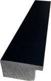
P118H ₩10
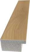
P118W ₩10
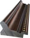
P438Z ₩10
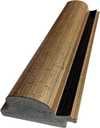
P508JH ₩12

P508YH ₩12
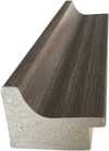
P805H ₩10
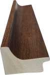
P805Z ₩10
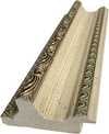
P919BZ ₩10
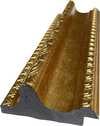
P919G ₩10
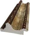
P919XJ ₩10
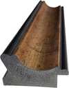
P959ZH ₩10
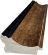
P968JZ ₩12
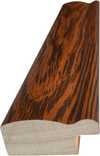
W106C ₩8
W218G ₩10
W218JH ₩8
W218Y ₩10
W307PJ ₩10

W316G ₩10
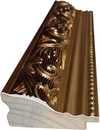
W316PJ ₩8
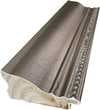
W316Y ₩10
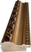
W398PJ ₩8
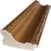
W4111J ₩10
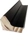
W500HY ₩15
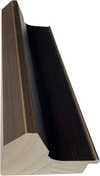
W500JH ₩15
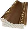
W692G ₩12
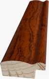
W849H ₩8
W940BG ₩15
W953PJ ₩8
작품의 원본 비율을 그대로 유지하는 프리셋 사이즈 중에서 선택해 보세요.

액자나 벽면 크기에 맞춰 필요한 가로와 세로 길이를 입력해 주세요. 프린트는 원본 이미지보다 크게 제작할 수 없으며 오직 자르는 것만 가능하므로, 비율이 다른 사이즈를 선택할 경우 이미지의 일부가 잘려 나갈 수 있습니다. 인쇄 작업에 들어가기 전, 최종 확인을 위해 디지털 목업을 보내드립니다. 이 페이지에 표시된 이미지는 실제 잘리는 영역을 나타내지 않으며, 오직 목업을 통해서만 정확한 확인이 가능합니다.


 유리 옵션은 110cm 미만 크기에서만 선택 가능합니다.

Orange Blocks
지클레 / 아트 프린트
복제본 규격
-


총 결제 금액
₩ 83614
A Symphony of Geometry: The Vibrant World of Orange Blocks
In the realm of abstract expressionism, few artists possess the ability to transform simple geometric shapes into a rhythmic dance of light and color as masterfully as Bob Brighton. His work, Orange Blocks, serves as a breathtaking testament to his lifelong pursuit of visual order and chromatic harmony. Created in 2009, this piece is not merely a collection of squares; it is a meticulously composed mosaic that invites the viewer into a playground of pure sensation. The painting presents a vibrant checkered pattern where red, yellow, blue, green, and orange squares intersect, creating a kaleidoscopic effect that feels both structured and infinitely energetic. Each square varies slightly in size and placement, a deliberate technique that breathes life into the composition, preventing the pattern from becoming static and instead imbuing it with a sense of organic movement.
The soul of this artwork lies in its profound connection to Brighton’s unique history. Having been trained in the disciplined craft of carpentry, Brighton brought an architect's eye for structure and a craftsman's respect for precision to his canvas. This foundational understanding of form allows him to manipulate the weight and balance of each color block with unparalleled skill. In Orange Blocks, the interplay between the warm, sun-drenched oranges and yellows against the grounding presence of deep blues and greens creates a tension that is both stimulating and soothing. The technique suggests a deliberate layering of pigment, where the edges of the shapes feel crisp yet integrated into a singular, cohesive rhythm, much like the interlocking pieces of a finely crafted wooden mosaic.
For the discerning collector or interior designer, Orange Blocks offers more than just aesthetic pleasure; it provides a focal point of transformative energy. The painting’s ability to command attention through its high-contrast palette makes it an ideal centerpiece for modern, minimalist, or eclectic spaces. It possesses a rare emotional versatility—it can act as a burst of joy in a bright, sunlit room or provide a sophisticated layer of complexity within a more muted, contemporary setting. To possess a reproduction of this work is to bring a piece of Brighton’s "geometric soul" into one's home, offering a permanent window into a world where chaos is conquered by color and every shape tells a story of balance, light, and enduring beauty.
질의응답
Bob Brighton의 "Orange Blocks"은 어느 시대의 작품인가요?
"Orange Blocks"은(는) Contemporary 시대의 작품입니다.
Bob Brighton의 "Orange Blocks"의 색감을 고려했을 때, 어떤 공간에 배치하는 것이 가장 좋을까요?
Bob Brighton의 "Orange Blocks"의 Dark 색조는 추천 공간인 Children's Room과 완벽하게 어우러집니다.
"Orange Blocks"이(가) 공간에 어떤 분위기를 선사할까요?
Bob Brighton의 "Orange Blocks"은(는) Bold 분위기를 자아내며, Children's Room에 추천하는 작품입니다. 무드란 작품이 주변 공간에 선사하는 정취를 의미합니다.
관련 작품들


작가 소개
The Geometric Soul of Bob Brighton
Bob Brighton, a name now synonymous with the captivating world of geometric squares and abstract color fields, wasn’t initially destined for the art world. Born in 1936 in Hastings, East Sussex, his early life was rooted in the practicalities of carpentry – a trade he learned from his father, a skilled craftsman. This foundational experience, working with wood and understanding its inherent structure, would profoundly influence his later artistic explorations. Brighton’s journey into art began somewhat unexpectedly, driven by a desire to create order out of chaos, a need to impose visual rhythm on the seemingly random. He initially experimented with collage techniques, but it wasn't until he discovered the power of simple geometric forms – primarily squares – that his unique style truly emerged. This shift represents a deliberate move away from representational art and towards an intensely focused exploration of color, shape, and composition.Early Influences and Artistic Evolution
Brighton’s artistic development wasn't entirely solitary; he drew inspiration from a diverse range of sources. The reductive aesthetic of Piet Mondrian, with its emphasis on primary colors and orthogonal lines, undoubtedly played a significant role in shaping his approach to composition. However, Brighton’s work transcends mere mimicry. He developed a distinctly personal vocabulary within this framework, prioritizing the interplay of color and the dynamic tension between positive and negative space. The influence of Josef Albers' "Homage to the Square" is also evident – Albers’ exploration of how colors interact when placed adjacent to each other served as a crucial guide for Brighton, demonstrating that the meaning of a color isn’t inherent but rather emerges from its relationship with others. Furthermore, his background in carpentry instilled an appreciation for structure and precision, which he translated into the deliberate arrangement of his squares. Early works often featured muted palettes and subtle variations in tone, gradually evolving towards bolder, more saturated colors as his style matured.The Rise of the Squares: Technique and Process
Brighton’s technique was remarkably consistent yet subtly nuanced. He typically began with a large sheet of paper – often watercolor paper – and would meticulously draw a grid of squares using a ruler and pencil. The size, spacing, and orientation of these squares were determined intuitively, reflecting his subconscious state at the time. He then applied acrylic paint directly to the surface, building up layers of color through a process of controlled layering and blending. Crucially, he avoided brushes, preferring instead to use sponges, rags, and other tools to manipulate the paint and create textures and variations in tone. This hands-on approach resulted in a tactile quality to his work – a sense that the paintings are not merely flat surfaces but rather three-dimensional entities. The repetition of squares creates a mesmerizing visual rhythm, while the subtle shifts in color and value maintain a dynamic tension within each composition. His process was deeply meditative; he often worked for extended periods, losing himself in the act of creation.Themes and Interpretations
While Brighton resisted offering definitive interpretations of his work, it’s clear that his paintings explore fundamental concepts such as order, chaos, balance, and harmony. The squares themselves can be seen as symbols of stability and structure, while the vibrant colors evoke a sense of energy and vitality. Critics have noted parallels between his work and Zen Buddhist philosophy, suggesting that he sought to capture the essence of emptiness – the space between things – through the repetition of simple forms. The paintings are not about depicting anything specific but rather about creating an experience—a visual meditation for the viewer. The seemingly random arrangement of squares can be interpreted as a reflection of the complexities and uncertainties of life, while the bold colors represent the potential for joy and beauty.Legacy and Recognition
Bob Brighton’s work gained significant recognition in the late 1980s and early 1990s, establishing him as a leading figure in British abstract art. His paintings have been exhibited widely throughout the UK and internationally, and are held in numerous public collections, including those of the Tate Gallery, Sheffield City Council, and Brighton & Hove Museums. He continued to paint until his death in 2017, consistently refining his style and exploring new approaches to color and composition. Despite eschewing overt self-promotion, Brighton’s influence on contemporary abstract artists is undeniable. His dedication to simplicity, his masterful control of color, and his profound understanding of visual rhythm have left an enduring legacy—a testament to the power of geometric abstraction to evoke emotion and stimulate contemplation. His work remains a vibrant reminder that beauty can be found in the most unexpected places, even within the repetition of squares.
Bob Brighton
1936 - 2017
작가 정보 요약
- Artistic Movement Or Style: Geometric squares
- Artists Or Movements Influenced By This Artist: ['None known']
- Artists Who Influenced This Artist:
- Minimalist Art
- Color Field Painting
- Date Of Birth: 1936
- Date Of Death: 2017
- Full Name: Bob Brighton
- Nationality: British
- Notable Artworks:
- Four
- Purple Squares
- Yellow Blue 1
- Small Squares 1
- Place Of Birth: WahooArt, UK
관련 기사

Beyond Form & Color: Geometric Abstraction's Enduring Legacy in Art History
Explore the captivating world of geometric abstraction! Discover its origins, key artists like Malevich & Mondrian, and why this movement remains highly valued by art collectors today. Expert insights at ArtsDot.

카지미르 말레비치 최고작 25선: 추상 미술의 혁신과 영감을 만나다 | ArtsDot
카지미르 말레비치의 최고작 25선을 만나보세요. 추상 미술의 혁신적인 세계, 슈프레마티즘의 정수를 담은 작품들의 이야기와 영감을 ArtsDot에서 경험하세요. 고품질 아트 프린트와 인테리어 데코 아이디어를 지금 바로 확인하세요! ArtsDot.com

The Enduring Appeal of Geometric Patterns in Art: A Historical & Contemporary Exploration
Explore the captivating history of geometric abstraction in art, from ancient roots to contemporary masters. Expert insights for collectors & enthusiasts. Discover key artists, movements & investment potential.

Beyond Form & Color: Geometric Abstraction's Evolution in 20th/21st Century Art
Explore the evolution of geometric abstraction from Cubism to contemporary art. Discover key artists like Malevich & Mondrian, investment insights, and expert collecting advice at ArtsDot.

기하학적 추상 미술을 정의한 명작 10가지 | ArtsDot.com
몬드리안, 말레비치 등 거장들의 기하학적 추상 미술 명작 10선을 만나보세요. 각 작품의 예술사적 의미와 색채, 구성을 탐구하고 ArtsDot.com에서 고품질 아트 프린트를 소장하세요. 지금 바로 온라인 컬렉션을 확인하세요!