

- 33.0 x 47.0 cm


The picture follows your choices: , .
컬렉션 상세 정보
Discover Abel Grimmer's 'Spring,' a vibrant 1607 Flemish masterpiece depicting bustling springtime life in Antwerp. Explore its rich details and historical context.
 상세 보기
상세 보기
작가 소개
아벨 그림머(c. 1570-1620)는 자연주의적 풍경화, 성서 속 장면, 건축 회화로 알려진 플랑드르 르네상스 화가입니다. 브뤼헐의 영향을 받아 기법을 간소화하여 계절 시리즈와 바벨탑 등 다수의 작품을 남겼습니다.
핸드메이드 유화 복제화
작가가 직접 캔버스에 손으로 그린 유화 작품으로, 원하는 크기와 액자로 맞춤 제작해 드립니다. ( 프린트 판매로 전환 디지털 이미지 판매 채널로 전환)
More about this painting
 실제 크기로 보기
 보내기
보내기 공유하기
공유하기
 상세 보기
상세 보기 가이드 보기

 이미지 다운로드
 유사 작품 더 보기
 X-레이
X-레이 슬라이드 쇼 보기
 Q&A
Q&A 통계 정보
통계 정보Order your painting in four simple steps
Take your time. You can change any answer; the price in your order card follows each choice.
1 Step one of four
Which size would you like?
These sizes keep the proportions of the original painting. The drawing shows your choice on a wall, above a two-metre sofa.
Or give your own measurements
작품의 원본 비율을 그대로 유지하는 프리셋 사이즈 중에서 선택해 보세요.

액자나 벽면 크기에 맞춰 필요한 가로와 세로 길이를 입력해 주세요. 본 작품은 수작업으로 제작되므로, 요청하신 비율에 따라 작가가 그림의 가장자리를 조금 더 넓게 그리거나 일부를 조정하여 작업할 수 있습니다. 작업 시작 전, 최종 확인을 위해 디지털 목업 이미지를 보내드립니다. 이 페이지에 표시된 이미지는 실제 결과물과 다를 수 있으며, 오직 목업 이미지만이 정확한 결과물을 보여줍니다.
2 Step two of four
How should it be prepared: rolled, stretched or framed?
The prices below are for the size you chose in step one.
Choose the edges of the stretched canvas
Choose your frame
White ₩1
Blurside ₩1
Extended ₩1
P118B ₩10
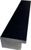
P118H ₩10
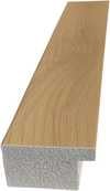
P118W ₩10
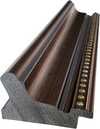
P438Z ₩10
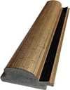
P508JH ₩12
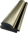
P508YH ₩12
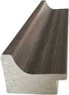
P805H ₩10
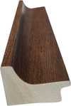
P805Z ₩10
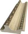
P919BZ ₩10
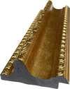
P919G ₩10
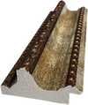
P919XJ ₩10
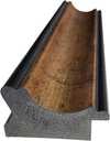
P959ZH ₩10
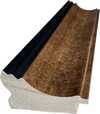
P968JZ ₩12
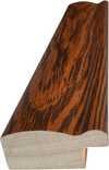
W106C ₩8
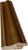
W218G ₩10
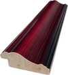
W218JH ₩8
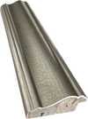
W218Y ₩10
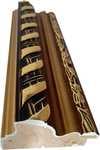
W307PJ ₩10
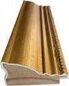
W316G ₩10
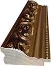
W316PJ ₩8
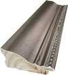
W316Y ₩10
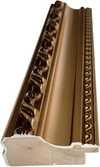
W398PJ ₩8
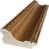
W4111J ₩10
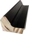
W500HY ₩15
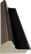
W500JH ₩15
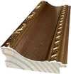
W692G ₩12
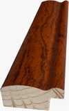
W849H ₩8
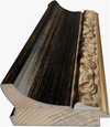
W940BG ₩15
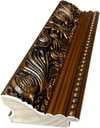
W953PJ ₩8
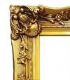
H24-GOLD ₩30
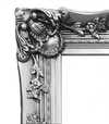
H24-SILVER ₩30
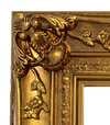
H36-GOLD ₩45
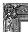
H36-SILVER ₩45
액자형
Moulding: . Overall size with the frame: .
3 Step three of four
Would you like anything changed in the painting?
Most people answer no. Because each painting is made by hand, our artist can also adapt it for you.
After order, ArtsDot.com team will email client for instructions and provide a mockup preview
4 Step four of four
A few finishing options
All of them are optional. The answers already selected cost nothing extra.
Who paints it?
A nameplate, as in a museum?
동판 각인 상세 정보
This elegant plaque features the artist's name and the title of the artwork, finely engraved for a timeless presentation.
It is made from bronze with a refined, elegant finish. The text is precisely laser-engraved for a sharp and permanent result. Measuring 9x2 cm, the plaque is compact yet easy to read. It's built to be durable and scratch-resistant, offering a professional, museum-quality look. Mounting is simple thanks to the included adhesive backing.
투명 아크릴 명판 상세 정보
The plaque includes essential engraved details such as the artist's name, the title of the artwork, the date it was created, the type of media used-like oil on canvas or watercolor-a brief description of the piece, and a QR code that links to the complete artwork information.
It is crafted from clear acrylic, offering a sleek, modern appearance. The text is UV-engraved in black to ensure strong visual contrast. With a size of 10x15 cm, it ensures optimal readability. It comes equipped with two metal hooks for secure wall mounting. The plaque is designed to be weather-resistant, making it suitable for various environments, and it includes interactive features that work seamlessly with smartphone scanning.
블랙 아크릴 명판 상세 정보
This elegant plaque includes engraved information such as the artist's name, the title of the artwork, the date it was created, the type of media used (like oil on canvas or watercolor), a short description of the artwork, and a QR code for quick access to more information.
The plaque itself is made from refined black acrylic with a premium finish. The text is laser-engraved in white for high contrast and readability. Its size is 10x15 cm, designed to be easy to read. It comes with two metal hooks for professional mounting. The design is sleek and fits any interior style. It is also weather-resistant and durable, with built-in digital integration for mobile compatibility.
A protective varnish?
When do you need it?
✓ Check and order
Your painting, as you ordered it

Spring
재현 매체
복제본 규격
-

최정상급 시니어 아티스트
더욱 세밀한 묘사와 정교함, 그리고 충분한 제작 시간
-

복제화 액자 옵션
-
-
가로 또는 세로 중 어느 한 면이라도 105cm(약 41인치)를 초과하는 작품이나 복제화의 경우, 프레임은 분해된 키트 형태로 배송됩니다. 이는 안전한 배송을 보장하고 운송 중 발생할 수 있는 손상을 방지하기 위함입니다.
전문가 조립 권장 - 본 제품은 DIY용이 아닙니다.
해당 키트는 숙련된 전문 프레임 제작자가 목공용 풀(별도 구매), 캔버스 스트레칭 플라이어 및 풀이 마르는 동안 나무 틀의 수평을 유지할 클램프를 사용하여 캔버스를 팽팽하게 고정하고 조립해야 합니다. 잘못된 조립이나 불균형한 캔버스 장력은 작품에 영구적인 손상을 입힐 수 있으며, 이로 인한 손상은 보증 범위에 포함되지 않습니다.
 가로 또는 세로 중 어느 한 면이라도 105cm(약 41인치)를 초과하는 작품이나 복제화의 경우, 프레임은 분해된 키트 형태로 배송됩니다. 이는 안전한 배송을 보장하고 운송 중 발생할 수 있는 손상을 방지하기 위함입니다.
모든 고형목재 부재가 포함되어 있으며, 정확한 크기로 정밀하게 재단되었습니다.
제공된 나사를 사용하여 조립하며, 모서리 접합부용 목공용 풀은 포함되어 있지 않으므로 제작자께서 별도로 준비해 주셔야 합니다.
전문가용 도구가 필요하며 키트에 포함되어 있지 않습니다: 캔버스 스트레칭 플라이어(텐셔너)와 접착제가 마르는 동안 나무 틀의 수평을 유지하기 위한 클램프가 필요합니다.
주의사항:
모서리 접합부에는 목공용 풀이 필요하며, 풀이 완전히 마를 때까지 클램프로 바(bar)를 고정해야 합니다. 또한 조립된 프레임에 캔버스를 팽팽하게 당기려면 캔버스 스트레칭 플라이어가 필요합니다. 이 제품들 중 어느 것도 키트에 포함되어 있지 않습니다. 이 사이즈를 주문하시기 전에 숙련된 전문 액자 제작업체를 미리 섭외하시기 바랍니다.

캡션
-
-

보호용 바니시
유광 바니시(색감을 선명하게 하며 빛과 습기로부터 보호함)
-

내 작품 맞춤 설정
변경 가능한 예시: 얼굴을 고객의 사진으로 교체, 반려동물 추가(예: 고양이를 강아지로 변경), 배경에 숨겨진 메시지 삽입, 배경 풍경 또는 요소 변경.
-

긴급 배송
전 세계 배송()은 기존 5주의 표준 기간 대신 3~4주 내에 완료됩니다. (2 11월). 품질에는 어떠한 타협도 하지 않습니다.
-
빠른 배송
지역 일반 배송: 약 5주 소요 (9 11월).
기본 배송비 포함
총 결제 금액
₩ 354683
유리 옵션은 110cm 미만 크기에서만 선택 가능합니다.
Included with every order
- 전 세계 무료 특급 배송
- 고품질 린넨 캔버스
- 배송 전 과정 보험 적용
- 관세 환급 보장 서비스
- 원본 색상 일치 보장
- 제조 결함 발견 시 100일 이내 반품 가능
- 100% 환불 보장
- 다량 구매 할인 혜택


A Springtime Reverie: Abel Grimmer’s “Spring”
Abel Grimmer's "Spring," painted in 1607, isn’t merely a depiction of a season; it’s a carefully constructed tableau of Flemish life imbued with the quiet dignity and burgeoning energy of renewal. Housed within the Koninklijk Museum voor Schone Kunsten in Antwerp, this oil-on-panel masterpiece offers a glimpse into a world where daily routines intertwine with the promise of warmer days and blossoming landscapes – a testament to Grimmer’s skill in capturing both the tangible details of everyday existence and the subtle poetry of nature.
The painting immediately draws the eye into a bustling, yet remarkably ordered, scene. The foreground is populated by figures engaged in familiar tasks: tending to vegetable gardens, mending clothes, perhaps preparing for market day. Their attire—simple tunics and skirts rendered with meticulous detail—grounds the image firmly within its historical context, suggesting a community bound by shared labor and tradition. Yet, these aren’t idealized portraits; they are ordinary people going about their business, radiating an understated sense of contentment.
The Language of Landscape: Technique and Style
Grimmer's approach to landscape painting was revolutionary for his time. He eschewed the dramatic mountainscapes favored by earlier masters like Joachim Patinir, instead opting for a more intimate portrayal of the Flemish countryside – rolling fields, meandering streams, and modest farmhouses. This shift reflects a growing interest in observing and documenting the natural world with increasing accuracy. Grimmer’s technique is characterized by its remarkable economy; he employs a limited palette of earthy tones—ochres, greens, and browns—to create a sense of depth and atmosphere. The brushstrokes are precise yet fluid, conveying both the texture of fabrics and the subtle variations in light across the landscape.
Notably, Grimmer’s work demonstrates an impressive understanding of perspective and spatial relationships. Buildings recede into the distance with convincing accuracy, while figures are rendered with a naturalistic sense of proportion. This attention to detail is further enhanced by his use of chiaroscuro—the dramatic contrast between light and shadow—which adds volume and realism to the scene.
Symbolism and Narrative
Beyond its realistic depiction of daily life, “Spring” carries a subtle symbolic weight. The painting isn’t simply celebrating the arrival of warmer weather; it's suggesting a cycle of renewal – a return to productivity after winter’s dormancy. The presence of figures engaged in agricultural labor speaks to the importance of this season for sustaining the community. The river, flowing serenely through the scene, represents life and fertility, while the modest buildings hint at a stable and prosperous village.
Interestingly, Grimmer's work often draws inspiration from biblical narratives, as evidenced by his series depicting the Tower of Babel. This connection to religious themes adds another layer of meaning to “Spring,” suggesting that human endeavors are ultimately subject to divine judgment and renewal. The painting subtly reminds us of our place within a larger cosmic order.
A Timeless Resonance
Despite being created over four centuries ago, "Spring" retains an extraordinary power to resonate with contemporary viewers. Grimmer’s masterful use of light, color, and composition creates a scene that is both familiar and captivating. The painting's quiet dignity and understated beauty invite us to pause and reflect on the simple pleasures of life – the rhythms of nature, the bonds of community, and the enduring promise of renewal. It stands as a poignant reminder of the timeless appeal of Flemish genre painting and Abel Grimmer’s remarkable contribution to the art world.
관련 작품들


아벨 그리머
1570 - 1620, 벨기에
작가 소개
아벨 그리머 (c. 1570–c. 1620): 절제된 미학을 구현한 풍경화가
아벨 그리머(성씨 변형: 'Grimer' 및 'Grimmaert')는 주로 풍경화를, 그리고 그보다 적은 비중으로 건축 회화를 그려냈던 플랑드르 후기 르네상스의 화가입니다. 그의 작품들은 플랑드르 풍경화가 더욱 사실주의적인 방향으로 발전하는 데 있어 중요한 이정표 역할을 했습니다. 그리머의 예술적 유산은 단순히 그가 남긴 방대한 작품 수에만 있는 것이 아니라, 효율성과 양식적 일관성을 우선시했던 그의 혁신적인 접근 방식에 있습니다. 이러한 방식은 생전 그가 안트베르프 미술 시장에서 확고한 위치를 점할 수 있게 해주었습니다. 안트베르프에서 태어나 생을 마감한 그는 아버지 야코프 그리머(c. 1526–1590)의 지도 아래 기량을 닦았습니다. 아버지는 피터 브뤼헐의 미니어처 풍경화를 모방하여 저렴한 가격에 보급함으로써 명성을 쌓았던 인물이었습니다. 이러한 가족적 영향은 그리머의 예술적 감수성을 깊게 형성하였으며, 세밀한 관찰력과 숙련된 기술력을 바탕으로 그만의 독창적인 화풍을 완성하는 밑거름이 되었습니다.- 유년기와 교육: 야코프 그리머의 작업실은 아벨의 형성기에 있어 일종의 용광로와 같았습니다. 이곳에서 그는 플랑드르 풍경화의 전통에 깊이 몰입하는 동시에, 새로운 접근 방식을 실험할 수 있는 기회를 얻었습니다.
- 결혼과 길드 입성: 1591년, 아벨은 카타리나 레스코르네와 결혼하였고 곧 안트베르프 성 루카 길드의 마스터로 승격되었습니다. 이는 그가 숙련된 예술가로서 인정받았음을 의미하는 결정적인 순간이었으며, 수익성 높은 주문 작업을 확보하는 계기가 되었습니다.
- 작업실의 계승: 1590년 아버지 야코프가 사망한 후, 아벨은 가업을 이어받아 아버지의 작업실을 운영했습니다. 그는 기존의 공식을 따르면서도 세심한 단순화와 양식적 정제를 통해 작품의 수준을 미묘하게 높이는 전통을 이어갔습니다.
그리머의 예술적 스타일: 브뤼헐의 영향과 효율성의 추구
그리mmer의 예술적 스타일은 피터 브뤼헐과 한스 볼이라는 거장들의 영향이 놀랍게 교차하는 지점에 있으면서도, 동시에 기법을 간결하게 다듬으려는 확고한 의지로 차별화됩니다. 복잡한 구도와 섬세한 색조를 사용했던 이전 세대 화가들과 달리, 그리머는 명료함과 시각적 충격을 우선시하는 미니멀리즘적 미학을 수용했습니다. 이러한 양식적 선택은 경제성과 접근성이 무엇보다 중요했던 안트베르프 시장에 대한 실용적인 이해에서 비롯되었습니다. 그의 풍경화 속 각 화면은 황토색이나 갈색 같은 차분한 단색조로 세밀하게 묘사되었으며, 명도를 극대화하고 바니시가 표면 질감에 미치는 영향을 줄이기 위해 변화를 최소화했습니다. 이러한 의도적인 단순화는 단순한 취향의 문제가 아니라, 보다 경제적인 제작 공정으로 나아가는 근본적인 전환을 의미했으며, 이를 통해 그리머의 회화는 당시 예술적 환경 속에서 경쟁력을 유지할 수 있었습니다.- 색채의 조화와 빛: 그리머는 브뤼헐과 볼을 연상시키는 색채 조화를 능숙하게 구사하였으며, 대기 중의 빛을 놀라울 정도로 정확하게 포착해냈는데 이는 그의 작품 세계를 상징하는 특징입니다.
- 구도의 단순성: 건축물들은 기하학적 형태로 묘사되었습니다. 이는 기존의 관습에서 의도적으로 벗어난 시도로, 풍경화 전체의 시각적 임팩트를 더욱 강화했습니다.
- 제작 기법: 그리머의 기법은 바니시 사용을 최소화하여 표면 반사를 제거하고 색채의 생동감을 극대화하는 데 중점을 두었습니다. 이는 효율성과 예술적 정밀함에 대한 그의 헌신을 잘 보여주는 전략이었습니다.
주요 작품과 반복되는 주제
그리머의 작품 세계는 계절의 변화를 담은 풍경화부터 건축 내부 묘사에 이르기까지 매우 다양한 주제를 아우르지만, 그중에서도 양식적 혁신과 주제적 울림이 큰 몇몇 작품들이 눈에 띕니다. 대표적으로 1592년에 제작된 '12개월' 시리즈가 있는데, 이는 1585년 한스 반 루이크가 출판한 한스 볼의 판화를 정확하게 모사한 것입니다. 또한 브뤼헐의 구도를 바탕으로 피터 반 데르 헤이든이 그린 두 점의 판화를 반영한 '봄'과 '여름', 그리고 브뤼헐의 기념비적인 작품에서 영감을 받은 '바벨탑' 묘사 등이 있습니다. 이러한 작품들은 기존의 예술적 관습을 숙련되게 재해석하는 동시에, 성서적 알레고리에 뿌리를 둔 깊은 도덕적 메시지를 전달합니다. 특히 인간의 오만과 신성한 권위에 대한 저항을 상징하는 바벨탑 모티프는, 당시 개신교 지역과의 갈등으로 격동의 시기를 겪던 안트베르프의 정치적 상황을 거울처럼 투영하고 있습니다.유산과 역사적 의의
그의 양식적 선택이 타인의 작업에 지나치게 의존한다는 비판을 받기도 했음에도 불구하고, 그리머의 유산은 플랑드르 풍경화의 진화 과정에서 핵심적인 인물로서 영원히 지속되고 있습니다. 단색조의 색채 팔레트와 기하학적 건축 표현으로 특징지어지는 그의 간결한 기법은 후대 예술가들에게 선례를 남겼으며, 안트베르프 예술 전통 내에서 그의 자리를 확고히 했습니다. 나아가 대기 중의 빛을 포착하고 건축 공간을 충실하게 재현하려 했던 그의 흔들림 없는 노력은, 훗날 피터 센레담이 주도한 네덜란드 실내 회화의 발전을 예견하는 듯하며 저지대 국가(Low Countries) 전체의 예술적 지평에 미친 그의 영향력을 증명합니다. 아벨 그리머가 플랑드르 미술에 기여한 바는 부정할 수 없습니다. 그는 사실주의를 향한 결정적인 도약을 이끌어냄과 동시에, 경제적인 제작 공정을 유지함으로써 그의 작품이 수 세기 동안 대중에게 다가가고 영향력을 발휘할 수 있도록 만들었습니다.관련 기사

낭만 풍경화의 황홀! 예술사에 빛난 10대 걸작 탐구 | 와후아트
낭만주의 시대, 예술혼을 불태운 10대 풍경화 걸작! 터너부터 프리드리히까지, 시대를 초월하는 아름다움을 와후아트에서 만나보세요. 고흐의 색채와 코로의 섬세함이 당신의 공간에 영감을 더합니다. 지금 바로 와후아트에서 명품 미술 작품을 감상하고 구매하세요!

Evocations of Place: A Historical Journey Through Landscape Art
Explore the rich history of landscape art with ArtsDot. Discover renowned artists, movements like Impressionism & Romanticism, and expert guidance for collecting timeless pieces. Find your perfect serene escape today!

Evoking Nature's Sublime: A Comprehensive Exploration of 19th-Century Landscape Painting
Explore the captivating world of 19th-century landscape painting! Discover renowned artists like Friedrich & Monet, key movements, and find the perfect artwork to bring nature's serenity into your home. Expert insights at ArtsDot.