

 設置イメージを表示
 シェアする
シェアする シェアする
シェアする
 詳細を見る
詳細を見る ガイドを表示

 ダウンロード
 似ている作品
 X線調査
X線調査 スライドショーを表示
 Q&A
Q&A 統計情報
統計情報Poppies

- 132.0 x 96.0 cm


 詳細を表示
詳細を表示
このページに掲載されている作品は著作権法によって保護されており、当社の許可なく同一の複製物を制作または販売することは法律で禁じられています。この保護は、以下のような国際条約に基づき執行されます。 ベルヌ条約 および、以下の条項に定められたものを含む各国の法律により、 米国著作権法 第17編。
この手法は、著作権で保護された作品の複製や複写を伴わないため、著作権法に完全に準拠しています。これは単なる模倣ではなく、創造的な再解釈です。元の作品からインスピレーションを受けつつも、それとは異なる、全く新しい絵画を生み出すものです。
ジークレー/アートプリント
スピーディーな制作と多彩な仕上げオプションが魅力の、ミュージアムクオリティなジークレー・キャンバスプリント。 ( 手描き複製画を注文する デジタル画像販売へ切り替え)

P118B ¥10
P118H ¥10
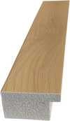
P118W ¥10

P438Z ¥10
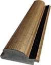
P508JH ¥12

P508YH ¥12
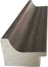
P805H ¥10
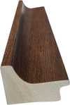
P805Z ¥10
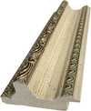
P919BZ ¥10

P919G ¥10
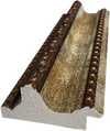
P919XJ ¥10
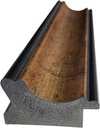
P959ZH ¥10

P968JZ ¥12
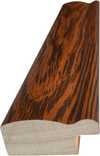
W106C ¥8

W218G ¥10

W218JH ¥8

W218Y ¥10
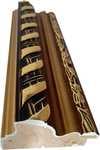
W307PJ ¥10

W316G ¥10
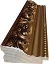
W316PJ ¥8

W316Y ¥10

W398PJ ¥8

W4111J ¥10
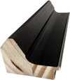
W500HY ¥15

W500JH ¥15

W692G ¥12

W849H ¥8
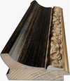
W940BG ¥15

W953PJ ¥8

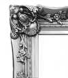

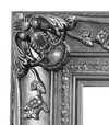
作品のオリジナル比率に合わせた、当店の規定サイズからお選びください。

額縁や壁のスペースに合わせて、ご希望の幅と高さを入力してください。プリントはカットすることは可能ですが、元の画像より大きくすることはできないため、異なる比率のサイズを選択された場合は、画像の一部が欠けることになります。印刷を開始する前に、内容を確認していただくためのデジタルモックアップをお送りいたします。このページに表示されている画像は、実際のカット後の状態を示すものではありません。実際の仕上がりはモックアップにてご確認ください。


 ガラスオプションは、110cm未満のサイズでのみご利用いただけます。

Poppies
ジークレー/アートプリント
複製画サイズ一覧
-


合計金額
¥ 9778
A Symphony of Crimson and Light
In the breathtaking canvas of Poppies, the viewer is immediately swept into a vibrant, sun-drenched meadow where nature performs its most brilliant concerto. The painting serves as a masterful exploration of color, centering on a lush field of poppies rendered in an array of intoxicating reds, from deep, velvety crimsons to bright, translucent scarlets. Interspersed among these fiery blooms are delicate splashes of yellow, acting as golden highlights that dance across the composition. This interplay of warm tones creates a rhythmic vitality, pulling the eye through a dense thicket of petals and stems that seem to sway with an invisible breeze. The artist’s ability to balance the intense heat of the red blossoms against the serene, expansive blue of the sky background provides a sense of profound equilibrium, making the scene feel both energetic and deeply peaceful.
The technique employed in this work speaks to a sophisticated understanding of depth and dimension. Rather than presenting a flat floral arrangement, the painting utilizes a layered approach where certain poppies emerge with striking clarity while others recede into a soft, impressionistic haze. This variation in focus—where some stems appear long and commanding while others nestle low within the greenery—creates a tactile quality that invites the observer to step into the field. The brushwork captures the delicate texture of the petals and the organic irregularity of the meadow, suggesting a moment captured in time where light and shadow perform their eternal dance. It is an impressive display of detail that honors the natural habitat of these iconic flowers, elevating a simple botanical subject into a complex study of light and form.
Beyond its visual splendor, Poppies carries a profound emotional resonance and symbolic weight that makes it a captivating choice for discerning collectors and interior designers alike. Historically, the poppy has long been a symbol of both sleep and remembrance, representing a bridge between the waking world and the realm of dreams. In this particular composition, the vibrancy of the red blooms evokes themes of passion, vitality, and the fleeting beauty of life. For an interior space, such a piece acts as a powerful focal point; its bold palette can breathe life into a neutral room, while its natural subject matter brings a sense of organic tranquility to modern or classical settings. Whether placed in a sunlit gallery or a sophisticated living area, this reproduction serves as a window into a perennial summer, offering an enduring sense of joy and botanical elegance.
Q&A
その色彩から、Stefano Arienti作「Poppies」 はどの部屋に飾るのがおすすめですか?
Stefano Arienti作「Poppies」のDarkな色彩は、おすすめの空間であるLiving Roomに調和します。
Stefano Arienti作「Poppies」をスライドショーで閲覧するには、どうすればよいですか?
Stefano Arienti作「Poppies」は、作品のスライドショーページにてスライドショーとしてご覧いただけます。
Stefano Arienti作「Poppies」の構図を主導している色は何ですか?
「Poppies」の中で最も際立っている色はPutty (#dedfdc)です。作品の主色(メインカラー)を知ることは、インテリアとのコーディネートを考える際に役立ちます。
関連作品


作家プロフィール
Rembrandt Gladys Schmitt: A Pioneer of Color and Form in the Early 1960s
The year 1961 marks a pivotal moment, not just for the art world, but for the burgeoning movement of abstract expressionism that was rapidly redefining visual language. It’s within this dynamic landscape that Rembrandt Gladys Schmitt emerged as a significant, though often overlooked, figure – an artist deeply engaged with color theory, geometric abstraction, and a uniquely personal approach to form. Born in 1923, Schmitt's artistic journey unfolded primarily during the early to mid-1960s, a period of intense experimentation and challenging established norms within American painting.
Schmitt’s formative years were steeped in European art history, particularly the vibrant hues and dynamic compositions of Fauvism and the geometric precision of Constructivism. These influences, coupled with her exposure to the avant-garde scene of post-war New York – a city pulsating with creativity and intellectual ferment – shaped her distinctive style. Unlike some of her contemporaries who embraced purely gestural abstraction, Schmitt’s work is characterized by a deliberate control over color and line, creating compositions that are both visually arresting and intellectually stimulating. She wasn't interested in simply expressing emotion; rather, she sought to explore the inherent relationships between color, shape, and space.
The Palette as Language: Color Theory and Composition
Central to Schmitt’s artistic practice was a rigorous investigation of color theory. She meticulously studied the interactions of hues – their complementary pairings, analogous sequences, and the subtle shifts in tone that could evoke specific moods or sensations. Her canvases are often built around carefully considered color schemes, employing techniques borrowed from both Matisse and Albers, but always filtered through her own unique sensibility. Schmitt wasn’t simply applying colors; she was using them as a language, each hue carrying a deliberate weight and significance within the overall composition.
Her compositions frequently feature interlocking geometric forms – circles, squares, triangles – arranged in dynamic, often asymmetrical arrangements. These shapes aren't merely decorative elements; they are actively engaged in creating visual tension and balance. Schmitt’s use of negative space is particularly noteworthy, allowing the colors to breathe and interact with each other, preventing the compositions from feeling overly dense or cluttered. The interplay between positive and negative forms creates a sense of depth and movement, drawing the viewer's eye across the canvas.
Key Works and Exhibitions
While Schmitt’s output wasn’t vast – she primarily focused on painting during her active period – several works stand out as particularly significant. “Untitled (Red, Yellow, Blue)” from 1962 is a prime example of her color-driven approach, utilizing a bold triad of primary colors to create a vibrant and energetic composition. “Composition in Turquoise and Ochre” (1963) demonstrates her mastery of subtle tonal variations and the way she could use seemingly simple color combinations to evoke complex emotional responses. These works were exhibited at several key venues during this period, including the Huysman Gallery in Los Angeles, a hub for experimental art in the early 1960s.
Notably, her work appeared alongside that of other prominent figures of the era – Joe Goode, Larry Bell, and Ed Bereal – within the “War Babies” exhibition at the Huysman Gallery. This show, though controversial due to its poster design, served as a crucial platform for showcasing emerging abstract artists pushing the boundaries of traditional painting.
Legacy and Historical Context
Rembrandt Gladys Schmitt’s contribution to American art history is often overshadowed by more commercially successful or widely recognized names. However, her work deserves recognition as an important voice within the vibrant experimental scene of the early 1960s. She represents a crucial bridge between the emotional intensity of abstract expressionism and the intellectual rigor of geometric abstraction – a synthesis that reflects the broader cultural shifts taking place in America at the time.
Her exploration of color theory, combined with her deliberate use of form, anticipates many of the developments in color field painting that would emerge in the late 1960s and early 1970s. Schmitt’s legacy lies not only in her individual artworks but also in her embodiment of a spirit of experimentation and intellectual curiosity – qualities that continue to inspire artists today.

Stefano Arienti
1961 - , Italy
プロフィール概要
- Artistic Movement Or Style: Arte Povera and Conceptual art
- Full Name: Stefano Arienti
- Nationality: Italian
- Notable Artworks:
- Cassetto con strisce
- Library
- natura, natura, natura
- Place Of Birth: Asolo, Italy
- Date Of Birth: 1961
関連記事

The Golden Hue: Exploring Symbolism & Emotion in Yellow Art
Explore the rich symbolism & emotional power of yellow in art history! From Van Gogh to Kandinsky, discover how artists used this vibrant hue. Expert analysis & high-quality reproductions at ArtsDot.

Crimson Threads of Narrative: Exploring Symbolism & Representation in Artworks Featuring the Red Dress
Explore the rich symbolism of the red dress in art history! From ancient power displays to iconic portraits like Cézanne’s 'Madame Cezanne', discover the cultural and artistic significance behind this captivating color. Expert analysis & insights.

Slate Blue Masterpieces: 10 Iconic Paintings & Timeless Home Decor Ideas
Immerse yourself in the captivating world of slate blue! Explore 10 iconic paintings by Monet, Van Gogh & Renoir. Discover their stories, techniques & find museum-quality art reproductions for your home at .
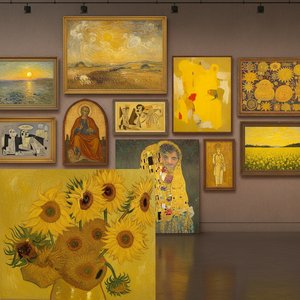
Golden Hues: 10 Masterpieces Dominated by Chrome Yellow | ArtsDot
Immerse yourself in golden light! Explore 10 famous paintings dominated by 'Chrome Yellow', from Van Gogh’s Sunflowers to Monet's Haystacks. Discover the stories behind these iconic Impressionist & Post-Impressionist masterpieces and find museum-quality art reproductions at ArtsDot.com.
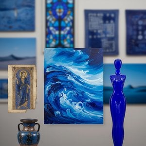
The Allure of Azure: Exploring the Symbolic & Aesthetic Depths of Blue in Art History
Explore the rich history of blue in art! Discover its symbolism, from ancient pigments to modern masterpieces by Kandinsky & Seurat. Uncover the psychological impact and cultural meanings behind this captivating hue.