シェアする
シェアするMemory

ジークレー/アートプリント
迅速な制作と多彩な仕上げオプションを備えた、ミュージアムクオリティのジークレーまたはキャンバスプリント。 (![]() 手描きの絵画を購入
手描きの絵画を購入![]() 画像を購入)
画像を購入)
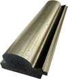
P118B $10
P118H $10
P118W $10
P438Z $10
P508JH $12
P508YH $12
P805H $10
P805Z $10
P919BZ $10
P919G $10
P919XJ $10
P959ZH $10
P968JZ $12
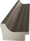
W106C $8
W218G $10
W218JH $8
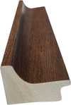
W218Y $10
W307PJ $10
W316G $10
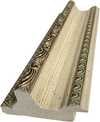
W316PJ $8
W316Y $10
W398PJ $8
W4111J $10
W500HY $15
W500JH $15
W692G $12
W849H $8
W940BG $15
W953PJ $8

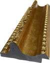
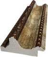
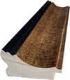
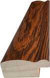
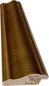
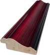
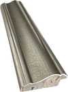
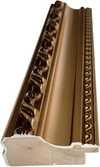
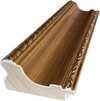
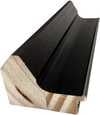
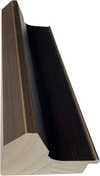
作品のオリジナル比率に合わせた、当店の規定サイズからお選びください。
特定のフレームやスペースに合わせて、ご自身でサイズを指定することも可能です。選択されたサイズが元の画像の比率と一致しない場合、作品をトリミングするか、鏡面反射または単色での塗りつぶしによって画像を拡張いたします。制作を開始する前に、ご確認用のデジタルモックアップをお送りいたします。
画面上のプレビューには、実際のトリミングや拡張は反映されませんのでご注意ください。最終的な構図を正確に確認できるのは、モックアップのみとなります。
カスタムサイズも承っておりますが、元の比率を維持するためには、あらかじめ用意されたリストからサイズを選択することをお勧めいたします。


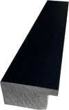
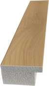
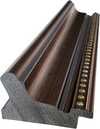
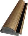
 ガラスオプションは、110cm未満のサイズでのみご利用いただけます。

Memory
ジークレー/アートプリント
複製画のサイズ
-


合計金額
$ 62
作品詳細説明
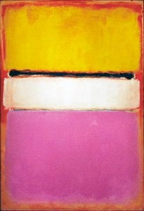
Mark Rothko’s “Memory”: A Descent into Color and Emotion
Mark Rothko's "Memory," painted in 1946, isn’t merely a depiction of a scene; it’s an immersion. This monumental abstract expressionist canvas, currently residing within the National Gallery of Art’s collection, invites viewers to confront the complexities of remembrance and the elusive nature of experience itself. Rothko, born Markus Yakovlevich Rothkowitz in Dvinsk, Latvia, carried with him from his early life a profound sense of displacement – a legacy shaped by the turbulent atmosphere of the Pale of Settlement and the subsequent immigration to Portland, Oregon. This inherent sensitivity to human suffering would become a defining characteristic of his work, informing his exploration of existential themes through color and form.
The painting’s foundation is deceptively simple: a vast field of crimson dominates the composition, punctuated by layered rectangles of muted blues and browns. However, this apparent simplicity belies an intricate web of emotional resonance. Rothko wasn't interested in literal representation; instead, he sought to evoke pure feeling through color fields. He described his process as “making blocks of color,” aiming to create a meditative space where the viewer could lose themselves within the painting’s depths. The red, often associated with passion, energy, and even violence – perhaps echoing the anxieties of his early life – acts as an anchor, grounding the composition while simultaneously radiating outward.
The Language of Color: Rothko's Technique
Rothko’s technique was revolutionary for its time. He applied paint in incredibly thin layers, often just a few coats, creating a luminous surface that seemed to glow from within. This layering process, known as “velvet,” resulted in an almost tactile quality – the viewer can practically feel the texture of the paint. The colors themselves are not blended; rather, they sit adjacent to one another, allowing them to bleed subtly into each other, creating a sense of atmospheric depth and movement. He meticulously controlled the edges of his rectangles, often leaving them slightly undefined, contributing to the painting’s ethereal quality. This deliberate lack of sharp boundaries encourages the eye to wander and explore, mirroring the way memories themselves can shift and morph over time.
Symbolism and the Evocation of Memory
While Rothko vehemently resisted any attempt to interpret his paintings literally, “Memory” undeniably speaks to the act of remembering. The layered rectangles can be seen as representing fragments of recollections – shards of experience that coalesce into a larger, more complex whole. The blues suggest melancholy and introspection, while the browns evoke a sense of grounding and stability. The central figure, often described as resembling a woman or an angel, isn’t explicitly defined but rather serves as a focal point for contemplation—a vessel through which the viewer can project their own memories and emotions. It's not about recalling a specific event, but about accessing the *feeling* of remembrance – that bittersweet blend of joy and sorrow that accompanies our recollections.
A Legacy of Emotional Resonance
“Memory” stands as a powerful testament to Rothko’s ability to translate profound emotional experiences into visual form. It's a painting that demands patience, contemplation, and an openness to feeling. Its enduring appeal lies in its capacity to resonate with each viewer on a deeply personal level, prompting us to reflect on our own memories and the complex tapestry of human experience. Today, high-quality reproductions of this iconic work offer art lovers the opportunity to bring Rothko’s evocative vision into their homes, creating spaces that are both visually stunning and emotionally resonant. Consider a hand-painted reproduction – a faithful recreation of Rothko's masterful use of color and texture, allowing you to experience the painting's profound impact in your own environment.
関連作品


アーティストの略歴
マーク・ロスコ:色彩の深淵と魂の叫び
1903年、ラトビアのダウガフピルスでマルクス・ヤコヴレヴィチ・ロトコヴィッチとして生まれたマーク・ロスコは、その生涯を色彩という言葉で人間の存在と感情の深淵を探求することに捧げた。幼少期から政治不安や迫害に晒されたユダヤ人家庭環境は、彼の中に深い感受性と苦悩の種を植え付けた。1913年のアメリカへの移民は、新たな文化との出会いをもたらす一方で、故郷との断絶という喪失感も与えた。ポートランドでの生活を経てニューヨークへ移り、当初は都市風景や人物を描いていたロスコだが、第二次世界大戦の激動期を迎え、その芸術は劇的な変貌を遂げる。
シュルレアリスムの影響を受けながら、ロスコは象徴的な形を通して普遍的な人間の感情を表現しようと試みた。1940年代後半には、彼の画業における転換点となる、純粋な色彩領域による作品群が誕生する。それらは単なる色の配置ではなく、深遠な精神性を帯びた、瞑想的な空間へと誘う力を持っていた。次第に、ロスコは具象表現から完全に脱却し、巨大なキャンバス上に不規則な矩形の色面を配置することで、見る者を圧倒的な色彩の海へと引き込むような作品を生み出した。このスタイルこそが、後のカラーフィールド絵画と呼ばれるものであり、抽象表現主義運動における重要な位置を占める。
色彩の交響曲:ロスコの芸術的探求
ロスコの成熟期作品は、色彩そのものが感情と直接的に結びつくという信念に基づいている。彼は、色の微妙なニュアンスや重ね合わせによって、喜び、悲しみ、絶望、希望といった人間の複雑な感情を表現しようとした。彼の絵画は、しばしば静寂の中に潜む激しいエネルギーを感じさせる。それは、色彩が互いに共鳴し合い、まるで音楽のように響き渡るかのような感覚である。ロスコは、作品にタイトルを与えることを避け、「No. 1」や「No. 6」といった番号のみを付与することで、鑑賞者が先入観なしに作品と向き合い、自身の感情を通して作品の意味を受け止めることを望んだ。
セagram美術館の壁画プロジェクトは、ロスコにとって重要な出来事であった。しかし、彼の作品が単なる装飾品として扱われることへの嫌悪感から、依頼を断り、これらの作品を Tate Gallery に寄贈した。この行為は、彼が芸術を商業主義から切り離し、純粋な精神的価値を守ろうとした姿勢を示すものだった。そして、ヒューストンにあるロスコ礼拝堂は、彼の芸術的探求の集大成と言えるだろう。14枚の絵画が配置されたこの聖域は、静寂と瞑想の中で、人間の魂を深く揺さぶる体験を提供する。
遺産:抽象表現主義を超えた影響力
マーク・ロスコの死後も、彼の作品は世界中の人々に深い感銘を与え続けている。彼の芸術は、ミニマリズムや現代絵画に多大な影響を与え、色彩を通して感情を表現する可能性を広げた。ロスコの作品は、単なる視覚的な体験を超え、鑑賞者の内面へと深く入り込み、自己と向き合い、存在の意味を探求することを促す力を持っている。彼の遺産は、抽象表現主義という芸術史上の重要な潮流を代表するだけでなく、人間の感情と精神性を探求する普遍的な芸術の力を体現していると言えるだろう。
ロスコの作品群は、色彩が持つ無限の可能性を示し、私たちに心の奥底にある感情と向き合う勇気を与えてくれる。それは、言葉では表現できない、人間の魂の叫びであり、永遠に人々の心に響き続けるであろう。

マーク・ロスコ
1903 - 1970 , ラトビア
基本情報
- フルネーム: マーク・ロスコ
- 主な作品:
- No. 10 (1950)
- セagramの壁画
- ロスコ礼拝堂
- 出生地: ラトビア、ダウガフピルス
- 国籍: アメリカ合衆国
- 影響を与えたアーティスト: ['ミニマリズム']
- 死亡年月日: 1970年2月25日
- 生年月日: 1903年9月25日
- 芸術運動またはスタイル: 抽象表現主義、カラーフィールド
関連記事

マーク・ロスコ傑作25選:色彩が織りなす深遠な世界|ArtsDot
マーク・ロスコの傑作25選。抽象表現主義を代表する巨匠、色彩が織りなす深遠な世界を探求します。絵画の背景や技法、感動的なストーリーを紐解き、ArtsDotで高品質なアートプリントをお楽しみください。リビングやオフィスにモダンアートを飾るなら!

抽象表現主義を定義する十大傑作:芸術と装飾の深遠な旅
抽象表現主義を定義する10の傑作。ポロック、ロスコら巨匠たちの情熱と色彩の世界へ。各作品に込められた物語と技法を紐解き、至高のアート体験を。ArtsDot.comで、ミュージアムクオリティの複製画や洗練されたインテリアアイデアを発見してください。

The Sublimity of Color: Exploring the Emotional Landscapes of Mark Rothko's Abstract Expressionism
Explore the profound emotional depth of Mark Rothko's abstract expressionism. Discover the history, techniques & lasting impact of this pivotal Color Field painter. Expert insights for collectors and art enthusiasts.

Kandinsky's Masterpieces: 25 Paintings That Define Abstract Art | ArtsDot
Journey through Wassily Kandinsky's 25 most iconic abstract paintings. Explore his revolutionary use of color, form & spiritual expressionism. Find museum-quality Kandinsky reproductions and elevate your home decor with ArtsDot.com. Discover all masterpieces on ArtsDot.com!

Beyond Representation: Exploring the Emotional Landscape of Abstract Expressionism
Explore the profound emotional world of Abstract Expressionism with ArtsDot. Discover key artists like Pollock & Rothko, learn about collecting, and find museum-quality reproductions to inspire your space.