- Home

- Stampa su tela
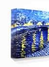
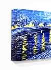
- Mark Rothko
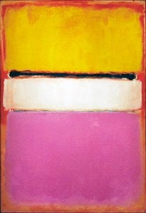
- No. 18

 Invia
InviaNo. 18


Giclée / Stampa d'arte
Stampa giclée o su tela di qualità museale, con produzione rapida e diverse opzioni di finitura. (![]() Switch to hand made Painting
Switch to hand made Painting![]() Switch to Image)
Switch to Image)
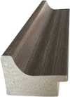
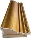
P118B $10
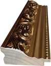
P118H $10
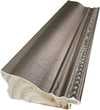
P118W $10
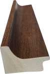
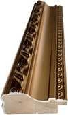
P438Z $10
P508JH $12
P508YH $12
P805H $10
P805Z $10
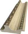
P919BZ $10
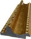
P919G $10
P919XJ $10
P959ZH $10
P968JZ $12
W106C $8
W218G $10
W218JH $8
W218Y $10
W307PJ $10
W316G $10
W316PJ $8
W316Y $10
W398PJ $8
W4111J $10
W500HY $15
W500JH $15
W692G $12
W849H $8
W940BG $15
W953PJ $8
Scegli tra le nostre dimensioni predefinite, che rispettano le proporzioni originali dell'opera d'arte.
È possibile inserire dimensioni personalizzate per adattare l'opera a una cornice o a uno spazio specifico. Se la dimensione selezionata non corrisponde alle proporzioni dell'immagine originale, procederemo al ritaglio dell'opera o all'estensione dell'immagine con un bordo specchiato o a tinta unita. Un mockup digitale ti verrà inviato per approvazione prima dell'inizio della produzione.
Si prega di notare che l'anteprima a schermo non riflette il ritaglio o l'estensione effettivi. Solo il mockup mostrerà accuratamente la composizione finale.
Sebbene siano disponibili dimensioni personalizzate, si raccomanda di selezionare una dimensione dall'elenco predefinito per preservare le proporzioni originali.
Consegna in tutto il mondo () in 2 settimane invece delle normali 4/5 settimane. (29 Luglio)

Spedizione espressa gratuita in tutto il mondo

Tela in lino di alta qualità

Assicurazione completa sulla spedizione

Garanzia di rimborso dei dazi doganali

Garanzia di fedeltà cromatica

Politica di reso entro 60 giorni (solo per difetti)

Garanzia di rimborso al 100%

Sconto per acquisti multipli
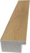
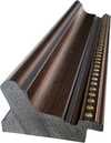
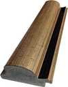
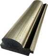
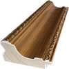
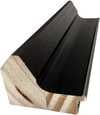
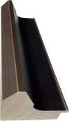
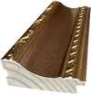
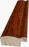
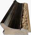
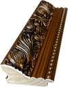
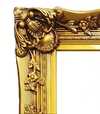
 L'opzione vetro è disponibile solo per dimensioni inferiori a 110 cm

No. 18
Giclée / Stampa d'arte
Dimensioni riproduzione
-


Prezzo totale finale
$ 62
Descrizione dell'opera
Mark Rothko’s ‘No. 18’: A Descent into Color and Emotion
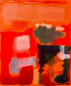
Mark Rothko's 'No. 18,' a captivating exploration of color and form, invites the viewer to confront profound questions about existence itself. This abstract canvas, dominated by a fiery red backdrop punctuated with shifting hues of pink and orange, is more than just a visual spectacle; it’s a deeply personal statement born from a lifetime grappling with displacement, loss, and the human condition. The painting's power resides in its ability to evoke raw emotion – a sense of yearning, melancholy, and perhaps even a glimmer of hope – through the deliberate layering and manipulation of color. Rothko wasn’t interested in depicting recognizable imagery; instead, he sought to create fields of color that would directly affect the viewer’s psyche, bypassing conscious thought and tapping into primal feelings.
The Genesis of Color: Rothko's Technique
- Layered Rectangles: Rothko’s signature technique involved meticulously applying thin layers of oil paint – often just a glaze – to create the luminous, almost ethereal quality characteristic of his work. These rectangles aren't sharply defined; they bleed into one another, creating a sense of depth and movement that seems to shift with the viewer’s perspective.
- Color Fields: The artist employed what he termed “color fields,” rejecting traditional representational techniques in favor of pure color as the primary subject matter. He believed that color possessed an inherent emotional power, capable of conveying complex ideas without the need for narrative or symbolism.
- Subtle Variations: Close examination reveals subtle variations in tone and texture within each rectangle, achieved through careful brushwork and glazing techniques. These nuances contribute to the painting’s overall richness and complexity.
Historical Context & Existential Themes
'No. 18' was created during a pivotal period in Rothko’s career, roughly between 1960 and 1961. This era saw him increasingly focused on exploring themes of mortality, trauma, and the search for meaning – deeply influenced by his own experiences as a displaced Jew navigating the complexities of American society. Born in Latvia (then part of the Russian Empire) to a Jewish family, Rothko’s early life was marked by instability and hardship. The 1913 immigration to Portland, Oregon, followed by the premature death of his father, instilled within him a profound sense of loss and alienation. These experiences fueled his artistic exploration of existential themes, reflecting a desire to grapple with the fundamental questions of human existence.
Symbolism & Emotional Impact
While Rothko resisted overt symbolism in his work, 'No. 18' undeniably evokes powerful emotions. The dominant red suggests passion, intensity, and perhaps even danger – a visual representation of the turbulent emotions that shaped Rothko’s life. The shifting pinks and oranges introduce a sense of vulnerability and fragility, hinting at the transient nature of existence. The presence of other paintings in the background adds to the painting's complexity, suggesting a layered narrative or a series of interconnected experiences. Ultimately, 'No. 18' is an invitation to engage with one’s own emotions and contemplate the profound mysteries of life and death.
A Legacy of Color
Mark Rothko’s ‘No. 18’ stands as a testament to his revolutionary approach to abstract art, influencing generations of artists who followed. Its enduring appeal lies in its ability to transcend the purely visual and connect with viewers on a deeply emotional level. ArtsDot.com offers meticulously crafted hand-painted reproductions that faithfully capture the essence of this iconic work, allowing you to experience Rothko’s profound vision firsthand.
Opere simili


Biografia dell'artista
giovinezza e influenze
mark rothko (marcus rothkowitz), un rinomato artista americano, è nato il 25 settembre 1903 a Dvinsk, Lettonia. La sua famiglia emigrò negli Stati Uniti quando aveva solo dieci anni. Questo cambiamento culturale avrebbe influenzato in seguito il suo stile artistico.evoluzione artistica
Le prime opere di Rothko erano caratterizzate dall'astrattismo espressionista, uno stile che enfatizzava il processo creativo piuttosto che il prodotto finale. I suoi dipinti, come no. 18 (1948) e untitled (1948), mostravano il suo approccio unico al colore e alla forma.- campo di colore: l'uso da parte di Rothko di audaci campi rettangolari di colore, spesso in forte contrasto tra loro, creava un senso di profondità ed emozione.
- struttura organica: i suoi dipinti sembravano respirare la vita, come se i colori fossero entità viventi.
opere notevoli ed esposizioni
- no. 10 (1950), un dipinto che ha segnato un significativo cambiamento nello stile di Rothko, è ora parte della collezione del Museum of Modern Art.
- I Seagram Murals, una serie di dipinti commissionati per il ristorante Four Seasons, hanno mostrato la capacità di Rothko di adattare il suo stile a diversi ambienti.
- no. 3 (1950), un dipinto che esemplifica l'uso di Rothko di audaci campi rettangolari di colore.
vita successiva e eredità
La vita di Rothko è stata segnata da difficoltà nella salute mentale e da un matrimonio tumultuoso. È morto il 25 febbraio 1970 all'età di 66 anni. Nonostante le sue sfide, Rothko ha lasciato un segno indelebile nel mondo dell'arte. ochre and red on red (campo di colore), un dipinto che mostra l'approccio unico di Rothko al colore, può essere trovato nella collezione ArtsDot.com. La pagina Wikipedia su Mark Rothko fornisce ulteriori informazioni sulla sua vita e sul suo stile artistico.
Mark Rothko
1903 - 1970 , Lettonia
Dati rapidi
- Artisti Influenti:
- Wassily Kandinsky
- Piet Mondrian
- Artisti Influenzati: ['Minimalismo']
- Data Di Morte: 25 febbraio 1970
- Data Di Nascita: 25 settembre 1903
- Luogo Di Nascita: Daugavpils, Lettonia
- Movimento Artistico: Espressionismo Astratto
- Nazionalità: Americano
- Nome Completo: Mark Rothko / Marcus Rothkowitz
- Opere Notevoli:
- No. 18 (1948)
- No. 10 (1950)
- Murals Seagram
- No. 3 (1950)
Articoli correlati

Minimalismo nell'Arte: 10 Capolavori per una Casa Elegante e Raffinata
Esplora 10 capolavori di arte minimalista, da Mondrian a Rothko. Scopri la storia, i colori e le tecniche che rendono queste opere iconiche. Trova stampe artistiche online e arredamento elegante su ArtsDot.com.
Le 10 Opere d'Arte Più Rilassanti: Emozioni di Pace e Serenità |
Scopri le 10 opere d'arte più rilassanti di Monet, Van Gogh e Klimt. Esplora la storia, i colori e le emozioni che rendono questi capolavori senza tempo perfetti per creare un'atmosfera zen in casa. Acquista riproduzioni artistiche su !

Joan Miró: I 25 Capolavori che Rivoluzionano l'Arte Moderna | ArtsDot
Esplora i 25 capolavori di Joan Miró, pittore surrealista catalano. Scopri la storia, il simbolismo e le tecniche dietro opere iconiche come 'La Fattoria'. Stampe d'arte e riproduzioni su ArtsDot.com per arredare con stile.

Henri Matisse: I 25 Capolavori Essenziali per Amare l'Arte e Decorare con Stile
Esplora i 25 capolavori di Henri Matisse, il maestro del fauvismo e dei colori vivaci. Scopri la storia, lo stile unico e l'impatto culturale di ogni dipinto. Trova riproduzioni arte di alta qualità per decorare casa tua su ArtsDot.com.

Bianco Sublime: I 10 Dipinti Più Famosi Dominati dal Colore Bianco | .it
Esplora i 10 dipinti più celebri dominati dal bianco, da Monet a Malevich. Scopri la storia, le tecniche e l'impatto di queste opere iconiche. Trova stampe su tela e riproduzioni d'arte di alta qualità per decorare casa con stile su .