Josef Albers: A Homage to Color Interaction & the Foundations of Visual Perception
Sadržaj
The Bauhaus Roots: Albers’s Early Exploration of Material & Form
 Robert Walter Irwin
Robert Irwin
Josef Albers’s artistic journey, though ultimately celebrated for its intensely focused exploration of color, began within the dynamic and revolutionary walls of the Bauhaus. Arriving in 1920 as a student – remarkably, at the age of thirty-two – he quickly immersed himself in the school’s holistic approach to artmaking, an environment that prioritized material investigation and functional design. This wasn't merely about aesthetics; it was about understanding the inherent qualities of materials—glass, metal, wood—and how they interacted with light and space. His early work at the Bauhaus, particularly his stained-glass compositions, reveals a nascent fascination with transparency, reflection, and the subtle shifts in color produced by varying textures and arrangements. These weren’t simply decorative elements; they were experiments in perceptual experience, foreshadowing the rigorous investigations that would define his later career. The emphasis on preliminary studies, meticulous craftsmanship, and the rejection of purely subjective expression laid a crucial foundation for Albers's belief that color wasn’t an inherent property but rather a relational phenomenon.
From Perception to Interaction: Defining Albers's Unique Color Theory
 Abstract Painting 780-1
Explore Gerhard Richter’s ‘Abstract Painting 780-1,’ a vibrant 1992 masterpiece! Dynamic color & impasto technique create an energetic abstract experience. A statement piece for art lovers.
The pivotal shift in Albers’s thinking came with his growing realization that color is not fixed, but profoundly dependent on its surroundings. This insight moved him beyond the formal concerns of Bauhaus design and into a deeper exploration of human visual perception. He began to question the very nature of how we see color, recognizing that our brains actively interpret and construct color relationships rather than passively receiving them. This led to his development of what he termed “color interaction,” the idea that a color’s appearance is dramatically altered by adjacent hues, their intensity, and even the surrounding space. He famously demonstrated this through a series of exercises – often involving squares of colored paper placed on different backgrounds – revealing how seemingly identical colors could appear strikingly different depending on their context. This wasn't about optical illusions in the traditional sense; it was about exposing the inherent instability of color perception and challenging the notion of objective visual truth. Albers’s work, therefore, isn’t simply *about* color; it’s about how we *see* color.
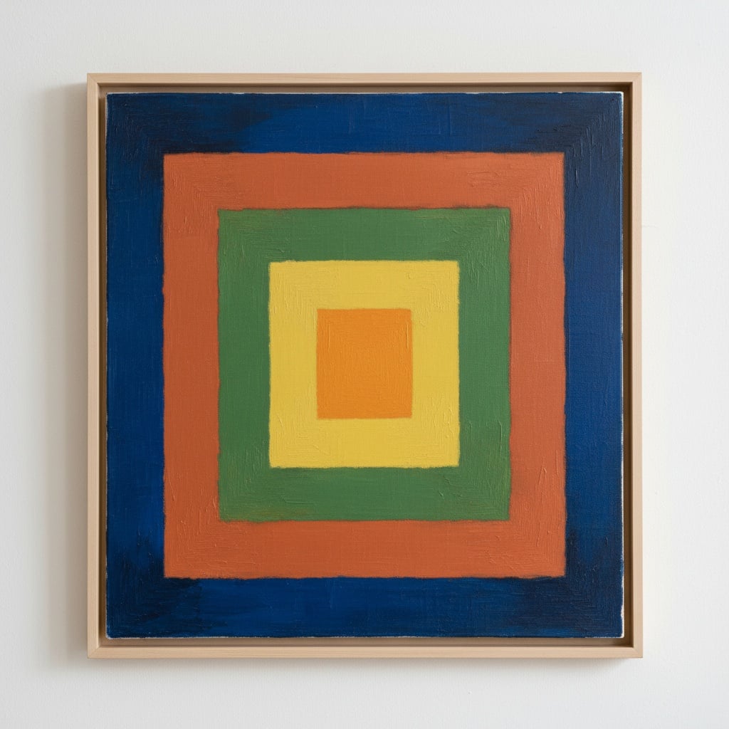
Homage to the Square: A Systematic Study of Relational Color
The series that cemented Albers's reputation – and continues to captivate audiences today – is undoubtedly Homage to the Square. Initiated in 1950, this ongoing project consists of hundreds of paintings featuring nested squares of varying colors. While seemingly simple in its composition, it represents a profound and systematic investigation into color interaction. Each painting functions as a carefully calibrated laboratory, exploring how different combinations of hues affect one another’s perceived intensity, warmth, and spatial depth. Albers deliberately avoided expressive brushwork or narrative content, stripping away any extraneous elements that might distract from the core focus on color relationships. The squares themselves aren't arbitrary; they are meticulously chosen and arranged to create a dynamic interplay of visual forces. The series isn’t about finding “correct” combinations but rather about revealing the infinite possibilities within a limited set of parameters, demonstrating how even subtle shifts in hue can produce dramatic changes in perception. It is a testament to Albers's belief that rigorous observation and disciplined experimentation are essential for unlocking the secrets of color.
Gestalt Principles and the Illusion of Depth in Albers’s Work
Gestalt psychology, gestaltism, or configurationism is a school of psychology and a theory of perception that emphasises the processing of entire patterns and configurations, and not merely individual components. It emerged in the early twentieth ce...
Underlying Albers’s exploration of color interaction is a deep understanding of Gestalt psychology, a school of thought that emphasizes how the human brain perceives entire patterns rather than isolated elements. Gestalt principles, such as proximity, similarity, and closure, play a crucial role in shaping our visual experience of his paintings. The nested squares in Homage to the Square, for example, aren’t simply seen as individual shapes; they are perceived as a unified composition, with the relationships between them creating an illusion of depth and spatial recession. Albers masterfully exploits these perceptual tendencies, using color contrast and layering to suggest volume and form where none physically exists. This isn't about tricking the eye but rather about revealing the inherent organizing principles that govern our visual perception. The paintings invite us to actively participate in the construction of meaning, challenging us to question our assumptions about what we see and how we see it. Artists like Mark Rothko, with his similarly minimalist color field works, also explored these principles, though Albers’s approach remained distinctly focused on systematic investigation rather than emotional expression.
Albers’s Legacy: Influence on Minimalism, Op Art & Contemporary Abstraction
The impact of Josef Albers's work extends far beyond the realm of painting. His rigorous exploration of color interaction profoundly influenced a generation of artists working in diverse styles, including Minimalism, Op Art, and contemporary abstraction. Artists like Robert Irwin embraced his emphasis on perceptual experience, creating immersive installations that challenged viewers’ understanding of space and light. The focus on pure form and the rejection of subjective expression resonated with Minimalist painters who sought to reduce art to its essential elements. Furthermore, Albers's work paved the way for Op Art artists who explored optical illusions and the dynamic effects of color contrast. His influence can also be seen in contemporary abstraction, where artists continue to investigate the psychological and emotional power of color. Amelia Toledo’s vibrant “Blue Color Field,” for example, echoes Albers’s sensitivity to layered textures and saturated hues, demonstrating a continued fascination with the relational qualities of color. Gerhard Richter's abstract paintings, with their dynamic impasto technique, also reveal an awareness of Albers’s principles of visual interaction.
Beyond the Canvas: Teaching as a Catalyst for Visual Awareness
Perhaps less known but equally significant was Albers’s remarkable career as an educator. For decades, he taught at institutions like the Bauhaus, Black Mountain College, and Yale University, instilling in his students a deep appreciation for visual awareness and critical thinking. He didn't focus on teaching technique; instead, he emphasized the importance of observation, experimentation, and self-discovery. His seminal book, The Interaction of Color, remains a cornerstone of art education, challenging aspiring artists to see the world in new ways. Albers believed that the most important thing he could give his students was not a set of rules or formulas but rather a way of thinking about color – a way of questioning assumptions and actively engaging with their own perceptions. His legacy extends beyond his paintings; it lives on in the countless artists who were inspired by his teachings to open their eyes and see the world anew.
Povezani članci

Anchoring Space: The Psychological and Aesthetic Impact of a Central Abstract Painting on Interior Composition
Discover how a central abstract painting transforms your interior. Expert insights on color psychology, composition & bespoke art commissions from ArtsDot. Elevate your space with museum-quality pieces.

Paul Klee: 25 Remek-dela za Ljubitelje Umetnosti i Inspirisan Dekor Doma
Istražite 25 remek-dela Paula Klea! Otkrijte priče iza ikoničnih slika, apstraktnog ekspresionizma i bogate palete boja. Inspiracija za dekoraciju enterijera & reprodukcije vrhunskog kvaliteta na ArtsDot.com.