
Composition (Theo Van Doesburg, 1923)

- 41.0 x 33.0 cm


Slika sledi vašim izbiram: , .
- Brezplačna ekspresna dostava po vsem svetu
- 100-dnevno vračilo denarja, zagotovljen povratek sredstev
Opis zbirateljskega predmeta
A balanced grid of primary red, blue, and yellow rectangles against black and white, reflecting a search for cosmic order in 1923.
 Preberi več
Biografija umetnika
Nizozemski pionir De Stijlja, ki je z primarnimi barvami in geometrijsko abstrakcijo ustvarjal dinamične kompozicije z ravnimimi črtami in koti.
Naročite svoj v štirih preprostih korakih
Ne prepohitejte. Svoje odgovore lahko kadar koli spremenite; cena v vaši košarici se samodejno prilagodi vsaki izbiri.
1 Prvi od štirih korakov
Na katerem mediju naj bo natisnjeno?
Platno je natiskano z tiskalniki giclée in je lahko napeto na okvir ali včrtano v okvir kot slika; papir je na voljo v ravni obliki ali v okvirju za steklom.
2 Drugi od štirih korakov
Katero velikost želite?
Te velikosti ohranjajo proporcije izvirne slike. Risba prikazuje vašo izbiro na steni, nad dvometrino kavčem.
Ali pa vnesite svoje lastne mere
Izberite eno od naših vnaprej določenih velikosti, ki ustrezajo prvotnim proporcijam umetničkega dela.

Vnesite širino in višino, ki jih potrebujete za svoj okvir ali steno. Tiskanje se lahko le odreže, vendar ga ni mogoče narediti večjega od slike, zato format z drugačno obliko pomeni izgubo dela slike. Pred tiskanjem vam pošljemo digitalni predogled za potrditev. Slika, prikazana na tej strani, ne prikazuje dejanskega izrezka — le predogled to omogoča.
3 Tretji od štirih korakov
Kako naj bo pripravljeno: v roli, na platnu ali v okvirju?
Cene spodaj veljajo za velikost, ki ste jo izbrali v prvem koraku.
Izberite robove platna
Izberite svoj okvir
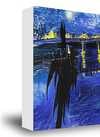
Beli rob €1
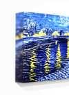
zamegljen rob €1
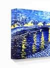
Razširjen rob €1
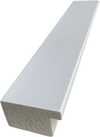
P118B €10
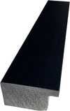
P118H €10
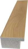
P118W €10
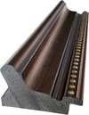
P438Z €10
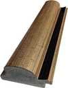
P508JH €12
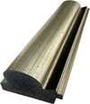
P508YH €12
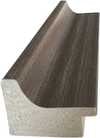
P805H €10
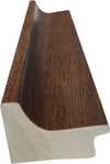
P805Z €10
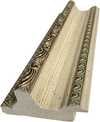
P919BZ €10
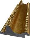
P919G €10
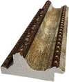
P919XJ €10
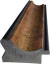
P959ZH €10
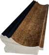
P968JZ €12
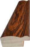
W106C €8
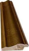
W218G €10
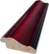
W218JH €8
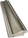
W218Y €10
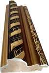
W307PJ €10
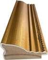
W316G €10
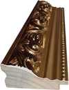
W316PJ €8
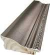
W316Y €10
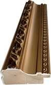
W398PJ €8
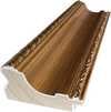
W4111J €10
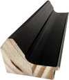
W500HY €15
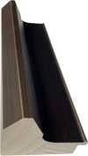
W500JH €15
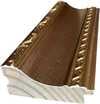
W692G €12
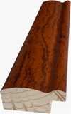
W849H €8
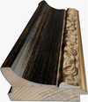
W940BG €15
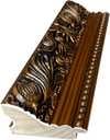
W953PJ €8
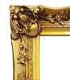
H24-GOLD €30

H24-SILVER €30
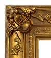
H36-GOLD €45
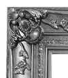
H36-SILVER €45
V okviru
Okvirni rob: . Celotna velikost z okvirjem: .
4 Četrtti korak od štirih
Nekaj možnosti končne obdelave
Vse so neobvezljive. Za odgovore, ki so že izbrani, ni dodatnih stroškov.
Globalna dostava () v 2 tednih namesto standardnih 4/5 tednov. (25 november)
Zvešča, kot v muzeju?
Podrobnosti o gravirani bronasti plošči
This elegant plaque features the artist's name and the title of the artwork, finely engraved for a timeless presentation.
It is made from bronze with a refined, elegant finish. The text is precisely laser-engraved for a sharp and permanent result. Measuring 9x2 cm, the plaque is compact yet easy to read. It's built to be durable and scratch-resistant, offering a professional, museum-quality look. Mounting is simple thanks to the included adhesive backing.
Podrobnosti o transparentni akrilni plošči
The plaque includes essential engraved details such as the artist's name, the title of the artwork, the date it was created, the type of media used-like oil on canvas or watercolor-a brief description of the piece, and a QR code that links to the complete artwork information.
It is crafted from clear acrylic, offering a sleek, modern appearance. The text is UV-engraved in black to ensure strong visual contrast. With a size of 10x15 cm, it ensures optimal readability. It comes equipped with two metal hooks for secure wall mounting. The plaque is designed to be weather-resistant, making it suitable for various environments, and it includes interactive features that work seamlessly with smartphone scanning.
Podrobnosti o črni akrilni plošči
This elegant plaque includes engraved information such as the artist's name, the title of the artwork, the date it was created, the type of media used (like oil on canvas or watercolor), a short description of the artwork, and a QR code for quick access to more information.
The plaque itself is made from refined black acrylic with a premium finish. The text is laser-engraved in white for high contrast and readability. Its size is 10x15 cm, designed to be easy to read. It comes with two metal hooks for professional mounting. The design is sleek and fits any interior style. It is also weather-resistant and durable, with built-in digital integration for mobile compatibility.
Zaščitni lak?
Kdaj jo potrebujete?
✓ Preverite in naročite
Vaša tiskanina, točno tako, kot ste jo naročili

Composition
Tehnik reprodukcije
Velikost reprodukcije
-

Okvir za reprodukcijo
-
-
Za umetniška dela ali reprodukcije, ki so po katerikoli strani širše od 105 cm (približno 41 palč), bo okvir poslan v razstavljeni obliki kot komplet. Ta metoda zagotavlja varno dostavo in preprečuje poškodbe med transportom.
Potrebna je profesionalna montaža – to ni izdelek za DIY izdelavo.
Komplet mora sestaviti in platno napeti izkušen profesionalni okvirjest, pri čemer bo uporabil lepil za les (ni vključeno), klešče za napetje platna in spone, da bi ohranil pravokotnost letev med sušenjem lepila. Nepravilna montaža ali neenakomerna napetost platna lahko trajno poškoduje umetniško del in
 Za umetniška dela ali reprodukcije, ki so po katerikoli strani širše od 105 cm (približno 41 palč), bo okvir poslan v razstavljeni obliki kot komplet. Ta metoda zagotavlja varno dostavo in preprečuje poškodbe med transportom.
Vključene so vse letve iz masivnega lesa, natančno izrezane po meri.
Montaža poteka s priloženimi vijaki, vendar je za kotiče potrebna lepil za les, ki ga ni v kompletu in ga mora zagotoviti vaš okvirnik.
Za uporabo so potrebna profesionalna orodja, ki niso vključena: klešče za napinjanje platna (napetnik) in sponke za ohranjanje pravokotnosti letev med sušenjem lepila.
Pomembno:
Za stike v kotih potrebujete lepil za les, nosilce je treba z

Značka z imenom
-
-

Zaščitni lak
Sijajni lak (poudarja barve ter zagotavlja zaščito pred svetlobo in vlago)
-

Hitra dostava
Hitra dostava po vsem svetu () v 2 tednih namesto standardnih 4/5 tednov. (25 november)
-
Hitra dostava
Globalna dostava () v 4 do 5 tednih. (2 december).
Vključeno v ceno
Skupna cena
€ 57
Možnost stekla je na voljo le za velikosti pod 110 cm
Vključeno v vsako naročilo
- Brezplačna ekspresna dostava po vsem svetu
- Visokokakovostno laneno platno
- Popolno zavarovanje pošiljke
- Garancija povračila carine in uvoznih davkov
- Garancija popolnega barvnega ujemanja
- 100-dnevno vračilo denarja, zagotovljen povratek sredstev
- Garancija 100% povračila denarja
- Popust pri večjem naročilu


Identification of Composition by Theo van Doesburg
The canvas known as Composition emerges from the mind of Theo van Doesburg, a work that captures a specific moment in 1923. This piece exists as a precise arrangement of form and color, born from a period of intense creative focus. The artist, Theo van Doesburg, brings a sense of equilibrium to the surface, translating abstract thought into a tangible presence. It is a work that demands attention through its structural clarity and its commitment to the principles of the De Stijl movement.
The history of this object is tied to a specific circle of thinkers and patrons. Antony Kok commissioned the work, setting it on its path through the hands of those who shaped the modern era. From there, the painting finds its way into the hands of Bart de Ligt (1883–1938), who becomes its first owner. This transition marks the beginning of a long lineage of stewardship, as the work moves from the artist's studio into a private collection where its presence remains constant.
Every line and color choice within Composition reflects the artist's pursuit of a universal visual language. As we observe the work, we see the direct result of a vision that seeks to strip away the unnecessary to find a fundamental truth. The painting remains a vital part of the history of abstraction, holding the weight of its 1923 origins in every carefully placed rectangle and primary hue.
Visual Composition and Geometric Elements
The canvas unfolds as a precise grid of rectangles, where vertical and horizontal lines intersect to dictate the movement of the eye. There is a profound sense of equilibrium achieved through this arrangement, as non-representational forms find their place within a structured, rhythmic order. The eye moves across the surface, guided by the intersections of these straight lines, finding balance in the way the shapes occupy the space. It is a study in pure geometry, where the subject matter is stripped of any external reference, leaving only the essence of form and relation.
Color acts as the primary force within this structured environment. The palette relies on the fundamental strength of red, yellow, and blue, which anchor the composition. These primary hues interact with a supporting cast of black, white, and grey, creating a tension between the boldest tones and the more neutral shades. The colors appear solid and flat, avoiding any blending or shading, which emphasizes the stark, clean nature of the geometric arrangement. Each rectangle holds its own weight, contributing to a visual language that seeks a universal harmony through simplicity.
Provenance and History of the Object
The history of this work begins in the creative atmosphere of Paris, where it finds its way from the artist's studio into the hands of Bart de Ligt. This acquisition likely occurs in late 1923, marking the start of a long and steady lineage. De Ligt, a man deeply connected to the avant-garde circles of the time, holds the piece within his personal collection until his passing in 1938.
From that moment, the painting enters a quiet, private chapter. It remains within the same family, passing through the hands of descendants for nearly a century. This continuity preserves the work's integrity, keeping it sheltered within a single domestic line since 1923. The colors and forms remain as they were when they first left the artist's side, held in a state of careful preservation through the decades.
Documented Interpretations and Artistic Debates
The canvas captures a moment of profound transition, acting as a key work within the artist's entire oeuvre. It reveals a growing complexity within his purist style, where the rigid logic of geometry begins to dance with a more nuanced sense of equilibrium. One senses the tension between the absolute and the evolving, as the lines and colors find a new, sophisticated rhythm. This evolution suggests a mind moving beyond simple shapes toward a more intricate visual language.
A deep connection between the realm of architecture and the act of painting pulses through the work. The composition feels less like a mere arrangement of pigment and more like a blueprint for a structured reality. This link is no accident; the artist himself articulated the concept behind its creation in the magazine Architectura on 17th July 1923. The painting exists as a bridge, where the spatial logic of built environments meets the spiritual pursuit of pure abstraction.
Related Works by the Same Artist
The evolution of this geometric language unfolds through several other pieces that trace the artist's shifting focus. One can look back to Composition XX from 1920 to see the early movements of these shapes. Nearby in the timeline, the 1923 work Study for a Composition offers a glimpse into the creative process behind these structured arrangements. These works exist as part of a continuous search for balance and order within the frame.
As the years progress, the compositions grow more complex and dynamic. The 1925 Counter composition XIV introduces a different energy to the grid. Later, the Simultaneous Counter-Composition from 1929–1930 pushes the boundaries of the aesthetic even further. Each piece captures a specific moment in a lifelong pursuit of a new visual language, moving from the rigid to the more fluid and experimental.
Vprašanja in odgovori
Na kakšen način je zasnovana barvna kompozicija dela "Composition" avtorja Theo Van Doesburg?
Barvna kompozicija dela "Composition" avtorja Theo Van Doesburg združuje Statement kontrast z Discordant Palette harmonijo.
Kdaj je nastalo in kateri slog predstavlja "Composition" avtorja Theo Van Doesburg?
"Composition" je nastalo leta 1923 v okviru gibanja De Stijl.
Katero temo in vzdušje združuje "Composition" avtorja Theo Van Doesburg?
"Composition" prikazuje red, blue, yellow, black, white, rectangles, lines, njegovo udejanjeno vzdušje pa je Minimalist.
Več o tej sliki
 Predogled v realnem okolju

 Kupite ročno slikano delo
 Pošlji
 Deli
 Podrobnosti o delu
 Priročnik


 Prenesi sliko
 Podobni izdelki
 Rentgenski posnetek
 Predvajaj diaporama
 Vprašanja in odgovori

 Statistika

Sorodni članki

Geometrična Abstraktna Umetnost: 10 Mojstrovin za Vaš Dom | ArtsDot.com
Odkrijte 10 mojstrovin geometrične abstrakcije! Mondrian, Malevich, Kandinsky in drugi. Zgodbe umetnikov, tehnike ter navdih za vaš dom. Kvalitetne reprodukcije slik na ArtsDot.com. Raziskajte celotno zbirko online!

Theo van Doesburg: Pioneering De Stijl & the Evolution of Neo-Plasticism
Explore the revolutionary De Stijl movement & Neo-Plasticism with our expert guide. Discover Piet Mondrian, Theo van Doesburg, and the lasting impact of this influential art style. Learn about collecting & investing in De Stijl masterpieces.

Piet Mondrian: Deconstructing Reality – A Study of Neo-Plasticism & Universal Harmony
Explore the revolutionary art of Piet Mondrian and the principles of Neo-Plasticism. Discover De Stijl's influence, iconic compositions like 'Composition with Red, Yellow and Blue,' and Mondrian’s lasting legacy on modern design.


