
Composition

- 41.0 x 33.0 cm


Картина подстраивается под ваш выбор: , .
Описание предмета коллекционирования
A balanced grid of primary red, blue, and yellow rectangles against black and white, reflecting a search for cosmic order in 1923.
 Читать далее
Биография художника
Голландский новатор «Де Стил», использующий основные цвета и геометрическую абстракцию для создания динамичных композиций из прямых линий и углов.
Закажите ваш в четыре простых шага
Не торопитесь. Вы можете изменить любой ответ; цена в вашей корзине будет обновляться после каждого выбора.
1 Шаг первый из четырех
На каком материале его напечатать?
Холст печатается жикле-чернилами и может быть натянут на подрамник или оформлен в раму как картина; бумага поставляется в плоском виде или в раме со стеклом.
2 Шаг второй из четырех
Какой размер вы бы хотели выбрать?
Эти размеры сохраняют пропорции оригинальной картины. На рисунке показано, как выбранный вами вариант будет смотреться на стене над двухметровым диваном.
Или укажите свои размеры
Выберите один из наших стандартных размеров, соответствующих оригинальным пропорциям произведения искусства.

Введите необходимую ширину и высоту, чтобы репродукция подошла к вашей раме или стене. При печати изображение можно только уменьшить, но нельзя увеличить больше оригинала, поэтому при выборе другого формата часть изображения может быть обрезана. Перед печатью мы отправим вам цифровой макет на утверждение. Изображение на этой странице не отображает реальную обрезку — ее можно увидеть только на макете.
3 Третий шаг из четырех
Как его подготовить: в рулоне, на подрамнике или в раме?
Ниже указаны цены для размера, выбранного вами на первом этапе.
Выберите тип обработки краев холста
Выберите свою раму
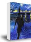
Белый торцевой край $1
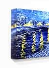
Размытый край $1
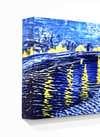
С продолжением изображения $1
P118B $10
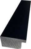
P118H $10
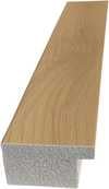
P118W $10
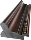
P438Z $10
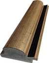
P508JH $12
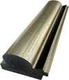
P508YH $12
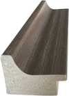
P805H $10
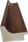
P805Z $10
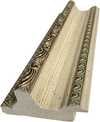
P919BZ $10
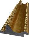
P919G $10
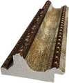
P919XJ $10
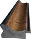
P959ZH $10
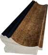
P968JZ $12
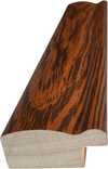
W106C $8
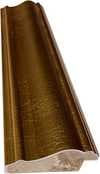
W218G $10
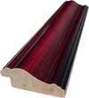
W218JH $8
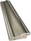
W218Y $10
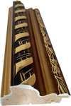
W307PJ $10
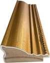
W316G $10
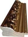
W316PJ $8
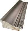
W316Y $10
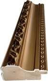
W398PJ $8
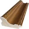
W4111J $10
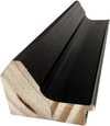
W500HY $15
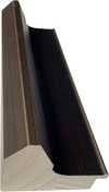
W500JH $15
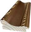
W692G $12
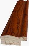
W849H $8
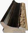
W940BG $15
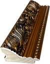
W953PJ $8
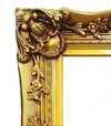
H24-GOLD $30

H24-SILVER $30
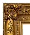
H36-GOLD $45
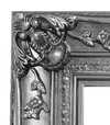
H36-SILVER $45
В раме
Багет: . Общий размер в раме: .
4 Четвертый шаг из четырех
Несколько вариантов отделки
Все они являются необязательными. Выбранные ответы не влекут за собой дополнительных расходов.
Доставка по всему миру () за 2 недели вместо стандартных 4–5 недель. (25 Ноябрь)
Табличка, как в музее?
Детали гравировки на бронзовой плакетке
This elegant plaque features the artist's name and the title of the artwork, finely engraved for a timeless presentation.
It is made from bronze with a refined, elegant finish. The text is precisely laser-engraved for a sharp and permanent result. Measuring 9x2 cm, the plaque is compact yet easy to read. It's built to be durable and scratch-resistant, offering a professional, museum-quality look. Mounting is simple thanks to the included adhesive backing.
Детали прозрачной акриловой таблички
The plaque includes essential engraved details such as the artist's name, the title of the artwork, the date it was created, the type of media used-like oil on canvas or watercolor-a brief description of the piece, and a QR code that links to the complete artwork information.
It is crafted from clear acrylic, offering a sleek, modern appearance. The text is UV-engraved in black to ensure strong visual contrast. With a size of 10x15 cm, it ensures optimal readability. It comes equipped with two metal hooks for secure wall mounting. The plaque is designed to be weather-resistant, making it suitable for various environments, and it includes interactive features that work seamlessly with smartphone scanning.
Информация о чёрной акриловой табличке
This elegant plaque includes engraved information such as the artist's name, the title of the artwork, the date it was created, the type of media used (like oil on canvas or watercolor), a short description of the artwork, and a QR code for quick access to more information.
The plaque itself is made from refined black acrylic with a premium finish. The text is laser-engraved in white for high contrast and readability. Its size is 10x15 cm, designed to be easy to read. It comes with two metal hooks for professional mounting. The design is sleek and fits any interior style. It is also weather-resistant and durable, with built-in digital integration for mobile compatibility.
Защитный лак?
Когда вам нужна доставка?
✓ Проверить и заказать
Ваш принт в соответствии с вашим заказом

Composition
Техника репродукции
Размер репродукции
-

Оформление репродукции
-
-
Для произведений искусства или репродукций, размер которых превышает 105 см (приблизительно 41 дюйм) по любой из сторон, рама будет доставлена в разобранном виде (в виде комплекта). Этот метод обеспечивает безопасную доставку и предотвращает повреждения при транспортировке.
Требуется профессиональная сборка — это не продукт для самостоятельной сборки (DIY).
Комплект должен быть собран, а холст натянут опытным мастером по багетным рамам с использованием клеевого ПВА (не входит в комплект), струбцин для натяжки холста и зажимов, чтобы удерживать подрамник ровным до полного высыхания клея. Неправильная сборка или неравномерное натяжение холста могут привести к необратимому повреждению произведения искусства и не являются гарантийным случаем.
 Для произведений искусства или репродукций, размер которых превышает 105 см (приблизительно 41 дюйм) по любой из сторон, рама будет доставлена в разобранном виде (в виде комплекта). Этот метод обеспечивает безопасную доставку и предотвращает повреждения при транспортировке.
В комплект входят все бруски из массива дерева, точно вырезанные по размеру.
Собирается с помощью предоставляемых винтов, а также столярного клея для угловых соединений, который не входит в комплект и должен быть приобретен вашим мастером.
Требуются профессиональные инструменты, не входящие в комплект: щипцы для натяжки холста (натяжитель) и зажимы, чтобы удерживать рейки ровно во время высыхания клея.
Важно:
Для соединения углов требуется клей для дерева, перекладины необходимо зафиксировать струбцинами до полного высыхания клея, а для натяжки холста на собранную раму требуются щипцы для натяжки холста. Ни один из этих инструментов не входит в комплект. Пожалуйста, убедитесь в наличии опытного мастера по багетным работам перед заказом рамы такого размера.

Этикетка
-
-

Защитный лак
Глянцевый лак (насыщает цвета, защищает от воздействия света и влаги)
-

Экспресс-доставка
Доставка по всему миру () за 2 недели вместо стандартных 4–5 недель. (25 Ноябрь)
-
Экспресс-доставка
Доставка по всему миру () в течение 4–5 недель. (2 Декабрь).
Включено в стоимость
Итоговая стоимость
$ 63
Вариант со стеклом доступен только для размеров менее 110 см
Включено в каждый заказ
- Бесплатная экспресс-доставка по всему миру
- Высококачественный льняной холст
- Полное страхование при доставке
- Гарантия возмещения таможенных пошлин
- Гарантия точного цветового соответствия
- 100-дневная гарантия возврата (только при обнаружении дефектов)
- Гарантия возврата 100% средств
- Скидка при оптовом заказе


Identification of Composition by Theo van Doesburg
The canvas known as Composition emerges from the mind of Theo van Doesburg, a work that captures a specific moment in 1923. This piece exists as a precise arrangement of form and color, born from a period of intense creative focus. The artist, Theo van Doesburg, brings a sense of equilibrium to the surface, translating abstract thought into a tangible presence. It is a work that demands attention through its structural clarity and its commitment to the principles of the De Stijl movement.
The history of this object is tied to a specific circle of thinkers and patrons. Antony Kok commissioned the work, setting it on its path through the hands of those who shaped the modern era. From there, the painting finds its way into the hands of Bart de Ligt (1883–1938), who becomes its first owner. This transition marks the beginning of a long lineage of stewardship, as the work moves from the artist's studio into a private collection where its presence remains constant.
Every line and color choice within Composition reflects the artist's pursuit of a universal visual language. As we observe the work, we see the direct result of a vision that seeks to strip away the unnecessary to find a fundamental truth. The painting remains a vital part of the history of abstraction, holding the weight of its 1923 origins in every carefully placed rectangle and primary hue.
Visual Composition and Geometric Elements
The canvas unfolds as a precise grid of rectangles, where vertical and horizontal lines intersect to dictate the movement of the eye. There is a profound sense of equilibrium achieved through this arrangement, as non-representational forms find their place within a structured, rhythmic order. The eye moves across the surface, guided by the intersections of these straight lines, finding balance in the way the shapes occupy the space. It is a study in pure geometry, where the subject matter is stripped of any external reference, leaving only the essence of form and relation.
Color acts as the primary force within this structured environment. The palette relies on the fundamental strength of red, yellow, and blue, which anchor the composition. These primary hues interact with a supporting cast of black, white, and grey, creating a tension between the boldest tones and the more neutral shades. The colors appear solid and flat, avoiding any blending or shading, which emphasizes the stark, clean nature of the geometric arrangement. Each rectangle holds its own weight, contributing to a visual language that seeks a universal harmony through simplicity.
Provenance and History of the Object
The history of this work begins in the creative atmosphere of Paris, where it finds its way from the artist's studio into the hands of Bart de Ligt. This acquisition likely occurs in late 1923, marking the start of a long and steady lineage. De Ligt, a man deeply connected to the avant-garde circles of the time, holds the piece within his personal collection until his passing in 1938.
From that moment, the painting enters a quiet, private chapter. It remains within the same family, passing through the hands of descendants for nearly a century. This continuity preserves the work's integrity, keeping it sheltered within a single domestic line since 1923. The colors and forms remain as they were when they first left the artist's side, held in a state of careful preservation through the decades.
Documented Interpretations and Artistic Debates
The canvas captures a moment of profound transition, acting as a key work within the artist's entire oeuvre. It reveals a growing complexity within his purist style, where the rigid logic of geometry begins to dance with a more nuanced sense of equilibrium. One senses the tension between the absolute and the evolving, as the lines and colors find a new, sophisticated rhythm. This evolution suggests a mind moving beyond simple shapes toward a more intricate visual language.
A deep connection between the realm of architecture and the act of painting pulses through the work. The composition feels less like a mere arrangement of pigment and more like a blueprint for a structured reality. This link is no accident; the artist himself articulated the concept behind its creation in the magazine Architectura on 17th July 1923. The painting exists as a bridge, where the spatial logic of built environments meets the spiritual pursuit of pure abstraction.
Related Works by the Same Artist
The evolution of this geometric language unfolds through several other pieces that trace the artist's shifting focus. One can look back to Composition XX from 1920 to see the early movements of these shapes. Nearby in the timeline, the 1923 work Study for a Composition offers a glimpse into the creative process behind these structured arrangements. These works exist as part of a continuous search for balance and order within the frame.
As the years progress, the compositions grow more complex and dynamic. The 1925 Counter composition XIV introduces a different energy to the grid. Later, the Simultaneous Counter-Composition from 1929–1930 pushes the boundaries of the aesthetic even further. Each piece captures a specific moment in a lifelong pursuit of a new visual language, moving from the rigid to the more fluid and experimental.
Вопросы и ответы
Как выстроена цветовая композиция в «Composition», Тео ван Дусбург?
Цветовой анализ «Composition», Тео ван Дусбург выявляет Statement контраст и Discordant Palette гармонию.
Как работа «Composition» соотносится с темами и стилем Тео ван Дусбург?
«Composition» разделяет с другими работами Тео ван Дусбург характерный стиль De Stijl и повторяющиеся темы: wassily kandinsky, de stijl movement, neoplasticism, geometric abstraction, total work of art.
Является ли произведение «Composition», Тео ван Дусбург общественным достоянием?
Что касается авторских прав, произведение «Composition» находится в общественное достояние — срок действия авторского права истёк.
Подробнее об этой картине
 Предпросмотр

 Купить картину ручной работы
 Поделиться
 Поделиться
 Детали произведения
 Руководство


 Скачать
 Похожие предметы
 Рентгенография
 Слайд-шоу
 Вопросы и ответы
 Статистика просмотров
Похожие произведения


Тео ван Дусбург
1883 - 1931, Нидерланды
Биография художника
The Architect of Abstraction: A Life in Geometric Harmony
Theo van Doesburg, born Christian Emil Marie Küpper in 1883 in Utrecht, Netherlands, wasn’t merely a painter; he was a revolutionary force who fundamentally reshaped the very foundations of modern art. His journey began amidst the lingering echoes of Impressionism and Post-Impressionism – initially mirroring styles reminiscent of Vincent van Gogh – both in subject matter and emotional intensity. However, this early phase served as a crucial prelude, a necessary stepping stone toward the radical transformation that would define his enduring legacy. A pivotal moment arrived in 1913 with his encounter with Wassily Kandinsky’s *Rückblicke*. This text ignited within van Doesburg a profound realization: true artistic expression lay not in replicating the external world but in channeling an inner, spiritual reality through pure abstraction. It was this conviction that birthed Neoplasticism – more commonly known as De Stijl – a movement he founded and fiercely championed, becoming its most ardent advocate.Forging a New Visual Language: The Principles of De Stijl
De Stijl wasn’t simply an artistic style; it was a comprehensive philosophical manifesto translated into visual form. Van Doesburg believed in stripping art down to its most essential elements – straight lines, right angles, and the primary colors of red, yellow, and blue, alongside black, white, and gray. This austere palette wasn't born from limitation but from a desire for universality—a belief that these fundamental forms resonated with an underlying cosmic order. He envisioned a *total* work of art, extending beyond the canvas to encompass architecture, design, and even everyday objects. Collaboration was key; van Doesburg worked closely with architects like J.J.P. Oud and Gerrit Rietveld, designing stained glass windows, furniture, and entire interiors that embodied the principles of De Stijl. His collaborations extended to fellow artists such as Piet Mondrian, with whom he co-founded the influential journal *De Stijl*, a platform for disseminating their ideas and attracting like-minded creatives. However, despite their shared origins, tensions arose between van Doesburg and Mondrian regarding the rigidity of Neoplasticism. Van Doesburg introduced “Elementarism” in 1926, advocating for diagonal lines and more dynamic compositions – a departure that ultimately led to a schism within the movement, revealing his restless spirit and constant pursuit of artistic evolution.The Early Years & Influences: From Impressionism to Kandinsky
Van Doesburg’s early artistic development was deeply influenced by the vibrant colors and emotional intensity of Vincent van Gogh. His initial paintings often depicted landscapes and portraits imbued with a sense of melancholy and introspection, mirroring Van Gogh's expressive brushstrokes and use of color. However, this early phase served as a crucial prelude, a necessary stepping stone toward the radical transformation that would define his enduring legacy. The turning point came in 1913 with his encounter with Wassily Kandinsky’s *Rückblicke*. This text, exploring the spiritual dimension of art and advocating for abstraction, profoundly impacted van Doesburg's artistic vision. He began to experiment with simplified forms and non-representational imagery, moving away from traditional subject matter and seeking a more direct connection to inner experience. The influence of Japanese prints – particularly their use of flat planes of color and geometric patterns – also played a significant role in shaping his aesthetic sensibilities.A Revolutionary Movement: The Birth of De Stijl
De Stijl, meaning “The Style,” emerged as a multifaceted movement encompassing painting, architecture, design, and typography. It wasn’t merely an artistic style; it was a comprehensive philosophical manifesto translated into visual form. Van Doesburg believed in stripping art down to its most essential elements – straight lines, right angles, and the primary colors of red, yellow, and blue, alongside black, white, and gray. This austere palette wasn't born from limitation but from a desire for universality—a belief that these fundamental forms resonated with an underlying cosmic order. He envisioned a *total* work of art, extending beyond the canvas to encompass architecture, design, and even everyday objects. The core tenets of De Stijl were rigorously defined: absolute geometric abstraction, the use of primary colors and neutral tones, and a rejection of illusionistic space. The group’s journal, *De Stijl*, became a vital vehicle for disseminating these ideas and attracting like-minded creatives, fostering a vibrant intellectual community dedicated to exploring the possibilities of pure abstraction.Beyond Painting: A Multifaceted Artistic Vision
While celebrated as a painter, van Doesburg’s artistic pursuits were remarkably diverse. He was a prolific writer, poet, and critic, using his pen to articulate the theoretical underpinnings of De Stijl and challenge conventional notions of art. His engagement with Dadaism in the early 1920s further broadened his artistic horizons, leading to experimental works that incorporated collage and typography. This period also saw him teaching at the Bauhaus, where he shared his ideas with a new generation of artists and designers. He wasn’t content to remain within the confines of traditional art forms; van Doesburg actively sought to integrate art into everyday life, believing it had the power to transform society. His designs for interiors and furniture weren't merely aesthetic exercises but attempts to create harmonious living spaces that reflected the principles of De Stijl. A prime example is his collaboration with Sophie Taeuber-Arp and Georges Vantongerloo on designing artist residences, showcasing a holistic approach to artistic creation – an attempt to build a world *in* the image of his ideals.Legacy & Enduring Influence: A Pioneer of Modernism
Theo van Doesburg’s life was tragically cut short in 1931 at the age of 47, yet his impact on modern art remains profound. De Stijl, though relatively short-lived as a cohesive movement, exerted an enormous influence on subsequent artistic developments, including Bauhaus design, Minimalism, and Constructivism. His emphasis on geometric abstraction, pure color, and functionalism continues to resonate with artists and designers today. His work serves as a reminder that art is not merely about representation but about the exploration of fundamental forms and ideas. Van Doesburg’s legacy extends beyond his paintings and designs; it lies in his unwavering commitment to artistic innovation and his belief in the transformative power of abstraction. His vision of a unified, harmonious world – expressed through the language of De Stijl – continues to inspire those who seek to create a more beautiful and meaningful environment.Key Works & Lasting Impact
- Study for Simultaneous Compositions XXII (1922): A quintessential example of Neoplasticism, showcasing the movement’s signature geometric forms and limited color palette.
- Composition with half values (1928): Demonstrates van Doesburg's exploration of tonal variations within the De Stijl aesthetic.
- Dancers (1917-1918): Represents a transitional phase in his work, blending figurative elements with emerging abstract tendencies.
- Collaboration on *De Stijl* journal: A crucial platform for disseminating the movement’s ideas and fostering dialogue among artists and intellectuals.
- Elementarism (1926): Van Doesburg's attempt to inject dynamism into Neoplasticism, introducing diagonal lines and a more fluid approach to composition.

Похожие статьи

Геометрическая абстракция: 10 шедевров, изменивших искусство | ArtsDot.com
Погрузитесь в мир геометрической абстракции! От Кандинского до Малевича – 10 шедевров, изменивших искусство. Узнайте историю создания и значение культовых картин. Репродукции музейного качества на ArtsDot.com. Вдохновение для вашего интерьера!

Piet Mondrian: Deconstructing Reality – A Study of Neo-Plasticism & Universal Harmony
Explore the revolutionary art of Piet Mondrian and the principles of Neo-Plasticism. Discover De Stijl's influence, iconic compositions like 'Composition with Red, Yellow and Blue,' and Mondrian’s lasting legacy on modern design.

От замысла к холсту: триада вдохновения – реализм, абстракция и поэтическое воображение в искусстве
Исследуйте триаду вдохновения в искусстве: реализм, абстракция и поэтическое воображение. Углубленный анализ техник, истории и роли воображения в создании шедевров. Откройте мир живописи с ArtsDot!