
Composition

- 41.0 x 33.0 cm


Imaginea respectă alegerile tale: , .
Descriere obiect de colecție
A balanced grid of primary red, blue, and yellow rectangles against black and white, reflecting a search for cosmic order in 1923.
 Vezi mai mult
Biografie artist
Pionier De Stijl, utilizând culorile primare și abstracția geometrică pentru compoziții dinamice din linii drepte și unghiuri drepte.
Comandă în patru pași simpli
Nu vă grăbiți. Puteți modifica orice răspuns; prețul din coșul de comandă se actualizează în funcție de fiecare alegere.
1 Pasul unu din patru
Pe ce suport ar trebui să fie tipărit?
Amprenta pe canvas este realizată cu cerneală giclée și poate fi întinsă pe șasiu sau înrămată ca o pictură; hârtia este livrată plată sau înrămată sub sticlă.
2 Pasul doi din patru
Ce dimensiune doriți?
Aceste dimensiuni păstrează proporțiile tabloului original. Ilustrația prezintă alegerea dumneavoastră pe un perete, deasupra unei canapele de doi metri.
Sau introduceți propriile dimensiuni
Alegeți dintre dimensiunile noastre prestabilite, care respectă proporțiile originale ale operei de artă.

Introduceți lățimea și înălțimea necesare pentru a se potrivi ramei sau peretelui dumneavoastră. O printare poate fi doar tăiată, niciodată extinsă dincolo de dimensiunea imaginii originale, astfel încât o dimensiune cu o formă diferită va pierde o parte din imagine. Vă trimitem o simulare digitală pentru aprobare înainte de a imprima orice. Imaginea afișată pe această pagină nu prezintă tăierea reală — doar simularea arată acest lucru.
3 Pasul trei din patru
Cum ar trebui pregătită: rulată, întinsă pe pânză sau înramată?
Prețurile de mai jos sunt pentru dimensiunea aleasă la primul pas.
Alege marginile tabloului pe pânză întinsă
Alege cadrul tău
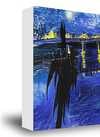
Alb lei1
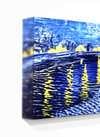
Margini difuze lei1
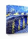
Extins lei1
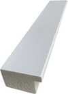
P118B lei10
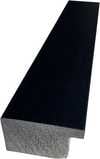
P118H lei10
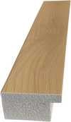
P118W lei10
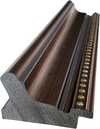
P438Z lei10
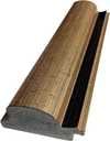
P508JH lei12

P508YH lei12
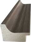
P805H lei10
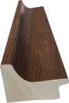
P805Z lei10
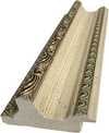
P919BZ lei10
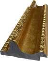
P919G lei10
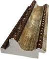
P919XJ lei10
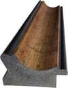
P959ZH lei10
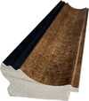
P968JZ lei12
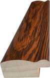
W106C lei8
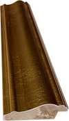
W218G lei10
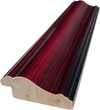
W218JH lei8
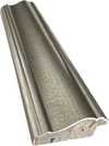
W218Y lei10
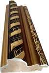
W307PJ lei10
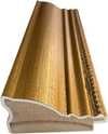
W316G lei10
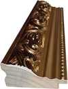
W316PJ lei8
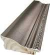
W316Y lei10
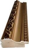
W398PJ lei8
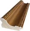
W4111J lei10
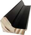
W500HY lei15
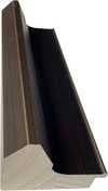
W500JH lei15
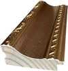
W692G lei12
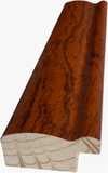
W849H lei8
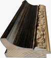
W940BG lei15
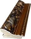
W953PJ lei8
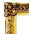
H24-GOLD lei30

H24-SILVER lei30
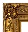
H36-GOLD lei45
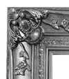
H36-SILVER lei45
Înramat
Ramă: . Dimensiuni cu ramă: .
4 Pasul patru din patru
Câteva opțiuni de finisare
Toate sunt opționale. Răspunsurile deja selectate nu implică costuri suplimentare.
Livrare în întreaga lume () în 2 săptămâni, în loc de cele 4/5 săptămâni standard. (25 Noiembrie)
O plăcuță de identificare, ca la muzeu?
Detalii plăcuță din bronz gravat
This elegant plaque features the artist's name and the title of the artwork, finely engraved for a timeless presentation.
It is made from bronze with a refined, elegant finish. The text is precisely laser-engraved for a sharp and permanent result. Measuring 9x2 cm, the plaque is compact yet easy to read. It's built to be durable and scratch-resistant, offering a professional, museum-quality look. Mounting is simple thanks to the included adhesive backing.
Detalii plăcuță din acril transparent
The plaque includes essential engraved details such as the artist's name, the title of the artwork, the date it was created, the type of media used-like oil on canvas or watercolor-a brief description of the piece, and a QR code that links to the complete artwork information.
It is crafted from clear acrylic, offering a sleek, modern appearance. The text is UV-engraved in black to ensure strong visual contrast. With a size of 10x15 cm, it ensures optimal readability. It comes equipped with two metal hooks for secure wall mounting. The plaque is designed to be weather-resistant, making it suitable for various environments, and it includes interactive features that work seamlessly with smartphone scanning.
Detalii placă din acril negru
This elegant plaque includes engraved information such as the artist's name, the title of the artwork, the date it was created, the type of media used (like oil on canvas or watercolor), a short description of the artwork, and a QR code for quick access to more information.
The plaque itself is made from refined black acrylic with a premium finish. The text is laser-engraved in white for high contrast and readability. Its size is 10x15 cm, designed to be easy to read. It comes with two metal hooks for professional mounting. The design is sleek and fits any interior style. It is also weather-resistant and durable, with built-in digital integration for mobile compatibility.
Un lac protector?
Când aveți nevoie de el?
✓ Verifică și comandă
Tipografia ta, așa cum ai comandat-o

Composition
Tehnică de reproducere
Dimensiune reproducere
-

Ramă pentru reproducere artistică
-
-
Pentru opere de artă sau reproduceri care depășesc 105 cm (aproximativ 41 de inch) pe oricare dintre laturi, cadrul va fi livrat demontat, sub formă de kit. Această metodă asigură o livrare sigură și previne deteriorarea în timpul transportului.
Este necesară asamblarea profesională – acest produs nu este de tip DIY (de făcut singur).
Kitul trebuie asamblat, iar pânza întinsă, de către un legător de cadre experimentat, utilizând adeziv pentru lemn (neinclus în colet), o cheie pentru întinderea pânzei și cleme pentru a menține barele la unghi drept în timp ce adezivul se usucă. Asamblarea incorectă sau tensiunea neuniformă a pânzei pot deteriora permanent opera de artă și nu sunt acoperite de garanția noastră.
 Pentru opere de artă sau reproduceri care depășesc 105 cm (aproximativ 41 de inch) pe oricare dintre laturi, cadrul va fi livrat demontat, sub formă de kit. Această metodă asigură o livrare sigură și previne deteriorarea în timpul transportului.
Toate barele din lemn masiv sunt incluse, tăiate cu precizie la dimensiunea necesară.
Asamblat cu șuruburile incluse, plus adeziv pentru lemn pentru îmbinările de colț, care nu este furnizat și trebuie achiziționat de către tâmplarul dumneavoastră.
Sunt necesare unelte profesionale care nu sunt incluse: o șipte de întindere a pânzei (tensionator) și cleme pentru a menține barele la unghi drept în timp ce adezivul se usucă.
Important:
Îmbinările de colț necesită adeziv pentru lemn, barele trebuie fixate cu clești de strângere până când adezivul este complet uscat, iar întinderea pânzei pe cadrul asamblat necesită un clește pentru întins pânza. Niciunul dintre aceste elemente nu este inclus în kit. Vă rugăm să consultați un încadrator profesionist cu experiență înainte de a comanda această dimensiune.

Etichetă de prezentare
-
-

Lac de protecție
Lac lucios (intensifică nuanțele și oferă protecție împotriva luminii și a umidității)
-

Livrare rapidă
Livrare la nivel mondial () în 2 săptămâni, în loc de cele 4/5 săptămâni standard. (25 Noiembrie)
-
Livrare rapidă
Livrare la nivel mondial în , în 4-5 săptămâni. (2 Decembrie).
Inclus
Preț total calculat
lei 302
Opțiunea cu sticlă este disponibilă doar pentru dimensiuni de sub 110 cm
Inclus în fiecare comandă
- Livrare expres gratuită la nivel mondial
- Pânză de in de înaltă calitate
- Asigurare completă pentru transport
- Garanție de rambursare a taxelor vamale
- Garanția fidelității culorilor
- Politica de retur în 100 de zile (doar pentru defecte de fabricație)
- Garanție de rambursare 100%
- Ofertă pentru comenzi multiple


Identification of Composition by Theo van Doesburg
The canvas known as Composition emerges from the mind of Theo van Doesburg, a work that captures a specific moment in 1923. This piece exists as a precise arrangement of form and color, born from a period of intense creative focus. The artist, Theo van Doesburg, brings a sense of equilibrium to the surface, translating abstract thought into a tangible presence. It is a work that demands attention through its structural clarity and its commitment to the principles of the De Stijl movement.
The history of this object is tied to a specific circle of thinkers and patrons. Antony Kok commissioned the work, setting it on its path through the hands of those who shaped the modern era. From there, the painting finds its way into the hands of Bart de Ligt (1883–1938), who becomes its first owner. This transition marks the beginning of a long lineage of stewardship, as the work moves from the artist's studio into a private collection where its presence remains constant.
Every line and color choice within Composition reflects the artist's pursuit of a universal visual language. As we observe the work, we see the direct result of a vision that seeks to strip away the unnecessary to find a fundamental truth. The painting remains a vital part of the history of abstraction, holding the weight of its 1923 origins in every carefully placed rectangle and primary hue.
Visual Composition and Geometric Elements
The canvas unfolds as a precise grid of rectangles, where vertical and horizontal lines intersect to dictate the movement of the eye. There is a profound sense of equilibrium achieved through this arrangement, as non-representational forms find their place within a structured, rhythmic order. The eye moves across the surface, guided by the intersections of these straight lines, finding balance in the way the shapes occupy the space. It is a study in pure geometry, where the subject matter is stripped of any external reference, leaving only the essence of form and relation.
Color acts as the primary force within this structured environment. The palette relies on the fundamental strength of red, yellow, and blue, which anchor the composition. These primary hues interact with a supporting cast of black, white, and grey, creating a tension between the boldest tones and the more neutral shades. The colors appear solid and flat, avoiding any blending or shading, which emphasizes the stark, clean nature of the geometric arrangement. Each rectangle holds its own weight, contributing to a visual language that seeks a universal harmony through simplicity.
Provenance and History of the Object
The history of this work begins in the creative atmosphere of Paris, where it finds its way from the artist's studio into the hands of Bart de Ligt. This acquisition likely occurs in late 1923, marking the start of a long and steady lineage. De Ligt, a man deeply connected to the avant-garde circles of the time, holds the piece within his personal collection until his passing in 1938.
From that moment, the painting enters a quiet, private chapter. It remains within the same family, passing through the hands of descendants for nearly a century. This continuity preserves the work's integrity, keeping it sheltered within a single domestic line since 1923. The colors and forms remain as they were when they first left the artist's side, held in a state of careful preservation through the decades.
Documented Interpretations and Artistic Debates
The canvas captures a moment of profound transition, acting as a key work within the artist's entire oeuvre. It reveals a growing complexity within his purist style, where the rigid logic of geometry begins to dance with a more nuanced sense of equilibrium. One senses the tension between the absolute and the evolving, as the lines and colors find a new, sophisticated rhythm. This evolution suggests a mind moving beyond simple shapes toward a more intricate visual language.
A deep connection between the realm of architecture and the act of painting pulses through the work. The composition feels less like a mere arrangement of pigment and more like a blueprint for a structured reality. This link is no accident; the artist himself articulated the concept behind its creation in the magazine Architectura on 17th July 1923. The painting exists as a bridge, where the spatial logic of built environments meets the spiritual pursuit of pure abstraction.
Related Works by the Same Artist
The evolution of this geometric language unfolds through several other pieces that trace the artist's shifting focus. One can look back to Composition XX from 1920 to see the early movements of these shapes. Nearby in the timeline, the 1923 work Study for a Composition offers a glimpse into the creative process behind these structured arrangements. These works exist as part of a continuous search for balance and order within the frame.
As the years progress, the compositions grow more complex and dynamic. The 1925 Counter composition XIV introduces a different energy to the grid. Later, the Simultaneous Counter-Composition from 1929–1930 pushes the boundaries of the aesthetic even further. Each piece captures a specific moment in a lifelong pursuit of a new visual language, moving from the rigid to the more fluid and experimental.
Întrebări și răspunsuri
Cum este construită compoziția cromatică a operei "Composition" de Theo van Doesburg?
Compoziția cromatică a operei "Composition" de Theo van Doesburg îmbină un Statement contrast cu o Discordant Palette armonie.
În ce perioadă și în ce stil a fost creat(ă) "Composition" de Theo van Doesburg?
„Composition” a fost creat în 1923, făcând parte din mișcarea De Stijl.
Ce subiect și ce atmosferă surprinde "Composition" de Theo van Doesburg?
„Composition” surprinde red, blue, yellow, black, white, rectangles, lines, având o atmosferă Minimalist.
Mai multe detalii despre această pictură
 Previzualizare

 Comandă pictură realizată manual
 Trimite prin felicitare
 Distribuie
 Detalii despre lucrare
 Ghid


 Descarcă imaginea
 Produse similare
 Radiografie
 Galerie foto
 Întrebări și răspunsuri
 Statistici
Opere similare


Theo van Doesburg
1883 - 1931, Țările de Jos
Biografie artist
The Architect of Abstraction: A Life in Geometric Harmony
Theo van Doesburg, born Christian Emil Marie Küpper in 1883 in Utrecht, Netherlands, wasn’t merely a painter; he was a revolutionary force who fundamentally reshaped the very foundations of modern art. His journey began amidst the lingering echoes of Impressionism and Post-Impressionism, initially mirroring styles reminiscent of Vincent van Gogh – both in subject matter and emotional intensity. However, this early phase served as a crucial prelude, a necessary stepping stone toward the radical transformation that would define his enduring legacy. A pivotal moment arrived in 1913 with his encounter with Wassily Kandinsky’s *Rückblicke*. This text sparked within van Doesburg a profound realization: true artistic expression lay not in replicating the external world but in channeling an inner, spiritual reality through pure abstraction. It was this conviction that birthed Neoplasticism, more commonly known as De Stijl – a movement he founded and fiercely championed, becoming its most ardent advocate.Forging a New Visual Language: The Principles of De Stijl
De Stijl wasn’t merely an artistic style; it was a comprehensive philosophical manifesto translated into visual form. Van Doesburg believed in stripping art down to its most essential elements – straight lines, right angles, and the primary colors of red, yellow, and blue, alongside black, white, and gray. This austere palette wasn't born from limitation but from a desire for universality—a belief that these fundamental forms resonated with an underlying cosmic order. He envisioned a *total* work of art, extending beyond the canvas to encompass architecture, design, and even everyday objects. Collaboration was key; van Doesburg worked closely with architects like J.J.P. Oud and Gerrit Rietveld, designing stained glass windows, furniture, and entire interiors that embodied the principles of De Stijl. His collaborations extended to fellow artists such as Piet Mondrian, with whom he co-founded the influential journal *De Stijl*, a platform for disseminating their ideas and attracting like-minded creatives. However, despite their shared origins, tensions arose between van Doesburg and Mondrian regarding the rigidity of Neoplasticism. Van Doesburg introduced “Elementarism” in 1926, advocating for diagonal lines and more dynamic compositions – a departure that ultimately led to a schism within the movement, revealing his restless spirit and constant pursuit of artistic evolution.The Early Years & The Seeds of Abstraction
Theo van Doesburg’s early life was marked by a surprising lack of formal artistic training. Born into a family of artists—his father, Wilhelm Küpper, was a photographer—he initially pursued acting and singing before finding his calling as a shop assistant. This seemingly mundane occupation provided him with a keen eye for detail and an appreciation for the beauty of everyday objects – qualities that would later inform his artistic vision. It wasn’t until 1908, when he exhibited his paintings in the Hague, that he began to establish himself as a serious artist. His early works were characterized by a sensitivity reminiscent of Vincent van Gogh—both in subject matter and emotional intensity. However, this initial phase served as a crucial prelude, a necessary stepping stone toward the radical transformation that would define his enduring legacy. The turning point arrived in 1913 with his encounter with Wassily Kandinsky’s *Rückblicke*. This text sparked within van Doesburg a profound realization: true artistic expression lay not in replicating the external world but in channeling an inner, spiritual reality through pure abstraction.The Birth of De Stijl & The Pursuit of Totality
In 1917, amidst the turmoil of World War I, Theo van Doesburg, along with Piet Mondrian, Bart van der Leck, and others, founded *De Stijl* (The Style), a journal dedicated to exploring the principles of pure abstraction. They sought to create a “total work of art” – an encompassing aesthetic that extended beyond painting to encompass architecture, design, and all aspects of human experience. This ambition led them to develop a rigorous set of rules: only primary colors, straight lines, right angles, and black and white were permitted. The goal was to achieve a sense of harmony and universality through the reduction of form to its most essential elements. *De Stijl* quickly became a focal point for avant-garde artists and designers, shaping the visual language of the interwar period.Beyond Painting: A Multifaceted Artistic Vision
While celebrated as a painter, van Doesburg’s artistic pursuits were remarkably diverse. He was a prolific writer, poet, critic, and designer, using his pen to articulate the theoretical underpinnings of De Stijl and challenge conventional notions of art. His engagement with Dadaism in the early 1920s further broadened his artistic horizons, leading to experimental works that incorporated collage and typography. This period also saw him teaching at the Bauhaus, where he shared his ideas with a new generation of artists and designers. He wasn’t content to remain within the confines of traditional art forms; van Doesburg actively sought to integrate art into everyday life, believing it had the power to transform society. His designs for interiors and furniture weren't merely aesthetic exercises but attempts to create harmonious living spaces that reflected the principles of De Stijl.Legacy & Lasting Influence
Theo van Doesburg’s life was tragically cut short in 1931 at the age of 47, yet his impact on modern art remains profound. De Stijl, though relatively short-lived as a cohesive movement, exerted an enormous influence on subsequent artistic developments, including Bauhaus design, Minimalism, and Constructivism. His emphasis on geometric abstraction, pure color, and functionalism continues to resonate with artists and designers today. His work serves as a reminder that art is not merely about representation but about the exploration of fundamental forms and ideas. Van Doesburg’s legacy extends beyond his paintings and designs; it lies in his unwavering commitment to artistic innovation and his belief in the transformative power of abstraction. His vision of a unified, harmonious world – expressed through the language of De Stijl – continues to inspire those who seek to create a more beautiful and meaningful environment.
Articole similare

Cele mai importante 10 capodopere ale abstracției geometrice | Artă & Decor de lux pe ArtsDot.com
Descoperă cele mai importante 10 capodopere ale abstracției geometrice! Explorează istoria, artiștii (Mondrian, Kandinsky) și culorile vibrante care au definit arta modernă. Reproduceri de tablouri de lux pe ArtsDot.com pentru un decor interior rafinat. Explorează colecția online!

Piet Mondrian: Deconstructing Reality – A Study of Neo-Plasticism & Universal Harmony
Explore the revolutionary art of Piet Mondrian and the principles of Neo-Plasticism. Discover De Stijl's influence, iconic compositions like 'Composition with Red, Yellow and Blue,' and Mondrian’s lasting legacy on modern design.

Triada Viziunii Artistice: Realism, Abstracțiune și Imaginație Poetică în Transformarea Inspirației
Explorați triada viziunii artistice: realism, abstracțiune și imaginație poetică. Analize detaliate, istoria artei și inspirații pentru colecționari și pasionați. Descoperiți secretele creației!