


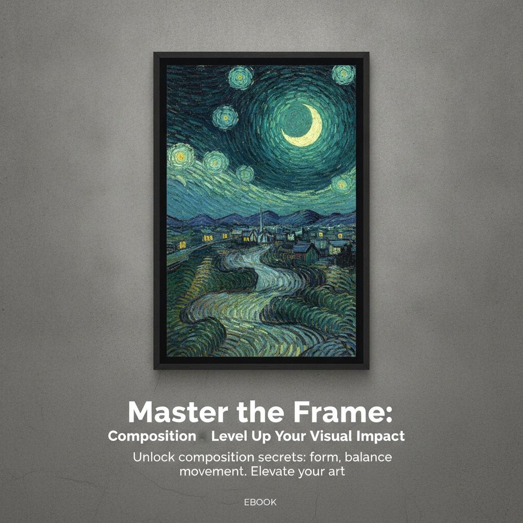
The Architecture of Vision: Understanding Composition as Visual Grammar
 Composition (visual arts)
In visual arts, composition (meaning "putting together") is the organization of an artwork. It is often used interchangeably with various terms such as design, form, visual ordering, or formal structure, depending on the context. In graphic design fo...
To gaze upon a masterpiece is to enter into a silent, profound dialogue with the artist—a conversation structured not by spoken words, but by the deliberate and masterful arrangement of form, light, and space. For the dedicated art student or the design-conscious collector, understanding composition is akin to learning the grammar of a visual language. It is the invisible scaffolding that supports the emotional weight of every canvas, guiding the eye from the initial moment of encounter through a carefully choreographed journey of discovery. Composition is never merely about where an object sits; it is about the tension between presence and absence, the balance of weight, and the rhythmic pulse of lines that direct our gaze.
In the realm of visual arts, composition—often referred to as design, form, or formal structure—is the fundamental organization of an artwork. It is important to distinguish the composition from the subject itself. While a subject might be a specific person, a landscape, or even a moment from a story, the composition is the way those elements are orchestrated within the frame. Whether we are analyzing the structured chaos of street art or the clean, geometric precision of an abstract piece, we are essentially reading the artist's intent through their use of visual ordering. This structural intent ensures that even the most ephemeral moment feels anchored in a lasting, structural truth.
The Power of Placement: Mastering the Rule of Thirds and the Golden Ratio
 Rule of thirds
The rule of thirds is a rule of thumb for composing visual art such as designs, films, paintings, and photographs. The guideline proposes that an image should be imagined as divided into nine equal parts by two equally spaced horizontal lines and two...
One of the most accessible yet profound tools in an artist's repertoire is the Rule of Thirds, a principle that avoids the static nature of perfect symmetry to create a more organic sense of equilibrium. By mentally dividing a canvas into a grid of nine equal rectangles, the artist identifies four key intersection points. Placing the primary subject—perhaps the piercing gaze of a sitter or the delicate curve of a neck—along these lines or at their intersections prevents the composition from feeling stagnant. This technique creates a breathing space that invites the viewer to contemplate the subject's psychological depth, injecting energy and interest into the frame.
Beyond the Rule of Thirds lies the more complex, mathematical elegance of the Golden Ratio. This ratio, found throughout nature and classical architecture, offers a blueprint for creating compositions that feel inherently "right" to the human eye. When artists utilize these mathematical proportions, they tap into a universal sense of harmony. It is about finding that sweet spot where the arrangement feels both spontaneous and mathematically inevitable. Mastering these placement secrets allows an artist to move beyond mere decoration and toward the creation of works that resonate on a deeper, almost instinctive level.
Dynamic Energy: Using Diagonals and Lines to Direct the Viewer's Eye
 Art Composition Secrets: Mastering the Rule of Thirds, Golden Ratio, and Diagonals for Professional Designers
Foundations of Visual Order: Why Composition is Critical in Hospitality Design The Eloquence of Arrangement: Exploring Compositional Strategies in Western Art Introduction: The Foundations of Visual Harmony Unlocking Beauty: A Beginner's Guide to App...
Lines are much more than simple marks on a surface; they are optical phenomena that allow the artist to direct the eye of the viewer. They act as visual paths, creating a continuous arrangement of elements that the viewer unconsciously "reads." These lines can be literal, such as the sharp edges of a geometric shape or the structural beams in an urban landscape, or they can be implied through the borders of contrasting colors and sequences of discrete elements. When used effectively, lines create movement, leading the gaze from one focal point to another in a controlled, rhythmic dance.
Diagonals, in particular, serve as powerful engines of dynamism. While horizontal lines often suggest stability and rest, and vertical lines evoke strength and height, diagonals introduce tension and action. A diagonal line cutting through a composition can disrupt a sense of stillness, injecting a feeling of motion or even instability. This is particularly evident in modern graphic works where sharp, intersecting diagonals create a high-impact, energetic atmosphere. By manipulating these directional forces, an artist can dictate the tempo of the visual experience, accelerating or slowing down the viewer's journey through the piece.
Balance and Tension: Navigating Symmetry, Asymmetry, and Negative Space
Design principles are fundamental guidelines or concepts in the visual arts used to help viewers understand a given scene. == Principles == Generally, design principles guide the viewer's attention by manipulating various aspects of a visual idea. Th...
At its core, composition is a study in balance—the principle governing how we distribute elements to achieve stability or intentional unease. Balanced designs tend to appear calm, stable, and natural, often achieved through symmetry. However, the most captivating works often embrace asymmetry, finding equilibrium through the careful weighing of different visual forces. This might involve balancing a large, dark mass with several smaller, brightly colored shapes, or offsetting a heavy subject with an expansive area of empty space.
< p>This brings us to the critical role of negative space, also known as white space. The relationship between the "figure" (the positive shape) and the "ground" (the surrounding area) is essential for defining boundaries and providing visual relief. We must remember that when designing positive shapes, we are simultaneously designing the negative space around them. Effective use of negative space prevents a composition from feeling cluttered and allows the primary subjects to breathe. It provides the necessary contrast that makes the focal points pop, ensuring that the eye is never overwhelmed but always engaged.The Geometry of Abstraction: Lessons from Neoplasticism and De Stijl
 Composition (no. III) blanc-jaune / Composition with Red, Yellow, and Blue
A Geometric Harmony: Exploring Piet Mondrian’s Composition (no. III) blanc-jaune The painting *Composition with Red, Yellow, and Blue*, created in 1942 during the tumultuous years of World War II, stands as a testament to Piet Mondrian's unwavering p...
In the pursuit of pure abstraction, artists like Piet Mondrian revolutionized the concept of composition by stripping art down to its most fundamental elements. The movement known as Neoplasticism sought to reject traditional illusionistic techniques in favor of a radical simplification of form. In works such as Composition 10 or Composition with Red, Yellow, and Blue, we see a profound reliance on the grid—a structure of thick black lines intersecting to form rectangular shapes. This approach uses straight lines and right angles to achieve maximum clarity and impact, aiming for a universal visual language.
This geometric revelation is not about emptiness, but about a deliberate reduction to complexity rather than an avoidance of it. By utilizing primary colors and a restricted palette, these artists explored the interplay between stability and movement. The grid symbolizes structure and order, while the placement of colored blocks creates an asymmetrical balance that is deceptively simple yet remarkably effective. Studying these works teaches us how to use scale, color, and shape to express profound truths without the need for representational subject matter, proving that even the most austere arrangement can possess a deep, rhythmic pulse.
Beyond the Subject: How Composition Defines Emotional Impact
 Harmonious Hues: 10 Masterpieces of Balanced Color |
Introduction Color, at its heart, is emotion made visible. It’s a language older than words, capable of stirring memories, evoking moods, and shaping our very perception of reality. But true mastery isn't simply about *using* color; it’s about achiev...
Ultimately, the mastery of composition allows an artist to move beyond what is depicted to how it is felt. The composition is the silent architect of emotion. A tightly cropped, centered composition might evoke feelings of intimacy or even claustrophobia, while a wide, expansive composition with significant negative space can inspire awe and tranquility. The way we use scale—making certain elements larger to emphasize importance or using size differences to create depth—directly influences the viewer's psychological response.
Whether you are exploring the bold, high-impact energy of Pop Art or the textured, impasto layers of a custom oil reproduction, composition remains your most powerful tool for communication. It is the difference between a mere image and a masterpiece. By mastering these structural secrets—the Rule of Thirds, the tension of diagonals, and the balance of space—you gain the ability to command attention and leave a lasting impression on anyone who enters into the silent dialogue with your work.


