
Composition

- 41.0 x 33.0 cm


Het werk volgt uw keuzes: , .
Beschrijving verzamelobject
A balanced grid of primary red, blue, and yellow rectangles against black and white, reflecting a search for cosmic order in 1923.
 Lees meer
Biografie kunstenaar
Nederlandse pionier van De Stijl die primaire kleuren en geometrische abstractie gebruikt voor dynamische composities met rechte lijnen en hoeken.
Bestel uw in vier eenvoudige stappen
Neem de tijd. U kunt elk antwoord nog wijzigen; de prijs in uw besteloverzicht wordt direct aangepast aan elke keuze.
1 Stap één van de vier
Op welk medium moet het worden afgedrukt?
Canvas wordt gedrukt met giclée-inkten en kan worden opgespannen of ingelijst als een schilderij; papier wordt plat geleverd, of ingelijst achter glas.
2 Stap twee van vier
Welke maat wilt u kiezen?
Deze formaten behouden de proporties van het originele schilderij. De tekening laat uw keuze zien op een muur, boven een bank van twee meter.
Of geef uw eigen afmetingen op
Kies uit onze vooraf ingestelde maten die overeenkomen met de originele verhoudingen van het kunstwerk.

Voer de gewenste breedte en hoogte in, passend bij uw lijst of muur. Een afdruk kan alleen worden ingekort en nooit groter worden gemaakt dan het origineel; een formaat met andere verhoudingen zal daarom een deel van de afbeelding verliezen. Wij sturen u een digitaal mockup ter goedkeuring voordat we tot drukwerk overgaan. De afbeelding op deze pagina toont niet de werkelijke uitsnede — dit is alleen te zien op het mockup.
3 Stap drie van vier
Hoe moet het worden geleverd: gerold, opgespannen of ingelijst?
De onderstaande prijzen zijn voor de maat die u in stap één heeft gekozen.
Kies de randen van het canvas
Kies uw lijst
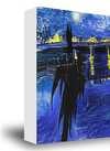
Wit €1
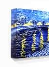
Vervagende randen €1
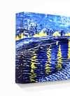
Doorlopende rand €1
P118B €10
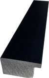
P118H €10
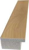
P118W €10
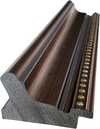
P438Z €10
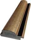
P508JH €12
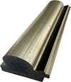
P508YH €12
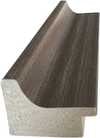
P805H €10
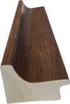
P805Z €10
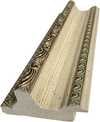
P919BZ €10
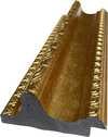
P919G €10
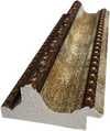
P919XJ €10
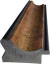
P959ZH €10
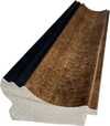
P968JZ €12
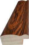
W106C €8
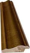
W218G €10
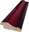
W218JH €8
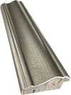
W218Y €10
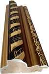
W307PJ €10
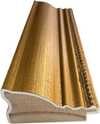
W316G €10
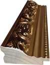
W316PJ €8
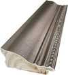
W316Y €10
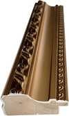
W398PJ €8
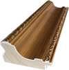
W4111J €10
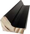
W500HY €15
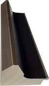
W500JH €15
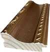
W692G €12
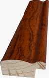
W849H €8
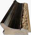
W940BG €15
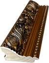
W953PJ €8
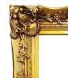
H24-GOLD €30

H24-SILVER €30
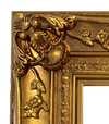
H36-GOLD €45
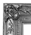
H36-SILVER €45
Ingelijst
Lijstrand: . Totale afmetingen inclusief lijst: .
4 Stap vier van vier
Enkele afwerkingsopties
Ze zijn allemaal optioneel. De reeds geselecteerde antwoorden brengen geen extra kosten met zich mee.
Wereldwijde levering () binnen 2 weken in plaats van de standaard 4/5 weken. (25 november)
Een naambordje, zoals in een museum?
Details van de gegraveerde bronzen plaat
This elegant plaque features the artist's name and the title of the artwork, finely engraved for a timeless presentation.
It is made from bronze with a refined, elegant finish. The text is precisely laser-engraved for a sharp and permanent result. Measuring 9x2 cm, the plaque is compact yet easy to read. It's built to be durable and scratch-resistant, offering a professional, museum-quality look. Mounting is simple thanks to the included adhesive backing.
Details transparante acrylplaat
The plaque includes essential engraved details such as the artist's name, the title of the artwork, the date it was created, the type of media used-like oil on canvas or watercolor-a brief description of the piece, and a QR code that links to the complete artwork information.
It is crafted from clear acrylic, offering a sleek, modern appearance. The text is UV-engraved in black to ensure strong visual contrast. With a size of 10x15 cm, it ensures optimal readability. It comes equipped with two metal hooks for secure wall mounting. The plaque is designed to be weather-resistant, making it suitable for various environments, and it includes interactive features that work seamlessly with smartphone scanning.
Details zwarte acrylplaat
This elegant plaque includes engraved information such as the artist's name, the title of the artwork, the date it was created, the type of media used (like oil on canvas or watercolor), a short description of the artwork, and a QR code for quick access to more information.
The plaque itself is made from refined black acrylic with a premium finish. The text is laser-engraved in white for high contrast and readability. Its size is 10x15 cm, designed to be easy to read. It comes with two metal hooks for professional mounting. The design is sleek and fits any interior style. It is also weather-resistant and durable, with built-in digital integration for mobile compatibility.
Een beschermende vernis?
Wanneer heeft u het nodig?
✓ Controleren en bestellen
Uw print, zoals u deze heeft besteld

Composition
Druktechniek
Afmetingen reproductie
-

Lijst voor reproductie
-
-
Voor kunstwerken of reproducties die aan één zijde groter zijn dan 105 cm (ongeveer 41 inch), wordt de lijst als een losse set verzonden. Deze methode garandeert een veilige levering en voorkomt schade tijdens het transport.
Professionele montage vereist - dit is geen doe-het-zelfproduct.
De set moet worden gemonteerd en het canvas moet worden gespannen door een ervaren professionele lijstenmaker, met gebruik van houtlijm (niet inbegrepen), een doekspanter en klemmen om de sponningen recht te houden terwijl de lijm droogt. Onjuiste montage of een ongelijkmatige spanning op het canvas kan het kunstwerk permanent beschadigen en wordt niet gedekt door onze garantie.
 Voor kunstwerken of reproducties die aan één zijde groter zijn dan 105 cm (ongeveer 41 inch), wordt de lijst als een losse set verzonden. Deze methode garandeert een veilige levering en voorkomt schade tijdens het transport.
Alle massief houten onderdelen zijn inbegrepen, nauwkeurig op maat gesneden voor montage.
Te monteren met de meegeleverde schroeven, plus houtlijm voor de hoekverbindingen, die niet wordt meegeleverd en door uw lijstenmaker moet worden aangeschaft.
Professioneel gereedschap is vereist en niet inbegrepen: een spanner voor canvas en klemmen om de latten recht te houden terwijl de lijm droogt.
Belangrijk:
De hoekverbindingen vereisen houtlijm, de latten moeten met lijmklemmen worden vastgehouden tot de lijm volledig is opgedroogd, en het spannen van het canvas op het samengestelde frame vereist een doekspanter. Geen van deze artikelen is inbegrepen in de set. Wij adviseren u om een ervaren professionele lijstenmaker te raadplegen voordat u deze maat bestelt.

Naamplaatje
-
-

Beschermende vernislaag
Glanzende vernis (versterkt de kleuren en biedt bescherming tegen licht en vocht)
-

Spoedlevering
Wereldwijde levering () binnen 2 weken in plaats van de standaard 4/5 weken. (25 november)
-
Spoedlevering
Wereldwijde levering () binnen 4/5 weken. (2 december).
Inbegrepen
Eindtotaal
€ 57
De optie voor glas is alleen beschikbaar bij een formaat kleiner dan 110 cm.
Inbegrepen bij elke bestelling
- Gratis wereldwijde expressverzending
- Hoogwaardig linnen canvas
- Volledige verzendverzekering
- Garantie op terugbetaling van invoerrechten
- Garantie op exacte kleurweergave
- Retourbeleid van 100 dagen (alleen bij defecten)
- 100% Geld-terug-garantie
- Korting bij meerdere afnames


Identification of Composition by Theo van Doesburg
The canvas known as Composition emerges from the mind of Theo van Doesburg, a work that captures a specific moment in 1923. This piece exists as a precise arrangement of form and color, born from a period of intense creative focus. The artist, Theo van Doesburg, brings a sense of equilibrium to the surface, translating abstract thought into a tangible presence. It is a work that demands attention through its structural clarity and its commitment to the principles of the De Stijl movement.
The history of this object is tied to a specific circle of thinkers and patrons. Antony Kok commissioned the work, setting it on its path through the hands of those who shaped the modern era. From there, the painting finds its way into the hands of Bart de Ligt (1883–1938), who becomes its first owner. This transition marks the beginning of a long lineage of stewardship, as the work moves from the artist's studio into a private collection where its presence remains constant.
Every line and color choice within Composition reflects the artist's pursuit of a universal visual language. As we observe the work, we see the direct result of a vision that seeks to strip away the unnecessary to find a fundamental truth. The painting remains a vital part of the history of abstraction, holding the weight of its 1923 origins in every carefully placed rectangle and primary hue.
Visual Composition and Geometric Elements
The canvas unfolds as a precise grid of rectangles, where vertical and horizontal lines intersect to dictate the movement of the eye. There is a profound sense of equilibrium achieved through this arrangement, as non-representational forms find their place within a structured, rhythmic order. The eye moves across the surface, guided by the intersections of these straight lines, finding balance in the way the shapes occupy the space. It is a study in pure geometry, where the subject matter is stripped of any external reference, leaving only the essence of form and relation.
Color acts as the primary force within this structured environment. The palette relies on the fundamental strength of red, yellow, and blue, which anchor the composition. These primary hues interact with a supporting cast of black, white, and grey, creating a tension between the boldest tones and the more neutral shades. The colors appear solid and flat, avoiding any blending or shading, which emphasizes the stark, clean nature of the geometric arrangement. Each rectangle holds its own weight, contributing to a visual language that seeks a universal harmony through simplicity.
Provenance and History of the Object
The history of this work begins in the creative atmosphere of Paris, where it finds its way from the artist's studio into the hands of Bart de Ligt. This acquisition likely occurs in late 1923, marking the start of a long and steady lineage. De Ligt, a man deeply connected to the avant-garde circles of the time, holds the piece within his personal collection until his passing in 1938.
From that moment, the painting enters a quiet, private chapter. It remains within the same family, passing through the hands of descendants for nearly a century. This continuity preserves the work's integrity, keeping it sheltered within a single domestic line since 1923. The colors and forms remain as they were when they first left the artist's side, held in a state of careful preservation through the decades.
Documented Interpretations and Artistic Debates
The canvas captures a moment of profound transition, acting as a key work within the artist's entire oeuvre. It reveals a growing complexity within his purist style, where the rigid logic of geometry begins to dance with a more nuanced sense of equilibrium. One senses the tension between the absolute and the evolving, as the lines and colors find a new, sophisticated rhythm. This evolution suggests a mind moving beyond simple shapes toward a more intricate visual language.
A deep connection between the realm of architecture and the act of painting pulses through the work. The composition feels less like a mere arrangement of pigment and more like a blueprint for a structured reality. This link is no accident; the artist himself articulated the concept behind its creation in the magazine Architectura on 17th July 1923. The painting exists as a bridge, where the spatial logic of built environments meets the spiritual pursuit of pure abstraction.
Related Works by the Same Artist
The evolution of this geometric language unfolds through several other pieces that trace the artist's shifting focus. One can look back to Composition XX from 1920 to see the early movements of these shapes. Nearby in the timeline, the 1923 work Study for a Composition offers a glimpse into the creative process behind these structured arrangements. These works exist as part of a continuous search for balance and order within the frame.
As the years progress, the compositions grow more complex and dynamic. The 1925 Counter composition XIV introduces a different energy to the grid. Later, the Simultaneous Counter-Composition from 1929–1930 pushes the boundaries of the aesthetic even further. Each piece captures a specific moment in a lifelong pursuit of a new visual language, moving from the rigid to the more fluid and experimental.
Veelgestelde vragen
Hoe is de kleurcompositie van "Composition" door Theo van Doesburg opgebouwd?
De kleuranalyse van "Composition" door Theo van Doesburg legt een Statement contrast en een Discordant Palette harmonie vast.
Hoe past "Composition" binnen de thema's en stijl van Theo van Doesburg?
"Composition" deelt met andere werken van Theo van Doesburg de De Stijl-stijl en de terugkerende thema's: wassily kandinsky, de stijl movement, neoplasticism, geometric abstraction, total work of art.
Behoort "Composition" door Theo van Doesburg tot het publiek domein?
Wat betreft het auteursrecht valt "Composition" onder bevindt zich in het publiek domein - de auteursrechten zijn verlopen.
Meer over dit schilderij
 Voorvertoning

 Bestel handgeschilderde reproductie
 Verstuur
 Delen
 Details bekijken
 Gids


 Download
 Vergelijkbare items
 Röntgenonderzoek
 Diavoorstelling
 Vraag & antwoord
 Statistieken
Vergelijkbare kunstwerken


Theo van Doesburg
1883 - 1931, Nederland
Biografie kunstenaar
The Architect of Abstraction: A Life in Geometric Harmony
Theo van Doesburg, born Christian Emil Marie Küpper in Utrecht on August 30, 1883, wasn’t merely a painter; he was a revolutionary force who fundamentally reshaped the landscape of modern art. His journey began not within the familiar embrace of Impressionism or Post-Impressionism, but amidst their fading echoes – initially mirroring styles reminiscent of Vincent van Gogh, both in the raw emotion conveyed and the directness of his brushstrokes. However, this early phase served as a crucial, almost instinctive, prelude, a necessary stepping stone towards the radical transformation that would define his enduring legacy. A pivotal moment arrived in 1913 with an encounter that irrevocably altered his artistic trajectory: Wassily Kandinsky’s *Rückblicke*. This text, a profound exploration of spirituality and abstraction, ignited within van Doesburg a seismic realization – true artistic expression wasn't found in faithfully replicating the external world but in channeling an inner, spiritual reality through pure, unadulterated form. It was this conviction that birthed Neoplasticism, more commonly known as De Stijl – a movement he founded and fiercely championed, becoming its most ardent and uncompromising advocate.Forging a New Visual Language: The Principles of De Stijl
De Stijl wasn’t simply an artistic style; it was a comprehensive philosophical manifesto translated into visual form, a radical attempt to distill art down to its purest essence. Van Doesburg believed in stripping away all extraneous detail, reducing painting, architecture, design, and even everyday objects to their most fundamental elements: straight lines, right angles, and the primary colors of red, yellow, and blue, alongside black, white, and gray. This austere palette wasn’t born from limitation or a desire for bleakness; rather, it represented a profound belief in universality – a conviction that these elemental forms resonated with an underlying cosmic order, a hidden harmony governing all existence. He envisioned a *total* work of art, extending far beyond the confines of the canvas to encompass architecture, furniture design, typography, and even the very fabric of daily life. Collaboration was paramount; van Doesburg worked in close partnership with architects like J.J.P. Oud and Gerrit Rietveld, designing stained glass windows for churches, meticulously crafted furniture pieces that embodied De Stijl’s principles, and entire interiors—creating spaces where form and function converged in a harmonious synthesis. His collaborations extended beyond the architectural realm, encompassing fellow artists such as Piet Mondrian, with whom he co-founded the influential journal *De Stijl*, a platform for disseminating their ideas and attracting a vibrant community of like-minded creatives. However, despite this initial shared vision, tensions gradually emerged between van Doesburg and Mondrian regarding the rigidity of Neoplasticism – a divergence that ultimately led to a significant schism within the movement, revealing van Doesburg’s restless spirit and his constant pursuit of artistic evolution.Beyond Painting: A Multifaceted Artistic Vision
While celebrated primarily as a painter, Theo van Doesburg's artistic pursuits were remarkably diverse and far-reaching. He wasn’t content to remain confined to the canvas; he was a prolific writer, poet, critic, and theorist, meticulously articulating the theoretical underpinnings of De Stijl and challenging conventional notions of art and aesthetics. His engagement with Dadaism in the early 1920s further broadened his artistic horizons, leading him to experiment with collage, typography, and photomontage – techniques that reflected a growing interest in exploring the relationship between image and reality. This period also saw him teaching at the Bauhaus in Weimar, where he shared his radical ideas with a new generation of artists and designers, influencing their approaches to form, color, and spatial organization. He wasn’t simply imparting technical skills; van Doesburg sought to instill within his students a fundamental shift in perspective – a recognition that art could be more than just representation; it could be a powerful tool for shaping the world around us. His designs for interiors and furniture weren't merely aesthetic exercises; they were carefully considered attempts to create harmonious living spaces—spaces that reflected the principles of De Stijl and fostered a sense of balance, clarity, and spiritual connection. A prime example is his collaboration with Sophie Taeuber-Arp and Georges Vantongerloo on designing artist residences in Paris, showcasing a holistic approach to artistic creation – an attempt to build a world *in* the image of his ideals.The Schism and Elementarism
The tensions between van Doesburg and Mondrian ultimately culminated in a significant rift within De Stijl. Van Doesburg, dissatisfied with the increasingly rigid formalism of Neoplasticism, introduced “Elementarism” in 1926 – a radical departure that sought to inject dynamism into the movement. Elementarism retained the core principles of De Stijl—straight lines, right angles, and primary colors—but crucially incorporated diagonal lines, tilted planes, and variations in tone. This subtle yet profound shift allowed for greater complexity and visual interest, moving beyond the static geometry of Neoplasticism towards a more fluid and expressive aesthetic. He argued that true abstraction wasn’t about eliminating all traces of the external world but about revealing its underlying structure through carefully controlled manipulation of form and color. This evolution didn't sit well with Mondrian, who staunchly defended the purity of Neoplasticism, leading to a permanent parting of ways.Legacy and Enduring Influence
Despite his tragically short life – Theo van Doesburg died in Davos, Switzerland on March 7, 1931 – at the age of 47 – his impact on modern art remains profound and enduring. De Stijl, though relatively short-lived as a cohesive movement, exerted an enormous influence on subsequent artistic developments, shaping movements ranging from Bauhaus design to Minimalism and Constructivism. His emphasis on geometric abstraction, pure color, and functionalism continues to resonate with artists and designers today. Van Doesburg’s legacy extends far beyond his paintings and designs; it lies in his unwavering commitment to artistic innovation, his belief in the transformative power of abstraction, and his vision of a world where art could play a vital role in shaping human experience. His work serves as a timeless reminder that art is not merely about representation but about exploring fundamental forms, ideas, and ultimately, the very essence of beauty.Key Works & Lasting Impact
- Study for Simultaneous Compositions XXII (1922): A quintessential example of Neoplasticism, showcasing the movement’s signature geometric forms and limited color palette.
- Composition with half values (1928): Demonstrates van Doesburg's exploration of tonal variations within the De Stijl aesthetic.
- Dancers (1917-1918): Represents a transitional phase in his work, blending figurative elements with emerging abstract tendencies.
- Collaboration on *De Stijl* journal: A crucial platform for disseminating the movement’s ideas and fostering dialogue among artists and intellectuals.
- Elementarism (1926): Van Doesburg's attempt to inject dynamism into Neoplasticism, introducing diagonal lines and a more fluid approach to composition.

Gerelateerde artikelen

Top 10 Meesterwerken van de Geometrische Abstractie | ArtsDot.nl
Ontdek de 10 meest invloedrijke meesterwerken van de geometrische abstractie! Van Mondriaan tot Malevich, leer over kunstenaars, technieken & kleuren. Museumkwaliteit reproducties op ArtsDot.com – voor een unieke interieurstijl.

Piet Mondrian: Deconstructing Reality – A Study of Neo-Plasticism & Universal Harmony
Explore the revolutionary art of Piet Mondrian and the principles of Neo-Plasticism. Discover De Stijl's influence, iconic compositions like 'Composition with Red, Yellow and Blue,' and Mondrian’s lasting legacy on modern design.

Van Concept tot Canvas: Een Drievoudige Interpretatie van Artistieke Inspiratie – Realisme, Abstractie en Poëtische Verbeelding
ArtsDot biedt hoogwaardige kunst reproducties & unieke maatwerk schilderijen. Vertrouw op onze expertise voor museumkwaliteit, persoonlijke service en een perfect resultaat in uw interieur. Ontdek nu!