
Composition (テオ・ファン・ドースブルフ, 1923)

- 41.0 x 33.0 cm


選択した条件に基づいた画像: , .
 詳細を表示
を注文する4つの簡単なステップ
ゆっくりとお選びください。回答はいつでも変更可能です。選択内容に応じて、注文カート内の価格が随時更新されます。
1 全4ステップ中のステップ1
どの媒体に印刷しますか?
キャンバスはジクレーインクで印刷され、絵画のようにストレッチ(木枠への張り込み)や額装が可能です。ペーパーは平らな状態で、またはガラス入りの額装状態でのお届けとなります。
2 4ステップ中の2番目
サイズをご選択ください。
これらのサイズは、原画の比率を維持しています。図は、高さ2メートルのソファの上の壁に、選択したサイズを配置した際のイメージです。
または、ご希望のサイズを指定する
作品のオリジナル比率に合わせた、当店の規定サイズからお選びください。

額縁や壁のスペースに合わせて、ご希望の幅と高さを入力してください。プリントはカットすることは可能ですが、元の画像より大きくすることはできないため、異なる比率のサイズを選択された場合は、画像の一部が欠けることになります。印刷を開始する前に、内容を確認していただくためのデジタルモックアップをお送りいたします。このページに表示されている画像は、実際のカット後の状態を示すものではありません。実際の仕上がりはモックアップにてご確認ください。
3 4ステップ中の3ステップ目
どのような状態での配送をご希望ですか:ロール状、キャンバス張り、または額装済み?
以下の価格は、ステップ1で選択されたサイズに基づいています。
キャンバスの側面仕上げを選択
フレームを選択
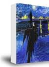
白の側面仕上げ ¥1
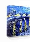
エッジぼかし仕上げ ¥1
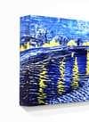
回り込み仕上げ ¥1
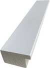
P118B ¥10
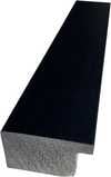
P118H ¥10
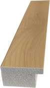
P118W ¥10
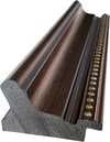
P438Z ¥10
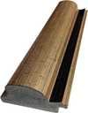
P508JH ¥12
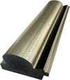
P508YH ¥12
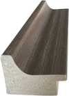
P805H ¥10
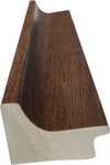
P805Z ¥10
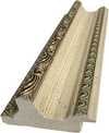
P919BZ ¥10
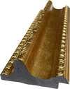
P919G ¥10
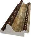
P919XJ ¥10
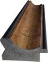
P959ZH ¥10
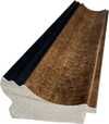
P968JZ ¥12
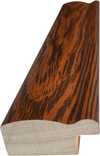
W106C ¥8
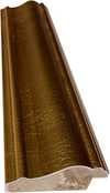
W218G ¥10
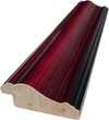
W218JH ¥8
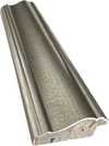
W218Y ¥10
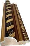
W307PJ ¥10
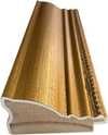
W316G ¥10
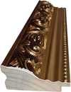
W316PJ ¥8
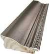
W316Y ¥10
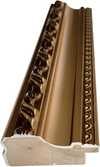
W398PJ ¥8
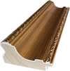
W4111J ¥10
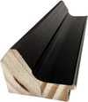
W500HY ¥15
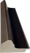
W500JH ¥15
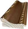
W692G ¥12
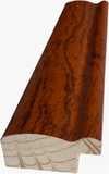
W849H ¥8
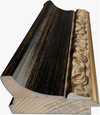
W940BG ¥15
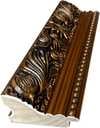
W953PJ ¥8
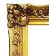
H24-GOLD ¥30

H24-SILVER ¥30
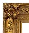
H36-GOLD ¥45
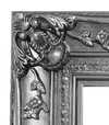
H36-SILVER ¥45
額装済み
額縁の形状: . 額縁を含む全体サイズ: .
4 4ステップ中、第4ステップ
仕上げのオプション(数種類)
すべて任意です。すでに選択されている回答に追加料金はかかりません。
世界中への配送()は、標準の4〜5週間ではなく、2週間でお届けいたします。(25 11月)
美術館にあるような、銘板(ネームプレート)を。
刻印入りブロンズプレートの詳細
This elegant plaque features the artist's name and the title of the artwork, finely engraved for a timeless presentation.
It is made from bronze with a refined, elegant finish. The text is precisely laser-engraved for a sharp and permanent result. Measuring 9x2 cm, the plaque is compact yet easy to read. It's built to be durable and scratch-resistant, offering a professional, museum-quality look. Mounting is simple thanks to the included adhesive backing.
透明アクリル銘板の詳細
The plaque includes essential engraved details such as the artist's name, the title of the artwork, the date it was created, the type of media used-like oil on canvas or watercolor-a brief description of the piece, and a QR code that links to the complete artwork information.
It is crafted from clear acrylic, offering a sleek, modern appearance. The text is UV-engraved in black to ensure strong visual contrast. With a size of 10x15 cm, it ensures optimal readability. It comes equipped with two metal hooks for secure wall mounting. The plaque is designed to be weather-resistant, making it suitable for various environments, and it includes interactive features that work seamlessly with smartphone scanning.
黒アクリル製銘板の詳細
This elegant plaque includes engraved information such as the artist's name, the title of the artwork, the date it was created, the type of media used (like oil on canvas or watercolor), a short description of the artwork, and a QR code for quick access to more information.
The plaque itself is made from refined black acrylic with a premium finish. The text is laser-engraved in white for high contrast and readability. Its size is 10x15 cm, designed to be easy to read. It comes with two metal hooks for professional mounting. The design is sleek and fits any interior style. It is also weather-resistant and durable, with built-in digital integration for mobile compatibility.
保護用ニスをご希望ですか?
お届け希望日をお選びください
✓ 内容を確認して注文する
ご注文内容の確認

Composition
再現技法
複製画サイズ一覧
-

複製画用フレーム
-
-
いずれかの辺が105 cm(約41インチ)を超えるアートワークまたは複製画の場合、フレームは分解されたキットの状態でお届けいたします。この方法は、輸送中の破損を防ぎ、安全に配送するために採用しております。
組み立てには専門知識が必要です(DIY用製品ではありません)。
本キットは、経験豊富なプロの額装師が、木工用ボンド(別売)、キャンバス用プライヤー、およびボンドの乾燥時に桟を直角に保持するためのクランプを使用して、組み立ておよびキャンバスの張り作業を行う必要があります。不適切な組み立てやキャンバスの張りの不均一は、作品に永久的な損傷を与える恐れがあり、弊社の保証対象外となります。
 いずれかの辺が105 cm(約41インチ)を超えるアートワークまたは複製画の場合、フレームは分解されたキットの状態でお届けいたします。この方法は、輸送中の破損を防ぎ、安全に配送するために採用しております。
すべての無垢材のパーツが含まれており、組み立てに最適なサイズに正確にカットされています。
付属のネジを使用し、角の接合部には別途木工用ボンドをご用意ください(ボンドは付属しておりません)。ボンドは額装業者様にてご手配をお願いいたします。
プロ仕様の道具が必要ですが、キットには含まれていません:キャンバス用ストレッチングプライヤー(テンショナー)、および接着剤が乾燥するまで木枠を直角に固定するためのクランプ。
重要:
コーナーの接合部には木工用ボンドが必要です。また、ボンドが完全に乾くまでクランプでバーを固定しておく必要があり、組み立てたフレームにキャンバスを張るにはキャンバス用ストレッチングプライヤーが必要となります。これらの道具はキットに含まれておりません。このサイズをご注文される前に、経験豊富なプロの額装師(フライマー)の手配をお願いいたします。

キャプション
-
-

保護用ワニス
光沢ワニス(色彩を鮮やかに引き立て、光や湿気から保護します)
-

お急ぎ便
通常4〜5週間かかる世界中への配送()を、今回は2週間でお届けします。(25 11月)
-
お急ぎ便
世界中への配送()は、約4〜5週間でお届けします。(2 12月)。
込み
合計金額
¥ 9947
ガラスオプションは、110cm未満のサイズでのみご利用いただけます。
すべての注文に同梱
- 世界中へ無料エクスプレス配送
- 高品質なリネンキャンバス
- 配送時完全保険付
- 関税・輸入税の払い戻し保証
- 真の色彩再現に関する保証
- 100日間返品保証、返金対応
- 100% 全額返金保証
- まとめ買い割引のご案内


Identification of Composition by Theo van Doesburg
The canvas known as Composition emerges from the mind of Theo van Doesburg, a work that captures a specific moment in 1923. This piece exists as a precise arrangement of form and color, born from a period of intense creative focus. The artist, Theo van Doesburg, brings a sense of equilibrium to the surface, translating abstract thought into a tangible presence. It is a work that demands attention through its structural clarity and its commitment to the principles of the De Stijl movement.
The history of this object is tied to a specific circle of thinkers and patrons. Antony Kok commissioned the work, setting it on its path through the hands of those who shaped the modern era. From there, the painting finds its way into the hands of Bart de Ligt (1883–1938), who becomes its first owner. This transition marks the beginning of a long lineage of stewardship, as the work moves from the artist's studio into a private collection where its presence remains constant.
Every line and color choice within Composition reflects the artist's pursuit of a universal visual language. As we observe the work, we see the direct result of a vision that seeks to strip away the unnecessary to find a fundamental truth. The painting remains a vital part of the history of abstraction, holding the weight of its 1923 origins in every carefully placed rectangle and primary hue.
Visual Composition and Geometric Elements
The canvas unfolds as a precise grid of rectangles, where vertical and horizontal lines intersect to dictate the movement of the eye. There is a profound sense of equilibrium achieved through this arrangement, as non-representational forms find their place within a structured, rhythmic order. The eye moves across the surface, guided by the intersections of these straight lines, finding balance in the way the shapes occupy the space. It is a study in pure geometry, where the subject matter is stripped of any external reference, leaving only the essence of form and relation.
Color acts as the primary force within this structured environment. The palette relies on the fundamental strength of red, yellow, and blue, which anchor the composition. These primary hues interact with a supporting cast of black, white, and grey, creating a tension between the boldest tones and the more neutral shades. The colors appear solid and flat, avoiding any blending or shading, which emphasizes the stark, clean nature of the geometric arrangement. Each rectangle holds its own weight, contributing to a visual language that seeks a universal harmony through simplicity.
Provenance and History of the Object
The history of this work begins in the creative atmosphere of Paris, where it finds its way from the artist's studio into the hands of Bart de Ligt. This acquisition likely occurs in late 1923, marking the start of a long and steady lineage. De Ligt, a man deeply connected to the avant-garde circles of the time, holds the piece within his personal collection until his passing in 1938.
From that moment, the painting enters a quiet, private chapter. It remains within the same family, passing through the hands of descendants for nearly a century. This continuity preserves the work's integrity, keeping it sheltered within a single domestic line since 1923. The colors and forms remain as they were when they first left the artist's side, held in a state of careful preservation through the decades.
Documented Interpretations and Artistic Debates
The canvas captures a moment of profound transition, acting as a key work within the artist's entire oeuvre. It reveals a growing complexity within his purist style, where the rigid logic of geometry begins to dance with a more nuanced sense of equilibrium. One senses the tension between the absolute and the evolving, as the lines and colors find a new, sophisticated rhythm. This evolution suggests a mind moving beyond simple shapes toward a more intricate visual language.
A deep connection between the realm of architecture and the act of painting pulses through the work. The composition feels less like a mere arrangement of pigment and more like a blueprint for a structured reality. This link is no accident; the artist himself articulated the concept behind its creation in the magazine Architectura on 17th July 1923. The painting exists as a bridge, where the spatial logic of built environments meets the spiritual pursuit of pure abstraction.
Related Works by the Same Artist
The evolution of this geometric language unfolds through several other pieces that trace the artist's shifting focus. One can look back to Composition XX from 1920 to see the early movements of these shapes. Nearby in the timeline, the 1923 work Study for a Composition offers a glimpse into the creative process behind these structured arrangements. These works exist as part of a continuous search for balance and order within the frame.
As the years progress, the compositions grow more complex and dynamic. The 1925 Counter composition XIV introduces a different energy to the grid. Later, the Simultaneous Counter-Composition from 1929–1930 pushes the boundaries of the aesthetic even further. Each piece captures a specific moment in a lifelong pursuit of a new visual language, moving from the rigid to the more fluid and experimental.
Q&A
テオ・ファン・ドースブルフ作「Composition」の色彩構成はどのように成り立っていますか?
テオ・ファン・ドースブルフ作「Composition」 の色彩分析は、Statement なコントラストと Discordant Palette な調和を捉えています。
「Composition」は、テオ・ファン・ドースブルフのテーマやスタイルとどのように結びついているのでしょうか?
「Composition」は、テオ・ファン・ドースブルフの他の作品と同様に、De Stijl様式と、一貫して描かれてきたテーマであるwassily kandinsky, de stijl movement, neoplasticism, geometric abstraction, total work of artを共有しています。
テオ・ファン・ドースブルフ作「Composition」はパブリックドメインですか?
著作権について、「Composition」はパブリックドメイン(著作権消滅)です。
この絵画の詳細を見る
 設置イメージを表示

 手描き複製画を注文する
 シェアする
 シェアする
 詳細を見る
 ガイドを表示


 ダウンロード
 似ている作品
 X線調査
 スライドショーを表示
 Q&A

 統計情報

関連記事

幾何学的抽象絵画を定義した傑作10選|アート、アーティスト、インテリア装飾
モンドリアン、マレーヴィチ…幾何学的抽象絵画を代表する傑作10選。各作品の背景や色彩構成、アーティストの情熱に迫ります。美術館品質の複製画はArtsDot.comで。オンラインでアートコレクションをご覧ください。

Theo van Doesburg: Pioneering De Stijl & the Evolution of Neo-Plasticism
Explore the revolutionary De Stijl movement & Neo-Plasticism with our expert guide. Discover Piet Mondrian, Theo van Doesburg, and the lasting impact of this influential art style. Learn about collecting & investing in De Stijl masterpieces.

Piet Mondrian: Deconstructing Reality – A Study of Neo-Plasticism & Universal Harmony
Explore the revolutionary art of Piet Mondrian and the principles of Neo-Plasticism. Discover De Stijl's influence, iconic compositions like 'Composition with Red, Yellow and Blue,' and Mondrian’s lasting legacy on modern design.


