
Composition

- 41.0 x 33.0 cm


Картината следва вашите избори: , .
Описание на колекционерския предмет
A balanced grid of primary red, blue, and yellow rectangles against black and white, reflecting a search for cosmic order in 1923.
 Прочети повече
Биография на художника
Холандски пионер на Де Стил, използвал основни цветове и геометрична абстракция за създаване на динамични композиции чрез прави линии и ъгли.
Поръчайте вашата в четири лесни стъпки
Не бързайте. Можете да промените всеки от отговорите; цената в количката ви се актуализира според всеки избор.
1 Стъпка първа от четири
На какъв материал да бъде отпечатано?
Платното се принтира с giclée мастила и може да бъде разпнато на подрамка или рамкирано като картина; хартията се доставя плоска или рамкирана със стъкло.
2 Стъпка две от четири
Какъв размер бихте искали?
Тези размери запазват пропорциите на оригиналната картина. Илюстрацията показва избрания от Вас размер върху стена, над двуметрова софа.
Или въведете свои собствени размери
Изберете от нашите предварително зададени размери, които съответстват на оригиналните пропорции на произведението.

Въведете необходимата ширина и височина, за да паснат на вашата рамка или стена. Принтовете могат само да се изрязват, но никога не могат да бъдат по-големи от оригиналната картина, така че при размер с различен формат част от изображението ще бъде загубена. Преди да започнем печат, ще ви изпратим дигитален мок업 за одобрение. Изображението, показано на тази страница, не показва реалното изрязване — само мок업ът го показва.
3 Стъпка три от четири
Как трябва да бъде подготвено: на руло, на платно или в рамка?
Цените по-долу са за избрания от Вас размер от първа стъпка.
Изберете страните на разпънатото платно
Изберете своята рамка
Бяло €1
Размити краища €1
Разширен €1
P118B €10
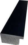
P118H €10
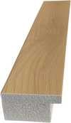
P118W €10
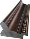
P438Z €10
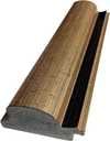
P508JH €12
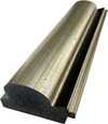
P508YH €12
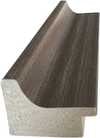
P805H €10
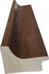
P805Z €10
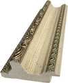
P919BZ €10
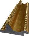
P919G €10
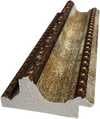
P919XJ €10
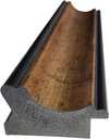
P959ZH €10
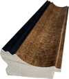
P968JZ €12
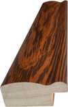
W106C €8
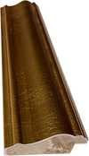
W218G €10
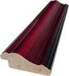
W218JH €8
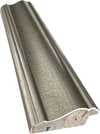
W218Y €10
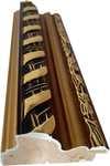
W307PJ €10
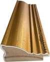
W316G €10
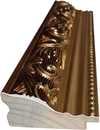
W316PJ €8
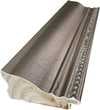
W316Y €10
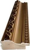
W398PJ €8
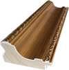
W4111J €10
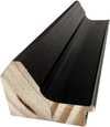
W500HY €15
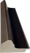
W500JH €15
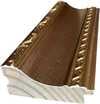
W692G €12
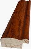
W849H €8
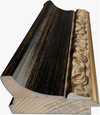
W940BG €15
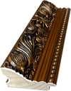
W953PJ €8
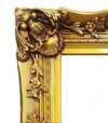
H24-GOLD €30

H24-SILVER €30
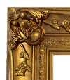
H36-GOLD €45
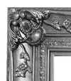
H36-SILVER €45
С рамка
Рамка: . Общ размер с рамката: .
4 Четвърта от четирите стъпки
Няколко варианта за завършен вид
Всички те са по избор. Вече избраните отговори не включват допълнителни разходи.
Доставка по целия свят () в рамките на 2 седмици вместо стандартните 4/5 седмици. (25 Ноември)
Табелка, точно като в музея?
Детайли за гравираната бронзова плака
This elegant plaque features the artist's name and the title of the artwork, finely engraved for a timeless presentation.
It is made from bronze with a refined, elegant finish. The text is precisely laser-engraved for a sharp and permanent result. Measuring 9x2 cm, the plaque is compact yet easy to read. It's built to be durable and scratch-resistant, offering a professional, museum-quality look. Mounting is simple thanks to the included adhesive backing.
Детайли за прозрачната акрилна плака
The plaque includes essential engraved details such as the artist's name, the title of the artwork, the date it was created, the type of media used-like oil on canvas or watercolor-a brief description of the piece, and a QR code that links to the complete artwork information.
It is crafted from clear acrylic, offering a sleek, modern appearance. The text is UV-engraved in black to ensure strong visual contrast. With a size of 10x15 cm, it ensures optimal readability. It comes equipped with two metal hooks for secure wall mounting. The plaque is designed to be weather-resistant, making it suitable for various environments, and it includes interactive features that work seamlessly with smartphone scanning.
Детайли за черната акрилна плака
This elegant plaque includes engraved information such as the artist's name, the title of the artwork, the date it was created, the type of media used (like oil on canvas or watercolor), a short description of the artwork, and a QR code for quick access to more information.
The plaque itself is made from refined black acrylic with a premium finish. The text is laser-engraved in white for high contrast and readability. Its size is 10x15 cm, designed to be easy to read. It comes with two metal hooks for professional mounting. The design is sleek and fits any interior style. It is also weather-resistant and durable, with built-in digital integration for mobile compatibility.
Защитен лак?
Кога ви е необходимо?
✓ Проверете и поръчайте
Вашата принтирана копия, точно както я поръчахте

Composition
Вид репродукция
Размер на репродукцията
-

Рамка за репродукция
-
-
За произведения на изкуството или репродукции, чийто размер е над 105 см (приблизително 41 инча) във всяка страна, рамката ще бъде изпратена в разглобен вид като комплект за сглобяване. Този метод гарантира безопасна доставка и предотвратява повреди по време на транспортиране.
Изисква се професионално сглобяване – това не е продукт за самостоятелна изработка (DIY).
Комплектът трябва да бъде сглобен, а платното – опънато от опитен професионален багер, като се използва дървено лепило (не е включено в комплекта), клещи за опъване на платно и затягащи скоби, за да се поддържа правотата на подрамника, докато лепилото изсъхне. Неправилното сглобяване или неравномерното опъване на платното може трайно да повреди произведението и не е покрито от нашата гаранция.
 За произведения на изкуството или репродукции, чийто размер е над 105 см (приблизително 41 инча) във всяка страна, рамката ще бъде изпратена в разглобен вид като комплект за сглобяване. Този метод гарантира безопасна доставка и предотвратява повреди по време на транспортиране.
Всички елементи от масивна дървесина са включени, прецизно изрязани по размер.
Сглобява се с предоставените винтове, както и с лепило за дърво за ъгловите връзки, което не е включено в комплекта и трябва да бъде осигурено от вашия рамкар.
Изискват се професионални инструменти, които не са включени: щипка за опъване на платно (натягач) и скоби за фиксиране на подрамниците под прав ъгъл, докато лепилото изсъхне.
Важно:
За сглобяването на ъглите е необходимо лепило за дърво, рейките трябва да се фиксират с

Етикет с име
-
-

Защитен лак
Гланцов лак (подсилва цветовете и предпазва от светлина и влага)
-

Спешно
Доставка по целия свят () за 2 седмици вместо стандартните 4/5 седмици. (25 Ноември)
-
Експресна доставка
Доставка по целия свят () в рамките на 4-5 седмици. (2 Декември).
Включена
Обща цена
€ 57
Опцията със стъкло е налична само за размери под 110 см
Включено във всяка поръчка
- Безплатна експресна доставка по целия свят
- Висококачествено ленено платно
- Пълно застраховане на доставката
- Гаранция за възстановяване на митнически такси
- Гаранция за пълно съответствие на цветовете
- Политика за връщане в рамките на 100 дни (само при дефекти)
- 100% Гаранция за връщане на сумата
- Оферта за отстъпка при поръчка на повече бройки


Identification of Composition by Theo van Doesburg
The canvas known as Composition emerges from the mind of Theo van Doesburg, a work that captures a specific moment in 1923. This piece exists as a precise arrangement of form and color, born from a period of intense creative focus. The artist, Theo van Doesburg, brings a sense of equilibrium to the surface, translating abstract thought into a tangible presence. It is a work that demands attention through its structural clarity and its commitment to the principles of the De Stijl movement.
The history of this object is tied to a specific circle of thinkers and patrons. Antony Kok commissioned the work, setting it on its path through the hands of those who shaped the modern era. From there, the painting finds its way into the hands of Bart de Ligt (1883–1938), who becomes its first owner. This transition marks the beginning of a long lineage of stewardship, as the work moves from the artist's studio into a private collection where its presence remains constant.
Every line and color choice within Composition reflects the artist's pursuit of a universal visual language. As we observe the work, we see the direct result of a vision that seeks to strip away the unnecessary to find a fundamental truth. The painting remains a vital part of the history of abstraction, holding the weight of its 1923 origins in every carefully placed rectangle and primary hue.
Visual Composition and Geometric Elements
The canvas unfolds as a precise grid of rectangles, where vertical and horizontal lines intersect to dictate the movement of the eye. There is a profound sense of equilibrium achieved through this arrangement, as non-representational forms find their place within a structured, rhythmic order. The eye moves across the surface, guided by the intersections of these straight lines, finding balance in the way the shapes occupy the space. It is a study in pure geometry, where the subject matter is stripped of any external reference, leaving only the essence of form and relation.
Color acts as the primary force within this structured environment. The palette relies on the fundamental strength of red, yellow, and blue, which anchor the composition. These primary hues interact with a supporting cast of black, white, and grey, creating a tension between the boldest tones and the more neutral shades. The colors appear solid and flat, avoiding any blending or shading, which emphasizes the stark, clean nature of the geometric arrangement. Each rectangle holds its own weight, contributing to a visual language that seeks a universal harmony through simplicity.
Provenance and History of the Object
The history of this work begins in the creative atmosphere of Paris, where it finds its way from the artist's studio into the hands of Bart de Ligt. This acquisition likely occurs in late 1923, marking the start of a long and steady lineage. De Ligt, a man deeply connected to the avant-garde circles of the time, holds the piece within his personal collection until his passing in 1938.
From that moment, the painting enters a quiet, private chapter. It remains within the same family, passing through the hands of descendants for nearly a century. This continuity preserves the work's integrity, keeping it sheltered within a single domestic line since 1923. The colors and forms remain as they were when they first left the artist's side, held in a state of careful preservation through the decades.
Documented Interpretations and Artistic Debates
The canvas captures a moment of profound transition, acting as a key work within the artist's entire oeuvre. It reveals a growing complexity within his purist style, where the rigid logic of geometry begins to dance with a more nuanced sense of equilibrium. One senses the tension between the absolute and the evolving, as the lines and colors find a new, sophisticated rhythm. This evolution suggests a mind moving beyond simple shapes toward a more intricate visual language.
A deep connection between the realm of architecture and the act of painting pulses through the work. The composition feels less like a mere arrangement of pigment and more like a blueprint for a structured reality. This link is no accident; the artist himself articulated the concept behind its creation in the magazine Architectura on 17th July 1923. The painting exists as a bridge, where the spatial logic of built environments meets the spiritual pursuit of pure abstraction.
Related Works by the Same Artist
The evolution of this geometric language unfolds through several other pieces that trace the artist's shifting focus. One can look back to Composition XX from 1920 to see the early movements of these shapes. Nearby in the timeline, the 1923 work Study for a Composition offers a glimpse into the creative process behind these structured arrangements. These works exist as part of a continuous search for balance and order within the frame.
As the years progress, the compositions grow more complex and dynamic. The 1925 Counter composition XIV introduces a different energy to the grid. Later, the Simultaneous Counter-Composition from 1929–1930 pushes the boundaries of the aesthetic even further. Each piece captures a specific moment in a lifelong pursuit of a new visual language, moving from the rigid to the more fluid and experimental.
Въпроси и отговори
Как е изградена цветовата композиция на „Composition“ на Тео ван Досбург?
Цветовата композиция на „Composition“ на Тео ван Досбург съчетава Statement контраст с Discordant Palette хармония.
Кога е създадена и от кой стил е „Composition“ на Тео ван Досбург?
„Composition“ е създадена през 1923 като част от движението De Stijl.
Каква сюжетна линия и атмосфера съчетава „Composition“ на Тео ван Досбург?
"Composition" изобразява red, blue, yellow, black, white, rectangles, lines, а уловеното настроение е Minimalist.
Още информация за тази картина
 Преглед в реален мащаб

 Купете ръчно рисувана картина
 Изпрати
 Сподели
 Детайли
 Ръководство


 Изтегляне
 Подобни артикули
 Рентгенова снимка
 Слайдшоу
 Въпроси и отговори
 Статистика
Подобни произведения


Тео ван Досбург
1883 - 1931, Нидерландия
Биография на художника
The Architect of Abstraction: A Life in Geometric Harmony
Theo van Doesburg, born Christian Emil Marie Küpper in 1883 in Utrecht, Netherlands, wasn’t merely a painter; he was a revolutionary force who fundamentally reshaped the very foundations of modern art. His journey began amidst the lingering echoes of Impressionism and Post-Impressionism, initially mirroring styles reminiscent of Vincent van Gogh – both in subject matter and the intense emotionality conveyed through brushstrokes. However, this early phase served as a crucial prelude, a necessary stepping stone towards the radical transformation that would define his enduring legacy. A pivotal moment arrived in 1913 with his encounter with Wassily Kandinsky’s *Rückblicke*. This text ignited within van Doesburg a profound realization: true artistic expression wasn't about faithfully replicating the external world, but rather channeling an inner, spiritual reality through the pure, unadulterated language of abstraction. It was this conviction that birthed Neoplasticism – more commonly known as De Stijl – a movement he founded and fiercely championed, becoming its most ardent advocate.Forging a New Visual Language: The Principles of De Stijl
De Stijl wasn’t simply an artistic style; it was a comprehensive philosophical manifesto translated into visual form. Van Doesburg believed in stripping art down to its most essential elements – straight lines, right angles, and the primary colors of red, yellow, and blue, alongside black, white, and gray. This austere palette wasn't born from limitation but from a profound belief that these fundamental forms resonated with an underlying cosmic order, a universal harmony waiting to be revealed through visual representation. He envisioned a *total* work of art, extending far beyond the confines of the canvas to encompass architecture, design, furniture, and even everyday objects – seeking to create a unified aesthetic experience across all aspects of human life. Collaboration was paramount; van Doesburg worked closely with architects like J.J.P. Oud and Gerrit Rietveld, designing stained glass windows, innovative furniture pieces, and entire interiors that meticulously embodied the principles of De Stijl. His collaborations extended beyond individual projects to include fellow artists such as Piet Mondrian, with whom he co-founded the influential journal *De Stijl*, a platform for disseminating their ideas and attracting a vibrant community of like-minded creatives. However, despite their shared origins and initial synergy, tensions gradually emerged between van Doesburg and Mondrian regarding the rigidity of Neoplasticism. Van Doesburg introduced “Elementarism” in 1926 – a bold departure that sought to inject dynamism into the movement, advocating for diagonal lines and a more fluid approach to composition, ultimately leading to a significant schism within De Stijl.Beyond Painting: A Multifaceted Artistic Vision
While celebrated primarily as a painter, Theo van Doesburg’s artistic pursuits were remarkably diverse and far-reaching. He was a prolific writer, poet, critic, and theorist – using his pen to articulate the complex theoretical underpinnings of De Stijl and challenge conventional notions of art and aesthetics. His engagement with Dadaism in the early 1920s further broadened his artistic horizons, leading him to experiment with collage, typography, and other innovative techniques. This period also saw him teaching at the Bauhaus in Weimar, Germany – a crucible of modern design and architecture – where he shared his ideas with a new generation of artists and designers, fostering dialogue and pushing the boundaries of creative expression. He wasn’t content to remain confined within the traditional realm of painting; van Doesburg actively sought to integrate art into everyday life, believing it had the power to transform society for the better. His designs for interiors and furniture weren't merely aesthetic exercises; they were carefully considered attempts to create harmonious living spaces that reflected the principles of De Stijl – spaces designed to evoke a sense of balance, order, and spiritual connection. A prime example is his collaboration with Sophie Taeuber-Arp and Georges Vantongerloo on designing artist residences in Paris, showcasing a holistic approach to artistic creation – an attempt to build not just buildings but entire worlds imbued with the spirit of De Stijl.Key Influences and Developments
Van Doesburg’s artistic development was shaped by a confluence of influences. The early impact of Vincent van Gogh's expressive brushwork instilled in him a deep appreciation for emotional intensity, while Kandinsky’s *Rückblicke* provided the crucial conceptual framework for embracing abstraction as a means of accessing spiritual truth. Furthermore, his exposure to Cubism and Futurism broadened his understanding of geometric forms and dynamic composition – though he ultimately rejected their emphasis on representation in favor of pure abstraction. The Dada movement's embrace of chance and anti-establishment sentiment also influenced his approach to art, encouraging him to question traditional conventions and explore new possibilities. His time at the Bauhaus exposed him to innovative design principles and a collaborative spirit that profoundly shaped his artistic practice. His interest in typography and graphic design led to explorations of visual communication as an integral part of the De Stijl aesthetic.Legacy and Enduring Influence
Despite his tragically short life – he died suddenly in 1931 at the age of 47 – Theo van Doesburg’s impact on modern art remains profound and enduring. De Stijl, though relatively short-lived as a cohesive movement, exerted an enormous influence on subsequent artistic developments, including Bauhaus design, Minimalism, Constructivism, and countless other movements that sought to simplify forms, reduce color palettes, and prioritize functionalism. His emphasis on geometric abstraction, pure color, and the integration of art into everyday life continues to resonate with artists and designers today. Van Doesburg’s legacy extends far beyond his paintings and designs; it lies in his unwavering commitment to artistic innovation, his relentless pursuit of a universal aesthetic language, and his belief in the transformative power of abstraction – a vision that continues to inspire those who seek to create a more beautiful, harmonious, and meaningful world through art.
Свързани статии

Топ 10 шедьовъра на геометричната абстракция за Вашия дом | ArtsDot.com
Разгледайте топ 10 шедьовъра на геометричната абстракция – Кандински, Мондриан и други! Открийте историите зад тези емблематични картини и добавете елегантност към дома си с репродукции от ArtsDot.com. Разгледайте пълната колекция онлайн!

Piet Mondrian: Deconstructing Reality – A Study of Neo-Plasticism & Universal Harmony
Explore the revolutionary art of Piet Mondrian and the principles of Neo-Plasticism. Discover De Stijl's influence, iconic compositions like 'Composition with Red, Yellow and Blue,' and Mondrian’s lasting legacy on modern design.

Трансформация на визията: Реализъм, абстракция и поетично въображение в съвременната художествена практика
Разгледайте трансформацията на визията в съвременното изкуство – реализъм, абстракция и поетично въображение. Експертни анализи, тенденции и вдъхновение за ценители и колекционери.