


تتبع الصورة اختياراتك: , .
وصف القطعة المقتناة
Admire Pieter van Lint's captivating 'Self Portrait,' a Flemish Baroque masterpiece from 1609 showcasing the artist’s Roman influences and skillful technique.
 عرض المزيد
السيرة الذاتية للفنان
Discover Pieter van Lint: Flemish Baroque painter known for history, genre & portraiture. Explore his Roman influences & copies of Rubens' work – a master of Antwerp art.
اطلب الخاصة بك في أربع خطوات بسيطة
خذ وقتك؛ يمكنك تغيير أي إجابة، حيث يتغير السعر في سلة طلبك بناءً على كل اختيار.
1 الخطوة الأولى من أصل أربع
أي حجم تود اختيار؟
تحافظ هذه المقاسات على أبعاد اللوحة الأصلية. ويُظهر الرسم التوضيحي اختيارك معروضاً على جدار، فوق أريكة بطول مترين.
أو أدخل مقاساتك الخاصة
اختر من بين أحجامنا المُعدّة مسبقاً والتي تتوافق مع النسب الأصلية للعمل الفني.

أدخل العرض والارتفاع اللذين تحتاجهما ليتناسب العمل مع إطارك أو جدارك. وبما أن هذه اللوحة مرسومة يدوياً، ففي حال اختيار مقاس بأبعاد مختلفة، يمكن للفنان رسم مساحة إضافية حول الصورة أو تقليصها قليلاً — الخيار لك. سنرسل لك نموذجاً رقمياً تجريبياً لاعتماده قبل البدء في الرسم. علماً بأن الصورة المعروضة في هذه الصفحة لا تعكس النتيجة النهائية الحقيقية، فالنموذج التجريبي هو الوحيد الذي يوضح ذلك بدقة.
2 الخطوة الثانية من أصل أربع
كيف تفضل استلامه: ملفوفاً، أم مشدوداً على إطار، أم مؤطراً؟
الأسعار أدناه هي للمقاس الذي اخترته في الخطوة الأولى.
اختر حواف اللوحة القماشية المشدودة
اختر إطارك
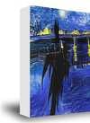
أبيض E£1
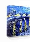
حواف ضبابية E£1
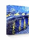
ممتد الحواف E£1
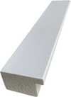
P118B E£10
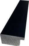
P118H E£10
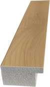
P118W E£10
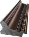
P438Z E£10
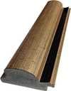
P508JH E£12
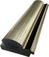
P508YH E£12
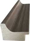
P805H E£10
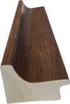
P805Z E£10
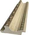
P919BZ E£10
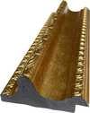
P919G E£10
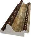
P919XJ E£10
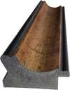
P959ZH E£10
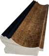
P968JZ E£12
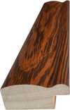
W106C E£8
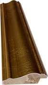
W218G E£10
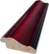
W218JH E£8
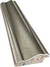
W218Y E£10
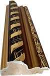
W307PJ E£10
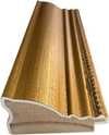
W316G E£10
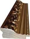
W316PJ E£8
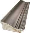
W316Y E£10
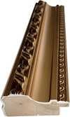
W398PJ E£8
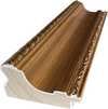
W4111J E£10
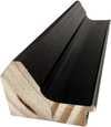
W500HY E£15
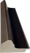
W500JH E£15
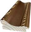
W692G E£12
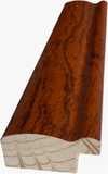
W849H E£8
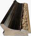
W940BG E£15
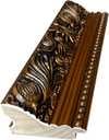
W953PJ E£8
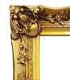
H24-GOLD E£30

H24-SILVER E£30
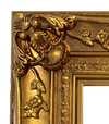
H36-GOLD E£45
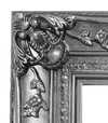
H36-SILVER E£45
مؤطر
الإطار: . الحجم الإجمالي مع الإطار: .
3 الخطوة الثالثة من أصل أربع
هل تود إجراء أي تغييرات على اللوحة؟
تكون الإجابة "لا" لدى معظم الناس؛ فبما أن كل لوحة تُصنع يدوياً، يمكن لفناننا أيضاً تخصيصها لتناسب ذوقك.
بعد الطلب، سيقوم فريق ArtsDot.com بمراسلة العميل عبر البريد الإلكتروني للحصول على التعليمات وتزويده بمعاينة تجريبية للعمل
4 الخطوة الرابعة من أصل أربع خطوات
بعض خيارات اللمسات النهائية
جميعها اختيارية. الإجابات المختارة مسبقاً لا تترتب عليها أي تكاليف إضافية.
من رسمها؟
توصيل عالمي إلى خلال 3 إلى 4 أسابيع بدلاً من المدة المعتادة البالغة 5 أسابيع. (19 نوفمبر). جودة لا تهاون فيها.
لوحة تعريفية، تماماً كما في المتاحف؟
تفاصيل اللوحة البرونزية المحفورة
This elegant plaque features the artist's name and the title of the artwork, finely engraved for a timeless presentation.
It is made from bronze with a refined, elegant finish. The text is precisely laser-engraved for a sharp and permanent result. Measuring 9x2 cm, the plaque is compact yet easy to read. It's built to be durable and scratch-resistant, offering a professional, museum-quality look. Mounting is simple thanks to the included adhesive backing.
تفاصيل اللوحة الأكريليكية الشفافة
The plaque includes essential engraved details such as the artist's name, the title of the artwork, the date it was created, the type of media used-like oil on canvas or watercolor-a brief description of the piece, and a QR code that links to the complete artwork information.
It is crafted from clear acrylic, offering a sleek, modern appearance. The text is UV-engraved in black to ensure strong visual contrast. With a size of 10x15 cm, it ensures optimal readability. It comes equipped with two metal hooks for secure wall mounting. The plaque is designed to be weather-resistant, making it suitable for various environments, and it includes interactive features that work seamlessly with smartphone scanning.
تفاصيل اللوحة الأكريليكية السوداء
This elegant plaque includes engraved information such as the artist's name, the title of the artwork, the date it was created, the type of media used (like oil on canvas or watercolor), a short description of the artwork, and a QR code for quick access to more information.
The plaque itself is made from refined black acrylic with a premium finish. The text is laser-engraved in white for high contrast and readability. Its size is 10x15 cm, designed to be easy to read. It comes with two metal hooks for professional mounting. The design is sleek and fits any interior style. It is also weather-resistant and durable, with built-in digital integration for mobile compatibility.
ورنيش واقٍ؟
متى تحتاجها؟
✓ المراجعة والطلب
لوحتك، تماماً كما طلبتها

Self portrait
خامة النسخة المطبوعة
مقاس النسخة المطبوعة
-

نخبة كبار الفنانين
مزيد من التفاصيل، والبراعة، ووقت إضافي للإنتاج
-

إطار النسخة المطبوعة
-
-
بالنسبة للأعمال الفنية أو النسخ المطبوعة التي يتجاوز طول أي من أضلاعها 105 سم (حوالي 41 بوصة)، سيتم شحن الإطار كمجموعة مفككة؛ حيث تضمن هذه الطريقة سلامة التوصيل وتمنع حدوث أي أضرار أثناء النقل.
يتطلب الأمر تجميعاً احترافياً - هذا المنتج ليس مخصصاً للتركيب الذاتي.
يجب تجميع المجموعة وشد القماش بواسطة فني إطارات محترف وخبير، باستخدام غراء الخشب (غير مرفق)، وكماشة شد القماش، وملاقط لتثبيت القضبان بشكل مستوٍ أثناء جفاف الغراء. إن التجميع غير الصحيح أو عدم توازن شد القماش قد يؤدي إلى تلف العمل الفني بشكل دائم، وهو أمر لا يغطيه الضمان الخاص بنا.
 بالنسبة للأعمال الفنية أو النسخ المطبوعة التي يتجاوز طول أي من أضلاعها 105 سم (حوالي 41 بوصة)، سيتم شحن الإطار كمجموعة مفككة؛ حيث تضمن هذه الطريقة سلامة التوصيل وتمنع حدوث أي أضرار أثناء النقل.
تتضمن المجموعة جميع القطع الخشبية الصلبة، والمقطعة بدقة لتناسب المقاسات المطلوبة.
يتم التجميع باستخدام البراغي المرفقة، بالإضافة إلى غراء الخشب للوصلات الزاوية، وهو غير مرفق ويجب توفيره من قبل فني التأطير الخاص بك.
تتطلب العملية استخدام أدوات احترافية غير مدرجة في المجموعة: مثل زرادية شد القماش (أداة شد) وملاقط لتثبيت القضبان بشكل مستوٍ أثناء جفاف الغراء.
تنبيه هام:
تتطلب الوصلات الزاوية استخدام غراء الخشب، كما يجب تثبيت القضبان باستخدام المشابك حتى يجف الغراء تماماً، ويتطلب شد القماش على الإطار المجمع استخدام كماشة شد القماش. لا تشتمل المجموعة على أي من هذه الأدوات؛ لذا يرجى التواصل مع فني تأطير محترف قبل طلب هذا المقاس.

بطاقة التعريف
-
-

ورنيش واقٍ
ورنيش لامع (يُبرز الألوان ويحمي من الضوء والرطوبة)
-

تخصيص عملي الفني
أمثلة على التعديلات المتاحة: استبدال الوجه بصورة العميل؛ إضافة حيوان أليف (مثل استبدال قطة بكلب)؛ إدراج رسالة مخفية في الخلفية؛ تغيير المناظر الطبيعية أو العناصر في الخلفية.
-

شحن سريع
توصيل عالمي إلى خلال 3-4 أسابيع بدلاً من المدة المعتادة البالغة 5 أسابيع. (19 نوفمبر). جودة لا تضاهى.
-
شحن سريع
توصيل عالمي إلى خلال 5 أسابيع. (26 نوفمبر).
مُضمَّن
إجمالي السعر النهائي
E£ 14330
خيار الزجاج متاح فقط للمقاسات التي تقل عن 110 سم
مرفق مع كل طلب
- شحن سريع ومجاني لجميع أنحاء العالم
- قماش كتان عالي الجودة
- تأمين شامل على الشحن
- ضمان استرداد الرسوم الجمركية
- ضمان مطابقة الألوان الحقيقية
- سياسة الإرجاع خلال 100 يوم (في حالات العيوب فقط)
- ضمان استرداد نقدي بنسبة 100%
- خصم عند طلب كميات


Self Portrait by Pieter van Lint: A Glimpse into a Flemish Master's World
- Artist: Pieter van Lint
- Date: Unknown (likely mid-17th century)
- Medium: Oil on Canvas
The Artist and His Time: Contextualizing the Portrait
Pieter van Lint (1609-1690) was a prominent Flemish painter, draughtsman, and tapestry designer who flourished during the Baroque period. Born in Antwerp, Belgium, he received his training under Artus Wolffort, a significant figure in Antwerp's artistic landscape. Van Lint’s career spanned decades, marked by periods of intense activity in both Antwerp and Italy, particularly Rome. He became a master in the Guild of Saint Luke in 1633, demonstrating his established standing within the art community. His time in Rome (1633-1640) was crucial to his development, where he worked for Cardinal Domenico Ginnasi and frescoed the Cybo family chapel in Santa Maria del Popolo. This exposure to Italian artistic traditions, including classicism and the Bamboccianti genre, significantly influenced his style.
A Detailed Examination of the Self-Portrait
This self-portrait offers a compelling window into the persona of Pieter van Lint himself. The artist presents as a man of refinement and intellect. He is depicted with brown hair and a neatly trimmed beard and mustache, indicative of contemporary fashion. His attire—a black suit complemented by a crisp white shirt and an elaborate lace collar—suggests his status and artistic profession. Notably, he holds a yellow cloth or napkin in his hand, the significance of which remains open to interpretation; it could be a simple gesture, a reference to everyday life, or perhaps even a symbolic element related to his craft.
The painting’s technique showcases van Lint's skill as an oil painter. The use of light and shadow creates depth and volume, bringing the artist's features into sharp focus. While the background is relatively simple, it allows the viewer's attention to remain firmly on the subject—the artist himself. A signature appears in the bottom right corner, a common practice among artists of the time, affirming authorship and adding to the painting’s authenticity.
Style and Influences: The Flemish Baroque Touch
The self-portrait exemplifies the characteristics of the Flemish Baroque style, which van Lint embraced. This style is characterized by its dramatic use of light and shadow (chiaroscuro), rich colors, and a sense of movement and emotion. However, van Lint’s work also reveals influences from classicism, reflecting his time spent in Italy studying antique art. His frequent visits to Antwerp's churches to copy the works of masters like Peter Paul Rubens and Marten de Vos further shaped his artistic development. The portrait demonstrates a balance between Baroque dynamism and classical restraint, a hallmark of van Lint’s unique style.
Emotional Resonance and Artistic Legacy
Beyond its technical merits, this self-portrait evokes a sense of quiet confidence and intellectual curiosity. It provides a rare glimpse into the life of an artist deeply engaged with his craft and surrounded by the vibrant artistic scene of 17th-century Antwerp and Rome. As a testament to van Lint’s skill and legacy, this self-portrait remains a valuable document of Flemish Baroque art and a captivating portrayal of the artist himself.
الأسئلة والأجوبة
أين يمكنني معاينة "Self portrait"؟
تتيح لك صفحة معاينة العمل الفني الخاصة بـ "Self portrait" معاينة العمل الفني قبل الطلب.
أين يمكنني مشاهدة العمل الأصلي "Self portrait" للفنان Pieter van Lint؟
تُحفظ النسخة الأصلية من "Self portrait" للفنان Pieter van Lint في Royal Museums of Fine Arts of Belgium, بروكسل, بلجيكا، بينما تتيح لك هذه النسخة المطبوعة عرض العمل الفني في منزلك.
هل يعتمد "Self portrait" للفنان Pieter van Lint على تباينات قوية أم تناغمات ناعمة؟
يُظهر التحليل اللوني لـ "Self portrait" للفنان Pieter van Lint تباينًا Gentle وتناغمًا Unified Palette.
المزيد حول هذه اللوحة
 معاينة الحجم الواقعي

 التبديل إلى نسخة مطبوعة
 مشاركة
 مشاركة
 التفاصيل
 دليل


 تحميل الملف
 قطع مشابهة
 الأشعة السينية
 عرض شرائح
 الأسئلة والأجوبة
 الإحصائيات
أعمال فنية ذات صلة


Pieter van Lint
1609 - 1690, Belgium
السيرة الذاتية للفنان
Pieter van Lint: A Flemish Master Bridging Antiquity and Baroque
Pieter van Lint (1609-1690), a name perhaps less familiar than his contemporaries Rubens or Van Dyck, nevertheless stands as a significant figure in the vibrant artistic landscape of 17th-century Antwerp. Born into a family deeply rooted in the art world – his father, Hendrik Frans van Lint, was a celebrated vedute painter in Rome – Pieter inherited not only a legacy but also a profound understanding of artistic technique and a restless spirit for exploration. His career spanned decades, encompassing diverse styles and commissions, reflecting a remarkable adaptability and a constant engagement with the prevailing trends of his time.
Van Lint’s early training under Artus Wolffort in Antwerp laid the foundation for his skill in historical painting and portraiture. Crucially, however, his formative years were spent immersed in the artistic traditions of the Flemish Baroque, particularly through frequent visits to the city's churches. These pilgrimages weren’t merely acts of devotion; they served as invaluable apprenticeships, allowing him to meticulously copy the works of masters like Peter Paul Rubens, Marten de Vos, and the Francken brothers – absorbing their compositional strategies, color palettes, and masterful rendering of texture. This deliberate study of his predecessors is evident in many of his early works, which demonstrate a clear debt to Wolffort’s academic style, itself influenced by Otto van Veen's classical approach.
Roman Influences and the Pursuit of Classicism
In 1633, Van Lint achieved the coveted status of master in the Guild of Saint Luke, marking his transition into independent practice. Shortly thereafter, he embarked on a transformative journey to Rome – a period that fundamentally shaped his artistic development. Unlike many Flemish artists who simply replicated Italian styles, Van Lint embraced the Roman environment with an open mind, actively seeking out and studying the legacy of antiquity. He meticulously sketched ancient sculptures and architectural ruins, absorbing the principles of classical form and composition. This engagement with the antique is powerfully evident in his later works, particularly those produced during his time in Rome (1633-1640), where he developed a distinct style characterized by clear outlines, balanced compositions, and an interest in idealized beauty.
His work for Cardinal Domenico Ginnasi, Bishop of Ostia, exemplifies this shift. He frescoed the Cybo family chapel in the Santa Maria del Popolo with the legend of the True Cross – a monumental undertaking that showcased his burgeoning skills in large-scale painting and his growing command of classical motifs. This period also witnessed him experimenting with the *bamboccianti* genre, producing small, lively scenes depicting everyday life, reflecting a desire to capture human emotion and interaction.
A Master of Copies and Diverse Commissions
Van Lint’s career was marked by a remarkable versatility, encompassing religious paintings, historical narratives, portraits, and even tapestry designs. He skillfully navigated the demands of various patrons, from wealthy families like the Cibos to the Antwerp art trade network. A significant portion of his output consisted of meticulously executed copies of Peter Paul Rubens' oil sketches – a lucrative business that allowed him to refine his technique and gain further insight into the master’s methods. These copies, often produced on copper, were highly prized in Spain and the Spanish colonies for their durability and lustrous finish.
Beyond these commissioned works, Van Lint created numerous devotional paintings, frequently depicting scenes from the life of Mary Magdalene – a subject that resonated deeply with his artistic sensibilities. His ‘Marriage of the Virgin’ (1640), painted in Antwerp Cathedral, is a prime example of this style, showcasing his ability to imbue religious subjects with a sense of drama and emotional intensity. He also designed tapestries for prominent weavers, demonstrating his broader creative talents.
Legacy and Artistic Connections
Van Lint’s influence extended beyond his own creations. He mentored several promising artists, including Caerel de las Cuevas, Jan-Baptista Ferrari, and Godfried Maes, ensuring the continuation of his artistic lineage. His son, Hendrik Frans van Lint, followed in his father's footsteps, establishing himself as a celebrated landscape painter in Rome – further demonstrating the family’s commitment to artistic excellence.
While Pieter van Lint may not be as widely recognized as some of his contemporaries, his work represents a crucial link between the Flemish Baroque and the burgeoning classical influences of the 17th century. His ability to synthesize diverse styles—from the academic traditions of Wolffort to the dynamism of the *bamboccianti* and the ideals of antiquity—solidifies his position as a significant and enduring figure in the history of Antwerp art.
مقالات ذات صلة

Flemish Renaissance Art: Meticulous Detail and Tradition of the Northern Masters
Master the intricate details and oil techniques of the Flemish Renaissance. Explore the legacy of the Northern Masters today.

Ferdinand Bol (1616-1680): A Dutch Master of Portraiture & Dramatic Light
Explore the captivating world of Ferdinand Bol (1616-1680), a master Dutch portraitist deeply influenced by Rembrandt. Discover his life, style, and enduring legacy with ArtsDot.

The Grandeur of Baroque Portraiture: Power, Emotion & Artistic Innovation
Explore the grandeur of Baroque portraiture! Discover Rubens, Van Dyck & the masters of 17th-century art. Uncover symbolism, techniques & lasting influence. Expert insights for collectors and enthusiasts.